Room of the Day: Multipurpose Design Brings a Room to Life
http://decor-ideas.org 11/11/2014 22:13 Decor Ideas
Interior designer Elena Calabrese took one space and made it a family room, game room, media center and home office. In truth, it was never supposed to be more than a living room. “This was a spec house,” she says. “And this was supposed to be the formal living room — but these clients didn’t need a space like that. What they needed was a multipurpose room.”
Room at a Glance
Who hangs out here: A professional couple and their 8-year-old son
Interior designer: Elena Calabrese
Big idea: This is a living room that was rethought as a multipurpose space.
Location: Mill Valley, California
Size: 15 by 15 feet (4½ by 4½ meters)
“Before the remodel this was the room that no one went into,” Calabrese says. “But the family needed a spot to hang out together. The parents travel a lot, and when they are home, they like to spend time together with their son.”
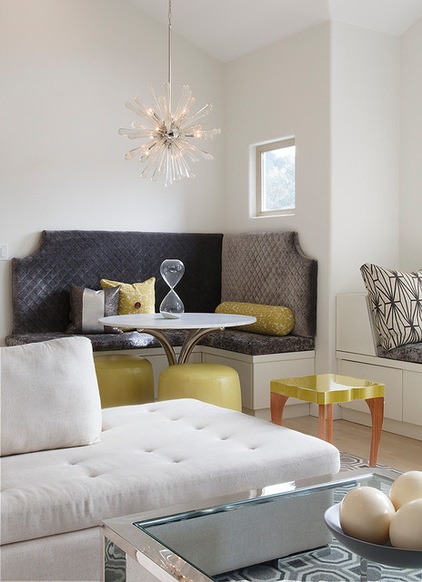
One of the central design features is an area for an activity they all enjoy: board games. The designer created this banquette and table expressly for that purpose. “I found the base on the Internet; it’s a vintage Milo Baughman piece. I had a marble top made for it,” Calabrese says. She created the built-in seating with notched backs to break up its linear nature. “I didn’t think about it matching the pattern in the carpet,” she says. That it does may be a happy coincidence, but the choice of a banquette was intentional. “I didn’t want it to read as an eating space, and I feel like that’s how it would appear if I used a table surrounded by chairs,” she says. “This way it looks like an intimate gathering spot.”
Light fixture: Regina Andrew; side table: HD Buttercup
10 Reasons to Love Banquettes (Not Just in the Kitchen)
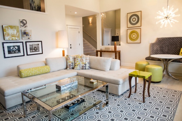
The large sectional was chosen with one eye toward the television and the other toward the game table. “Because it has a bumper on one end, someone can perch there and chat with people seated around the table or on the window seat,” Calabrese says. “I didn’t want it to be all about the television. I did want it to be cool, modern and lounge-y.”
The coffee table was chosen to work with the carpet. “I love how you can see the carpet pattern through it,” the designer says. “Another wood would have been too heavy.”
Sofa: Dellarobbia; carpet: Stark; coffee table: Z Gallerie
What to Know Before You Buy a Sectional
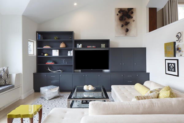
One of the owners likes to watch sports on television, and the dark gray built-in serves as a media center. “The opening you see in the wall on the right is [to] the dining room,” Calabrese says. “We made the built-in stepped down so that when you look out from the dining room, you see the artwork, not the top of a shelf.”
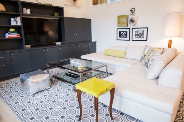
The art collection over the sofa is the start of a gallery wall. “The idea is that the owners will add to it over time,” Calabrese says. “One of them collects art on her travels.”
Handmade Home: How to Design a Gallery Wall
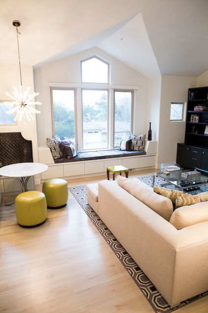
Between trips that owner can be found perched on the window seat working on her laptop. “When we started the project, the window seat wasn’t there,” the designer says. “When we designed it, we created storage in the bottom for her son’s Legos and toys.”
In Calabrese’s opinion, the room’s success is how it meets many needs. “It’s a multipurpose space, but we worked hard to make it cohesive,” she says. “That’s a design challenge, but in this case, I think it’s a win.”
More: How to Add a Window Seat
Related Articles Recommended


