My Houzz: Light Emerges in a Dark Victorian House
When Beth Dadswell and her family moved into their Victorian semidetached house in West Dulwich, in southeast London, in 2011, they were excited about living in a historic building again. They were leaving behind a 1960s house they had renovated themselves. Though they liked that home’s airiness, they yearned for period features, Dadswell says.
She and her partner bought the Victorian from a couple who had called it home for more than 30 years, but who hadn’t really focused on bringing the building into the 21st century. “Everything was kind of moss green,” she recalls, describing the interior, “and there was tons of wood stained really dark. But we could see beyond all that. We thought, ‘This could be a really nice family home.’”
With the help of a part-time builder, the couple got to work, knocking down walls and retiling floors until an airy, bright space emerged a year later. As an interior designer with a love of vintage, and founder of the company Imperfect Interiors, Dadswell had the expertise required to turn the space into a stylish, family-friendly home. Her main focus was to bring as much light as possible into the house, which she estimates was built around 1900. “Pulling light through the house was a real challenge,” she says. “The corridors were incredibly dark. We took out entire walls so we could get the light coming in from all angles.”
The reward for all their thought and effort, though, is easy to see: The property is now a bright, welcoming family home with large, airy rooms in crisp whites and grays.
Houzz at a Glance
Who lives here: Beth Dadswell of Imperfect Interiors, her partner and their 8-year-old son
Location: West Dulwich, London
Year built: Around 1900
Size: 4 bedrooms, 3 bathrooms
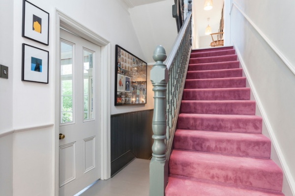
To open up the hallway as much as possible, Dadswell opted for airy white and statement gray, a radical change from the room’s previous look. “The walls were all avocado. It was grim,” she says with a laugh. “We also installed [chair] rails to break up the space. Otherwise it was just too much hallway.”
The exception to the crisp-white-and-gray rule is the dusky rose stair carpet. “We needed some color,” Dadswell says, “and the stairs were an obvious place to add a bright touch.”
The door on the left opens into the living room. Two of its panels were replaced with glass to aid the flow of light between the spaces.
Carpet: Vorwerk; paneling and banister paint: Down Pipe, Farrow & Ball
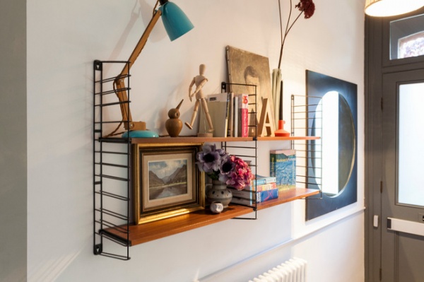
A vintage shelving unit full of personal pieces warms up the white hallway. “The lamp is a vintage Conran design, picked up at an antiques market,” says Dadswell. “The picture closest to the door is an oil painting of my father when he was a child.”
Shelving unit: Crystal Palace; lamp: vintage Conran, Alfies Antique Market
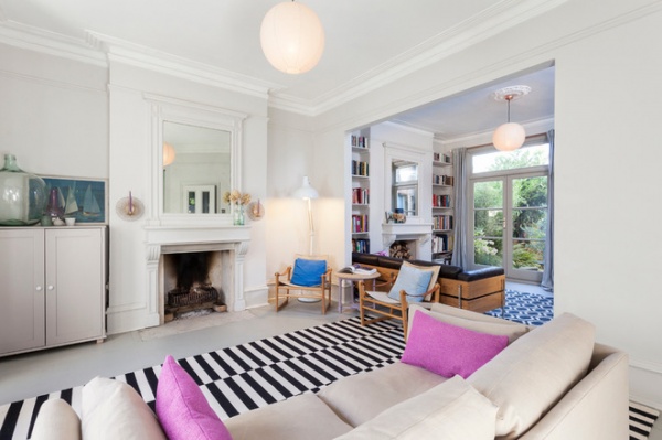
The original house had two living rooms, which Dadswell opened up into one while still maintaining distinct areas. “The room at the front was really dark,” Dadswell says. The open layout now allows light from the garden to reach into both areas.
“The front room is more for TV watching,” Dadswell says. However, she has hidden the TV from view in a custom cabinet. “I don’t like looking at a blank screen,” she says. Disappointed by the cabinet options on the market, she asked her builder to design one instead.
The couple restored and reinstated period features throughout the space. They refitted traditional-style wooden sash windows — now double glazed — replacing some out-of-character uPVC (unplasticized polyvinyl chloride) ones. “We also put the ceiling roses [medaliions] in,” Dadswell says. “The rooms have really nice, high ceilings, and I felt they needed a little fancy cornicing.”
The curtain rails are copper. “We couldn’t find curtain rails that would fit, so we decided to put up some copper pipes instead,” Dadswell says. She added copper fixtures to the central pendant lights for cohesion.
Copper light fixture: Habitat
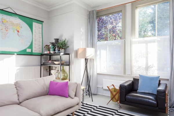
Dadswell likes to throw midcentury pieces into the contemporary mix, as well as treasured finds. “It’s a real mishmash of things, but they’re all tied together with color or texture,” she says. “We like nothing better than going to a [garage] sale or antiques market, and many of the pieces in the house are things we’ve found or got really lucky with.”
Even chain store buys have been given Dadswell’s magic touch, adding to the unique character of the space. The tripod floor lamp, for instance, originally had silver legs, but she spray painted them black for a more striking contrast.
Rug: Stockholm, Ikea; sofa: The Conran Shop; tripod floor lamp: BHS
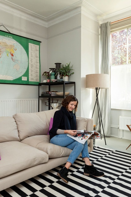
Dadswell (seen here) was searching for something to add a little bright color to the neutral front living room when she came across this world map and decided it would provide just the eye-catching detail she was looking for. “It’s the perfect size for this room,” she says.
World map: Crystal Palace
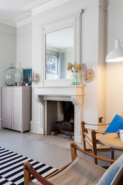
The living rooms have identical fireplaces and mantelpiece mirrors, but they aren’t originals. “When we bought the house, the front fireplace resembled a horrendous, Fred Flintstone–type design,” Dadswell says, while the one in the back room was an unappealing concrete structure. “Neither had any sort of design merit,” she says. “We found matching fireplaces and mirrors at Ardingly antiques fair.”
The vintage canvas safari chairs add another touch of midcentury charm. “We found them in a junk shop in Hastings,” the homeowners reveals. The lamp is also a vintage find, while the antique demijohn jug on the TV cabinet adds color and gleam.
Fireplace, mirror: Ardingly antiques fair
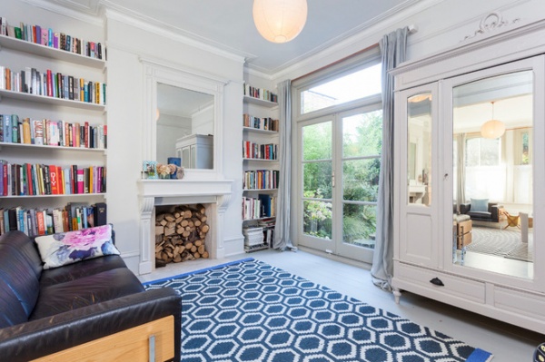
The back living room is dedicated to music practice. The couple’s son plays the violin, and this space is where he hones his musical skills.
The fireplace in here is never lit but acts as wood storage for the active fireplace in the front living room.
The large white wardrobe is also from Crystal Palace. Dadswell and her partner painted it and gave it new handles, but the inlaid mirrors are part of its original features.
The rug, which gives this room energy, came from Designers Guild.
Wardrobe: Crystal Palace
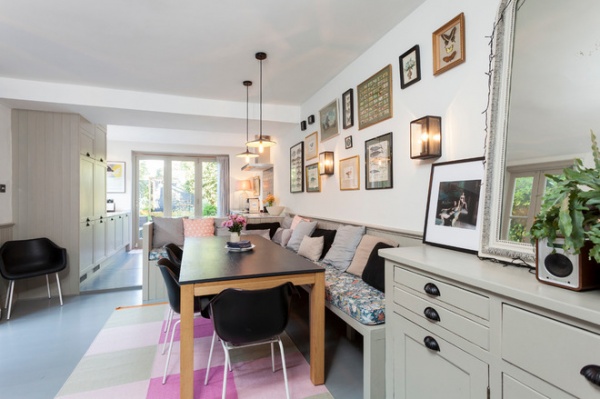
They took out the wall between the kitchen and the dining room, which has made the dining area much lighter. It now also offers a view of the garden, further helped by the new bifold doors. “This space would probably have been used by servants originally,” Dadswell says, “so good views weren’t a priority.”
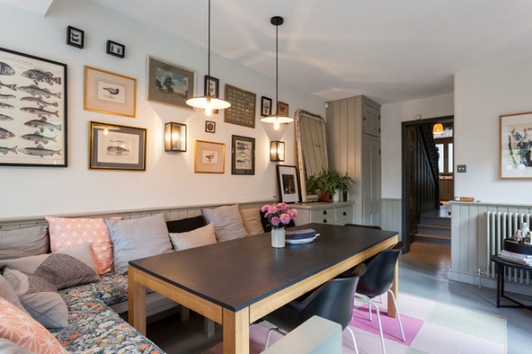
The large dining room table was a cost-effective custom solution. “We bought the table legs at Habitat and topped them with a piece of leftover plywood painted black,” Dadswell says. Their builder then created a space-smart banquette, which also hides storage, and Dadswell made cushions from vintage fabric for the top. “I used my mum’s old curtains,” she says with a laugh.
The alterations have resulted in a much more welcoming space. “I spend about 80 percent of my time in the house in these two rooms,” Dadswell says.
Armchairs: Polypropylene by Robin Day, Twentytwentyone
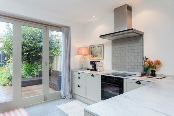
After ripping out the 1970s boiler and installing a new one, Dadswell and her partner got to work on the kitchen. “It’s actually an Ikea kitchen that we’ve hacked,” she says. They painted the units and fitted new handles, then topped the lot with honed marble countertops.
The couple also sanded, filled and painted the original floorboards, a process they repeated throughout the house.
The lamp is another of the couple’s DIY projects. They picked up the demijohn at the Ardingly antiques fair, then worked together to create the lamp. “He did the drilling; I did the designing and constructing,” Dadswell says. “It’s nice to make stuff you can’t find anywhere else.”
Kitchen units: Metod, Ikea; demijohn, Ardingly antiques fair; tiles, Fired Earth
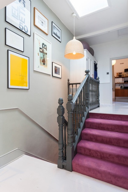
The staircase wall is brimming with framed photographs and artworks. “The ceiling is really high, and the walls needed filling,” Dadswell says. This selection is a mix of prints by her partner, who is a graphic designer, and her pictures. “We’re usually on the same page with most things,” she says, referring to their shared tastes.
“I think our house is a collection of pieces we’ve gathered together over the years,” she adds. “We curate little spaces, and it’s nice to have a theme running through them.” The kitchen, for example, houses a collection of botanical and animal prints, while this hallway is “much more graphic and quite monochrome,” she says.
The couple installed a big skylight at the top of the stairwell to flood the previously dark space with light. The pendant shades are from Ikea, although Dadswell picked them up in a charity shop.
Pendant light: Leran, Ikea
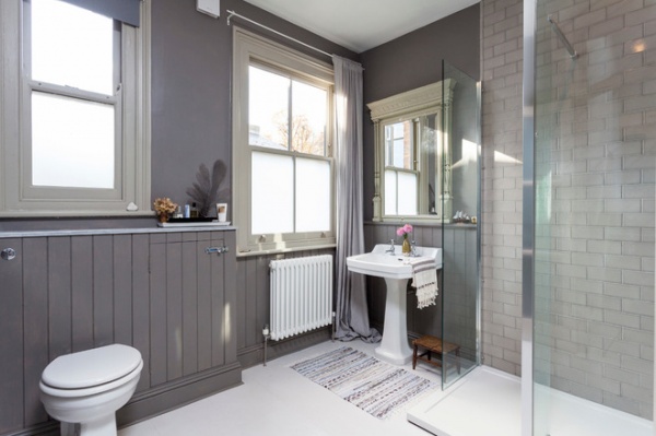
This bathroom was originally two rooms, with the toilet in one and the bath in the other. “We knocked down the wall and installed frosted glass French windows to let light from here into the hallway,” she says. They also added tongue and groove paneling with an integrated cupboard.
Dadswell wanted the shower to feel luxurious but not imposing. “The shower has an open feel,” she says. “It looks sort of invisible.” The tiles in the shower are the same design as the ones used in the kitchen.
A vintage mirror adds a touch of elegance. “We’ve had it for years,” Dadswell says. “It was a junk shop find.”
Tiles: Fired Earth
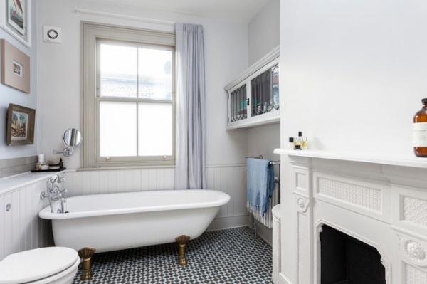
The second bathroom was strangely configured. “It had a shower in the middle of the room, like a throne,” Dadswell says, laughing. They stripped the room back and retiled the floor, then found a vintage claw-foot bathtub on eBay. “That’s the girly element,” Dadswell says. “I wanted this bathroom to feel a bit more feminine.”
She used the same marble as in the kitchen to create a shelf and vanity unit for the basin. “I wanted it to be a bit more glamorous than your average bathroom,” she says. “I’m a bit obsessed with marble.”
The wall cabinet is an original feature but was located downstairs. Dadswell painted it white, with a lilac interior, and moved it upstairs to turn it into a nice display for toiletries. “We wanted to keep the Victorian features, so anything we could bring up-to-date, we painted,” she says. The fireplace is a case in point, painted white for a crisp finish.
Tiles: Topps Tiles; tub: eBay
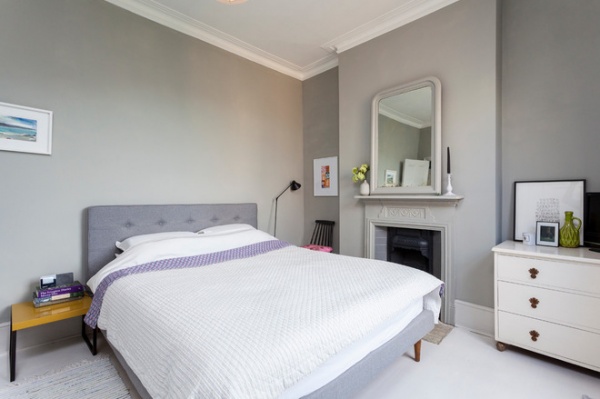
The master bedroom is not the biggest bedroom. Dadswell and her partner chose the smaller room, she says, “because it’s at the back of the house and it looks onto the garden. It feels cozy.”
The room’s fireplace is not original. The couple found one on eBay similar to the original fireplace in the guest room and painted it the same shade as the walls — Farrow & Ball’s Lamp Room Gray, which is Dadswell’s favorite color in the house. The chest of drawers was also an eBay find, and Dadswell picked up the chair in a junk shop and painted it black.
Wall paint: Lamp Room Gray, Farrow & Ball; floor lamp: Bobby, Habitat; bedside table: Habitat; bed: Marais, Sofa.com
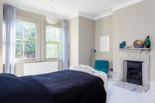
Dadswell painted the walls of the guest bedroom in Hardwick White by Farrow & Ball, then added accents with colorful pieces of furniture. “The turquoise chair was from a Margaret Howell sample sale,” she says. In a happy coincidence, her turquoise floor lamp matches the color of the chair. “This was me trying to inject a bit of color into the gray,” she says.
Dadswell retiled and painted the fireplace but apart from that kept its original features. She adorned the mantelpiece with personal mementos. “The two jugs belonged to my grandmother,” she says.
Wall paint: Hardwick White, Farrow & Ball; floor lamp: Grayson, Habitat
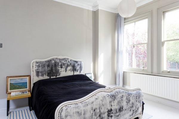
The unique bed has a great backstory. Dadswell had bought the bed from a junk shop, but it was covered in “this really disgusting blue fabric,” she says, so she dyed it black. One day her mischievous cat decided to turn the frame into a scratching board. Dadswell pulled off the damaged fabric, with the intention of reupholstering it, only to realize that the black dye had made a unique imprint on the calico underneath. She decided she liked the resulting look, and kept the bed in memory of her creative kitty. “She did me a favor,” she says, laughing.
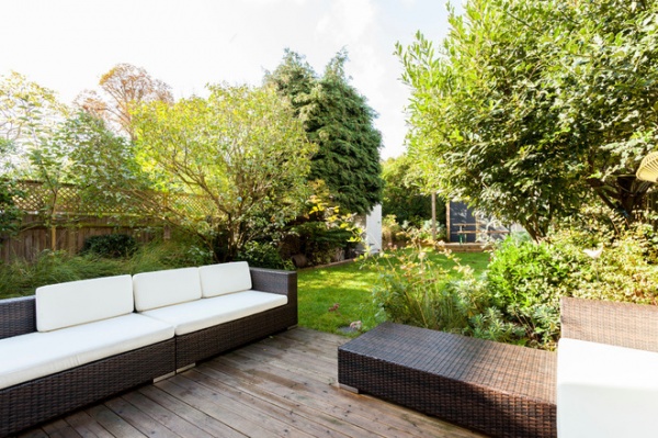
Dadswell is particularly fond of the patio. The deck is surrounded by bamboo and shrubbery, which creates a perfect private oasis.
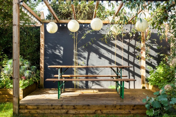
Further down in the garden, a raised platform holds a table and bench set. The paper lanterns are actually limited-edition Regolit solar-powered lanterns from Ikea. The casual feel of the table and paper lanterns makes this the ideal place for laid-back garden parties.
Bench, table: Ardingly antiques fair
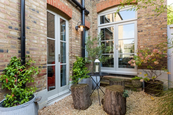
In the side yard, Dadswell and her partner have created a secluded seating area. The tree trunk stools were originally supposed to serve a different purpose; Dadswell’s builder had been cutting down a tree and had offered her the trunk as firewood. But instead of burning the pieces, the couple decided to use them as quirky seating.
This secluded spot was immediately claimed by Dadswell’s son. “He’ll have his tea out here,” she says. It’s also the perfect spot for him — and the rest of the family — to hang out with friends.
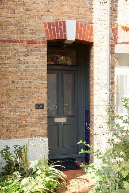
The front door is original, but Dadswell replaced the top two panels with frosted glass to bring in more light, and painted it a contemporary dark gray. She also redesigned the front garden and created a path using bricks left over from removing internal walls.
Door paint: Down Pipe, Farrow & Ball
My Houzz is a series in which we visit and photograph creative, personality-filled homes and the people who inhabit them. Share your home with us and see more projects.
Browse more homes by style:
Small Homes | Colorful Homes | Eclectic Homes | Modern Homes | Contemporary Homes | Midcentury Homes | Ranch Homes | Traditional Homes | Barn Homes | Townhouses | Apartments | Lofts | Vacation Homes


