Kitchen of the Week: Taking Over a Hallway to Add Needed Space
http://decor-ideas.org 11/08/2014 03:13 Decor Ideas
“Hallways are dead space,” says interior designer Harmony Weihs. When designing this renovated kitchen, she knew that between the permit process and extensive construction, expanding the space with an addition would be a huge expense. Instead, she broke through to a dark hallway and incorporated it into the space, gaining 62 square feet. She also ripped out dated soffits and upper cabinets, changed the layout from a U shape to one that incorporated a large island, added a large window and used reflective surfaces like glass tile and stainless steel to make the new room functional, brighter and much larger feeling.
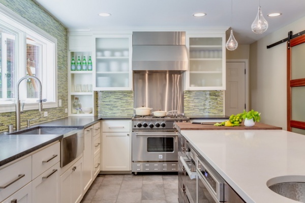
Photos by Holland Photography
Kitchen at a Glance
Who lives here: A couple who loves to cook and entertain
Location: Kenmore, Washington
Size: Expanded from 150 to 212 square feet (14 to 20 square meters)
“She absolutely loves industrial style, and he loves the color green,” Weihs says. Both homeowners love to cook and wanted the new kitchen to turn into an entertainment hub during parties. “As a cook myself, I love to think about how the kitchen will function,” Weihs says. “This layout keeps the work zone clear while friends can gather on the other side of the island.”
Tile: Moda Vetro Forest Blend Bullet Mosaic, Penta; sink: 30-inch stainless steel, Kraus USA; Culina Pull-Out Spray Kitchen Faucet: Blanco; 36-inch gas range: BlueStar; 36-inch built-in fridge, 18-inch built-in freezer, Miele; cabinet paint: Oyster White semigloss lacquer, Sherwin-Williams
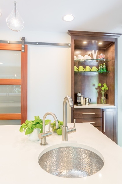
A water purification system was important to her clients. This shimmering hammered-nickel sink in the island has a water filter and is a handy place from which to serve drinks to guests.
Sink: Great Point Round Hammered Nickel, Nantucket Sinks
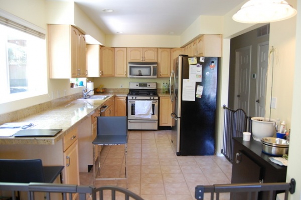
BEFORE: “We only had 8-foot ceilings to work with, and the upper cabinets and soffits were making them seem even lower,” Weihs says. “We have a lot of overcast days in the Pacific Northwest, and we needed to let in as much light as possible.” She convinced her clients to rip them out. To the right you can see the former hallway.
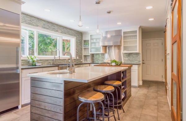
AFTER: While a loss of upper cabinets makes people fear they are losing a lot of storage space, this renovation doubled the storage capacity. The two uppers on either side of the range house everyday dishes and glassware. Weihs is a big fan of deep lower cabinet drawers instead of shelves for storing items like pots and pans. The cabinetry includes a special spice drawer near the range, a knife drawer and a cookie sheet cabinet.
The edge of the new island lines up right around where the wall used to divide the hallway from the kitchen. Between the old wall’s and the hallway’s widths, the room became 40 inches wider, adding a total of 62 more square feet. The island is 9 feet, 3 inches by 40 inches.
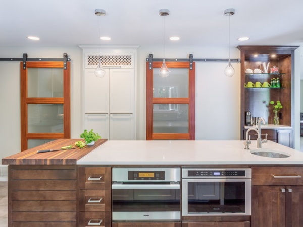
Of course, when you eliminate the hallway, you don’t want what remains to feel like a hallway. The doors in the center are a new pantry, and the two sliding doors open to an office and the basement stairs. The area to the right is an espresso station. After all, Kenmore is a stone’s throw from Seattle, the epicenter of barista culture.
One small detail that makes a big difference is the decorative grate over the pantry, which camouflages an unsightly cold air return and opens for cleaning.
Microwave drawer: Thermador; steam oven: Miele; pendant lights: ET2 Lighting; pantry pullout shelves: Rev-A-Shelf; return grate (at top of pantry): Van Dyke’s Restorers; sliding doors: solid ribbon mahogany with frosted glass; door hardware: Barn Door Hardware
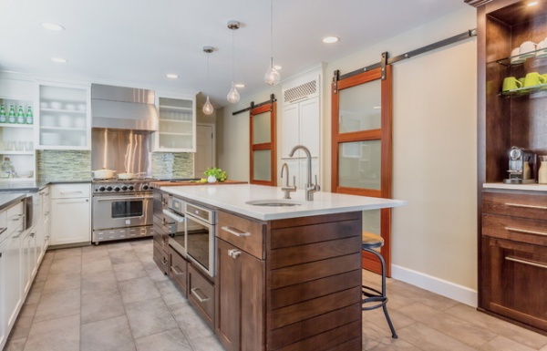
Placing the steam oven and microwave drawer in the island also helped save wall and counter space. “I like to use alder wood for cabinets, because it takes on dark stain really well,” Weihs says. The island helps balance out the industrial steel of the appliances. A tongue and groove detail on the end adds to the design.
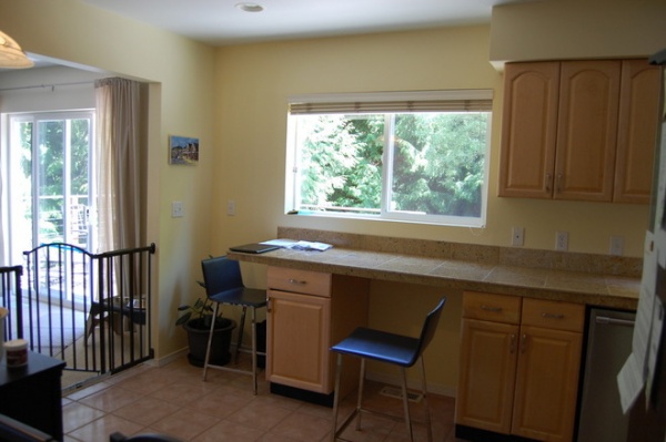
BEFORE: The upper cabinets along this wall were blocking an opportunity to let in more natural light.
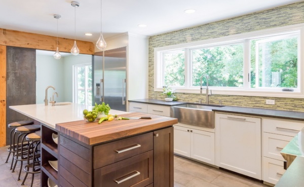
AFTER: A priority that was well worth the investment was this 9-foot-long window over the sink. In addition to all of the light the window lets in, it also offers a view of trees that stay green year-round. The colors work well with the backsplash tile. The glass mosaic tiles, glass doors and semigloss white paint on the cabinets help bounce the light around. Weihs added can lights and three modern pendants to help with lighting too.
Window: Vander Hoek Windows & Doors; floor tiles: 12- by 24-inch Rapanui, United Tile; cabinet hardware: Top Knobs; counter stools: Allen Stool, Ballard Designs
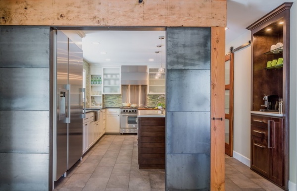
“The trick was to make it warm and bright while incorporating the industrial style the homeowner loved,” Weihs says. “Stainless steel can be cold.” This new wall, for example, helps warm up the industrial look. A load-bearing wall between the dining room and the kitchen proved too costly to remove and reengineer, and these cooks preferred to put the money into high-quality appliances.
Weihs enlisted a welder to help attain the industrial look they were after. The metal is natural raw steel with a wax finish, with ¼-inch gaps between the pieces to play off the tongue and groove look on the island. The beam and post pieces are fir.
“The wood helps warm and soften the steel’s look,” Weihs says. She is currently working on a dining room–living room redo for the couple that will create a balance between hard industrial elements and softness.
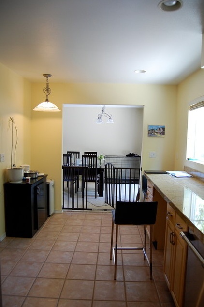
BEFORE: The left corner was more dead space in a kitchen where space was at a premium. Behind the wall here was a deep coat closet; the designer borrowed a few unneeded feet from it.
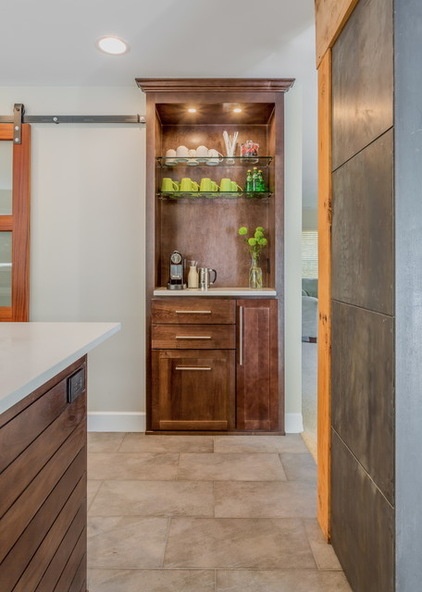
AFTER: Weihs punched through to the back of the coat closet and took over a few feet to create the espresso station. She also converted another hallway closet into a new pantry.
“I can’t stand it when the final result looks like a closet filled in with cabinets and shelves,” she says. “By having both of these stick out from the wall a bit and being mindful of the design, the pantry and espresso bar look more like furniture.”
Check out ideas for creating a deluxe coffee center
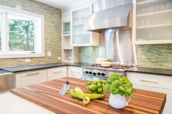
One functional detail these cooks love is this butcher block on the island, close to the range. The quartz countertop is 1¼ inches thick, and the walnut block is 2 inches thick. The thickness gives the block a stronger presence and creates an interesting transition between the two very different materials.
White quartz, Seashell BQ400, PentalQuartz; dark quartz: Belgium Blue Satin BQ2102S, PentalQuartz; butcher block: Hardwood Lumber Company
Browse more Kitchens of the Week
Related Articles Recommended


