Houzz Tour: High-Low Mix in a Colorful Victorian
This Victorian terrace house in East London was in poor condition aesthetically when it was bought by its current owners in 2008. They were attracted by its central location and quirky, three-story layout, and saw plenty of potential in spite of its worn appearance. “It hadn’t really been touched for 30 years,” says interior designer Inga Kopala. “It looked very unloved when I was first asked to help.”
Having used most of their resources buying the property, the owners adopted a gradual approach to the renovation, beginning with the kitchen and dining area in the basement, before moving on to the bathroom and bedrooms on the top floor, and finally the living room on the ground floor. The owners lived there throughout the redo, which took around four years to complete, with pauses in between.
“We finally finished in 2012,” Kopala says. “The owners have a very good eye for design and had already amassed a large collection of accessories and artwork they wanted to incorporate. Essentially, they wanted me to create a backdrop against which they could display everything to best effect.”
The eclectic scheme features shots of vibrant color, which sit alongside a masterful blend of budget and designer furnishings, as well as original Victorian features — such as the cornicing and side-by-side fireplaces — that reference the property’s rich heritage.
Houzz at a Glance
Location: Hackney, London
Decade built: 1870s
Size: 2 bedrooms, 1 bathroom
Designer: Inga Kopala, Amberth
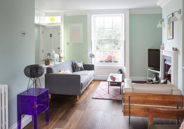
The front door opens to a bright, open-plan living area furnished with a mix of modern and classic pieces. The restored cornicing and two original fireplaces emphasize the home’s Victorian heritage.
“The owners do a lot of entertaining, so it was important to make this a welcoming space; the green walls are very soothing,” says Kopala. “I chose the dark stained walnut floor to add depth to the scheme. Everything sits very well on it. I find darker floors are generally more versatile, particularly with colorful walls.”
Wall paint: Cupboard Green, Little Greene
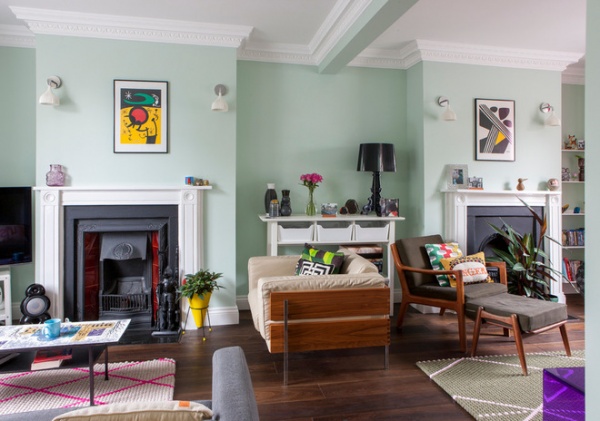
Much of the cornicing was in such poor condition that it had to be replaced. “We restored it where we could, but otherwise it was a case of carefully matching it to retain a sense of authenticity,” Kopala says.
Matte black paint around the restored fireplaces adds a contemporary twist, which Kopala picked up in the choice of furniture and accessories. “It’s a very livable home, and while the owners did splurge on a few items, they were happy to mix it up with some clever high-street [budget] finds, such as the Habitat armchair,” she says.
The room features art and accessories the couple has collected over the years. “They have a lot of things,” Kopala says. “I provided them with a blank canvas, which they’ve filled with their treasured possessions.”
Armchair: Habitat
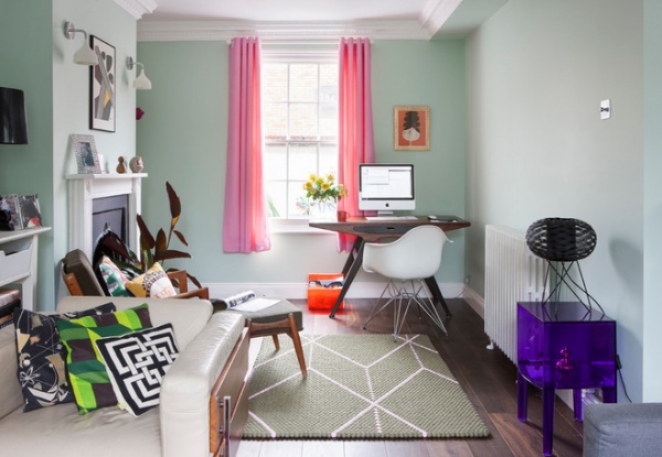
At the other end of the living area, a small workstation serves as a stylish home office. “It’s not an enormous house, so we had to be clever with the available space,” says Kopala. “For this couple the devil was in the detail — they have a lot of trinkets, but we made sure the scheme wouldn’t feel crowded. I think we’ve succeeded in keeping it very balanced.”
The owners chose these cheerful pink curtains.
Odyssey Writing Desk: Graham & Green; wall light: Kartell E by Ferruccio Laviani, Heal’s; desk chair: Vitra DAR by Charles and Ray Eames, Heal’s
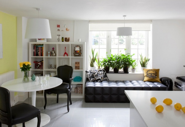
In the basement kitchen, porcelain floor tiles and a gleaming white countertop reflect light from the window. “Downstairs doesn’t get much natural light, so we stuck to a neutral palette and introduced glossy surfaces to give the impression of more light,” Kopala says.
A pair of French-style designer chairs strikes a dramatic note against the contemporary white table.
“The owners wanted to make an impact in this space, as they host a lot of informal dinner parties,” the designer says. “This is where they spend most of their time, so it had to be a fun and comfortable space. As well as the chairs, there’s an inflatable sofa underneath the window, which is another high-street find.”
Dining table: Docksta, Ikea
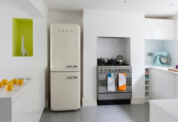
The kitchen features retro appliances and a white Smeg fridge-freezer. “The colorful recess was the one spot where we went a bit crazy, just to break up the white space a little,” Kopala says.
Recess paint: Pale Lime, Little Greene; countertop: Corian
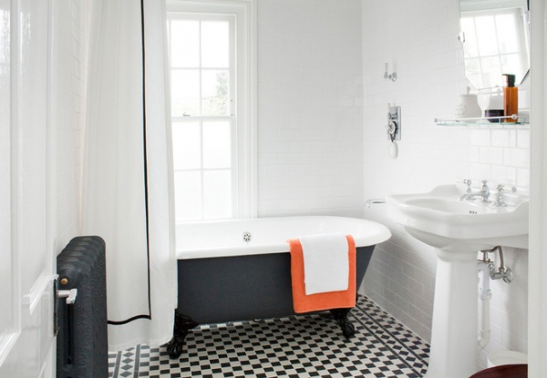
The owners wanted to reference their home’s Victorian heritage in the bathroom, so Kopala opted for a classic monochrome palette with replica fixtures and fittings. “The tiles are a classic Victorian design, but the white metro tiles and matte black on the bath and radiator give the room a contemporary twist,” she says.
Tub: Chateau; sink: La Chapelle, both from Lefroy Brooks
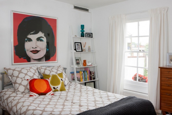
The owners’ prized Andy Warhol print was the starting point for the master bedroom design. “They really love his work, so the bedroom is all about this picture,” Kopala says. “We kept the rest of the room very simple to allow the picture to take center stage.”
Treasured photographs and ornaments fill a shelving unit in the otherwise pared-down room. The owners found the chest of drawers in a local thift shop.
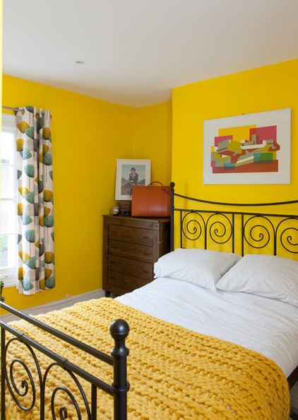
A dazzling yellow fills the guest room. “They don’t spend much time in here, so they felt they could go a little bit more crazy in the guest bedroom — hence the bright color,” Kopala says. A chunky knit throw keeps the scheme feeling cozy and welcoming.
Wall paint: Lemon Chiffon, Dulux; curtains: made with Dandelion Clocks fabric by Sanderson, John Lewis; knit throw: John Lewis


