DIY Spirit Reinvents an Industrial Home
After living in his downtown Edmonton loft, in the Canadian province of Alberta, for six years, this homeowner was ready for a change. He liked the industrial nature of the space — soaring ceilings, raw redbrick walls, exposed ducting and conduit — but didn’t like its low-grade cabinetry. Plus, he was flat-out tired of his furniture.
While he didn’t mind getting his hands dirty doing some of the work of refreshing the space, he knew he needed professional help when it came to the layout and choosing colors and furniture styles. He found designer Brenda Brix of AMR Design while searching for local professionals on Houzz and enlisted her help through a design consultation. She wrote up a detailed plan, and he implemented it himself, finding materials and furnishings and even teaching himself how to build and modify pieces.
For example, he bought mirror tiles and antiqued them. He took a basic pine cabinet from Ikea and distressed it. He even located his own stainless steel and installed it himself as a backsplash. “I wanted to add personal touches and cool things that people would come in and we could talk about them for five minutes,” he says.
Photos by Ryan Patrick Kelly Photographs
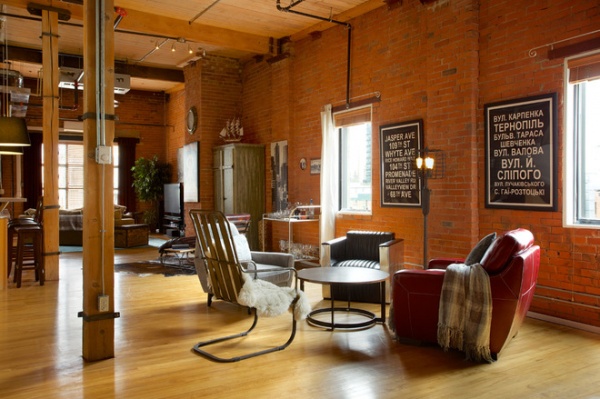
Brix’s plan divided up the long, narrow space without interior walls into a TV room with a sectional near the farthest window, a reading area with a single chaise in the middle and a conversation grouping with four chairs, seen here in the foreground. The sleeping area is to the right (not shown), separated by bookshelves.
Each chair in the conversation area is from a different supplier, because Brix and the homeowner felt that four of the same club chair would have made the space feel too heavy.
Breaking up the three walls of brick with artwork also kept things from feeling too heavy. The homeowner made the bus stop–style signs himself on canvas. “It brings a little script into the space and flows with the brick, so it feels like you’re outside,” says Brix.
Red chair: Costco; leather chair with metal: Wayfair; metal chair with sheepskin: Restoration Hardware
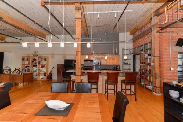
BEFORE: The low-grade kitchen cabinets and lack of a backsplash played a big part in the homeowner’s decision for a new look.
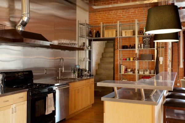
AFTER: The homeowner removed the cabinets and countertop himself and found a contractor to weld the sink and integrated countertop from stainless steel. He then had the steel cut for the counter-to-ceiling backsplash and enlisted the help of his neighbor to install it.
He created the live-edge floating shelf from a piece of wood he picked out at a local supplier and attached it himself. He bought the range hood from Costco and took it to a local powder-coating shop.
The stairs lead to a home office.
Shelves: Ikea
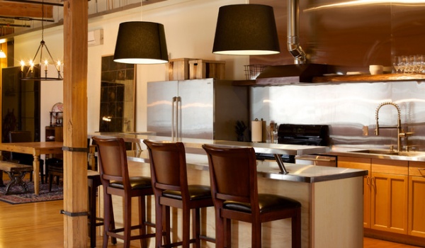
Drum shades from Ikea replaced a wineglass rack that had hung over the island. While the loft gets a good amount of light from three large windows, during the winter it gets dark by 4 p.m., so Brix suggested bringing in more light fixtures, like the chandelier that now hangs over the dining table to the left of the kitchen.
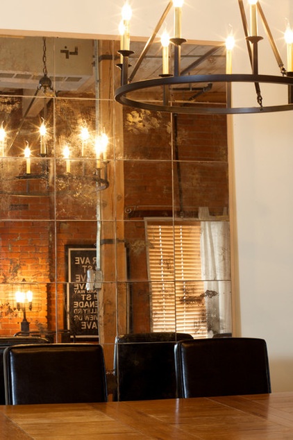
The homeowner bought the mirror tiles at a hardware store, then used a chemical to remove the paint on the back of each one. He then bought some gold and silver spray paint and sprayed that on the backs and mounted them to create an antique mirror. “It was way more work than I thought it would be,” he says.
12 Signs You’ve Caught the DIY Bug
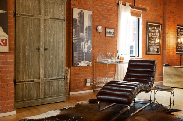
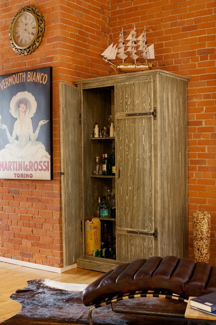
A chaise longue provides an intimate spot for reading. For the liquor cabinet, the homeowner had looked at retail stores for something distressed or whitewashed but thought he’d like to try distressing one on his own.
So he bought a plain pine cabinet from Ikea and went to the local Benjamin Moore paint store, where an employee gave him some guidelines on what to do. Before assembling the cabinet, he applied two coats of white paint as a base, then did a little sanding on each piece. He then played with brown and green colors in a couple of layers and sanded the pieces until he was happy with what he saw.
Chaise: Costco
Spruce Up the House With 50 Clever DIY Ideas
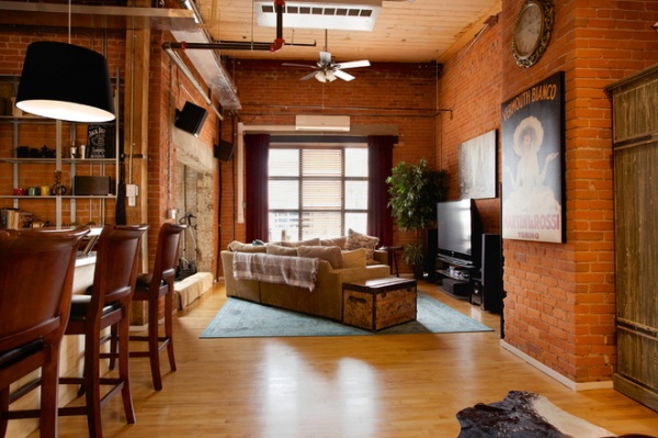
Since this room was already wired for a TV, they chose to keep it as a TV room. The homeowner got this sectional from a friend. Brix wanted to break up the space a bit instead of having it fully open, so they angled the sectional, which also made the TV visible from each spot.
The large opening to the left of the living room leads to some storage, a Murphy bed for guests and a door that goes to a spacious patio, where the homeowner performed most of the work on the mirror, cabinet and more.
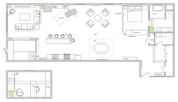
Here you can see the layout Brix gave to the homeowner to implement.
See more lofts


