Room of the Day: A Loft Space Filled With Character
http://decor-ideas.org 11/03/2014 23:13 Decor Ideas
This Boston loft started life as a chocolate factory, so perhaps it is fitting that designer Steven Santosuosso of Homepolish was asked to make something sweet out of a few key ingredients. “This was the first home they owned together,” he says of his clients. “They brought a few elements from their individual places and asked me to help define their new style for the new home.”
Photos by Joyelle West
Who lives here: A professional couple and their dog, Milo
Location: Boston
Size: Roughly 800 square feet
Tip: Have a pet? Choose high-performance fabrics and finishes.
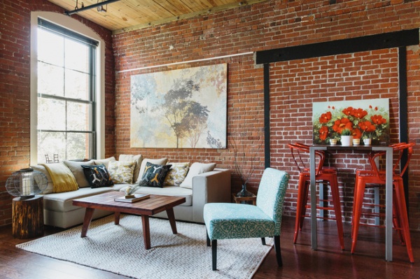
A long room at the front of the house serves as a combined living-dining room. It has two brick walls (from its factory days) and two white walls. One of the first questions from the client: Should they cover up the brick behind the sofa?
Most loft dwellers celebrate the rustic brick in their homes; this wall is like a brick quilt, comprising old masonry and newer brick that fills in an old steel portal. “I thought we should absolutely leave it,” says Santosuosso. “It’s part of what gives the space its character.”
One of the clients had a sectional, so the designer tucked it into the far corner, under the tall factory windows. He added a blue and white chair with a fabric that resembles damask. “The brick is red; the wood ceiling has red tones. I felt the blue cooled things off a bit,” Santosuosso says. The rug defining the seating area also has a hue that leans toward ice rather than fire.
Chair: Sunshine Lucy’s; rug: West Elm
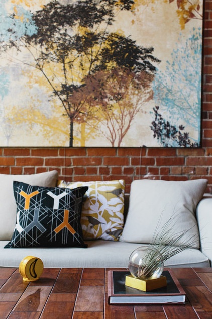
The designer dressed the sofa with new pillows to give it a fresh look. “I thought it was important that the pillows include a geometric print to break up the organic shapes,” he says.
The painting is hung on an inexpensive gallery rail. “To be honest, hanging pictures on a brick wall is a pain in the butt,” Santosuosso says. “This allows us to do it easily, and it gives the clients flexibility if they want to change it later.”
Art, pillows: Ikea
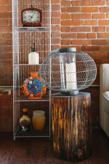
A shelving unit and a side table that looks like petrified wood are next to the sofa. “The wood blends with the floor and ceiling,” Santosuosso says. “I chose the metal pieces because they fit in the industrial space, but they don’t cover up the brick.”
Side table: Sunshine Lucy’s; shelving unit: Crate & Barrel
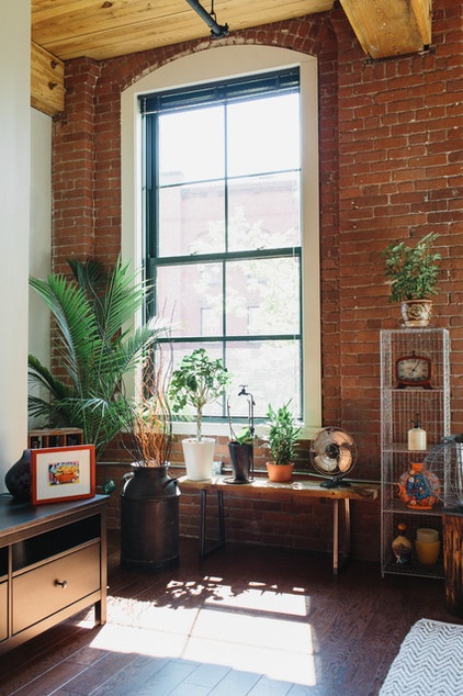
One of the clients loves houseplants, so Santosuosso created a mini greenhouse for him under one of the windows. “I love the way the light hits them and casts shadows on the floor throughout the day,” he says. “It’s like sunlight streaming through a tree’s branches.”
Besides putting them in the sunlight, placing the plants on a bench also keeps them out of the reach of Milo, the couple’s French bulldog. “He tends to eat the plants,” notes the designer.

Milo also drove the choices of finishes. “When there’s a dog, I go for performance, performance, performance,” Santosuosso says. “Dogs can be unpredictable; they like to lick things; and if it’s on the floor, they are on it. It doesn’t pay to choose delicate items — better to go a little sturdier.”
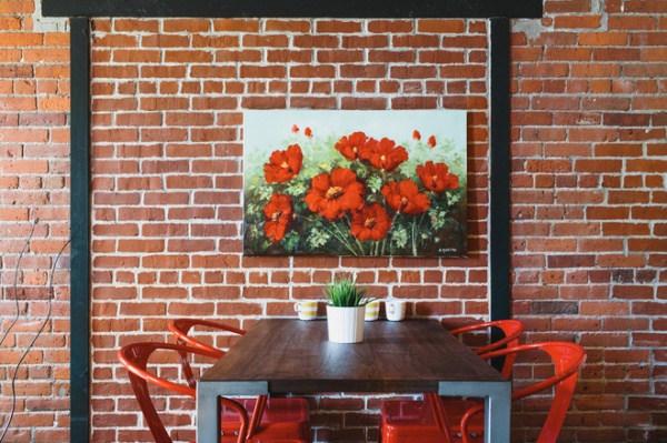
To define the dining area, Santosuosso chose a bar-height table and chairs and used the old steel portal as an asymmetrical frame. “The clients chose the art on a trip,” he says. “I like how it works with the color of the chairs.”
Table, chairs: Apt2B
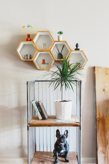
Part of the designer’s goal was to bring the industrial and patina-rich feeling of the brick walls to the drywall-covered areas. This vintage baker’s rack strikes the perfect note and provides a great display spot for the dog (Houzzers, I kid).
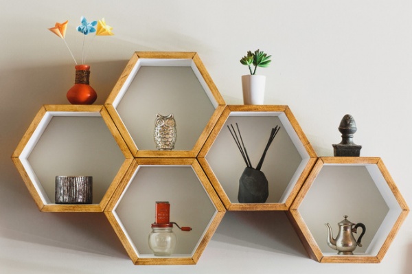
Honeycomb shelves provide serious display space for small objects. “I love the form of these, because they can be configured in interesting geometric ways,” says Santosuosso. “It’s like an art piece.”
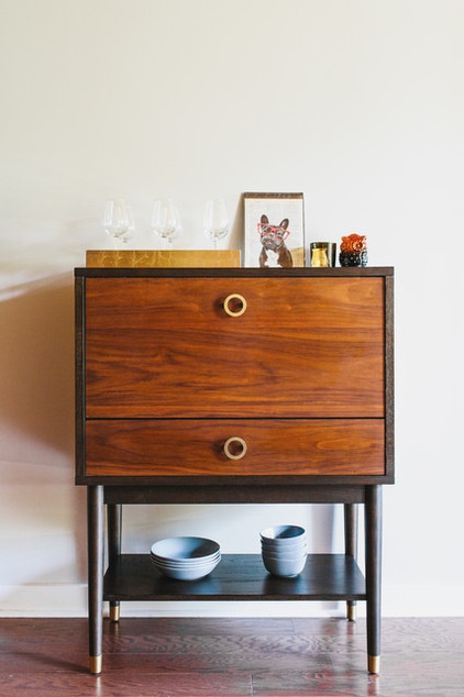
Santosuosso chose the bar to bring the character and texture of wood to this side of the room.
Bar: West Elm
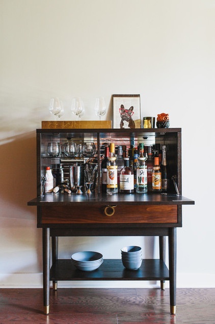
It also makes the space, which is adjacent to the kitchen, command central for entertaining.
“I think they love the open space,” says Santosuosso. “Honestly, it is not how much square footage a space has — what matters is how it feels. You can have a small apartment that feesl like Versailles, and a grand room that seems cramped. In this home the lofty ceilings will never be occupied, but they make the room feel great.”
More: Get ideas from more great lofts
Related Articles Recommended


