Room of the Day: Family Digs In for a Chic New Kitchen and Dining Area
Andrea and Adam Freeman adopted a gradual approach when it came to renovating their Edwardian family home in Kingston, a suburb of London. After they moved in a decade ago, the Freemans tackled the loft conversion as well as other light renovation work on the property, which they share with their three teenage children and pet dog. But 10 years is a long time, and when Andrea’s home baking business, Andi Freeman Cakes, started to grow quickly a few years ago, the family realized they needed more space.
“Andrea and Adam had spent years getting their house exactly how they wanted it, so they didn’t want to move,” says designer Siobhan Casey. “Instead they decided the best solution was to dig down to create a basement for a new family kitchen and dining area that would then free up the existing kitchen for Andrea’s custom cake business.” The couple wanted the basement to be the new hub of the home, where the sociable family could entertain and spend time together.
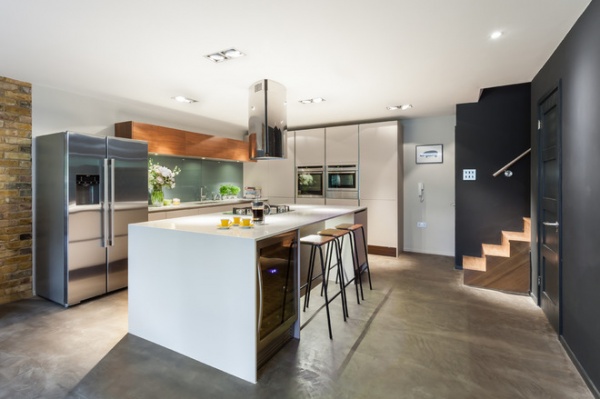
The new basement is 700 square feet (66 square meters). “Andrea has wonderfully eclectic taste and had a vision of how she wanted the space to look, but once the building work was completed, she needed some help putting her ideas together in a coherent way. That’s where I came in,” says Casey, of Casey & Fox. The basement now houses a generous kitchen, a dining area and a TV-watching area. The space successfully blends traditional and contemporary elements with a hint of midcentury style.
“Andrea’s not afraid to experiment when it comes to design,” says Casey, “and the finished room is such a wonderfully eclectic and welcoming space, perfect for entertaining family and friends as well as kicking back and watching TV.”
A walnut staircase, just peeking out, leads down from the main house into the new family kitchen and dining area. “It’s a large space with limited natural light, so we opted for neutral units with accents of walnut in the upper cabinetry and underneath the island to add warmth,” says Casey. “It’s a lovely touch that brings texture to this part of the room and prevents it [from] becoming too cold or clinical.”
A double-width island, in Glacier White quartz, is the main feature of the room, providing ample space for relaxed family breakfasts.
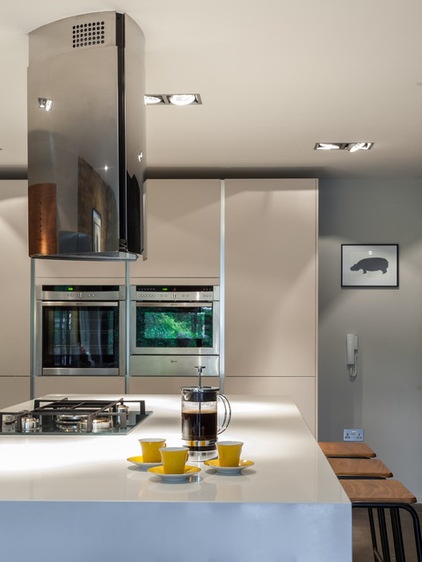
“The extractor fan [range hood] is a beast!” exclaims Casey. “Andrea really wanted to avoid a curved or hidden fan in favor of something with a bit of weightiness about it.” The glimmering stainless steel fan she chose is a striking, almost sculptural feature that’s stylish as well as functional. “The polished finish bounces more light around this part of the room as well,” adds Casey.
LED lighting is set into the ceiling and bathes the kitchen in pools of soft light. It’s Casey’s favorite feature in the kitchen. “It’s such a wonderful product that’s cost effective to run, and they’re specially designed to prevent any harsh spots of light, so they gently illuminate the entire space,” she describes.
Range hood: Britannia; LED lighting: Ecoled
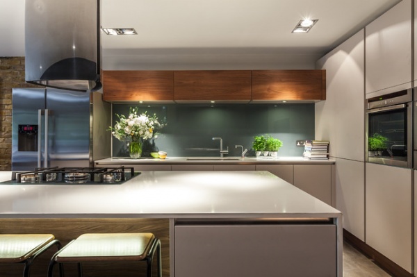
A glass backsplash underneath the walnut wall units has been painted in a blue-gray hue for timeless appeal.
The Smeg gas range, with a cast iron griddle, references the industrial feel of the concrete floor and has been set into the quartz worktop of the island for a seamless effect. The range surface “is silver glass, so although it looks quite sturdy, there’s still an element of glamour, plus it’s very easy to clean,” says Casey.
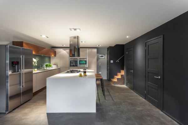
Given Andrea’s quest for light, the dark wall color — Farrow & Ball’s Down Pipe — seems a surprising choice at first. “They were very keen to add an element of drama to the scheme,” says Casey. “Andrea wanted it to be a talking point and felt that uniform white walls would look a little dull.”
The polished concrete floor injects an industrial-style vibe into the space. “It’s a great look with a seamless finish, but it was a practical choice, too,” says Casey. “With three kids and all their friends coming in and out, as well as a dog, Andrea wanted a surface that was easy to sweep and mop clean. And the underfloor heating means it isn’t cold underfoot.”
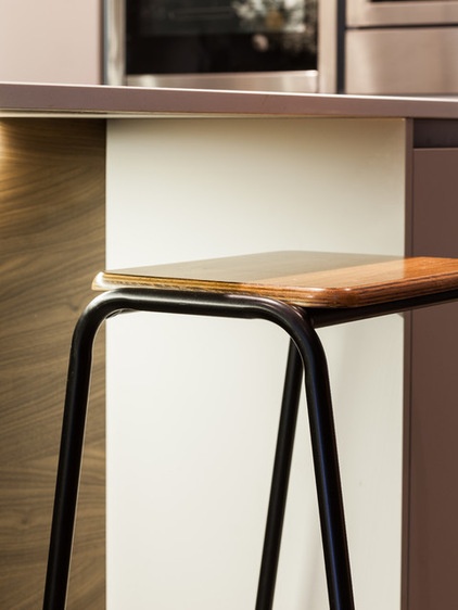
In a space with little natural light, no opportunity was missed to get the lighting right. LED lights set into the underside of the island worktop illuminate the glorious grain of the walnut panels. “The lights here also add dramatic effect,” says Casey.
Vintage bar stools are an elegant but simple choice. The contemporary elements of the kitchen area blend seamlessly with the midcentury styling that continues as the space transitions into the dining area.
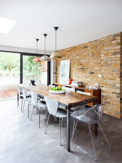
The sociable family needed a large table that would comfortably accommodate the children as they do their homework, as well as the frequent dinner parties the Freemans enjoy hosting. The Horace table is made from reclaimed wood and can seat up to 12 people. “It’s a marvelous find,” says Casey. “It cost less than 500 pounds [U.S.$800] and is a great example of how you don’t have to spend a fortune for a fantastic piece of furniture.” Arne Jacobsen butterfly chairs in muted gray complete the look.
Tom Dixon pendant lights illuminate the dining table and reflect light from the bifold doors. Each pendant light is in a different finish. “Andrea didn’t want a homogenous scheme, so we’ve introduced subtle differences wherever we can,” says Casey.
Table: Horace, Metro Retro
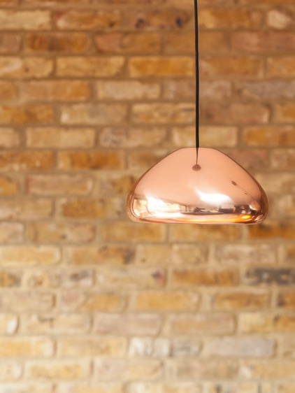
This copper pendant light glimmers in the natural light. The shine contrasts with the rough brick wall behind.
Pendant light: Tom Dixon
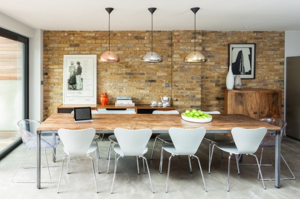
Contemporary artwork is also displayed where it will benefit from the light from the nearby glass doors. The choice of art, including a print of the Empire State Building in New York, breaks up the plain brickwork in the dining area.
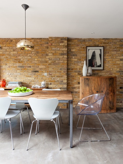
Warm yellow and brown hues from the exposed brick wall contrast with the muted gray of the concrete floor and dining chairs, adding another layer of texture to the family dining area. “The juxtaposition of the raw brick and the clean, contemporary lines of the kitchen is what helps to define the different zones in the basement in a very natural and effortless way,” says Casey.
The drinks cabinet was requisitioned from elsewhere in the family home.
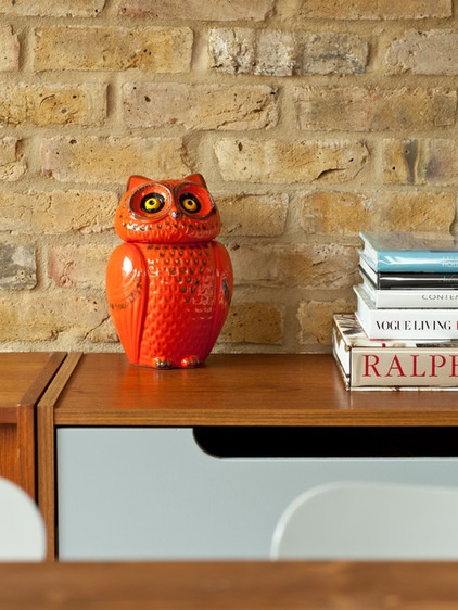
A ceramic owl — an existing family favorite — sits on top of another bargain find. “This cabinet was bought on eBay and fits in perfectly with the blend of styles in the basement,” says Casey. “The room is furnished with a mix of expensive pieces and less pricey but high-quality finds. There are some things it’s worth spending a significant part of your budget on, but other areas where you don’t have to spend a fortune to get a fantastic look.”
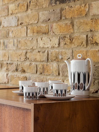
A set of vintage coffee cups adds a hint of retro chic to this corner of the room.
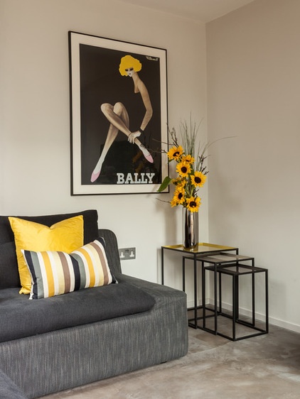
Opposite the dining table, there’s a cozy area where the family kicks back and relaxes in front of the TV. Yellow accents add a playful touch in this pared-down corner, which features a slouchy sofa chosen for comfort. “It’s a very welcoming and relaxing space,” says Casey.
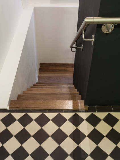
Original monochrome tiles from the Edwardian part of the house are referenced in the dark gray and white walls that flank the walnut staircase down to the basement.
The brushed stainless steel handrail gives a hint that the basement may be a departure from the traditional scheme elsewhere in the house. “Brushed stainless steel gives an even more industrial-style feel than polished steel would, so it clearly marks a departure from the more traditional elements of the house,” says Casey.


