Decorating 101: The ABCs of Arranging Vignettes
http://decor-ideas.org 11/01/2014 21:13 Decor Ideas
In the world of interior design, a vignette is a small, pleasing picture formed by grouping several objects — think of it as a pocket-size table arrangement that tells a story about you and your home. A vignette is a harmonious tableau made from a variety of items, rather than a large collection of similar articles (for example, clocks or toys), which would require a different display strategy.
Vignettes can easily be reinvented to suit your whims — a change of season, a new find, a gift and a special occasion are all good reasons to refashion your mini displays. There’s a knack to making these small scenes look effortlessly composed and eye catching. So take a look at how to build delightful vignette worlds with this easy lesson.
“A” Is for “Anchor”
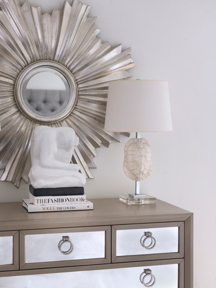
Choose an item as the center of interest, the “hero” of your vignette. Pick something you love to see every day and that expresses your personality and that of your home. It will be the first point on which the viewer’s eye rests.
A very small hero would be swamped by other objects in the group, so choose a statement piece with visual weight and height, like this dramatic starburst mirror.
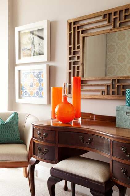
The anchor may also be a minigroup of similar things. These three vivid orange vases instantly capture attention.
An “A” Formation
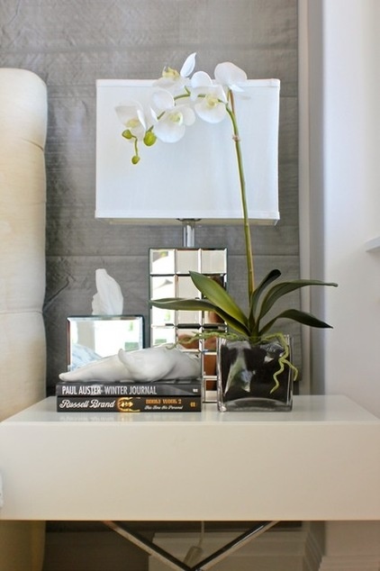
Assemble your pieces and then superimpose an imaginary “A” or triangle over them. Use this visual structure to prevent a long skyline effect, which would scatter focus, and to carry interest around the frame. Positioning the shortest objects toward the outer edges will help form your “A” shape.
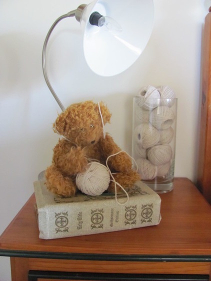
A dear little “A” for a bedside table.
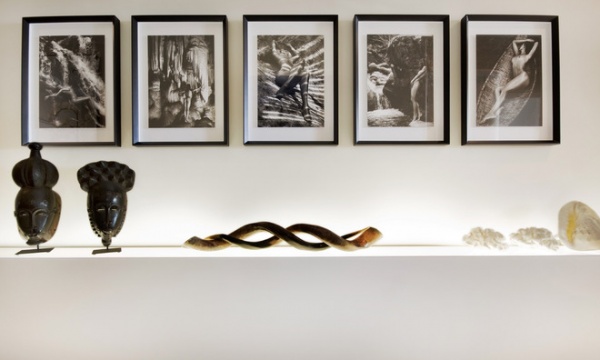
Despite breaking the “A” rule, linear arrangements can work beautifully if there is a strong relationship between the objects and some contrast.
The serpentine curves of the women in these photographs are duplicated in the central sculpture and contrast the precise angles of the frames, while the heights of the pieces differ and black and white has been carried throughout.
Asymmetry
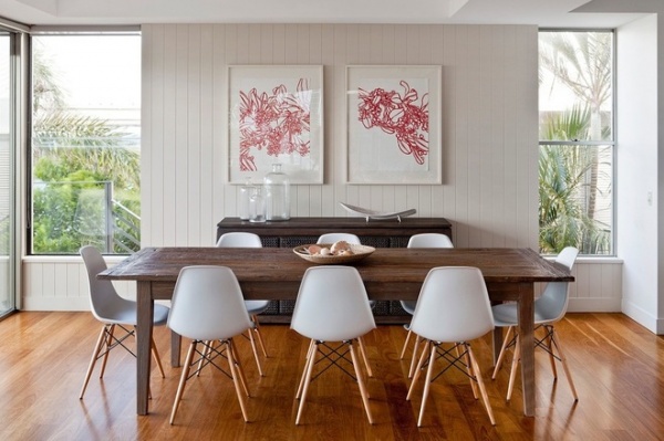
Sorry, all you neatness nuts, you may have to loosen up. Pairs placed symmetrically give the impression of an altar and can look very stilted and formal. We want the opposite: an unstudied gathering (only you know you have been to ABC vignette class!) that moves the eye around the articles. Deconstruct a too-tight structure by moving the items of a pair closer together or taking one of them away.
This arrangement avoids the symmetry trap through the use of two paintings above the sideboard that, although similar in style, are still different. Underneath, smaller pieces have been placed at differing heights: three clear jars varying in size at one end and a lower stylish dish at the other.
“B” Is for “Background”
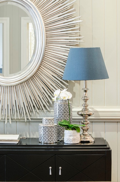
Your display’s backdrop is a vital part of it. Complicated wallpaper can cause visual chaos behind intricately patterned objects. And a vignette featuring, say, orange, may pick an argument with a red or green wall. Backgrounds act in a positive way when they unify the vignette.
Here a white wall and linear moldings echo colors in the collection and the credenza’s horizontal detail.
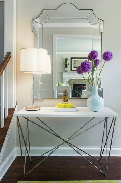
Mirrors make an effective background and animate a vignette by creating depth and perspective while also magnifying color and light. In this corner the features of the reflected room enter the vignette.
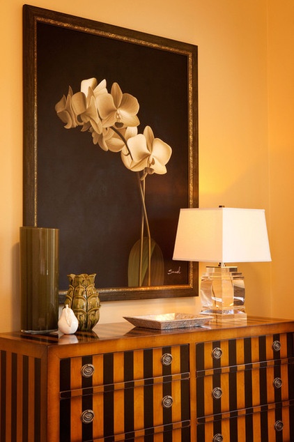
The surface under your vignette is part of its background, too. Elaborate marquetry or grained timber can detract from a display with lots of detail. Try not to overload a distinctive surface; keep shapes and colors unfussy.
The gorgeous cabinet in this photo holds a simple yet elegant and clean-cut array of objects while showing off its stunning timberwork.
Balance
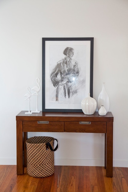
Several objects of similar height or color placed at one end of a table or bench create an unbalanced look. A lopsided placement needs variety within it and visual connection to the rest of the surface. Balance it with a tall central object, such as a painting or sketch, and a secondary grouping opposite. This picture shows how.
“C” Is for “Commonality”
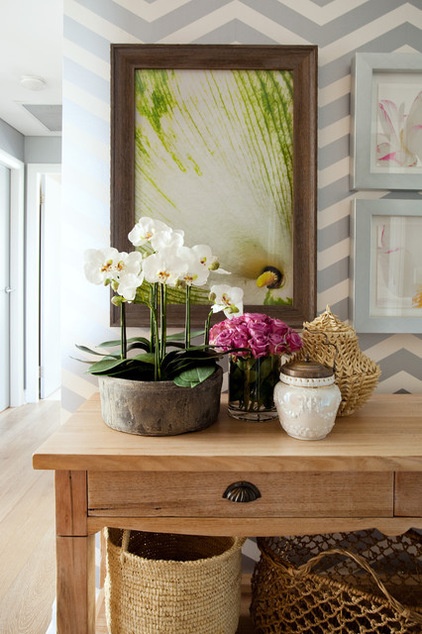
Give the members of your vignette a reason to be together. Relate them by color, texture, theme, shape and/or pattern. When one or more of these elements is repeated, the eye travels enjoyably around the vignette.
This is one of my favorite vignettes — a picture in green, white and natural wood. I love how the floral theme is made intriguing by the scale of the close-up in the background. It makes me want to lean in for a closer look.
Contrast
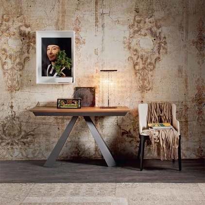
Play with contrasts. Think of fresh flowers highlighting the patina of an antique bronze bell, or a delicate woven basket beside a heavy glass bowl.
The unexpected bonsai, crystal lamp and sharp modern table offset this distressed Italianate wall finish with its bold flourishes.
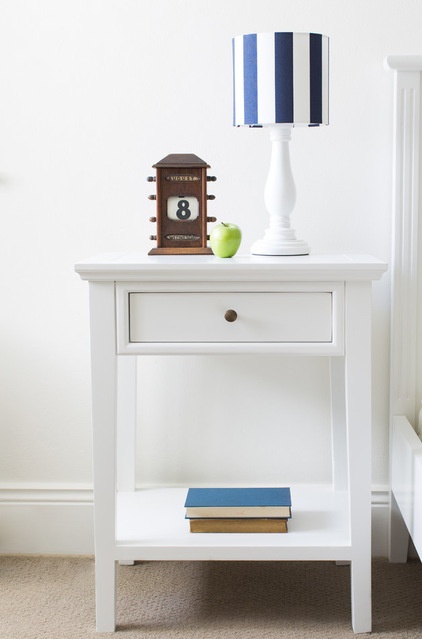
A tiny burst of contrasting apple green enlivens an uncluttered blue and white bedside vignette.
Coziness
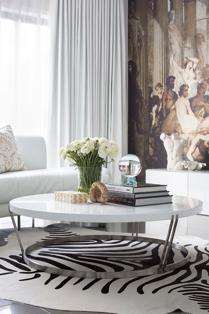
Pieces spaced evenly over the whole surface lose their connection to one another and may end up looking as if they are set out for a garage sale. Snuggle them up to one another and let some of them touch.
If your vignette is on a central table, check it out from all angles and tweak anything that looks awkward.
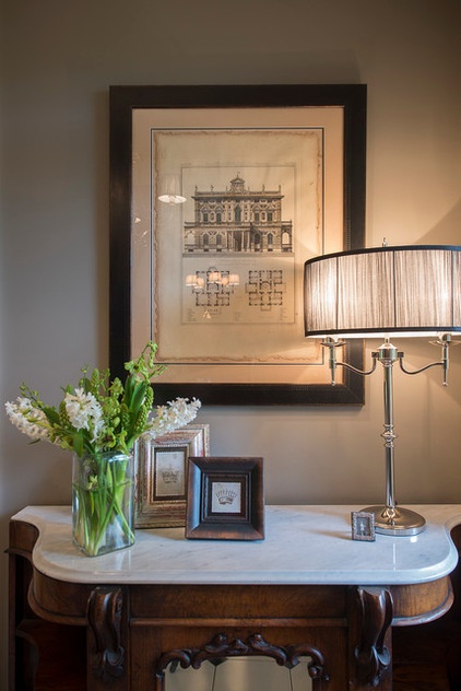
Keep articles visually linked. Hang a painting or mirror low enough so some of your objects encroach on it but don’t hide it. It will then be a cohesive part of the arrangement.
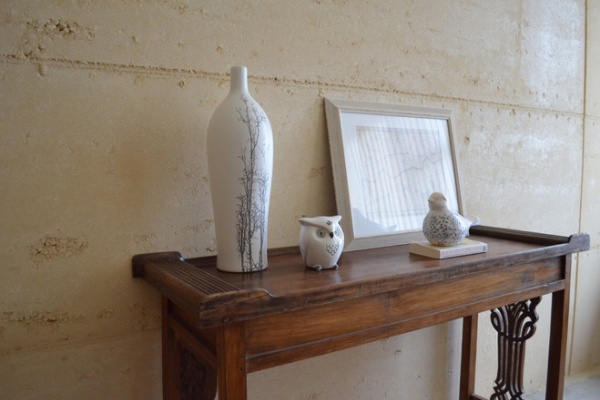
I love this fine Oriental-style table and great wall texture, but I’d like to bring these charming objects closer together.
Tip: When you are happy with your vignette, take a photo, so if you have to rearrange it for cleaning, you can replace everything easily.
Cost
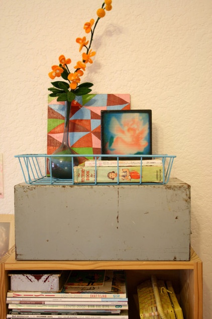
Vignettes are a wonderful way to give every room character, and they need not cost the earth. Collect flowers from your garden, a vintage shoe, pretty glass bottles or an attractive feather, or reframe old photographs or wallpaper offcuts. Hunt through your house and see what treasures you can find.
Shop Your Home for a New Look
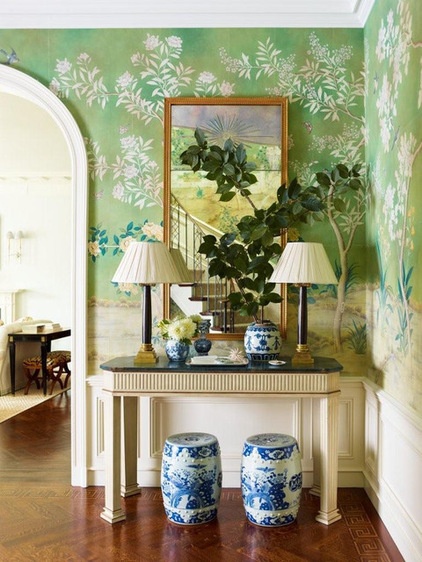
An ABC test: Study this vignette and decide whether you think it works and why.
Do you have a favorite vignette in your house? Share a photo and tell us why you chose your hero piece.
More: How to Start a Decorating Project
15 No-Cost Ways to Invigorate Your Space
Related Articles Recommended


