Kitchen of the Week: Bold Green and User Friendly in Connecticut
http://decor-ideas.org 11/01/2014 01:24 Decor Ideas
Soon after David Behrends and Alejandra Holway bought their contemporary Stamford, Connecticut, home in 2010, Hurricane Irene battered through the area, sending water into their walls. A major renovation was in order, and the couple decided to update their kitchen in the process.
While the kitchen was workable, they wanted a brighter space with better traffic flow and user-friendly storage. Working with designer Gianna Santoro of Deane | Rooms Everlasting, they used bold color and a smarter layout to create a place were they could cook daily meals, entertain and enjoy spending time together.
Kitchen at a Glance
Who lives here: David Behrends, Alejandra Holway and their young daughter, Emma
Location: Stamford, Connecticut
Size: About 400 square feet
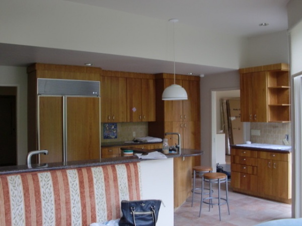
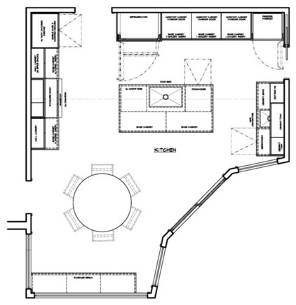
BEFORE: The kitchen had neutral flat-panel cherrywood cabinets that dominated the space. It also had what Santoro calls a “postage stamp” island and a banquette that impeded traffic. “It just wasn’t my style,” Holway says. Since the kitchen sits in a central location, it was important to improve the flow in and out of the space.
“After” photos by Jane Beiles
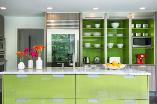
Removing the existing banquette improved traffic flow and allowed room for the large custom island, which has a Caesarstone top and a glossy green-apple lacquer base. “I knew I wanted that color,” says Holway. “It was Gianna who had the idea of toning things down with the cabinets so it’s not overwhelming. The bold green color makes me happy. The balance is thanks to her.”
The island includes the main sink, a dishwasher, a trash center and plenty of roomy drawers for glass containers with lids, an ice cream maker and water bottles. “The island serves as the main cleanup and prep zone,” says Santoro. “It’s a working island, and that’s why we didn’t include seating.”
A glass-front Sub-Zero and Wolf refrigerator enables the homeowners to clearly see what they have inside. Holway says a lot of people tried to talk them out of the purchase, but they love the look and don’t worry if they have lots of items on display. A separate freezer with panel fronts (also Sub-Zero and Wolf) is to the right of the appliance garage.
Cabinets, island: custom, Downsview Kitchens; sink: Dawn Kitchen & Bath Products; dishwasher: Miele; faucet: Kohler
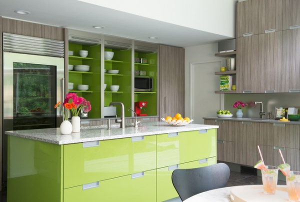
Three appliance garages with pull-down steel tambour doors store the family’s numerous small appliances, keeping them close by but out of sight and the counters clutter free. A small stepladder on wheels is cleverly tucked behind the toe kick for reaching items on the higher shelves.
Using the same green-apple lacquer featured on the island base for the inside of the appliance garage added a nice splash of color on the back wall of the kitchen. Meanwhile, the custom, easy-to-clean textured melamine cabinets with flushed recessed metal pulls offer a relief from the bold color of the lacquer. “The cabinets have a calm look,” says Holway. “I don’t like knobs, so I love the recessed pulls, and the drawers are big, sturdy and self-closing.”
Views can be enjoyed from the island or the nearby breakfast table with modern chairs, located by large windows that overlook the backyard.
Breakfast table, chairs: Design Within Reach; wall and ceiling paint: Extra White, Sherwin-Williams; flooring: limestone tile, Exquisite Surfaces
13 Popular Kitchen Storage Ideas and What They Cost
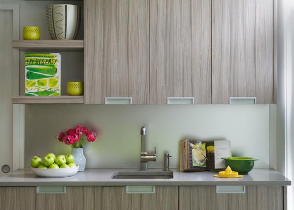
A separate hygienic area in the kitchen is used for preparing raw-diet meals for the family’s two dogs and two cats. This clever “pet bar” and garden center includes a separate dishwasher (seen on the right in this photo, disguised to look like drawers), a prep sink, storage cabinets and drawers for pet food and accessories. The backsplash is acid-etched mirror. “It’s easy to clean and creates a muted reflective surface,” says Santoro.
Sink: Dawn Kitchen & Bath Products; faucet: Kohler; dishwasher: Miele
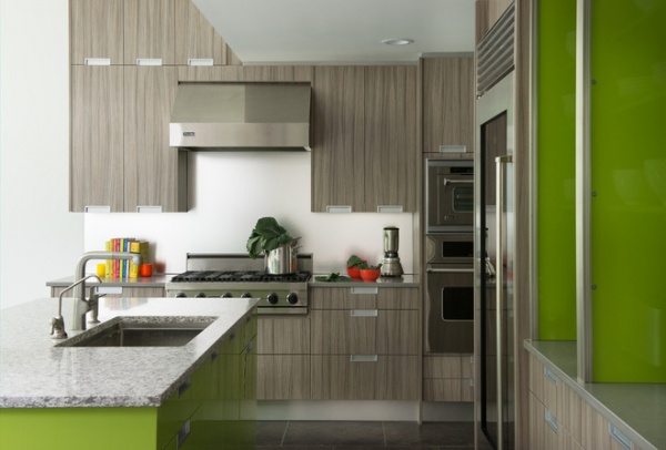
Behrends and Holway combined their existing Viking cooktop and hood with a new Viking steam oven that they use to prepare poached fish and risotto. Long, lean drawers under the ovens store cookie sheets and platters, while roomy drawers with dividers under the cooktop hold pots, pans, lids and casserole dishes. Upper cabinets provide storage for dishes and tea and coffee supplies. The tall cabinet to the right of the hood offers a handy spot for spices.
“What makes a kitchen stand out is that it works for the specific client or clients,” says Santoro. “This kitchen is a nicer space to live in and an easier space to gather.”
Team
Designer: Gianna Santoro, Deane | Rooms Everlasting
Architect: David Goetsch, David Goetsch Architects
Builder: John Farrell
See more Kitchens of the Week
Related Articles Recommended


