Room of the Day: Storage Attic Now an Uplifting Master Suite
http://decor-ideas.org 10/28/2014 20:13 Decor Ideas
As far as cramped situations go, sharing a bathroom with two teenagers has to rank at the top. That was the situation this husband and wife were facing in their 100-year-old house in the historic Irvington neighborhood of Portland, Oregon. They endured for years until they finally found the time and opportunity for an upgrade. And up they went, taking over a semifinished attic space that was being used for storage. They put together a design team and got to work creating a new master bedroom with privacy, treetop views and, best of all, their own bathroom.
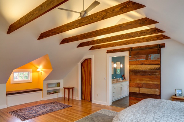
Photos by Jeff Amram Photography
Room at a Glance
Who lives here: A writer, a high-tech entrepreneur and their 2 teenage daughters
Location: Portland, Oregon
Lesson: By taking over attic space, the homeowners avoided adding on, which would have meant a lengthy review process with the historic board.
Architect Marty Buckenmeyer helped with structural layout issues, made sure the couple used the space as efficiently as possible and helped get the project through the historic review process. Because previous owners had already added flooring, partial wall framing and a staircase leading up to the attic, Buckenmeyer was able to get it listed as a living space, which meant they didn’t have to bring it up to current code. This also meant they didn’t have to rip up the floor and add new joists, so they were able to keep costs down. “In this neighborhood people try to take the path of least resistance,” he says.
The existing collar ties were structural, but Buckenmeyer assessed that they were more than what was needed. Because the homeowners liked the look, though, he added new ones that kept the feeling of an attic space but were stained to look a bit nicer.
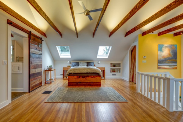
Interior designer Marketa Rogers of ID Seven handled the material palette and fixtures. She kept the overall palette neutral and introduced pronounced accents of color, like warmer yellow hues on some walls and a bit of leftover light blue paint on a piece of the reclaimed barn door.
Rogers wanted the bathroom’s barn door, built by woodworker George Ramos, to be a focal point and the only door in the room, because it’s the first thing you see when coming up the stairs. (Ramos carefully selected the pieces of wood for the door, making sure that the piece with the blue paint was placed at eye level.) So instead of adding closet doors that might compete with the barn door, Rogers used golden-colored silk fabric to conceal the two closets, one of which is seen here to the right of the bed.
The house is not considered historic, but because it’s in a historic neighborhood, the remodeling project had to go through historic review. The city has regulations about what kinds of changes can be made to the fronts and sides of the houses. To get around this, the design team added new skylights to the back side, seen here, which pretty much dictated where the bed would go. (The skylights are operable and programmed to close if it starts raining.)
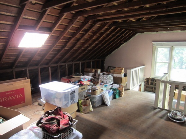
BEFORE: Here you can see how the existing attic space was only semifinished. The existing skylight was replaced with a larger one, and a second skylight was added next to it to bring in more light.
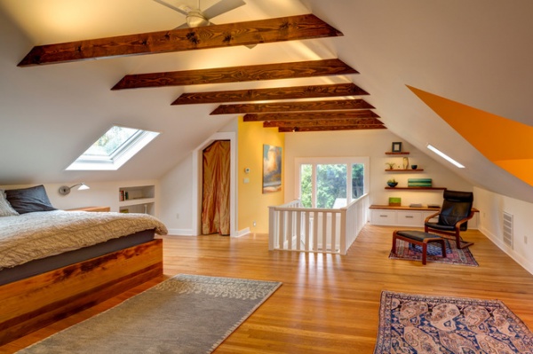
AFTER: LED lighting is used throughout the space. It’s concealed in grooves on the beams to uplight the ceiling. “It creates another layer of atmosphere up there,” Rogers says.
The rooflines created a lot of constraints when it came to storage. Niches in the wall built in between the studs create space for a bookshelf to the right of the bed. “We just wanted to make the best use of all the space we could,” Rogers says.
Out of salvaged wood, Ramos built the bed and, to create a reading nook, the floating shelves and cabinetry in the rear corner. “There’s a pronounced horizontal linearity with the collar ties, floating shelves and the bed. Keeping those lines in place was part of the design process,” Rogers says.
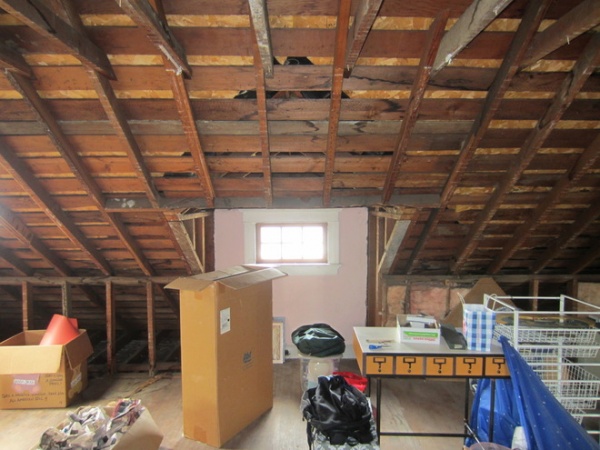
BEFORE: This tiny window looks out to the front of the home. The team and homeowners had hoped to put a new skylight on this side, but the city wouldn’t let them, because it would have looked too contemporary.
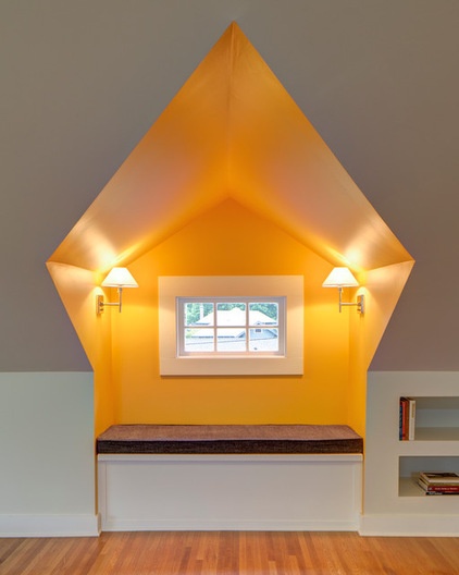
AFTER: They did, however, collaborate on opening up an existing decorative dormer surrounding the window and adjusting the roof framing to create a new window seat. (Rogers developed the color scheme, while Ramos built the seating.)
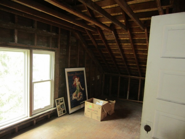
BEFORE: Because this portion of the attic was situated above a bathroom on the second floor, it made sense to put the new bathroom here to streamline the plumbing configuration. Part of the plumbing runs through an old, unused brick chimney, and another part through the ceiling of a closet below.
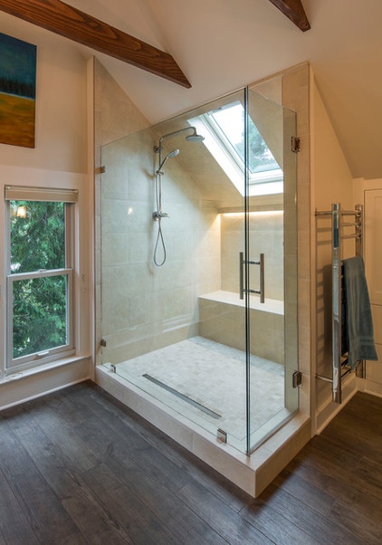
AFTER: The new shower is raised slightly off the floor to accommodate the new drains that run through the closet ceiling below. (Attic floors aren’t typically designed to accommodate plumbing, making these kinds of renovations tricky.) “It becomes a game of inches,” Rogers says.
They kept the existing windows on the side of the house because, again, making changes to the exterior would have been costlier and more time consuming. They were able to add a new skylight on the back of the home to brighten the shower. The skylight’s placement determined the layout of the space.
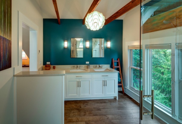
The flooring is ceramic tile that mimics wood planks. Rogers and the homeowners chose a darker floor to provide contrast with the white walls, while opting for a teal accent wall for a scoop of color.
The half wall seen to the left is actually a laundry chute that uses part of the old chimney to send clothes four levels down to the basement.
More
11 Tips for Building a Bathroom in the Attic
14 Tips for Decorating an Attic — Awkward Spots and All
Tell us: What have you done to make the most of your attic space? Share your stories and photos in the Comments section.
Related Articles Recommended


