Houzz Tour: Simplicity Rules in a Canadian Lake House
http://decor-ideas.org 10/26/2014 23:13 Decor Ideas
Spare and sleek don’t have to equal cold and stark. Although this family wanted a monochromatic minimalist aesthetic for their vacation home on Lake Simcoe in Canada, they also wanted comfort. Interior designer Shirley Meisels paid careful attention to textural and color contrast, adding warmth and interest to the uncluttered space in subtle ways. To fulfill the homeowners’ desire to make their vacation home as “supersimple” and fuss free as possible, she emphasized their vast lake views, made the most of the natural light and created a harmonious balance between gallons of white paint and darker accents.
Photos by Stephani Buchman Photography
Houzz at a Glance
Who lives here: A couple and their 3 (soon to be 4) children
Location: On Lake Simcoe, about a 1½-hour drive north of Toronto
Size: About 2,500 square feet (232 square meters); 4 bedrooms, 4 bathrooms
Interior designer: Shirley Meisels
Meisels joined the project around the time the family received their first set of architectural plans. Her marching orders: “They wanted something spare and uncluttered, so they wouldn’t have to worry about cleaning,” she says. Also, the house can withstand abuse; she carefully chose kid-friendly and durable materials and surfaces.
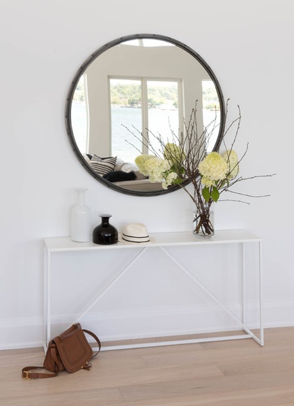
The front door opens into an entryway with big views through the great room and out to the lake. A console table creates a landing zone, and the mirror reflects the view of the lake and natural light.
Table: Strut, Blu Dot; mirror: Restoration Hardware
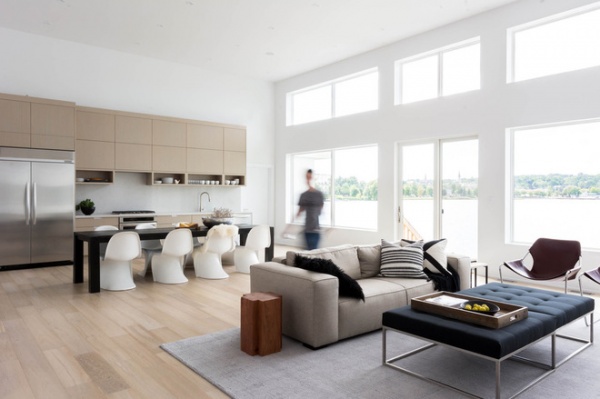
The kitchen, dining area and family room are all contained in one big, open space. The one-and-a-half-story windows drove a lot of the design; Meisels didn’t want to obstruct or distract from the expansive views of the lake. To enhance the light and airy feeling, she opted for all-white walls and a light oak floor. The oak continues up the kitchen wall onto the cabinets, making the transition seamless.
“We wanted to create functional spaces that would be comfy for the whole family to be together,” Meisels says. A wool rug defines the family “room”; a dining table creates a buffer between that area and the kitchen.
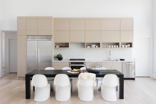
The same Caesarstone is used on the countertops and the backsplash, also to keep the look smooth. The homeowners wanted just one wall of cabinetry. “The open shelves were born of necessity,” the designer says. “They wanted an easy place for the kids to grab and put away their cups and plates.” As a bonus, the objects on the shelves add visual interest.
To temper the sleekness, Meisels brought in contrasting color, a range of textures and striking silhouettes. “Even though everything is clean and simple, I wanted to rough it up a bit with imperfect elements like rougher woods, pottery and hammered steel,” she says. “The cottage itself is pretty slick; if everything was perfectly clean and monotone, it would feel very sterile.”
One of the biggest “roughed up” elements she added is the dining room table. “The contrast of the black helps ground the space and balances the other half of the room,” she says. The curved silhouettes of the Vitra Panton chairs throw some curves at all of the straight, modern lines.
Dining table: Restoration Hardware
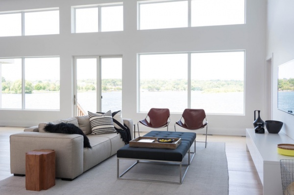
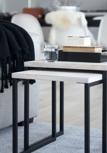
The family members come up to the lake to spend the majority of their time enjoying the outdoors, so they don’t need to keep much stuff here. They do have a comfy spot for gathering to watch TV in the family room. A large, deep sofa, two large upholstered ottomans and two Paulistano chairs provide comfy seating. A lacquered custom cabinet provides storage for toys and books.
Meisels picked a stain-resistant fabric for the sofa and wipeable leather for the ottomans and chairs. Details like the wood and metal nesting tables and the wood side table bring in some roughness and texture. “I wanted to layer in some natural elements,” she says. “The wood side table also helps tie in the caramel leather on the Paulistano chairs.” Throw pillows and blankets add more softness. Black leather on the ottomans and other dark accents balance things out with contrast, while pottery pieces add interesting silhouettes.
Sofa, ottomans: custom via Shirley Meisels; rug: Restoration Hardware; nesting tables: West Elm; black jug: Stefania Vasquez for Diamantini & Domeniconi
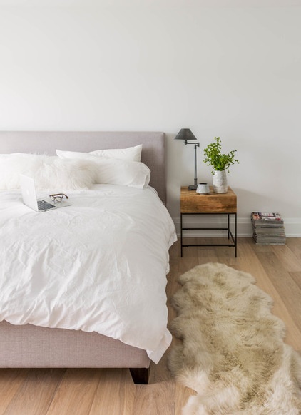
In the master bedroom, Meisels continued her strategy of roughing up the very simple white space. “Using textures really helps warms things up in a light room,” she says. The bed is upholstered, the rug adds furry softness underfoot, and the mango wood nightstand adds a rough-hewn industrial feeling. “The combination of these textures makes the bedroom supercozy,” she says.
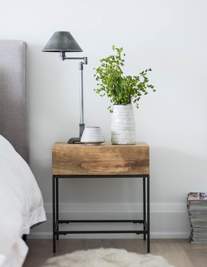
Pottery in imperfect shapes helps to keep things from feeling too slick and rectilinear.
Bed, nightstand: West Elm; pottery: Target; table lamp: Restoration Hardware
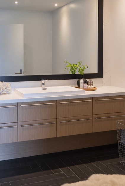
In the master bathroom, Meisels used the same oak wood she used in the kitchen on the vanity and the same Caesarstone countertops. The dark floors and mirror frame provide contrast. The floor tiles are porcelain planks shaped like boards that Meisels laid in a herringbone pattern. She has clever ways of keeping things from getting boring.
Bang for Your Buck: Herringbone Tile Floors
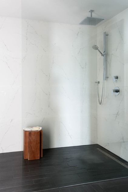
Twenty-four-inch by 48-inch porcelain tiles that look like marble cover the walls in the bathroom. Paired with clear glass, they create a seamless transition into the shower stall. A slightly slanted floor directs the water into a long, linear drain.
Builder: Ablebrook Developments
Browse more homes by style:
Small Homes | Colorful Homes | Eclectic Homes | Modern Homes | Contemporary Homes | Midcentury Homes | Ranch Homes | Traditional Homes | Barn Homes | Townhouses | Apartments | Lofts | Vacation Homes
Related Articles Recommended


