Front and Center Color: When to Paint Your Door Orange
http://decor-ideas.org 10/26/2014 05:13 Decor Ideas
Orange is a high-energy color that hollers, “Look at me!” — a great choice for an entry to a home. But it’s not an easy color to work with. Bright orange is intense and needs to be paired with more soothing, neutral hues to avoid appearing too busy and garish. Lighter, mellower oranges can read as too pastel and peachy, making them tricky to work with as well.
Fortunately Houzz abounds with excellent examples of orange front doors done successfully. Check out seven of them, along with sample color palettes to help get you fired up for an orange front door.
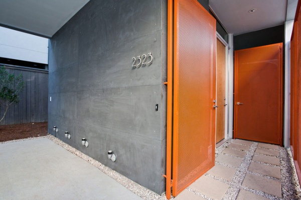
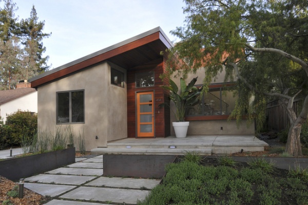
1. Orange Door With Clean Architecture
We tend to see bold hues on contemporary homes more often than on traditional ones because the former, with its clean lines and minimal adornment, makes for a terrific blank canvas that can support vibrant hues. Busier styles of architecture can start to look circus-y if bright colors are overused.
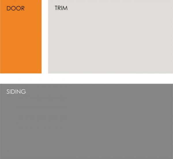
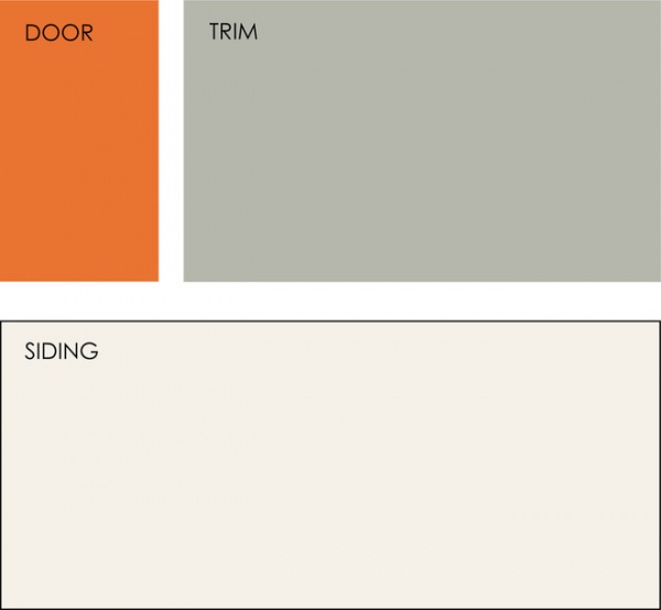
Example palette: Clockwise from top left (all from Glidden Paint): Orange Marmalade GLO04, Toasted White GLC18 and Seal Grey GLN46.
2. Glass and Orange-Framed Door
If your front door has lites (glass panels), painting the frame a vibrant hue gives you a hit of color while still allowing your home's entry to stand out nicely.
Example palette: Clockwise from top left (all from Sherwin-Williams): Invigorate SW6886, Sensible Hue SW6198 and Reliable White SW6091.
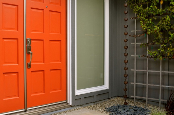
3. Bright Orange Door With a Soothing Gray Exterior
This eye-popping shade of orange is not for the timid. But it works here because the siding and the trim are cool, soothing neutrals that support rather than compete with the bold hue.
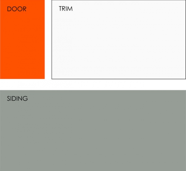
Example palette: Clockwise from top left (all from Valspar): Trolley AR1605, Ultra White 7006-24 and Seafoam Storm 5002-1C.
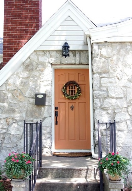
4. Neutral Orange and Traditional Architecture
Those looking for a subtler shade of orange or to complement more traditional architecture may want to consider an orange similar to the one shown here. This shade is more tonal in that it has some taupe in it (white, black and brown), making it read as more of a neutral. If you took the bold orange hue in the previous example and added only white, it would turn a pastel orange. Lighter hues need the addition of black and/or brown to keep them from looking like a color better suited for a nursery.
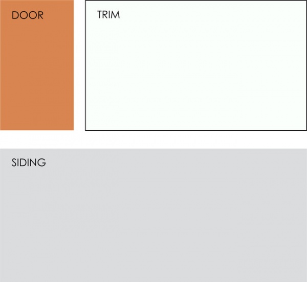
Example palette: Clockwise from top left (all from Pittsburgh Paint): Carrot Cake 223-5, Silver Feather 530-1 and Fog 517-3.
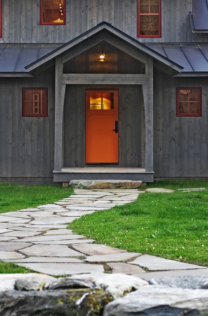
5. Orange Door With a Cool Gray Exterior
This is one of my favorite exterior color palettes on one of my favorite styles of architecture. The cool blue-gray siding with the true orange door is stunning. Orange and blue are opposite each other on the color wheel, so they offer the most contrast. The orange makes the blue appear brighter and bluer and vice versa. A good tip when working with contrasting colors is to pick a more vibrant shade of one of the hues (the orange in this case) while keeping the other color (the blue-gray here) subtler and more neutral. This creates an eye-catching yet elegant palette.
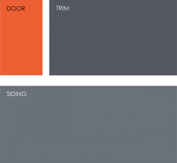
Example palette: Clockwise from top left (all from Mythic Paint): Ember's Glow 107-6, Mason Gray 134-5 and Monarch Pass 135-5.
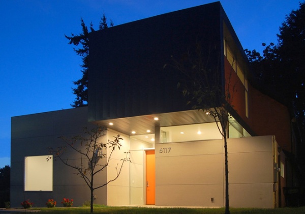
6. Orange Door With a Taupe Exterior
So far we've seen lots of orange and gray combinations, but orange is a warm hue and therefore works well with other warm colors. Using a warmer hue on an exterior will also make the orange appear less bold and intense, for a more toned-down entry than in the previous example.
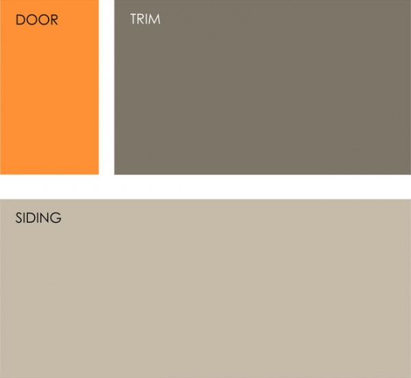
Example palette: Clockwise from top left (all from Benjamin Moore): Calypso Orange 2015-30, Gargoyle 1546 and Stone Hearth 984.
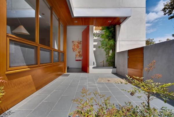
7. Orange Door With Wood Siding
Natural wood siding of this coloration tends to read as orange, so an orange door is the perfect extension of that. This front door still stands out, but there's less contrast than if the siding were a cooler hue.
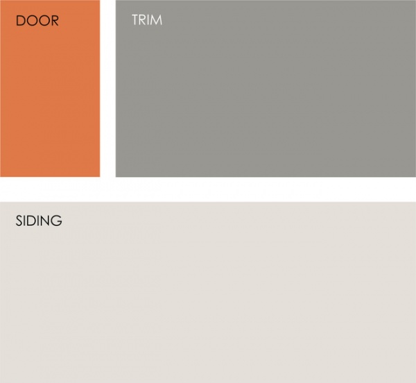
Example palette: Clockwise from top left (all from Pratt and Lambert): Midnight Sun 8-13, Trout 33-13 and Mirage Gray 28-31.
Keep in mind that the colors you see on your monitor do not exactly match what comes out of the paint can, so always get samples and test the colors in the intended space to make sure you are happy with the result.
Tell us: What do you think of orange on a front door?
Related Articles Recommended

