Houzz Tour: Midcentury Meets Mediterranean in California
http://decor-ideas.org 10/24/2014 23:13 Decor Ideas
For many of us, personal style is not a one-note thing. It wasn’t for this couple, who love both classic Mediterranean style and a midcentury modern aesthetic. However, when they purchased a traditional Mediterranean home in Mountain View, California, they were having problems making their chosen styles jibe. They hired designer Melina Copass to help them reconcile the looks in the new home they share with their twins.
Houzz at a Glance
Location: Mountain View, California
Year built: 1938
Size: 2,283 square feet (212 square meters); 3 bedrooms, 2½ bathrooms
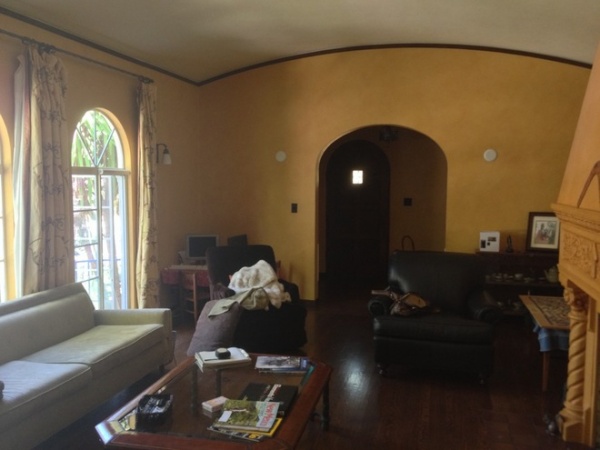
BEFORE: “The big problem with the house was that it was really dark,” says Copass, of Melinamade Interiors. “The walls were done in a squash-colored faux paint, and there were very few overhead lights.”
Copass thought the narrow crown molding that outlined the dramatic arched ceilings wasn’t doing the house any favors. “It felt like the rooms were wearing a hat,” she says. “It brought everything down.”
“After” photos by Bernard André
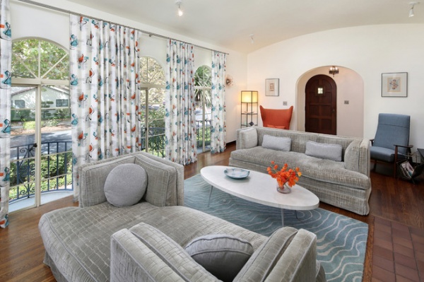
Copass’ main move was to remove the molding and repaint the rooms a crisp white. This made a clean backdrop for a collection of midcentury and atomic age–inspired furnishings.
“My thought was that once you cleaned up the background, anything could exist in front of it,” says Copass. “We carefully balanced both styles.”
Thus, you have a modern interior with a Spanish accent. The dark, wide-plank floors; arched doorways and ceiling; and many of the original fixtures remain (including the heavily ornamented fireplace, which is visible in the “before” shot but just out of frame here). They are joined by brightly colored curtains with a boomerang print (the pattern was designed by Copass and screen-printed on the fabric by her husband), classic midcentury chairs and contemporary sofas.
Curtains, sofas: custom; rug: Angela Adams
Why We Love Midcentury Modern Design
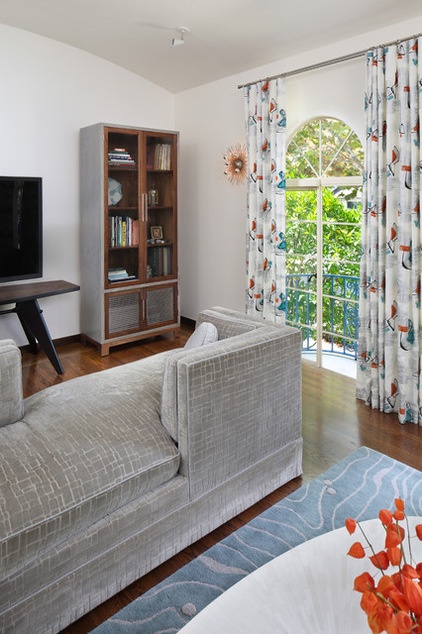
Another challenge was the long, thin shape of the living room. “They wanted to have their 72-inch television in this room,” Copass says. “The way it is set up, you can watch from the far sofa. The sofa that’s closer to the set has two backs, which allows a single person to sit near the television.”
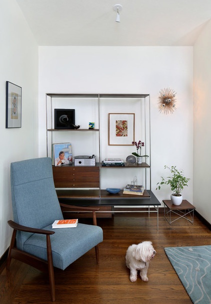
Classic midcentury chairs at the back of the room anchor reading nooks.
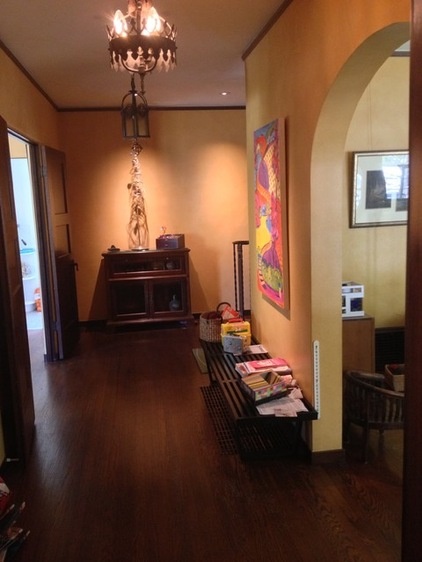
BEFORE: Perhaps the darkest spot in the house was the entry. It didn’t make for a warm welcome.
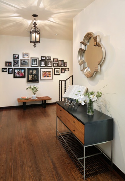
AFTER: Copass kept the original light fixture and brightened the space with white paint and a mirror.
This is a family who loves to display photos but was loath to drive nails into the stucco wall. After much research, the owners hit on the answer: They had the far wall covered in sheet metal and painted white (the stucco remains intact underneath). Heavy-duty magnetic hooks make a family photo wall an art installation that’s easy to change and expand.
These clients also love words. The console, a vintage Paul Mcobb piece, is home to an old dictionary.
Neodymium Rare Earth Magnet hooks: Apex Magnets
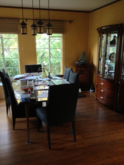
BEFORE: The clients asked for a dining room they didn’t have: one that was light, bright and glamorous.
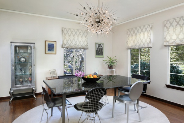
AFTER: A sparkling new chandelier crowns the transformation. “They really wanted a Sputnik fixture,” says Copass. “The one that was there was not original — it was an Arts and Crafts–inspired chandelier.” While on a quest for the perfect light, Copass saw a 60 Minutes report on New York’s Metropolitan Opera House. “There, on my television, was the mother of all starburst chandeliers,” she says. “But this one looked like it was 10 feet by 10 feet.”
Using her design detective skills, Copass tracked down the craftsman who made the Met’s fixture. “I had him make one inspired by the original, complete with Swarovski crystals,” she says. “This version is smaller and slightly more elliptical. The ends are blunted, so they are not quite as sharp. The clients were worried about people bumping their heads on it, so we measured their tallest friend [a man who stretches the tape at 6 feet, 8 inches] to make sure there was clearance.”
One of the clients had made the marble-topped table, and they wanted to keep it. The decision about seating was harder. “There was a lot of back-and-forth, and we were having a hard time setting on one,” says Copass. “We decided that we would use several different iconic modern chairs, but unite them by having them made in black and silver.”
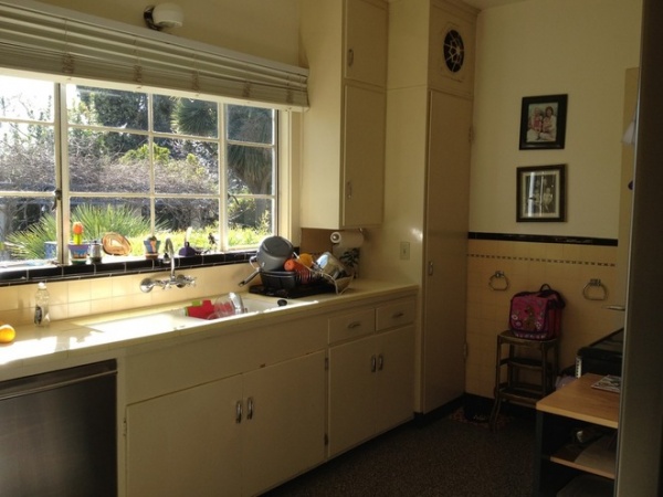
BEFORE: Prior to the remodel, the kitchen was outfitted with what the designer believes to be original 1938 fixtures.
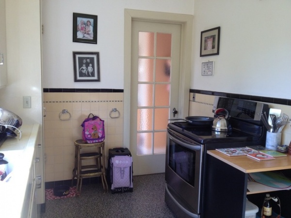
The layout was of the era too, with no countertops around the range.
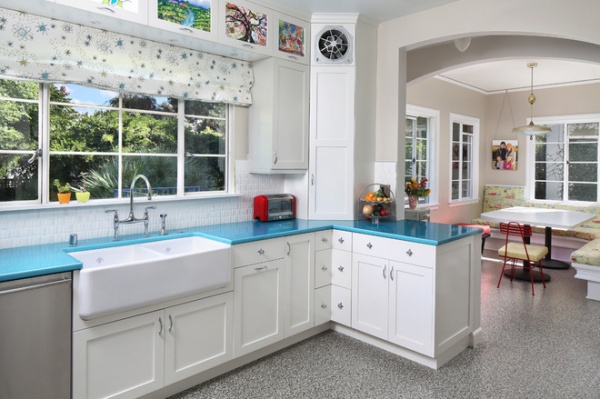
AFTER: The wall between the kitchen and the breakfast nook was removed, making both spaces brighter.
The designer left the original ventilation fan (located at the top of the corner cabinet), because it looked cool. The owners added their own hip note with uppermost cabinets made with glass fronts and small clips that hold the kids’ artwork like frames. “They change it out often,” says the designer.
The countertop is aqua-colored lava stone. “Not only is aqua blue a very midcentury color; it’s a happy color,” says Copass. “The goal was to make this a happy, family-friendly place.”
With that in mind, the designer chose cabinet knobs crafted with another midcentury hallmark: a starburst. The Roman shade was made with another fabric the designer created. “I first made this pattern for Disneyland,” Copass says. “If you go and visit Red Rocket’s Pizza Port, you’ll see it there. I had it done in different colors for this family.”
The new banquette is covered with a vintage fabric the clients found. “It has a neighborhood theme, with children, houses and fire trucks,” the designer says. It’s complemented with a bright red 1950s metal chair — a remade flea market find.
Hardware: Saturn + Star, Rejuvenation
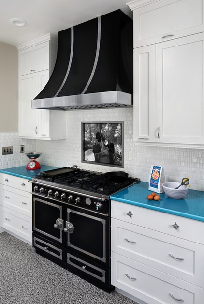
The new black range is now surrounded by countertops, and above it is a bit of family nostalgia.
“The clients wanted to have something personal there, so we designed a stainless steel niche where they display photos printed on wipeable canvas,” says Copass. “They can switch it out when they want.”
One of the clients sums up the project this way: “We told Melina that when people enter our home, we want them to feel comfortable, surrounded by warmth and, in a few places, to say out loud, ‘Wow’ — and that’s exactly the home we have now.”
Range: CornueFé 100, La Cornue
Browse more homes by style:
Small Homes | Colorful Homes | Eclectic Homes | Modern Homes | Contemporary Homes | Midcentury Homes | Ranch Homes | Traditional Homes | Barn Homes | Townhouses | Apartments | Lofts | Vacation Homes
Related Articles Recommended


