Houzz Tour: A Studio Makes the Most of Every Inch
Olga Alexeeva, of interior design firm Black and Milk Residential, likes a challenge, and when she was asked by a firm of developers to modernize a small studio flat in central London, that’s exactly what she got. “Not only was it tiny; it had not been touched in more than 30 years and was a real wreck,” says Alexeeva of the fourth-floor apartment. “But I was lucky it came along. It was such an exciting, challenging project.”
Exciting it may have been; straightforward it was not. “There was no road access to it and never anywhere to park nearby,” Alexeeva says with a laugh. “We had to carry everything on foot to the property.” In addition, building and safety regulations limited how she could reconfigure the space, and the age of the property — it’s about 150 years old — also created issues. Once the two-month build was under way, for example, moving ancient pipework caused a huge leak.
Hiccups and restrictions aside, Alexeeva has created a wonderfully innovative home. Now its central space can hop seamlessly between roles, morphing from living room to office to dining area to bedroom with minimal effort. “It’s a tiny studio, and I wanted to create maximum space and functionality in it,” the designer says. “Every centimeter counts!”
Houzz at a Glance
Who lives here: A woman who works in the creative and media industries
Location: Central London
Era built: Mid-19th century
Designer: Black and Milk Residential
Size: 270 square feet (25 square meters); studio with 1 bathroom
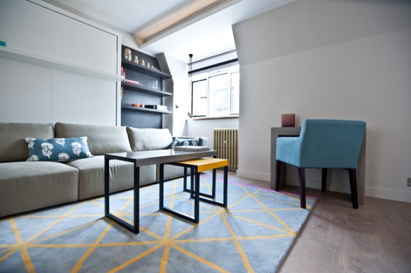
“The starting point for redesigning the apartment was to take out as many partitions as I could, to get it back to its rectangular shape,” Alexeeva says.
The biggest space is also the most multifunctional. A bed pulls down from the wall, and the small console can be extended to become a long dining table.
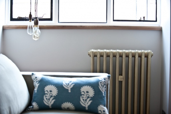
The original metal window frames were hidden behind layers of white paint. “We stripped them back and painted them black to really show them off,” Alexeeva says. The radiator was another original feature. “We sanded it back and painted it in an antique gold color,” she says.
Alexeeva made the cluster light, too. “I sourced all the individual pieces and put it together,” she says. “It was much cheaper than buying a ready-made design.”
Cushions: Occa-Home
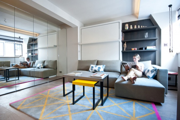
Although the apartment is tiny, Alexeeva has chosen good-sized pieces for it. The sofa can be extended to become a corner design, creating a generous space for relaxing. “It’s incredibly comfortable,” she says.
Coffee tables: Made
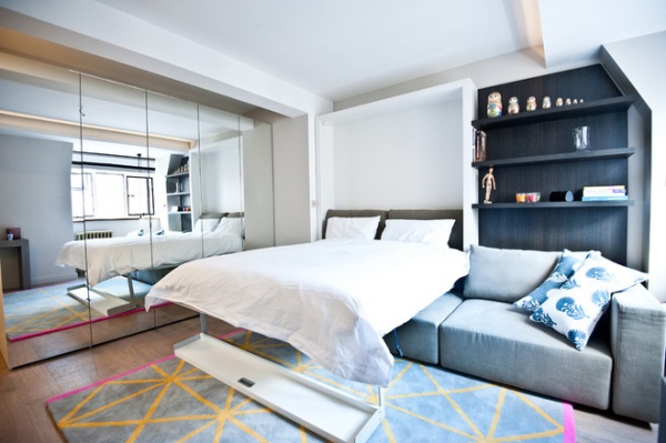
A double bed pulls down from the wall and sits above the sofa. “You just tuck the back cushions down the side, and then it’s ready,” Alexeeva says. “It’s nice and high, just right for watching TV. You feel as if you’re in a boutique hotel!” The bed, sofa and shelves are a set; Alexeeva obtained it from an Italian manufacturer, which was able to modify the shelves to fit with the sloping wall.
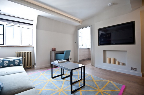
The apartment has plenty of natural light, thanks to its position on the top floor of the four-story building. Alexeeva chose a pale color scheme to help the space feel open and bright, and added color through the rug and cushions.
Rug: Habitat
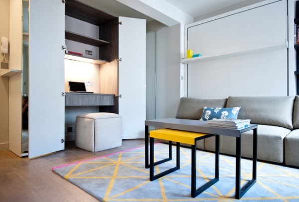
A storage bank on one wall contains ample wardrobe and drawer space, as well as a mini office. “The apartment is in central London and will typically be used by a professional person, so a desk is vital,” Alexeeva says. She designed it with drawer space beneath and shelves above, served by a high electrical socket, so a printer could be placed there. “The ottoman fits back underneath when not in use and also pulls apart to become six stools,” Alexeeva says.
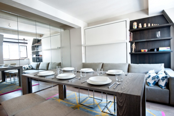
There is space to seat six at the dining table. It sits against the wall as a console when not in use, and then is pulled out to create a table; the top is stored in a cupboard. Ingenious design means the stools fit back together to become the ottoman, tucked under the desk. Mirrored doors on the wall of storage help to boost light levels and increase the feeling of space.
Downsizing Help: Think ‘Double Duty’ for Small Spaces
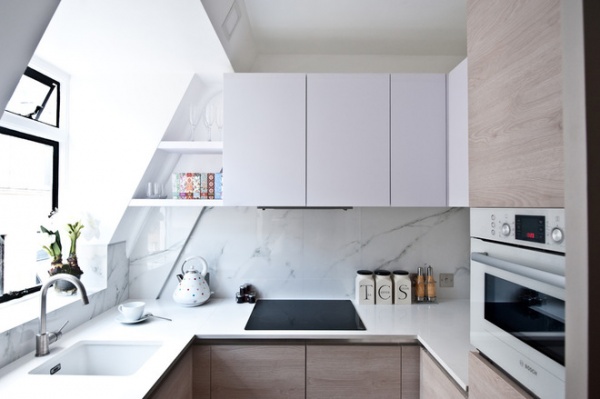
The kitchen used to be barely functional, but by taking down a partition wall that sat in front of this window, Alexeeva improved its dimensions.
“It was more like a bar, with just a kettle and sink, than a kitchen,” she says. “In order to fit in all the necessary appliances, I designed the kitchen first and then built the walls around it, with the help of Battersea Builders.”
To limit costs Alexeeva chose porcelain tiles that look like marble for the backsplash. “The apartment really lacked a touch of luxury,” Alexeeva says, “but these look like the real thing.”
Porcelain tiles: The London Tile & Mosaic Company

The small bathroom presented Alexeeva with challenges. “I didn’t want a square shower enclosure, as you would have been knocking against its corners all the time,” she says. The solution was a diamond-shaped enclosure, which feels far less blocky and obtrusive. It also comes with a slim slower tray that the enclosure glass fits neatly into. “It looks very minimal — ideal for a small room,” she says.
Alexeeva then chose the smallest wall-mounted toilet she could find, with a slim cistern that fits in the space between the bathroom’s and the kitchen’s stud walls. “This meant there was space for a good-sized basin and vanity unit, which feels generous and is nice to use,” Alexeeva says.
Faucets: C.P. Hart; showerhead: Methven; tiles: The London Tile & Mosaic Company
More:
Timeless Design Ideas for Small Spaces
12 Studio Homes Offer Grand Small-Space Inspiration


