Houzz Tour: Victorian With a Modern Outlook
In spite of the fact that these empty nesters have a penchant for “super modern” design, they also adore their 19th-century Victorian house. But as the go-to hosts for large gatherings of family and friends, they found that their small rooms were cramping their entertaining style. Though not interested in knocking down walls and messing with the integrity of the original architecture that had survived 100-plus years, they were stumped at how to make it work with their lighthearted tastes and their lifestyle.
“They were feeling the squeeze of the separate rooms when they were entertaining,” says interior designer Lisa K. Tharp. Working with the existing layout, she found clever ways to tweak their rooms’ functionality while creating an easy cohesive flow between them. Respecting the home’s history, she layered in nods to style eras from the Victorian era to today. The result is a collected look that appears as though it evolved over the decades.
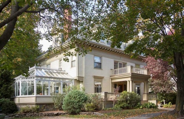
Photos by Eric Roth, except where noted
Houzz Tour
Who lives here: A couple of empty nesters
Location: Boston, Massachusetts
Size: 4,000 square feet (372 square meters); 6 bedrooms, 4 bathrooms
Team: Interior design: Lisa K. Tharp, K. Tharp Design; faux painting: Stephanie Mesner, Arteriors Designer Finishes; custom-made furniture:
Norton Deamorim
“These homeowners were fearless and fun, and they wanted to use color to make the house feel alive and welcoming to their guests,” Tharp says. “The biggest design challenge was to accomplish that while working within the Victorian architecture’s rooms.”
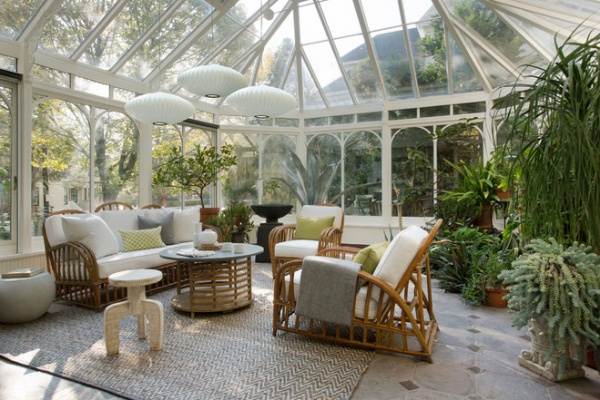
While hunting through the home for entertainment space, Tharp saw through a jungle of exotic plants and said, “This is the answer.” The couple had imported the conservatory from England years earlier and had been using it as a true greenhouse ever since. It was so full of plants it was impossible to see from one end to the other. It didn’t take much cajoling to have the couple put some of the plants in the yard and give away others to clear some entertainment space. Radiant heat floors keep it toasty during the winter.
Midcentury George Nelson Saucer pendants float above art deco-inspired vintage wicker furniture. Tharp changed out the damaged cocktail table top for chalkboard, giving visiting children a fun activity. For frequent dinner parties, the couple moves their dining room table and its leaves out here. “It’s a magical place lit up at night, with everyone eating under the stars,” Tharp says.
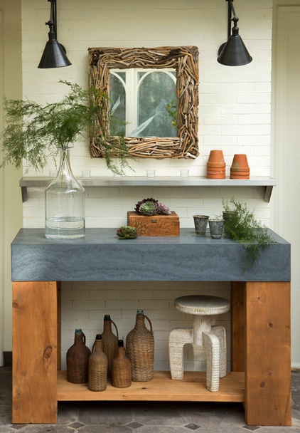
Though the couple thinned out their plant inventory, there is still plenty left to keep their green thumbs engaged. At the entry to the room, Tharp designed a new potting bench for them, crafted of reclaimed wood legs and a locally sourced Fireslate top. The chunky bench has more modern lines, but the tableaux incorporates traditional library lights, an industrial stainless-steel wall-mounted shelf and an eclectic driftwood mirror. Tharp layered the styles from different eras like this throughout the house.
LIbrary sconces: Visual Comfort; driftwood mirror: custom; potting bench crafted by Norton Deamorim
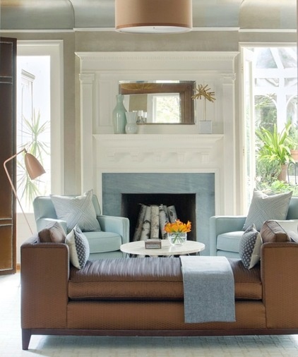
Tharp also did some clever room swapping to better suit the house to the couple’s lifestyle. This room at the front of the house used to be the dining room; the openings flanking the fireplace lead out to the conservatory. It had the only functioning fireplace in the house, which was blocked by the dining table. Knowing her clients longed to do some cozy evening reading together by the fire, she transformed the room into a library and moved the dining room to a more suitable space in the back of the house across from the kitchen. New built-in bookshelves (not pictured) flank either side of the opening off the hallway.
She set up seating to accommodate a party’s open flow, but the room also serves as an intimate space for the couple when they want to curl up by the fire. Soft upholstered furniture is accentuated by a three-paneled velvet room screen on the left, which adds more softness to the corner. An iconic grashöppa floor lamp provides great reading light and adds a Scandinavian modern touch.
The color palette in the library was inspired by fire and ice. The original fireplace millwork has a new bluestone surround. (The original was covered in tiny tile that Tharp tried to save, but it was cracked and crumbled beyond repair.) Playing off the icy blue, she added glints of warm metal to the daybed and the coved ceilings. Stephanie Mesner of Arteriors Designer Finishes created a gorgeous metallic leaf effect in copper, bronze and gold on the ceiling that reflects the fire’s glow. “Stephanie was lying on her back painting like Michelangelo in the Sistine Chapel,” Tharp says. “It was amazing to watch her at work.”
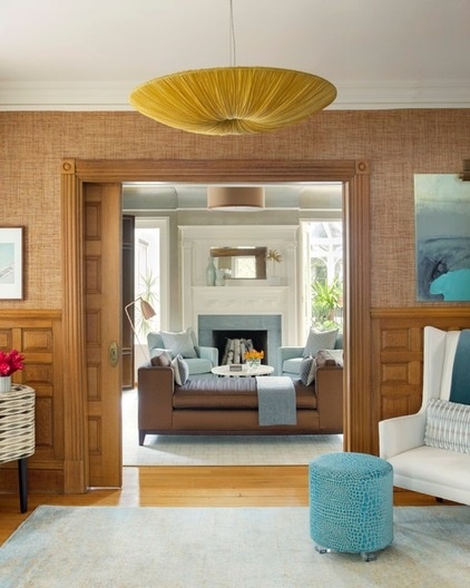
The library is on the front of the house off a large entryway, which was a wasted space Tharp knew she could turn into a functional one.
“I decided to move all of the seating areas to the front of the house,” she says. The space sits between the freshly appointed library and the living room, so she designed it to create an open flow between the two rooms. During parties with the pocket doors open, the three rooms become one big entertainment space. Extra seating includes an updated wing chair, playful turquoise velvet croc stools and a telephone bench covered in a midcentury modern-inspired fabric (there’s a small peek of it on the left). A telephone bench is something that would have been common in a hallway like this one when phones first arrived in every household. “I love to mix different periods,” Tharp says. “Paying attention to form, proportion and finishes makes it all work together.”
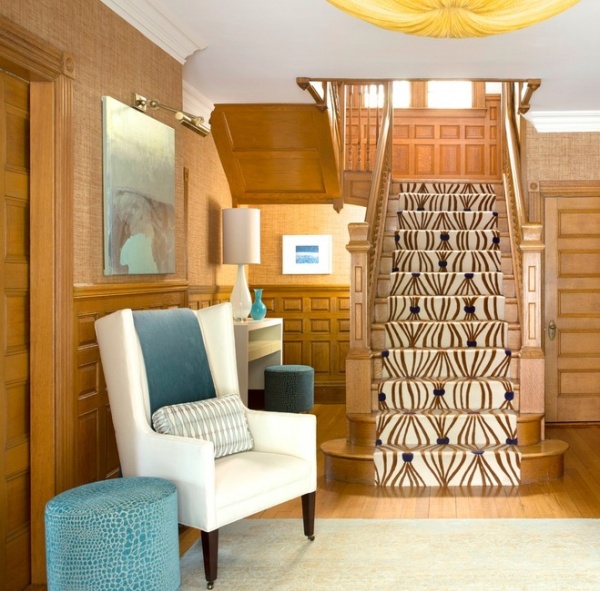
The console toward the back doubles as a bar during parties.
In addition to all of this new function, the entryway makes a strong first impression. An Angela Adams runner catches the eye and leads it upstairs. Tharp extended the original oak moldings, adding the angled piece under the stairs and more paneling underneath the windows on the landing. This ties the two floors together and puts an emphasis on the original Victorian era when it was built.
A silk light fixture from Aqua Creations fits the scale of the large space and is a fresh take on a big style era that followed Victorian: art deco. Finally, a grasscloth wall covering extends the warmth of the oak and adds interesting texture to the walls.
Runner: Angela Adams; abstract painting: Aisyah Ang; chandelier: Aqua Creations; wall covering: Phillip Jeffries
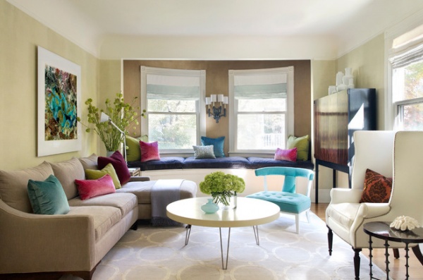
Directly across the foyer from the library is the living room, which continues the metallics and mix of eras, but amps up the color palette to incorporate bold jewel tones. “The dining room has a more natural earthy palette while the living room has more polish and glamour,” Tharp says. “I wanted to wake up the room with shimmer and beauty without making it feel overly serious.”
She pulled the color palette from the artwork over the sofa, which she created herself. In homage to the large-scale photography work of Massimo Vitali, she found a high-resolution Landsat 7 satellite photo of Lake Carnegie in Australia and had it super-scaled and printed at exhibition quality. She framed it with a wide border of white, back-mounted it to aluminum and face-mounted it to acrylic.
The curved alcove wall is directly across from the library’s fireplace, so Tharp created a conversation between the two. It has another custom metallic paint treatment in copper, creating a connection to the library’s metallics. A comfortable built-in bench with a velvet-covered cushion provides more extra seating.
The curved alcove window and coved ceilings inspired touches in the room like the round cocktail table, the circular pattern on the rug and the turquoise art deco-reminiscent chair. The cocktail table’s hairpin legs bring in a hint of the midcentury modern, while the sconce on the alcove wall has art deco style.
Because Tharp moved the dining room to the former TV room, a TV was a must for the homeowners in here. To keep the room sophisticated, Tharp came up with a custom cabinet that could house it (right). The hidden TV is anchored to the wall, which allowed her to create a narrow cabinet that doesn’t clunk up the room.
TV cabinet: custom by Norton Deamorim; wing chair: Victoria Hagan; Addison chair fabric: Ocean linen, Jonathan Adler; modern spindle side table: Oly; rug: Landry & Arcari
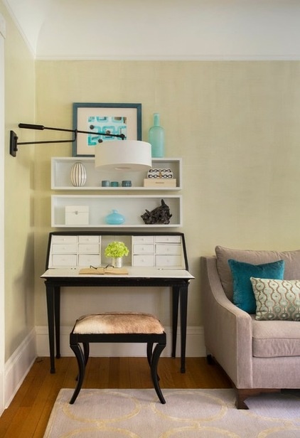
“I’m always looking for ways to make rooms multi-function,” Tharp says. A vintage desk provides a spot for writing notes and organizing invitations. A painting by Tharp brings in another nod to midcentury modern patterns.
Painting: Lisa K. Tharp
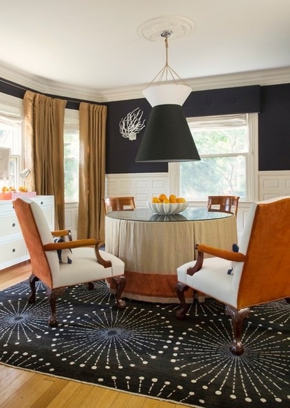
Moving to the back of the house, we find the dining room in the former TV room. Its new location placed it right across from the kitchen. While the mix of styles, use of luxe fabrics and original paneling continue in here, the room has a more neutral color palette full of sharp contrasts. The homeowners’ influence includes their love of sailing and a cache of luxe wool fabric they’d been saving to use somewhere.
The walls are fully upholstered in the fabric with X-shaped seams on the walls and tufted button detailing on the window cornices. The white paneling and trim provide a crisp contrast to the midnight blue fabric. The other fabrics juxtapose luxe and rough. Tharp reupholstered the homeowner’s existing chairs in leather and suede, and covered the table in linen with a silk band, topped with glass. The window treatments are a tweedy gold fabric. The rug’s circular pattern plays off the coved ceiling’s curves and is a fresh take on midcentury modern.
She found an Etsy artist who creates interesting pendant lights from two lampshades and commissioned her to make a very large one, specifying a nautical burlap twine for hanging it. “We hung it low to create a pool of light on the glass tabletop,” Tharp says.
Rug: Steven King; wall upholstery completed by Partners in Design; pendant light commission completed by Studio Jota, found via Etsy
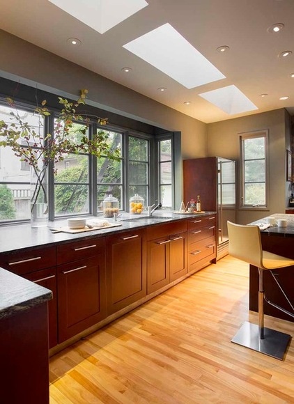
A few years earlier, the homeowners designed the kitchen themselves during a renovation. Because they already had it set up for the way they like to cook and gather with close family, they didn’t want to change a thing during this renovation. An extensive bay window looks out onto the backyard, while skylights let in the natural light. Soapstone countertops connect the more contemporary room to the home’s Victorian heritage.
Read more about soapstone
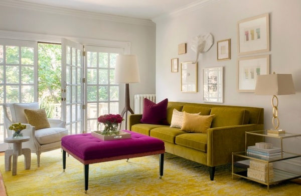
Upstairs, a sitting room is open to the staircase landing. The doors open to the balcony over the front door. The room continues the metallic shimmer and jewel tones used in the living room, bringing them into a more casual light and airy setting. “It feels connected to the richness on the first floor but has a more lighthearted feel,” Tharp says.
Floor lamp: Fern and Company (no longer in business); ottoman: Duralee; rug: Steven King; antique Louis chair: Charles Spada
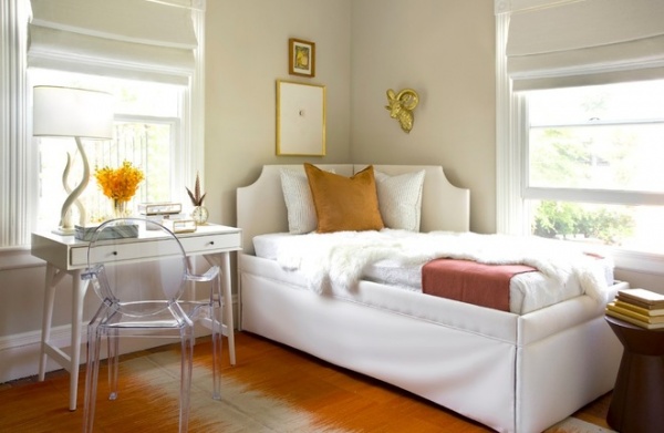
“The guest bedroom was basically a blank slate,” Tharp says. “My client wanted the room to feel like a serene respite from the day’s adventures, without feeling too serious.” The rug’s subtly tribal look, the Philippe Starck Louis Ghost chair, vintage clock and the artwork add personality.
Intaglio: Charles Spada
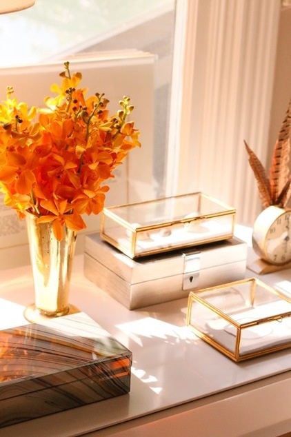
Photo by Fia Tharp
Glinting glass keepsake boxes display treasures found on world travels. Like the rest of the home, the guest room has an inviting collected-over-time look.
Browse more homes by style:
Small Homes | Colorful Homes | Eclectic Homes | Modern Homes | Contemporary Homes | Midcentury Homes | Ranch Homes | Traditional Homes | Barn Homes | Townhouses |Apartments | Lofts | Vacation Homes


