Houzz Tour: A New Mediterranean Home Goes Country
Most renovation stories start with a dreary assessment of the house before the remodel. In this case there were no leaky ceilings, dark rooms or cramped spaces to describe. When Jim and Stephanie Stafford purchased this home in Sonoma, California, it was practically new and served as a spec house in a recently developed neighborhood. The Staffords loved the location and the size of the house — they were looking for something large enough to host big family gatherings and their children’s friends — but less appealing were the look and feel of the home. “It was built in sort of the style of an old Mediterranean house, but it didn’t have the soul of an old Mediterranean house,” says Ken Linsteadt, their architect. “It also had some substandard details and wasn’t conducive to indoor-outdoor living. We decided to recast it as a modern country home.”
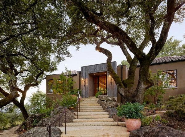
Photos by Matthew Millman
Houzz at a Glance
Who lives here: Jim and Stephanie Stafford and their 2 children
Location: Sonoma, California
Size: 5,000 square feet (464 square meters); 3 bedrooms, 4 bathrooms
One thing that helps give the house character is reclaimed wood. Jim Stafford is the founder of Restoration Timber, a company that sells salvaged wood. Once a high-tech executive, Stafford fell in love with the character of old wood when he built a house for himself — that’s also how he met Linsteadt. With that history, using reclaimed wood was a given.
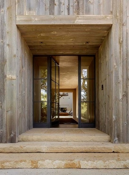
The use of salvaged wood is announced at the home’s entry. Changing the face of the home did much to alter its nature.
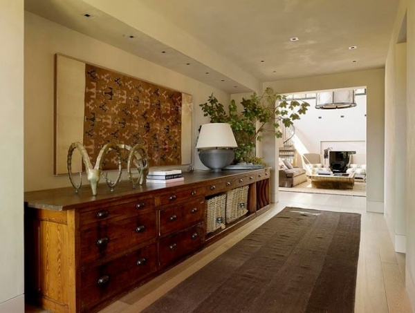
Inside, a long hallway leads to the signature space — a two-story-height room modeled after Villa Rotonda, a renaissance masterpiece in Italy.
The interior designer, Erin Martin, used large pieces of furniture throughout the home. Maria Franchi, a designer at Martin’s firm, says it was a key move. “Scale is always important,” she says. In this space Franchi says the larger pieces “ground the house and make it feel more permanent.”
Also important: The wall plaster, which has a bit of a sheen to it. “I don’t love supershiny plaster,” says Linsteadt. “But in this house it feels like a comfortable suede coat. It adds warmth to it.”
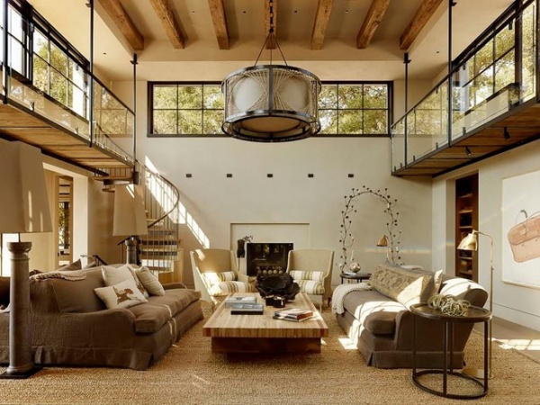
At the core of the house is where the design magic happens. “The space was just too tall,” says Linsteadt. “We needed to bring it into scale.”
The architect enlarged the clerestory windows that surround the space, then gave the inhabitants a way to access them with a horseshoe-shaped catwalk. “The catwalk brings the space into a livable scale, and from the windows you can look at the pool and back toward San Francisco,” he says. “The new windows show the tops of the oak trees, which are beautiful.”
Light fixture: custom by Erin Martin and Olivia Rogers; sofas: Axel Vervoordt with upholstery by Pollack; chairs: Christian Astuguevieille for Holly Hunt
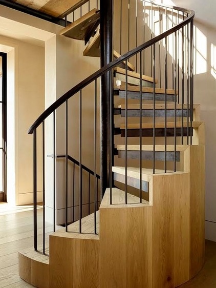
The catwalk is accessed by a spiral staircase in the corner of the room. It goes up to the high windows and travels down to a basement-level gym as well. The paneling around the stairs screens the lower level from view.
“We thought a lot about how this staircase was going to look,” says Linsteadt. “We tried to make it sculptural with tread detailing and the paneling. I think those elements save it from being an awkward space.”
What to consider when designing a staircase
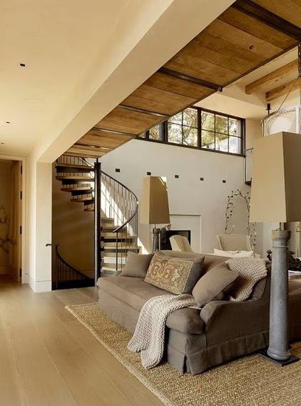
Sofas flank the fireplace, and one of them has two sides. This side of the sofa faces a bank of windows overlooking the Sonoma Valley. Franchi says the idea is simple: “You can stare at the view or stare at each other.”
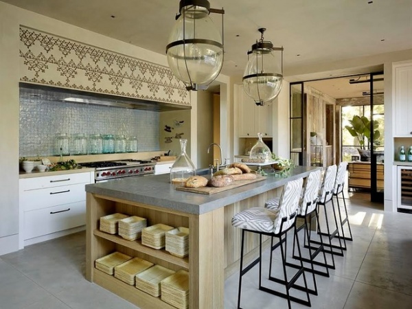
Many of the other rooms, such as the kitchen, radiate off the central space. The showstopper in the kitchen is a plaster hood adorned with a giant nailhead trim. “It was done by a great artist named Michael Duté,” says Franchi. “Erin thought the space needed something.”
Lindsteadt seconds the opinion, adding that the pattern gives the space sex appeal — a phrase not often associated with kitchens but applicable here.
The floors in the rooms at the back of the house, including the kitchen, are sandblasted concrete — designed to make it easy to walk in and out from the pool.
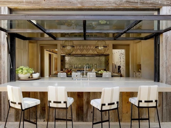
But the outdoor bar, with its metal and glass garage-style door, surely cuts down on the number of wet feet padding through the kitchen. “This feature gives the home a resort feel,” says Lindsteadt. “This is a place to have fun. You throw up the door and start serving the guests.”
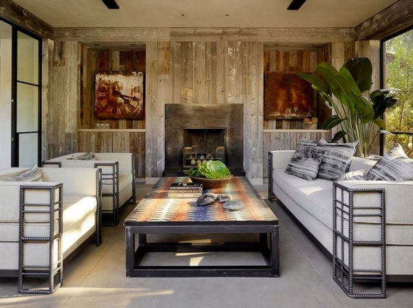
On one side of the kitchen is a screened-in porch, something of a rarity in California but essential for this family. “Jim is from the East Coast, and he really wanted this porch,” says Linsteadt. “He was right to do it, because we do have bugs in this state.” The architect adds that the porch feels like a true indoor-outdoor hybrid and is used year-round.
Coffee table: Van Den Akker Antiques; clocks: Obsolete
See more screened-in porches
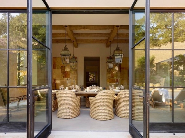
The dining room is on the other side of the kitchen. Large glass and metal doors open to the backyard, giving it the same direct connection to the outdoors the kitchen and screen porch enjoy. The Staffords wanted the room to feel both formal and casual. Although the desires seem to be at odds, the feel was accomplished with woven chairs and a dining room table that is crafted in segments. Depending on the party, the pieces can be pushed together to form one large table or pulled apart to make several small seating areas. Four hanging lanterns provide illumination for multiple table configurations.
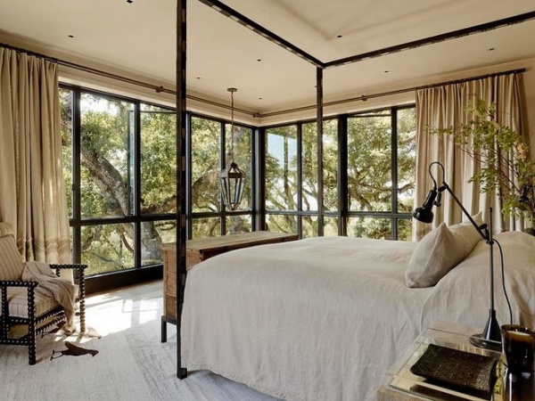
Linsteadt re-created the master bedroom with windows that wrap around the corner. Martin’s team kept the colors inside the room neutral. “The view is the color,” says Franchi.
Rug: Little Birds by Gypsy/Maturin, Kathleen Clements Design for Woven Accents
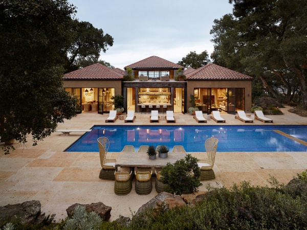
In this view from the backyard, it’s clear why the owners wanted a better connection with the outdoors. “We wanted to give the house more casualness and a sense of modernism,” says Linsteadt. “The reimagined house focuses on the outdoors. It’s a huge hit with the family.”
Browse more homes by style:
Small Homes | Colorful Homes | Eclectic Homes | Modern Homes | Contemporary Homes | Midcentury Homes | Ranch Homes | Traditional Homes | Barn Homes | Townhouses | Apartments | Lofts | Vacation Homes


