Houzz Tour: Snug London Cottage Has a Spacious Feel
As three-bedroom, three-bathroom houses go, this light, bright, 19th-century cottage is on the small side. In a 1,000-square-foot property, you might not expect to have the space for a separate dining area or find an en suite bathroom roomy enough to accommodate twin basins as well as a tub. But this house is all about expecting the unexpected. A modern hole-in-the-wall fireplace is the focal point of a classically furnished living room, a seemingly standard bookcase hides the TV, and even the teenage daughter’s bedroom has an air of sophistication.
Designer Philippa Thorp says the cottage, which hadn’t been touched for 20 years, was taken on as an architectural and interior design project for clients who have two children. The owners use the cottage for unwinding after work during the week, and on the weekend they head out to the countryside, so the emphasis was on creating an easy, relaxing home rather than a space for entertaining.
Thorp Design gutted the dark space, relocating the staircase and replacing the back wall with a glass panel. The firm installed skylights above the new kitchen area and reconfigured the upstairs space to (somehow) fit three double bedrooms with bathrooms. It was like working with “a tiny Rubik’s cube,” Thorp says.
Houzz at a Glance
Who lives here: A family of 4 on weekdays
Location: Chelsea, London
Era built: 19th century
Designer: Thorp Design
Size: 1,000 square feet (93 square meters)
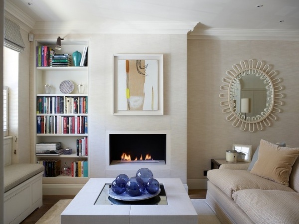
A hole-in-the-wall fireplace is the focal point in the living room. “I like to mix modern and traditional elements, so I chose this design to keep the lines crisp and clean,” Thorp says. “It’s also a good space-saving option, as it doesn’t have a hearth taking up valuable floor space.”
Storage is incorporated into all sorts of places, including the bench seat at the window, the leather-clad coffee table (which has drawers) and the alcove shelving, which hides a secret.
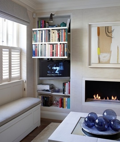
An ingenious rise-and-fall mechanism conceals the TV behind a false wall of books in the living room. “I had a dreadful time in a secondhand bookshop selecting books that were the right height and width, and knowing that I was planning to chop them all up,” Thorp says. “But when I confessed to the shop owner, he didn’t seem to think it was as sacrilegious as I did.”
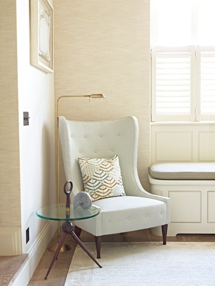
The floor was lowered 7 inches to improve the proportions on the ground floor. “Now you step down into the room, which helps give it a sense of being much bigger,” says Thorp. A wingback chair upholstered in pale fabric fits perfectly into the corner, while a glass-topped table helps maintain a sense of space.
The walls are covered in fabric rather than wallpaper. “The fabric helps to absorb any noise,” says the designer. “It all adds to the sense of it being a cozy little house. You feel wrapped in it.”
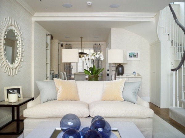
Pale colors have been used throughout the house. “Because it’s a small space, a light, bright palette made a lot of sense,” says Thorp. “The midoak floor is darker, which grounds the whole space.” Thorp Design selected all the furniture, lighting and artwork for the house.
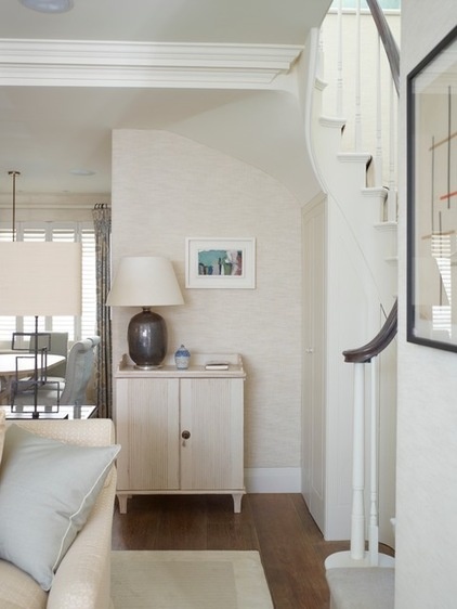
The relocated staircase, perfectly in keeping with the original architecture of the 19th-century cottage, is now tucked away at the edge of the room. An eclectic collection of lamps provides ambient lighting.
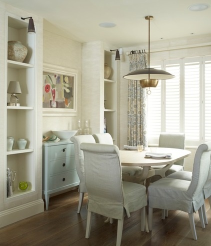
Covered chairs create a formal mood in the compact dining area. A brass pendant light defines the zone, while a perfectly proportioned chest fits snugly between the alcove shelves.
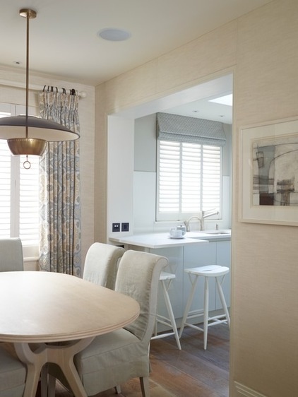
A large opening between the kitchen and dining room increases the sense of space and natural light. “I’m fixated on daylight. I think it’s the secret to happy spaces, and it makes everything seem bigger and airier. It’s uplifting,” says Thorp. Patterned curtains add color and texture.
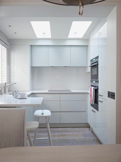
The pure white kitchen is illuminated by skylights, installed by Thorp and her team. Handle-free cupboards keep the look sleek and uncluttered. “In order to fit everything in, we had to arrange it in a U shape,” says Thorp. “The breakfast bar is really there to create space underneath.”
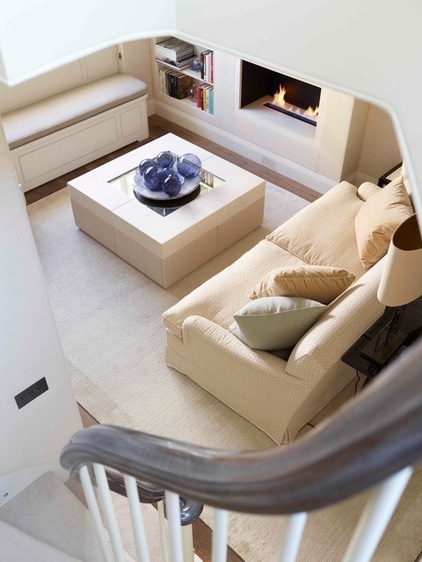
Crisp angles and clean lines make the living room feel spacious. Cream and off-white shades unite the scheme and ensure that no piece of furniture has to fight for attention.
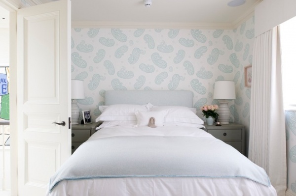
The daughter’s bedroom, with its matching lamps and bedside tables, wouldn’t look out of place in a boutique hotel. “The idea is that it will stand the test of time rather than being a room that would only suit a 13-year-old,” Thorp says.
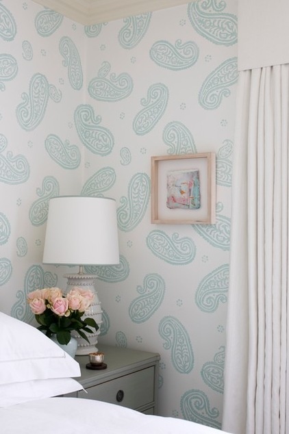
Pale blue paisley wallpaper is feminine without being overly girly. Ceramic lamp bases and a vase full of roses add a subtle vintage vibe that fits Thorp’s vision of creating “a small jewel.”
Considering Wallpaper? Here’s How to Get Started
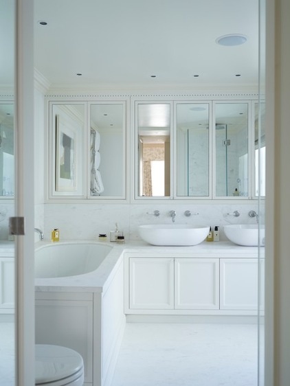
No space has been wasted in the master bathroom, in which Thorp incorporated double basins. A wall of mirrored cupboards keeps clutter at bay and bounces light around, and there’s more storage in the vanity unit. The white color scheme creates a quietly luxurious bathing zone.
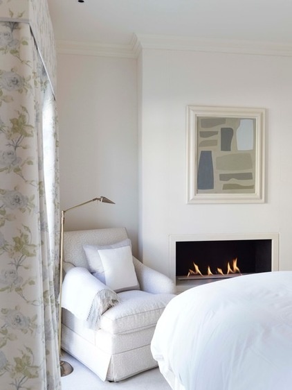
A classic botanical print and an abstract artwork are tied together by their shared palette. A traditional armchair and an open fire seem well placed in this period cottage.
So Your Style Is: Cottage
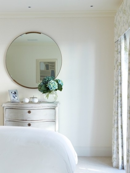
A shallow chest of drawers provides storage without dominating this bedroom. An antique mirror adds a sense of light, space and history.
Browse more homes by style:
Small Homes | Colorful Homes | Eclectic Homes | Modern Homes | Contemporary Homes | Midcentury Homes | Ranch Homes | Traditional Homes | Barn Homes | Townhouses | Apartments | Lofts | Vacation Homes


