Houzz Tour: New York Apartment Redesign Cooks Up Good Looks
Over its 150 years of existence, this apartment in a New York City brownstone has been home to a fashion model–actress, a renowned DJ and the woman responsible for the look of Vogue. It was Grace Coddington, longtime creative director for arguably the world’s best-known fashion magazine, who gave the two-story apartment a loft-like look. Downstairs it was one open space lined with closets and a tiny, out-of-the-way kitchen. A hard-to-navigate spiral staircase in the corner led up to a single bedroom and bath tucked under a steeply angled roof.
“Judging from the size of the kitchen, I would guess Grace Coddington didn’t cook much,” says Katie Martinez, the interior designer who, along with architect Anastasia Amelchakova, remodeled the space for the current owners — newlyweds Trevor and Christina Winstead. The bride and Martinez are old college friends, and she trusted the designer to help make the couple’s first home fit their sensibilities.
Houzz at a Glance
Location: Greenwich Village neighborhood of Manhattan
Year built: 1864
Team: Interior designer: Katie Martinez; architect: Anastasia Amelchakova, Studio Ppark
Size: 1,225 square feet (113 square meters); 2 bedrooms, 2 bathrooms
Martinez describes the former layout of the home as not suited to the Winsteads’ taste. “Christina likes to cook, so she wanted room to do that and entertain,” she says. “And although they definitely needed storage, they didn’t need a series of walk-in closets. It wasn’t as much of a priority for them.” The designer also says the upstairs bedroom with its “wacky” roofline was better suited to guests who were passing through than everyday living.
Together with the architect, Martinez reordered the layout, creating a lower-level master bedroom and bath, storage that was long and shallow rather than deep, and a more elegant, easy-to-climb staircase. That staircase now divides the lower level, with the living room and kitchen on one side of it and the master bedroom and bath on the other.
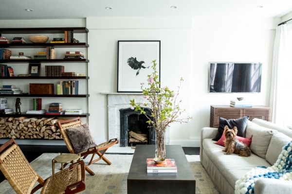
The living room showcases the chosen style of the couple: traditional with youthful, modern touches. “Christina and I did a lengthy exploration of what their style was,” Martinez says. “In the end she had a strong sense of personal style, and it is traditional and classic with modern elements. She and her husband grew up in very traditional suburban homes. They didn’t want completely traditional homes for themselves, but they didn’t want something cold and modern either. We landed on something that is graceful, classic and timeless with modern detailing and nods to contemporary style.”
Artwork: Geoffrey Knott, The Apartment by the Line
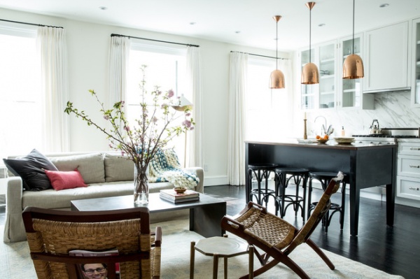
They removed a wall, so the kitchen is no longer separated from the living room. The kitchen’s furniture-like island and “hidden” appliances make the space live comfortably beside the living area.
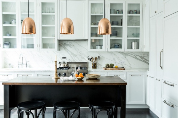
“It was really important to me that the island look like a piece of furniture,” Martinez says. “Because it’s right next to the living room, appearing as a table makes it more chic and less boring. If it were a traditional peninsula, it would effectively cut the space off from the living room again.” The designer made the piece a storage powerhouse by including drawers on one side and at the ends.
The dishwasher and the refrigerator (just out of frame) are covered with wood panels that match the cabinets, which also helps the space coexist peacefully with the living space.
Cabinet hardware: Restoration Hardware
How to Design a Kitchen Island
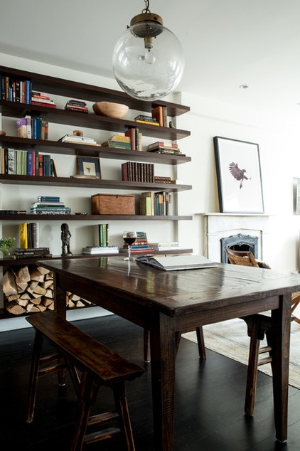
The dining area is at the other side of the living room. “We wanted the living room to be right by the windows, so we moved the dining area here,” Martinez says. “The narrow bench seats might not be applicable to every client, but this couple loves them — and they work in the small space.”
The long rows of shelves were installed by a previous resident (probably Coddington). “It can be tricky to make uninterrupted shelves look good,” Martinez says. “We did it by mixing in accessories with the books. These shelves hold everything from firewood on the lowest level to a wooden salad bowl on an uppermost shelf.”
Ways to declutter your bookshelves
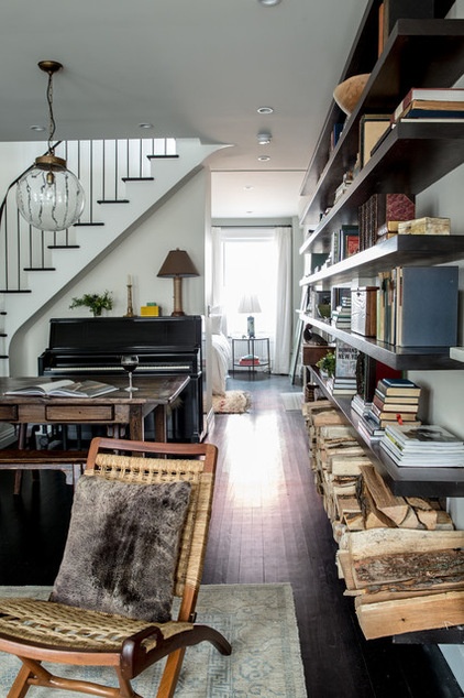
From the living room, you can see how the new staircase divides one space into two. You can glimpse the new master bedroom through the doorway under the stairs.
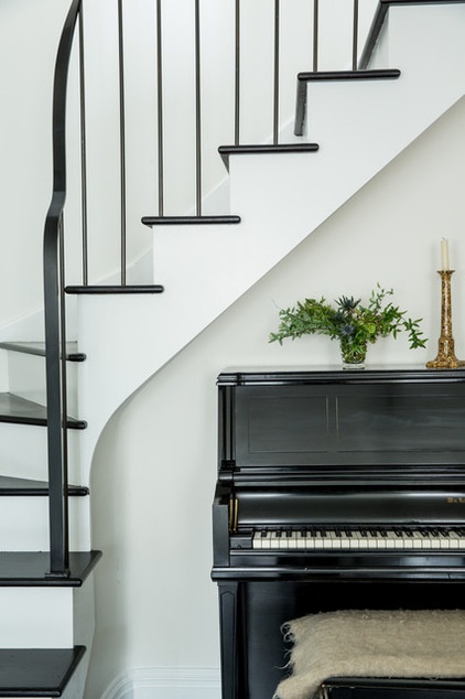
The new staircase gives the couple a spot for an upright piano, an heirloom from the groom’s family.
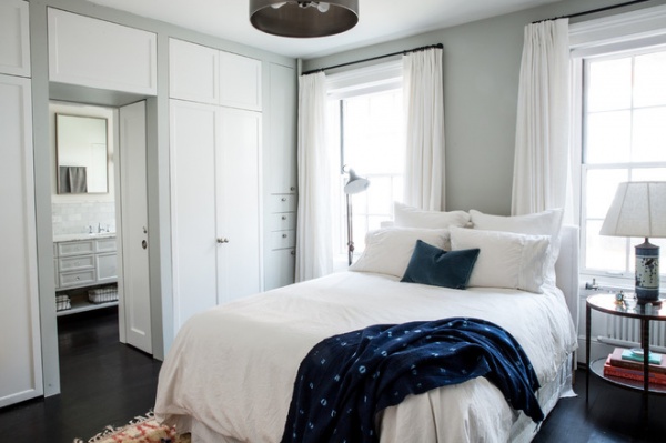
Instead of walk-in closets, the bedroom has a row of shallow closets along one wall. “I think it’s easier to quickly see and access your possessions in this kind of closet,” Martinez says. It also frees up floor space for the tranquil master bedroom, which is decorated in light tones. “We wanted to keep a consistent color palette throughout, something I think is important in a smaller space,” the designer says.
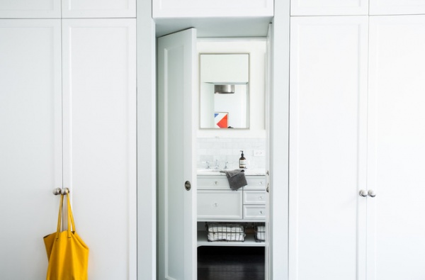
In the middle of the cabinets is a pair of double doors to the new master bath. The doors swing into a wall niche, allowing the portal to be completely clear when they are open.
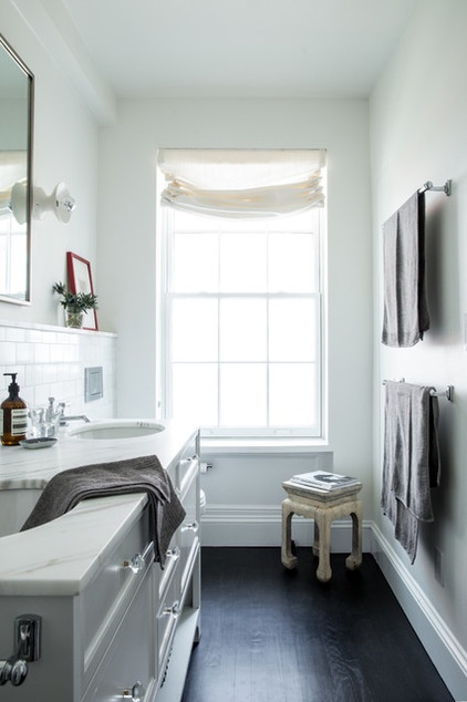
Inside the bath a small bump-out behind the sink was necessary to hide plumbing. The designer ran it all the way across the room to create symmetry and a display ledge.
Cabinet hardware: Anthropologie
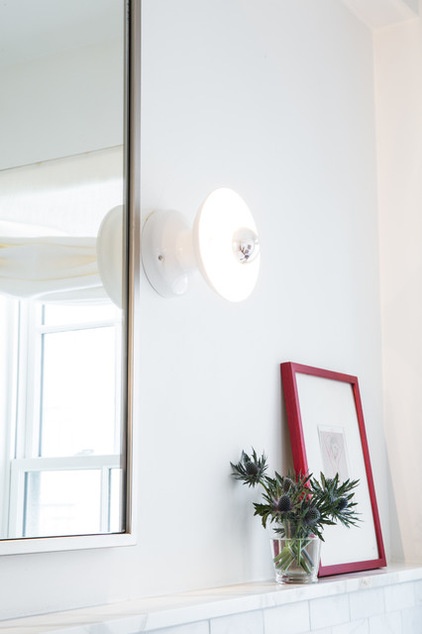
Beside the mirrors, a ceiling light fixture was hung in a new way to become a wall sconce. A silver-dipped lightbulb diffuses the light. “It’s a fresh look for a traditional vanity light concept,” Martinez says.
The new owners and its creators love the space. “There is a calm feeling about it that, to be honest, feels great,” Martinez says. “To me it’s modern and timeless, livable and chic.” And, as the home is equipped with a more functional kitchen, its days as a regular takeout delivery stop may be over.
Light fixture: Schoolhouse Electric
Browse more homes by style:
Small Homes | Colorful Homes | Eclectic Homes | Modern Homes | Contemporary Homes | Midcentury Homes | Ranch Homes | Traditional Homes | Barn Homes | Townhouses | Apartments | Lofts | Vacation Homes


