Room of the Day: Dark and Daring Pay Off in a Den Redesign
http://decor-ideas.org 10/19/2014 02:13 Decor Ideas
They tried calling it the music room, the den and the library, but no matter what they called it, no one in this family of four was using this room on their home’s first floor. After meeting interior designer Becca Galbraith, they were open to anything that would stop the space from being wasted. “My clients knew they liked handsome fabrics, rich textures and dark colors,” Galbraith says. “I suggested we do something dark and risky, and they were totally onboard.” Comfortable seating, an elegant media center, reading lamps, patterns and layers of textures turned the room into one of the most sought-after spaces in the house.
Photos by Rikki Snyder
Room at a Glance
Who lives here: A couple and their 2 teenage children
Location: Chatham, New Jersey
Size: About 95 square feet (9 square meters)
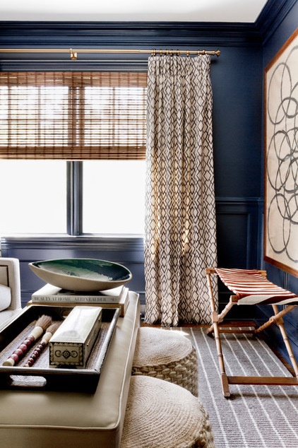
The room is located right off a larger living room–family room. Galbraith began with a favorite Robert Allen fabric for the window treatments. Because her clients were not afraid to go with dark paint, she pulled an indigo hue straight from the fabric to use on the walls. The owners had added extensive millwork throughout the house a few years prior, including wainscoting and other molding. At first they were a little wary of covering everything with the color, but they trusted their designer and let her go for it.
She used Polo Blue by Benjamin Moore on everything, using a high-gloss finish on the millwork and an eggshell finish on the walls for a subtle contrast. The high gloss, accentuated by the lighting, gives the millwork its due.
Next she layered in texture. A striped rug grounds the room in light neutral color. Vintage and global-inspired finds add character. The X-stool was made from a vintage luggage rack. Galbraith was drawn to the bamboo base’s color and texture, so she had her upholsterer replace the top with a hide. “An animal print always helps a room,” she says.
Another interesting texture turns up on the stools, which can be tucked right in underneath the leather ottoman. “I knew I wanted something woven and kind of “ropey,” she says. She found just the right extra seating with these CB2 pieces.
Blinds: bamboo in Sendai-Tortoise, Smith & Noble; drapery fabric: Robert Allen; rug: Stanton Carpet
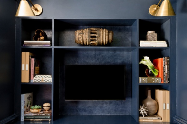
A TV was next on the owners’ wish list. To preserve the millwork all the way around the room, the media casework is freestanding. Matching moldings make them look built in and protect the wainscoting behind them.
The TV practically disappears into the inky paint. Galbraith used a special Venetian plaster treatment on the back panels of the unit to add a little pizzazz. She used the same color as the walls and a gray wash. Antique brass library sconces add shine.
“That top shelf was a big gap, and I knew we needed something really cool to fill it,” Galbraith says. She found it in the form of a vintage wooden Thai wheel from a sugar factory.
Sconces: Visual Comfort
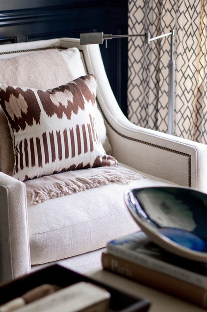
One of the homeowners wanted to be able to read in here and prop her feet up on the windowsill, so Galbraith chose comfortable upholstered swivel armchairs and swing-arm floor lamps.
The chairs are upholstered in a handsome tweed that adds more subtle pattern and texture. Luxe mohair throws and ikat pillows add comfort and style.
Pillows: Madeline Weinrib; throws: Thomas O’Brien; chairs: Gabby; bowl: West Elm; floor lamps: Restoration Hardware
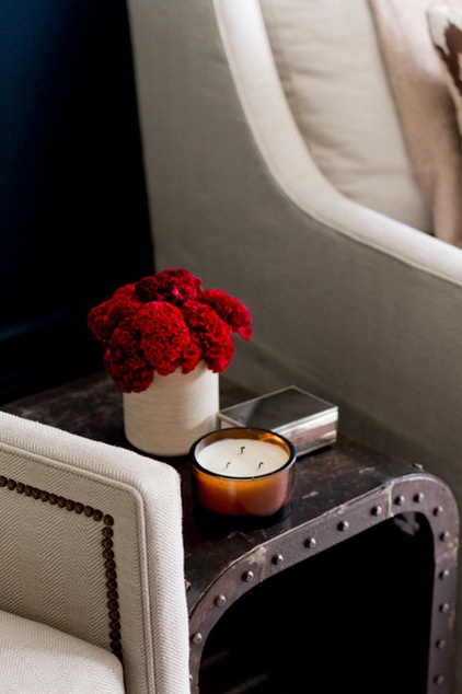
A vintage metal side table provides a convenient spot for drinks and the TV remote. “I wanted to add a little bit of edge to it,” Galbraith says. “I didn’t want to overkill with the brass, so I chose a bronzy finish for the lamps,” she says. The antique brass upholstery nails can also take on a bronze cast.
Side table: vintage, Ruby Beets
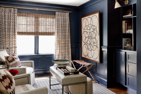
The ottoman is another repurposed piece; originally it was a table. Galbraith had the top replaced with a leather-like vinyl upholstery. The woven stools are just the right height for being tucked underneath.
Tip: Artwork doesn’t have to fit within molding. The piece in the room that packs the biggest design punch is one the homeowners weren’t sure about at first. “I brought the art over on approval on install day, and they were asking where in the world it was going to fit,” Galbraith says. “Once they saw it, they said it made the room — they absolutely had to have it.”
Art: Peter Dunham
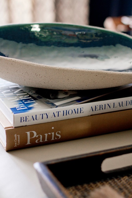
Final touches include this bowl with a gorgeous glaze that brings in a touch of aqua.
The new design of this room has made it a favorite spot where the teenagers gather with their friends and their parents curl up with books. “They used to call it the den and now they call it the gem,” Galbraith says. “Everyone loves to hang out in here.”
Galbraith is currently working on the family’s dining room, and they hope to get to the living room next.
Have you made over a room recently? Please show us what you did in the Comments!
More:
So Your Style Is: Darkly Romantic
See all Rooms of the Day
Related Articles Recommended


