Kitchen of the Week: Bringing Back Glamour to a Hollywood Hills Home
Sitting high on a hill overlooking Hollywood Boulevard in Los Angeles, this once-glorious house had been chopped up into rooms that had been rented to actors. Strange exterior doors from bedrooms and neglected spaces abounded. Seeking to bring the historic 1939 home back to its former glory, an adventurous young couple bought it and made plans for an extensive restoration. Rather than going for a strict historic restoration that wouldn’t function well for their modern family, they sought to give it an essence that respected the original architecture and era. Using striking colors and materials that will patinate and gain character with age, principal designer Jeff Troyer helped them create a kitchen that matches the home’s original glamour while functioning well for a growing modern family.
“After” photos by Lee Manning Photography
Kitchen at a Glance
Who lives here: A couple with a 1-year-old
Location: Los Angeles
Size: 232 square feet (21½ square meters)
Team: Design: JWT Associates; construction: Duane LaDage, Trueline
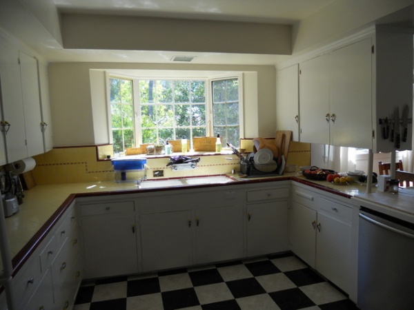
BEFORE: During the era in which the home was built, kitchens were simple utilitarian spaces and not the important hubs they are today. An oddly placed peninsula (right) originally separated the breakfast room from the rest of the kitchen. A lack of windows and upper cabinets gave the room a chopped-up feeling and made it dark.
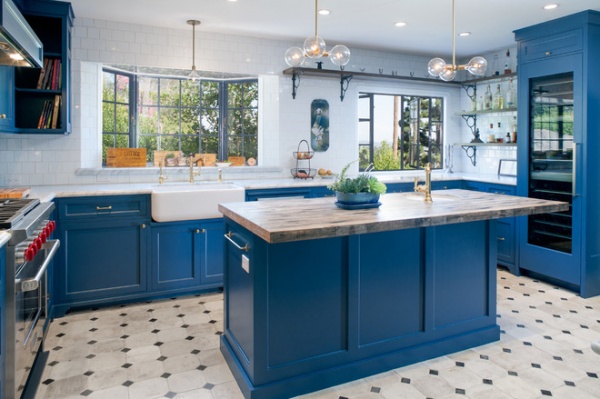
AFTER: Troyer removed the peninsula to combine the small kitchen and breakfast room into one large, open space. Now the entire room benefits from both windows, and the room is flooded with light. White tile helps keep it as bright as possible. The original windows were saved, offering views of Hollywood Boulevard and a tie to the past.
“These clients were really fun to work with — they were well traveled, sophisticated and had a great art collection but were also quirky in a good way,” the designer says. A few small details worth noting are the Carrara marble on the shelf beneath the bay window and the open cabinet shelves to the left, used for cookbooks. The owners are wine lovers, and the large glass-front refrigerator stores their collection.
“It was very important to keep this wall light; if you look at the situation before, you’ll see why,” Troyer says. Thus, he eschewed upper cabinets and made up the difference with extensive storage across the room.
Cabinet paint: Stiffkey Blue, Farrow & Ball; refrigerator, wine refrigerator, dishwasher: Miele; pendant lights: Satellite 3 with natural brass finish, Schoolhouse Electric; sinks: Julian; faucets: unlacquered brass, Newport Brass; reclaimed wood on island and on shelves: Croft House; range: Wolfe
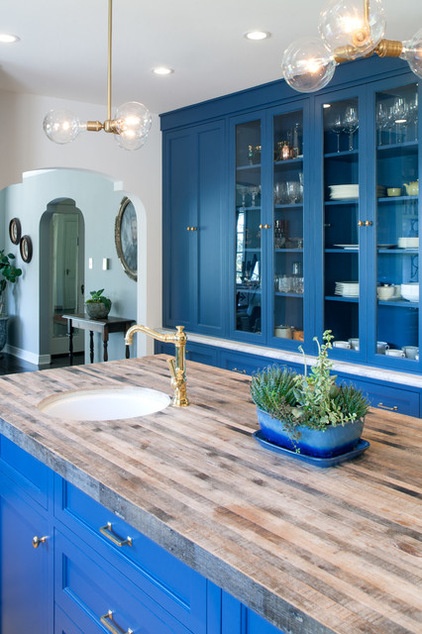
Extensive storage on the opposite wall allowed for the open window wall. The space to the left serves as a pantry; the space to the right stores china and glass. The glass cabinet fronts and the proportions give the piece more the feel of a china cabinet–vintage butler’s pantry than of typical modern cabinets, appropriate to the home’s history.
The new island top is a mix of reclaimed pine and oak wood with a wax finish. “My clients loved the idea of bowling alley–like wood strips, so we used two different types of wood in thin strips,” Troyer says.
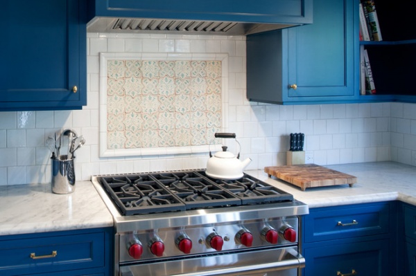
A lucky budget saver: One of the homeowner’s fathers is a contractor, and he just happened to have scads of beautiful handmade white 4- by 4-inch tile he wasn’t using. “It has lots of character to it,” Troyer says. He took full advantage, using it throughout the house (he also renovated bathrooms during a different renovation phase). He staggered the squares here, creating a fresh take that mashes up square tiles with a subway tile pattern. Saving on this item meant the owners could splurge on custom-painted ceramic tiles from Ann Sacks over the range.
One of the “living” finishes the couple opted for is brass, which is seen on the hardware, lights and faucets. It starts off looking shiny, but will age and patinate over time.
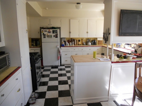
BEFORE: Another view prior to the renovation.
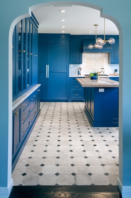
AFTER: Obviously, the brilliant blue paint is a major design element. When Troyer presented several material palettes to the couple during the first part of the design phase, they immediately fell in love with this daring hue.
The floor is antique cement tile from a monastery in France, acquired via Exquisite Surfaces. “After we installed this, we all agreed that the kitchen had soul,” Troyer says. To go along with the floors, the couple chose a material that could quickly match the tiles’ aged look: Carrara marble. “It will take on a life of its own as it stains and chips,” he says.
Tip: Carrara marble is not for everyone; before investing, test it out to see if it’s for you. When clients think they might want it, Troyer gives them a big piece to take home, lay atop their counter and abuse for awhile. If they see its imperfections as the marble’s getting better with age, it’s for them. If they freak out about stains and dings and want to keep it looking exactly as it did on installation day, it’s not.
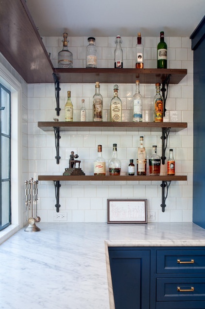
Vintage-looking wood shelves and iron corbels contrast with the elegant Carrara marble and serve as a bar area next to the wine refrigerator.
Shelf brackets: Anthropologie
Using White Marble: Hot Debate Over a Classic Beauty
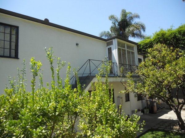
BEFORE: The renovation extended to a badly located laundry room and to the exterior. There was an exterior staircase that led to a clunky enclosed porch (part of the boardinghouse additions), neither of which was original to the home.
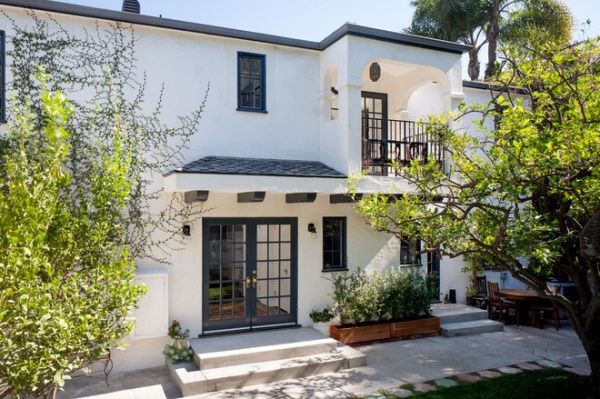
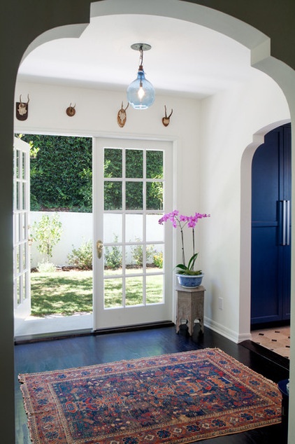
AFTER: Inside, a laundry room used to block this area off. Troyer moved it to open up the access and let in the light through new French doors. He also removed the exterior staircase, which was not original to the house, and added a new balcony and roof over the French doors that suited the historic architecture. The French doors now provide easy access between the kitchen and the backyard.
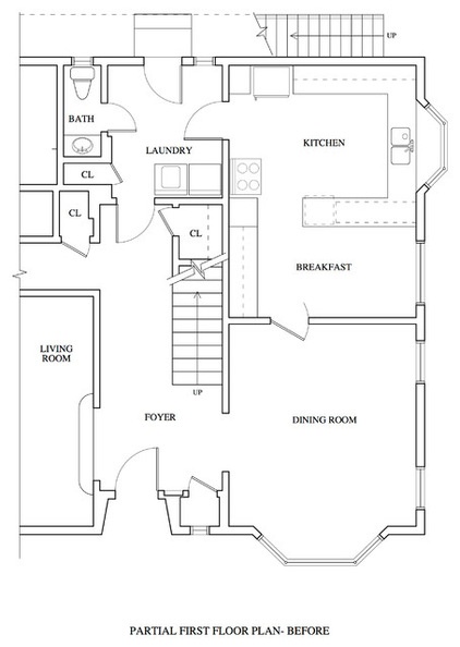
From the floor plan you can get a good idea of how the peninsula chopped up the kitchen. The outdoor dining area is located just past the top of this plan. As you can see, one had to navigate through the laundry room to get outside.
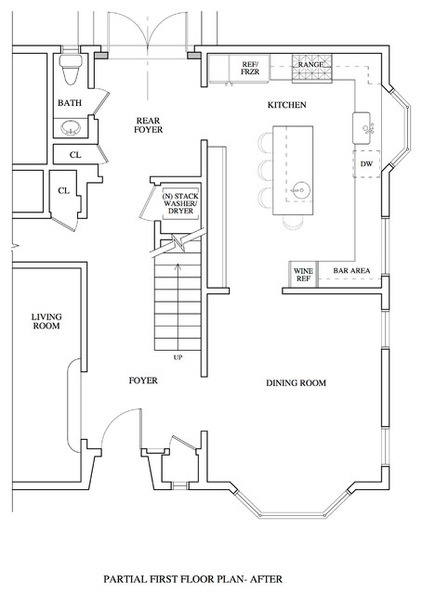
In this “after” plan, you can see where the new hallway, arched opening and French doors replaced the laundry room, allowing for easy access from the kitchen to the outdoor dining area. You can also see that Troyer relocated the laundry room underneath the staircase. The beautiful renovation honors the home’s history and has brought it back to life and revived its soul.
See more Kitchens of the Week


