Houzz Tour: A Classic Ranch House Rises to the Location
http://decor-ideas.org 10/14/2014 21:13 Decor Ideas
Janette Mallory’s clients loved the location of this Los Angeles ranch house, and with good reason. As she describes the site: “It’s perched on a hill in the Mount Olympus neighborhood in Hollywood Hills. It has incredible views of the Hollywood sign, downtown Los Angeles and the ocean.” There would be many people drawn to such a setting, but fewer would have the vision to like the house itself pre-remodel. The classic 1950s ranch was worn and outdated, but Mallory’s clients saw past that. “It had a great layout,” she says. “They decided to update it, but to leave the floor plan the same. Some people would have torn it completely down and started over again. They didn’t think they needed to go there.”
Houzz at a Glance
Location: Los Angeles
Size: 4,000 square feet (371 square meters); 4 bedrooms, 4 bathrooms
“The couple wanted the house to be contemporary and rustic,” says Mallory. “The vision fit with how the house already was — it had all the rustic elements of a classic ranch with a twist of midcentury style.”
Playing on that, the designer produced a transitional look that incorporated the owner’s love of collecting and art.
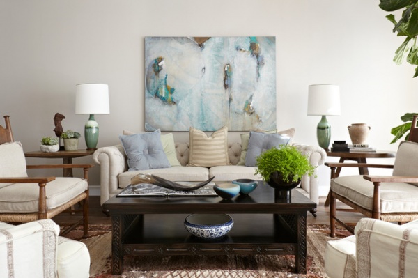
Many ranch homes of the time were built with sunken or step-down formal living rooms. It’s a feature that has, by and large, been remodeled away in many houses. Mallory and her clients chose to preserve the element, and to reach this room you must go down two steps. The space itself is furnished with a mix of classic, colonial, rustic and midcentury pieces — a similar stylistic brew that might have been found in many ranchers in the early 1950s.
Sofa and wooden armchairs: custom; coffee table: Michael Smith; rug: vintage; upholstered armchairs: Hollywood at Home
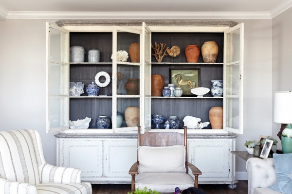
Although the layout and the indoor–outdoor nature of the home were carefully preserved, many of the tired finishes had to be replaced. “We had to take some areas down to the studs,” says Mallory. “In this room, the walls and crown molding are completely new.”
The cabinet is a replica of an antique, and it houses the couple’s collection of vessels. Throughout the house, furniture and accessories are large and simple, making for a graphic decorative statement. In this cabinet, the designer included natural elements such as corals, shells and ammonites. “I love mixing in items from nature,” she says. “They look pretty, they blend well with any style and they add dimension to a room.”
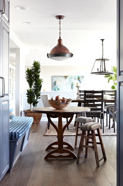
The living room is separated from the dining room and kitchen by a pony wall (you can just see the top of the abstract painting that hangs over the sofa peeking above it). Before the remodel, this shot would not have been possible, as the breakfast room was separated from the dining room by a floor-to-ceiling wall. “We just don’t live like that anymore,” Mallory says of the old space and the decision to open it up. “It’s much more desirable to be able to flow between spaces. And, now that the wall is gone, you can see through the windows of the dining room as you sit at the breakfast table and enjoy the view.”
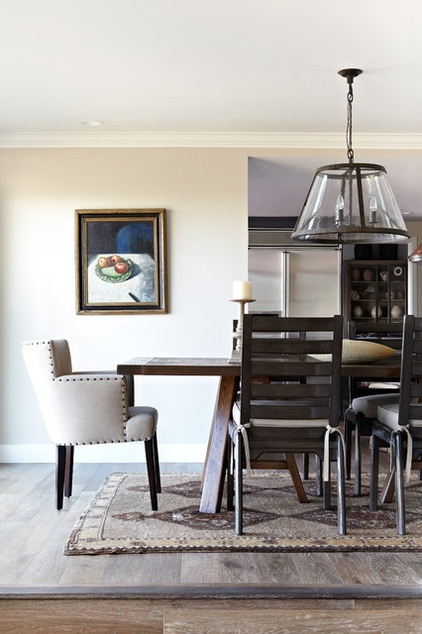
The dining room table has oversize ladder back chairs on the sides and upholstered chairs at each end. “I thought too many wooden chairs would make it feel heavy,” says Mallory. “The upholstered chairs soften things up a bit.”
Table and wooden chairs: Gregorius|Pineo; upholstered chair: Brenda Anton
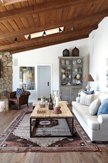
The family room is topped by another classic ranch house feature: A wood-paneled ceiling and exposed rafters. “They were in pretty bad shape, and very dirty,” says Mallory. But she and the owners didn’t want to paint them, choosing to sandblast and refinish them instead. The statement ceiling is balanced by a floor crafted from reclaimed walnut.
Flooring: Living Green
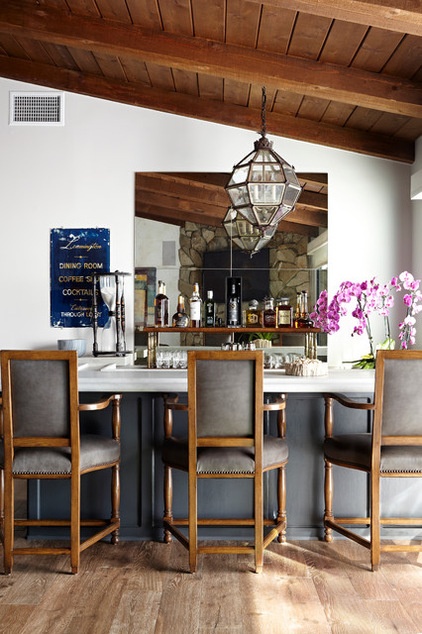
In another classic midcentury move, the family room contained a wet bar. The owners chose to preserve it, and Mallory gave it a new limestone top and accessories to freshen it up. “They entertain a lot, so it made sense to keep it,” she says. She chose to front it with incredibly comfortable chairs, making bellying up to the bar a relaxing experience. A giant antique hourglass and a vintage hotel sign advertising “dining, coffee and cocktails” decorate one end of the bar; while a new metal-and-wood shelf displays select bottles behind it.
Chairs: Jessica chairs, Paul Ferrante
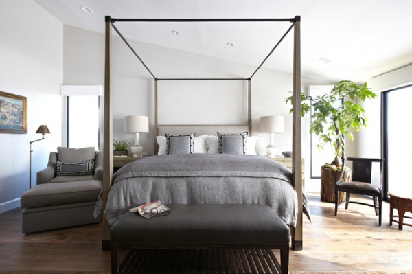
In the master bedroom, the designer started with the bed. “It was perfect, because I wanted it to be simple and clean-lined,” she says. “I fell in love with this piece.”
The designer put a chair on either side of the bed for her current event-loving clients. “Each one has a place to sit and enjoy their coffee and newspaper,” she says.
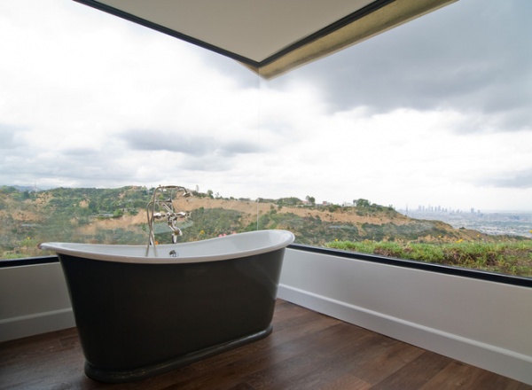
The master bedroom already had a corner glass window, designed to embrace a swoon-inducing view. “I love this tub because you can select your own color for the exterior,” says Mallory. “I didn’t want a stark white tub there.”
Tub: Waterworks
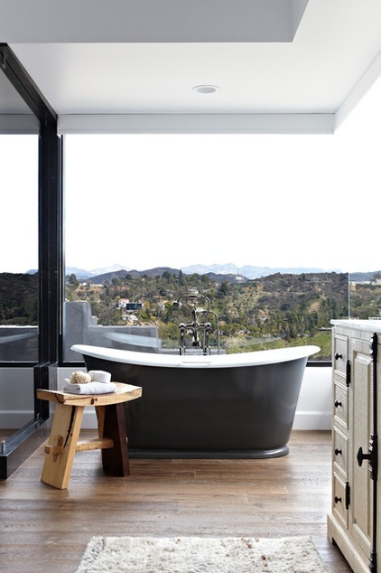
The elegant tub is positioned perfectly to enjoy the landscape — giving new meaning to the phrase “soak in the view.”
Browse more homes by style:Small Homes | Colorful Homes | Eclectic Homes | Modern Homes | Contemporary Homes | Midcentury Homes | Ranch Homes | Traditional Homes | Barn Homes | Townhouses | Apartments | Lofts |Vacation Homes
Related Articles Recommended


