Houzz Tour: 20 Acres, a Train and a Midcentury Gem Fuel a Remodel
http://decor-ideas.org 10/12/2014 01:13 Decor Ideas
While searching for land on a local real estate site in Grand Rapids, Michigan, a husband and wife kept coming across photos of a grim-looking house in a wooded area of the city. They tried avoiding it, but their real estate agent eventually persuaded them to go see it.
The photos hadn’t lied. The deteriorating home had been untouched for 20 years, and the front of the house had a large wood face that had turned orange in the sun. Not to mention that the woods on the 20-acre property were overgrown, and the creek had run over its banks and flooded the wetlands, so there was water everywhere.

Houzz at a Glance
Location: Grand Rapids, Michigan
Size: About 4,000 square feet (372 square feet); 3 bedrooms, 3½ bathrooms
Budget: $750,000

But as the couple walked the property and discovered that a one-quarter scale train that runs on tracks and a trestle spanning a pond came with the house, they tried to be a little more optimistic.
After they stepped inside the home, things got better too. The house had an interesting layout, and the original wood ceilings and stonework were in good shape. If they bought the home, they’d have the land they wanted right in the heart of the city. They wouldn’t have to commute far to the event staging company they owned — and they would have a train! After weighing all the considerations, they climbed aboard.
A Subaru car engine powers the train, which holds up to six passengers and trundles over a trestle that spans a picturesque pond. The track it runs on totals about 4,000 feet.
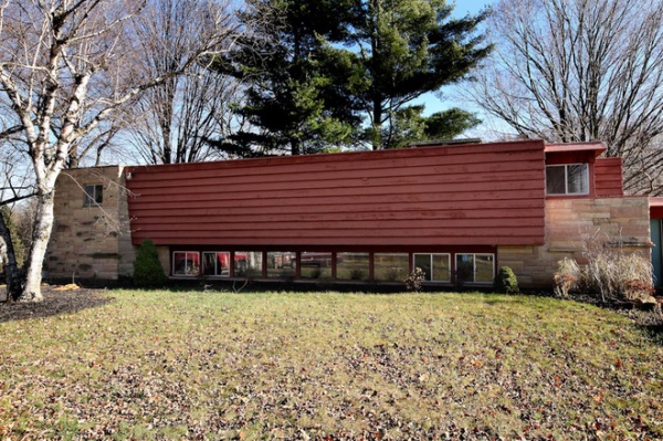
BEFORE: The home’s previous owner, tool maker Kenneth Stanaback, designed and built the train and tracks, as well as acted as general contractor for the home when it was built in 1957. Midcentury modern architect John Randal McDonald, whose work has often been compared to that of Frank Lloyd Wright, designed the home.
One of McDonald’s signature design moves was to downplay the front of his homes and focus on opening up the back. Here you can see that a row of basement light windows was nearly all that was on the front of this one. The homeowners preserved the original facade and added a new wing to the left.
“After” photos by M-Buck Studio
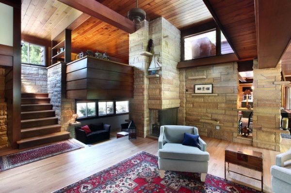
AFTER: The living room, shown here, features the original cedar tongue and groove ceilings and stone fireplace, which has three openings: one for the living room; one for the family room below, which is often referred to as “the pit”; and one for the office space above.
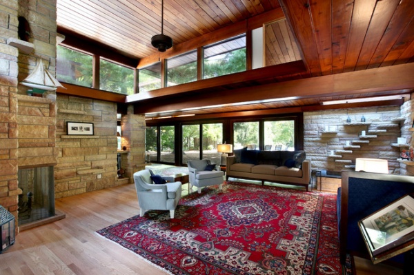
Most of the stone in the house is original. Some of it was found buried in the ground during construction and repurposed for certain elements, like the wall seen here to the right of the fireplace that now divides the living room and the dining room.
The stone step shelves on the interior corner wall to the right are actually part of a water feature with a pond below it.
All the floors and sliding doors are new.
BEFORE: The original kitchen and dining room were just off the living room. The homeowners wanted a larger kitchen, so they gutted this area.
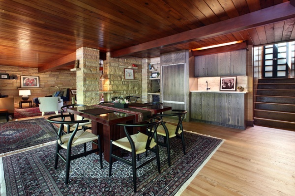
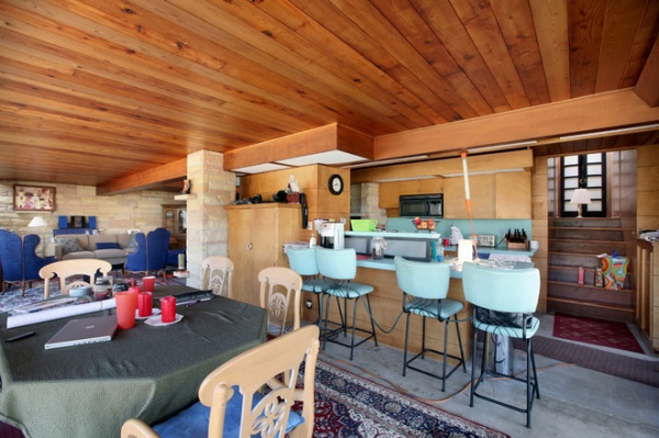
AFTER: The homeowners turned this space into a dining room with a Baker table that extends to seat 14 people. It’s surrounded by reproduction Hans Wegner Wishbone chairs.
The Sub-Zero fridge came with the home. It’s now used for the bar area on the back wall. The space also came with an indoor grill (to the left of the fridge) that once used wood or charcoal. To avoid fire hazards and the smell of smoke filling the home, the homeowners converted it into a water fountain and storage shelves.
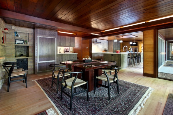
From this angle you can see into the new kitchen (at the upper right). It’s part of the new addition that also contains a master suite, garage, laundry room and bathroom. Everything beyond that opening was once an outdoor patio.
An architect handled the exterior and construction drawings, but the homeowners did all the interior design and planning themselves. They used graph paper and a pencil to figure out the dimensions and where to put things. They taped the papers on the walls, and the builders, led by James Balk of Scott Christopher Homes, worked off those.
As for ideas, the homeowners say they studied Houzz every night on their iPad while lying in bed to come up with layout choices, furnishings, color schemes and even the design of a staircase. They then picked out all the materials, light fixtures and furnishings online.
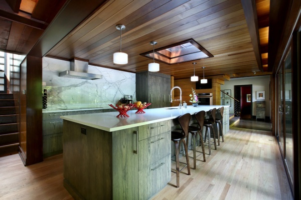
Custom ash cabinets with a gray stain and an 11-foot single-slab marble backsplash define the new kitchen. The countertops are white quartz.
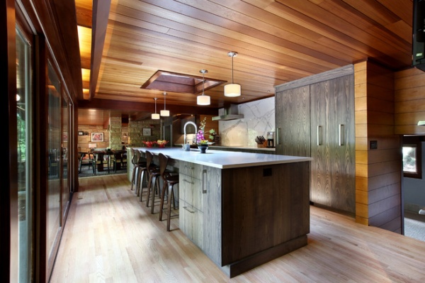
The 16-foot island provides ample storage on both sides.
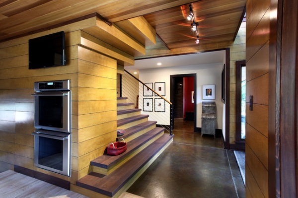
Double ovens and a TV sit in a maple wall that wraps around to the staircase that connects to the master suite.
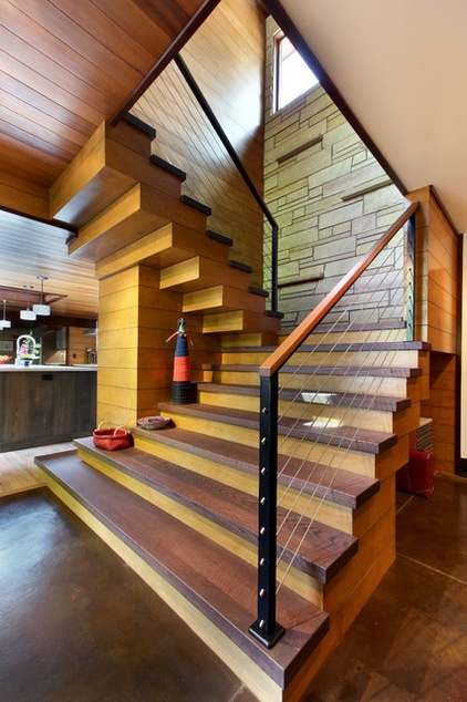
The homeowners designed the oak staircase themselves from Houzz photos. Balk then interpreted the homeowners’ drawings and added a few nuances of his own, like a stain on the treads to make them darker than the risers.
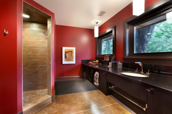
The new “swim bath,” as it’s called because it’s near the back doors that lead to the pool, is stocked with beach towels and guest supplies. The homeowners got the idea for the bench from a photo they saw on Houzz.
Countertops: granite, Great Lakes Granite Works
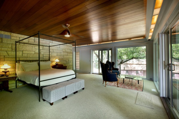
From the new master bedroom, the homeowners have views of a barn, the pond and the land beyond. They spent last summer going up and down an extra-large stepladder anticipating what the views would be like from each window. They wanted to make sure they saw what they thought they were going to see.
Because they don’t have any neighbors, they don’t have any window coverings. This was a bold leap, as the owners came from a home with blackout curtains. But they haven’t had any problems sleeping.
Bed: Room & Board
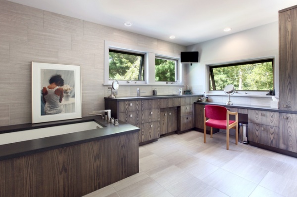
The new master bathroom cabinets are the same as the kitchen but with different hardware. A 4-foot single trough sink sits in concrete countertops.
Tile, carpet: Century Flooring; countertops: Hard Topix
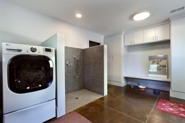
The laundry room is just off the garage. There’s a small pet shower where the homeowners can wash their pug and golden retriever, or rinse their boots after doing their own landscaping.
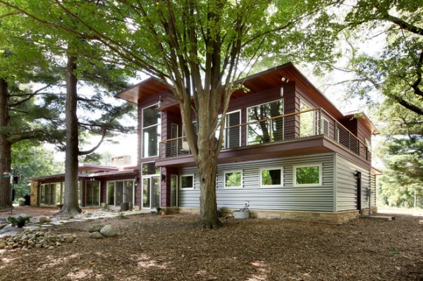
When the homeowners saw renderings of the new addition (seen here from the back of the home) done solely in stone, they felt it was too heavy, so they looked for another material. They considered wood, but they didn’t like how that looked either. They saw a photo on Houzz that used metal siding, and they liked the idea of wrapping and defining the more utilitarian parts of the home — the laundry, garage etc. — with it.
Windows: H Window
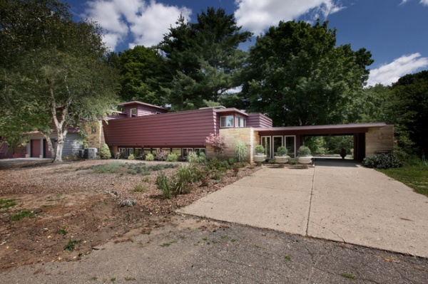
From this angle you can just see the new addition to the left of the original home, the exterior of which was updated with Cabot’s Solid Stain in Plum Island. The homeowners are currently in the process of doing their own landscaping.
See more photos of this home
Team:
Drafting service: Sears Architects
General contractor: Scott Christopher Homes
Steel siding: Buist Sheet Metal
Excavation: Grade 8 Excavating
Roofing: Grandville Roofing and Siding
Paint: Jon DeGraaf Painting
Masonry work: Karsten Masonry
Plumbing: Lameyer Plumbing
Concrete: Nobel Concrete
Interior doors and front door: R and J Raven
Electric: Res.Com
Hardwood floors: RT Baldwin
Hardware: US10B
Browse more homes by style:
Small Homes | Colorful Homes | Eclectic Homes | Modern Homes | Contemporary Homes | Midcentury Homes | Ranch Homes | Traditional Homes | Barn Homes | Townhouses | Apartments | Lofts | Vacation Homes
Related Articles Recommended


