Switching Up a Colonial Home to Suit a Modern Family
The layout of their colonial home in East Greenwich, Rhode Island, was not working for this active family of five. “The house was not cozy or kid friendly,” says interior designer Jocelyn Chiappone, of Digs Design Company. The family room was too small, they used the formal dining room only for Christmas dinner, and the living room was full of uncomfortable small-scale inherited antiques. After getting to know the family and the spaces, Chiappone shook up the layout and uses for each room. This included creating a billiards room in the former dining room, making a formal living room a more casual and comfortable hang-out space, relocating the family room to a former screened-in porch space and creating a special homework room, library and part-time formal dining room in the old family room. Follow along and see how swapping rooms around created a home that is perfect for this family and full of good design tricks.
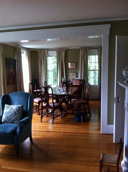
The home had a formal living room (foreground) that opened to a formal dining room, and the family rarely used either.
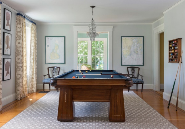
The switch: Dining room to billiards room. This family prefers shooting pool to formal dining, and the former dining room provided just the right space for a pool table.
“When I first sit down with clients, I ask them about pieces they already have that they’d like incorporated into the design,” Chiappone says.
The pool table is an antique family piece that she had re-felted in a classic blue. Also, when Chiappone saw the family’s collection of ship models, she knew right away that the crystal ship chandelier was just the one for this space.
Grounding the room is a geometric David Hicks rug, which adds a modern touch. The nautical charts are of Block Island and Deer Island, two places the family enjoys visiting during the summer. The two chairs are family antiques that Chiappone re-covered in a more modern print that picks up on the blue felt.
Take Your Cue: Planning a Pool Table Room
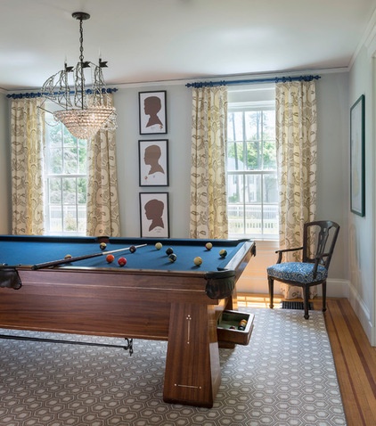
The silhouettes of the four boys were something else the family already had. They had planned to hang them in a hallway, but Chiappone chose this more prominent placement.
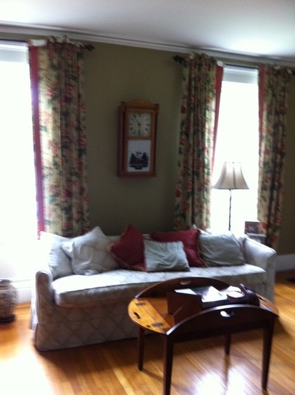
The formal living room was rather bare and the antiques were lovely but didn’t invite lounging.
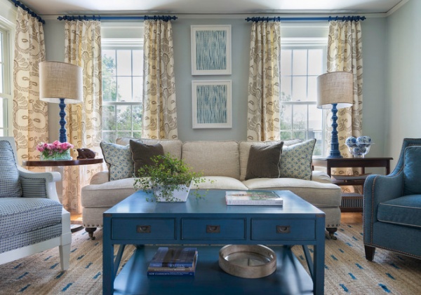
The switch: Unused formal living room filled with antiques to casual living room with comfortable seating.
Chiappone layered in lots of soft and comfortable textiles to make the living room more inviting. Next she threw off formal symmetry a bit with mixed doubles: a chair with a white wooden frame and a solid blue chair make an unconventional pair on either side of the sofa, as do the vintage rattan-detailed side table and the Lucite tube and wood one. The living room went from being one of the least popular spots in the house to one of the most used after the redesign.
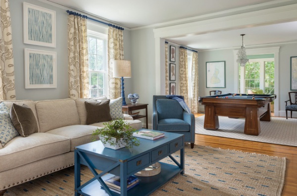
Because the living room opens to the billiards room, Chiappone continued the same paint, drapes, drapery rods and color palette through both spaces. She played off the pool table’s blue felt in several places, including the rug, coffee table, table lamps and drapery rods. She had the rods lacquered in the same hue as the table lamps. “The printing on the sisal rug adds a graphic element and makes it more special,” she says.
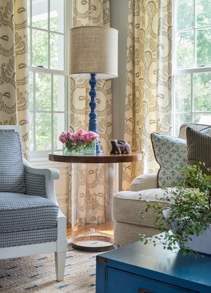
Chiappone took a cue from the pool table’s wood base, bringing in more wood to this end of the space via the side tables. This Lucite tube has a wooden top.
While she added more traditional furniture silhouettes, she punched them up with patterned textiles on the throw pillows, drapes and artwork. The drapery fabric has a large-scale hand-blocked pattern, the artwork over the sofa is framed handmade indigo batik textiles. Most important, she made this room one that everyone loves to sink into. The mix of materials makes things inviting and interesting at once.
Wall paint (in both rooms): Wickham Gray, Benjamin Moore; drapery fabric: Peter Fasano; coffee table: Somerset Bay Home; sisal rug: Serena & Lily; sofa: Lexington Home; art over sofa (seen in previous photo): “Organic Indigo,” by Aboubakar Fofana, St. Frank
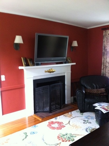
This space off the kitchen originally served as the family room but proved too tiny for a family of five to enjoy it together.
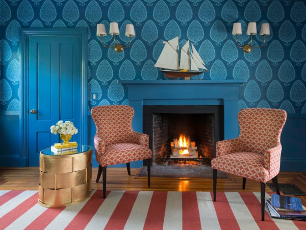
The switch: Family room to homework room, morning coffee room and part-time dining room. Finding a better spot for a family room on a former screened-in porch, Chiappone implemented a clever multipurpose solution in its former place. The room serves as a good space for the clients’ three sons to do their homework. With its location close to the coffeemaker, it’s also a cozy spot in which to enjoy a cup of joe with the fire and the newspaper.
The family enjoys gathering for meals at the new banquettes in their kitchen and the new family room. On the rare occasion that they have a formal sit-down dinner, the room can be transformed to accommodate it. The library table has two leaves that extend to accommodate 12, and there’s a stash of inherited antique dining chairs in the basement. The two armchairs serve as host and hostess chairs.
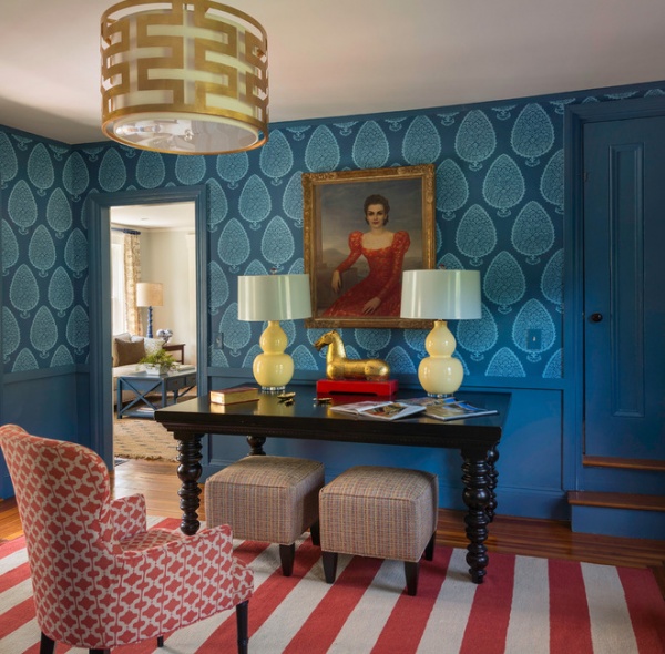
A special family piece, an heirloom portrait of an ancestor, wielded a big influence in this room. “I pulled the entire color palette for the room from this painting,” Chiappone says. She recommends choosing a big piece first, in this case the flat-weave rug, which matches the coral red on grandmother’s dress. Next she matched the persimmon geometric fabric on the armchairs to it. The woven ottomans pull in all of the colors in a modern way and add a casual touch. “We added the yellow lamps last. It just makes it more interesting and youthful,” she says.
The library table is where the boys do their homework, with close proximity to parents working in the kitchen. “Because the room is a pass-through between the kitchen and the living room, a dining table in the middle of the room would have gotten in the way,“ she says of its placement against the wall.
Wall paint: custom; wallpaper: Leaf, Katie Ridder; rug: Surya; chair fabric: Duralee; pendant light: Worlds Away; sconces (seen in first photo): Visual Comfort
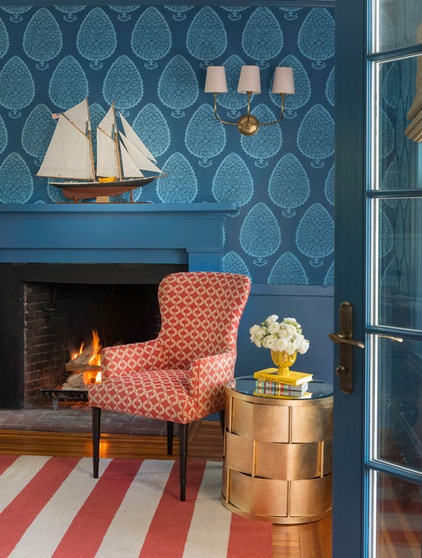
More heirloom pieces the family wanted to incorporate were a collection of ship models, including this one on the mantel. Chiappone nodded to nautical style with brass, seen on the ceiling light, woven side table and antique horse, without making a theme of it.
The large-scale wallpaper is a powerful element in the room. Tip: When you invest in wallpaper, make sure it gets the attention it deserves. “When you have a lot of doors and other trim, if you match the paint color to the field in the wallpaper, it makes them disappear,” Chiappone says. This gives the wallpaper a dominant presence.
She also saved money and the owners’ sanity by painting the wall below the chair rail rather than papering it. “It’s also much more durable this way,” she says. “If one of the boys scratched the paint, it wouldn’t be a big deal, but if they scratched the wallpaper, it would be!”
Considering Wallpaper? How to Get Started
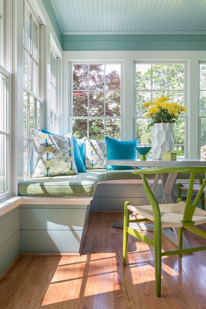
The switch: Screened-in porch to enclosed family room. This once-seasonal room is now usable all year round. It’s a long, narrow space, so Chiappone divided it into three distinct spaces — a banquette complete with built-in aquarium at one end, a wet bar at the other and a comfy TV lounge area in the middle.
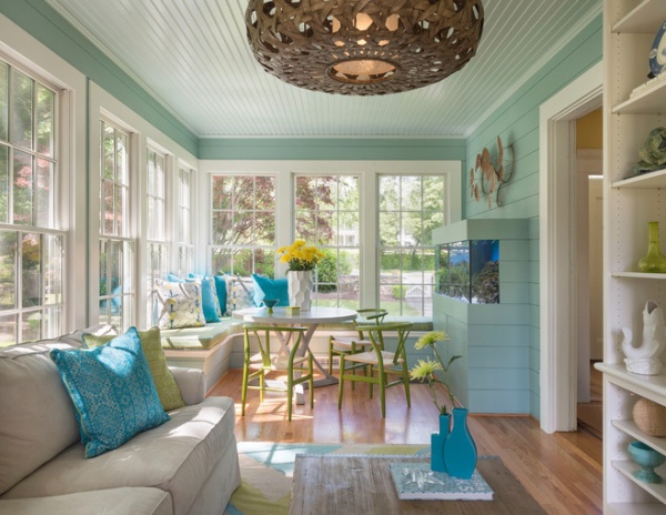
“These clients were not afraid of color,” Chiappone says. She used a bright summery color palette, shiplap and beadboard that suited the porch feel but went heavier with the upholstery fabrics, because the room is now used in all seasons. All of the fabrics she chose are durable and can stand up to abuse.
Another way she kept the room from feeling narrow was by keeping the windows bare. She studied the way the light hit the room throughout the day first. “This keeps it feeling much more open, and they didn’t have any privacy issues here,” Chiappone says. She explains that the oversize woven pendant light and the coffee table provide a strong center to “break up the bowling alley feel” of the long space. The coffee table is made of reclaimed wood with a galvanized-metal-wrapped top. “I like to add something to a room that doesn’t look completely new,” she says.
Wall paint: Covington Blue, Benjamin Moore; sofa: Mitchell Gold + Bob Williams; Manhattan Saucer Pendant: Palecek; rug: Surya
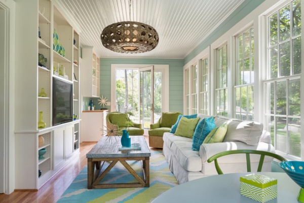
Built-ins house the TV, Xbox and other media, as well as a playful collection of brightly colored objects. Just past the TV is an opening into the billiard room. At the far end, two funky rattan and chenille swivel chairs can turn to face the wet bar area. This function makes entertaining out here easy. In fact, all of the changes and room swaps transformed the house into a highly functional, cozy and inviting home.
More: Renovation Ideas: Playing With a Colonial’s Floor Plan
Tell us: What do you think of this reconfiguration? What rooms in your house would you think about changing up?


