9 Fun Ceiling Colors to Try Right Now
http://decor-ideas.org 10/07/2014 22:38 Decor Ideas
I’m always on the lookout for creative ways to sneak fun color into a client’s home. It can be tough to pull off an intense color on all four walls of a room without making the space feel small, dark and claustrophobic, so I tend to prefer injecting high-voltage hues in smaller bits and pieces, or in unexpected ways. It’s no secret now that a bold ceiling color is a great way to set the tone in a room and draw the eye upward and around the space. But choosing the right bold color is crucial. Here are some of my favorite bold ceiling colors right now along with suggestions for how to make them work in your home.
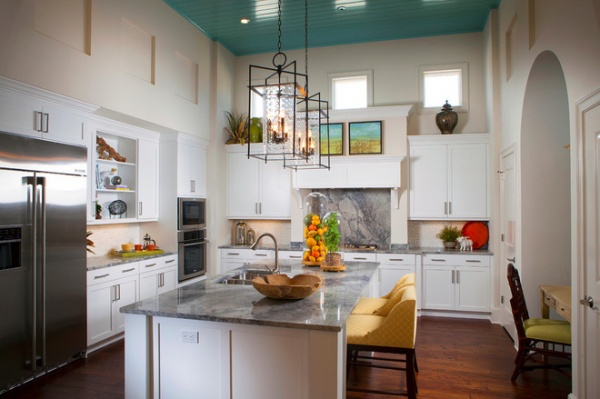
Blue is a smart choice for ceiling color because it mimics the sky, which can bring a tranquil feeling to a space.
Note how the ceiling paint used here has a glossy sheen. Normally I recommend using flat paint for ceilings, as it’s best for hiding imperfections, but if your ceiling surface is in good shape, then a glossy sheen is a nice choice to help bounce light around a space.
This is particularly beneficial if you are using a deeper, darker hue on the ceiling. A flat sheen won’t reflect light back into the space, so, depending on the color used, it can appear heavy and dull. A glossy sheen will reflect light and break up the expanse of strong color.
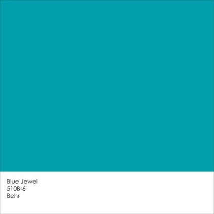
Get a similar look with Blue Jewel from Behr.
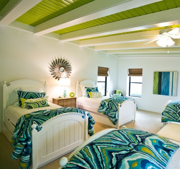
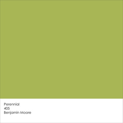
This is a lovely leafy-green color, but one that would undoubtedly overwhelm the space if painted on all four walls. If you’ve got ceiling joists, leave them exposed to help break up the large expanse of green and highlight an interesting architectural element.
Get a similar look with Perennial from Benjamin Moore.
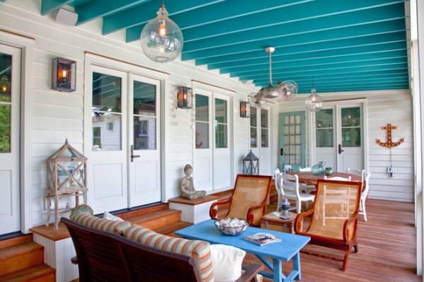
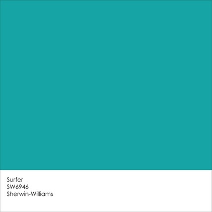
Painting the joists can also help create texture. A blue porch ceiling is fairly common, especially in the southern United States, but you’ll see a soft, sky blue used more often than not. Try amping up the intensity with a deeper, watery blue such as the one in the room seen here.
Get a similar look with Surfer from Sherwin-Williams.
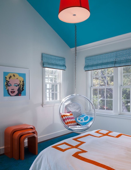
Bold colors should be limited to the items or features of your home that you want to highlight, such as the dramatic ceiling line here. If you go with a dramatic ceiling color, such as an intense blue like this one, try keeping the overall color palette simple, with no more than two bold colors paired with one or two neutrals. I also recommend selecting a white or light neutral wall color, which allows the ceiling to take center stage.
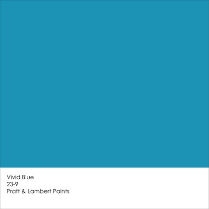
Get a similar look with Vivid Blue from Pratt & Lambert Paints.
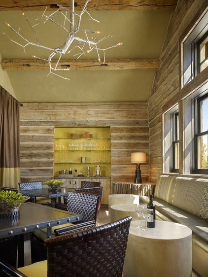
Here’s an example of a softer approach, for those who are interested in moving beyond a ceiling but don’t necessarily want an intense hue overhead.
Just keep in mind that colors almost always appear darker on the ceiling than on the wall, due to how light hits the differing planes. So if you are testing ceiling color samples, be sure to put them up on the actual ceiling — or, better yet, paint your sample on lightweight poster board or foam core and then securely attach the board to the ceiling with painter’s tape.
Move your sample around different areas of the ceiling and check it out during different times of the day to get a sense of how the color appears in a variety of real-life light conditions.
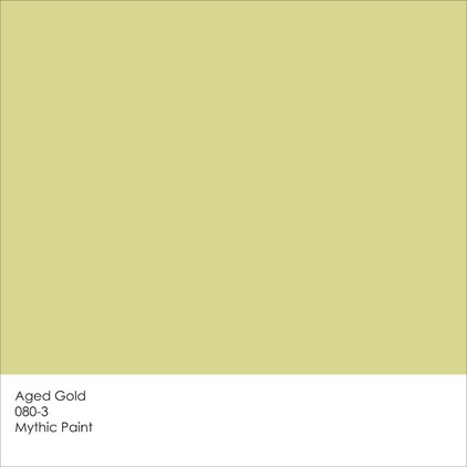
Get a similar look with Aged Gold from Mythic Paint.

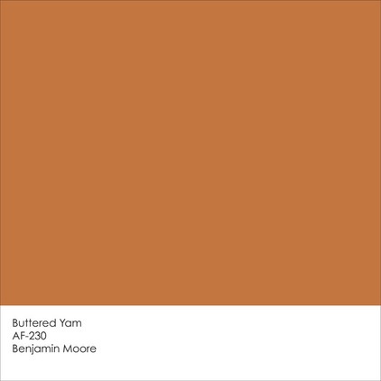
Many homeowners are understandably hesitant to paint a vibrant color on the ceiling, because it can be a literal pain in the neck to repaint down the road should they get tired of the hue. If you want to try a fun color overhead but are concerned about the amount of work involved, consider painting a ceiling accent band only, whether you have ceiling moldings or not. It’s a great way to draw the eye up and tie in a bold color you are using elsewhere in the room.
Get the look with Buttered Yam from Benjamin Moore.
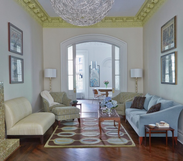
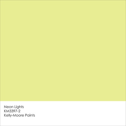
These intricate decorative moldings deserve to take center stage in this room, and the best way to help them do that was with color — in this case a crisp chartreuse. The color also keeps the room from having an overly formal and stuffy feel. Instead it feels youthful and welcoming.
Get a similar look with Neon Lights from Kelly-Moore Paints.
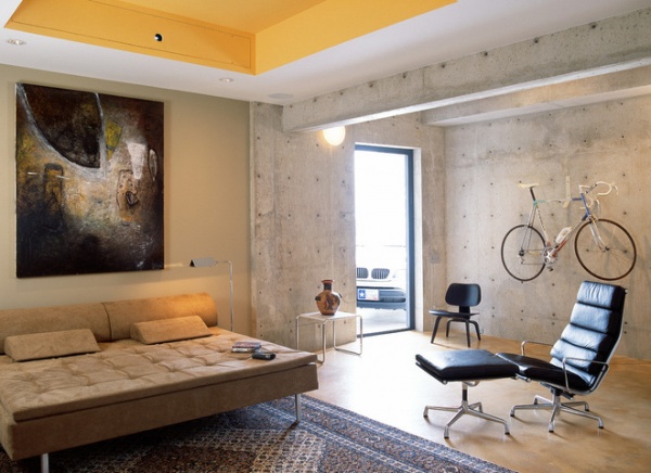
I love the unexpected chunk of color in this otherwise neutral and minimalist space. It does a great job of warming up the cool, concrete-clad room.
Again, painting all four walls, or the entire ceiling, in this bold hue might be too much for most folks, but using it to highlight the tray ceiling is a great use of — and amount of — the strong color.
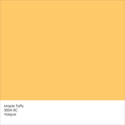
Get a similar look with Maple Taffy from Valspar.
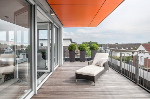
For those apprehensive about painting their bedroom or living room ceiling a vibrant hue, think about using a bold ceiling color in “occasional” spaces, those areas of your home that you don’t spend large amounts of time in.
If you think this particular deep orange hue might drive you nutty in your kitchen or living room, try it on the ceiling of a small deck overhang instead, or in a guest bathroom or powder room. It would add a nice punch of color in an unexpected area of the home.
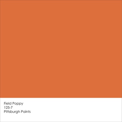
Get a similar look with Field Poppy from Pittsburgh Paints.
More: 11 Reasons to Paint Your Ceiling Black
Tell us: What color is your ceiling?
Related Articles Recommended

