Houzz Tour: Living and Working in Style
http://decor-ideas.org 10/07/2014 22:34 Decor Ideas
Interior designer Claire Stevens spends most of her time redesigning and decorating her clients’ homes, but when she moved into the apartment of her husband, Hamish McIntosh, in Brisbane, Australia, three years ago, she got the chance to take full ownership of her craft. Together they created a home that is stylish, functional and accommodating for them both.
Stevens runs her company out of the comfort of her home, proving that working from home can be as productive and enjoyable as working in an outside office. The spacious two-bedroom unit, which includes a wraparound balcony and an office studio, has a calming and professional air about it, with color accents in carefully chosen pieces that truly represent the couple’s style.
Houzz at a Glance
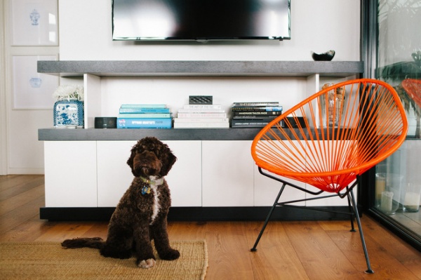
Who lives here: Claire Stevens, Hamish McIntosh and their chocolate Spoodle, George
Location: Brisbane, Australia
Size: 1,292 square feet (120 square meters); 2 bedrooms plus a covered balcony and an office-studio
Stevens and her husband began gradually renovating and updating their space. Additions included a new kitchen, an office-studio, new flooring, wardrobes, a master suite and cabinetry in the lounge.
“We have such a beautiful outlook and amazing privacy in our unit that we really just wanted to create a beautiful place for us to live, entertain and work,” says Stevens.
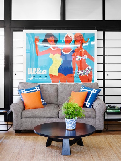
The living room is where the duo and their pooch spend the majority of their time. Colorful accessories add personality to the largely black and white interior.
Bright cushions designed by Stevens and a vibrant vintage poster are focal points of this room. Stevens and McIntosh bought the 1950s advertising poster on a special trip to Sydney, and it has pride of place on the wall as a decorative souvenir.
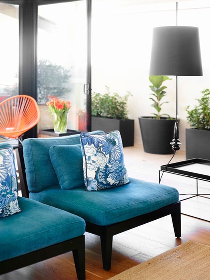
“We were able to spread out the furniture placement in this room as well to ensure that the space didn’t feel too crowded,” says Stevens.
To do this Stevens made good use of their large enclosed balcony. With the glass sliding doors opened up and the dining room moved outdoors, the living area appears open and spacious.
“We are really lucky that we have the entire floor and have a beautiful balcony that runs around three sides of the apartment. This has allowed us to create outdoor rooms and makes the space feel much larger than it really is,” she says.
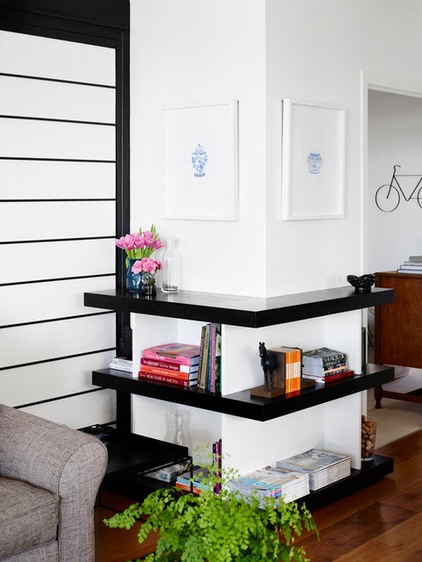
The black and white palette started with the aluminum doors and spread throughout the rest of the apartment with the addition of custom-made black and white cabinetry and other features, including these wood floating shelves.
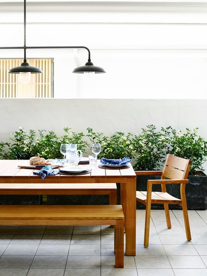
The large wood dining table and benches on the balcony provide Stevens and Hamish with the perfect entertaining quarters. This setup works perfectly for the warmer climate of Brisbane, and the cover means it can be enjoyed all year.
“I love the light over the table; it helps to make the space feel more like an indoor room and looks very intimate lit up at night,” says Stevens.
Lights: Town & Country Style
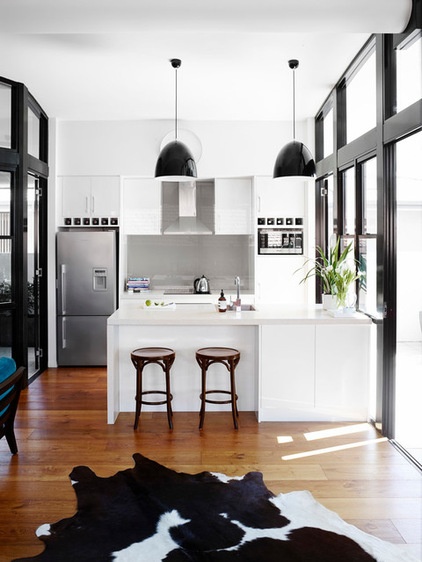
The black and white open-plan kitchen basks in natural light, with floor-to-ceiling windows letting the sun shine through.
Stevens added a black and white cowhide rug to add warmth to the room and break up the wood-finished flooring that continues throughout the living areas.
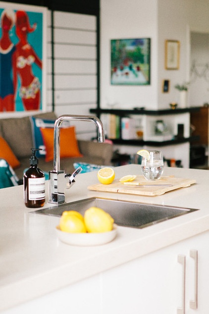
“I cook a lot in the kitchen, as we do a fair amount of entertaining. It is small; however, because it is so open to the living space, I can be in there while we have guests over and still be connected to the conversation, which is nice,” she says.
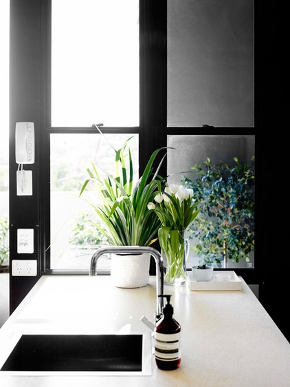
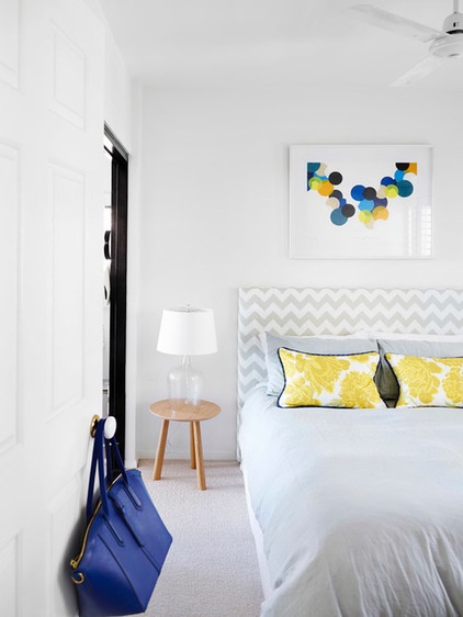
The guest bedroom veers away from the black and white color scheme with a fresh color combination of soft grays and yellows. A colorful painting by Rachel Castle is a focal point.
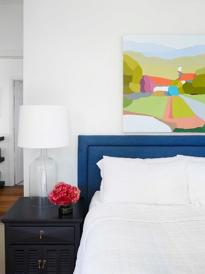
The main bedroom is simple and classic, with a navy headboard standing out in the neutral color palette. Above the bed hangs one of Steven’s favorite pieces in the entire home, a painting by Australian artist Michael Muir.
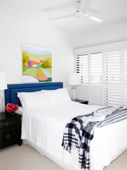
The neutral carpet gives the room a cozy feel. The apartment originally had a gray-brown carpet that ran all the way through and plunged the scheme into darkness. Luckily, fate intervened: “I accidentally dropped an iron on the existing carpet one day — the carpet was completely synthetic, so when I lifted the iron off the carpet, there was a very distinctive burn mark right in the middle of the hallway,” Stevens recalls.
According to Stevens, her husband is a perfectionist and couldn’t stand the mark’s being there. He went on to install wood floorboards throughout the living areas and lighter carpet in the bedrooms. “It was a complete accident; however, it worked out as a benefit to me in the long run,” says Stevens.
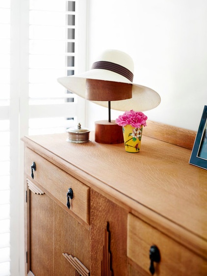
The eclectic mix of furniture is one of the apartment’s signature features and creates a fun and welcoming atmosphere. Stevens found this antique sideboard on eBay from a seller on the Gold Coast and made the 1½-hour drive to pick it up.
Wooden sideboard: eBay
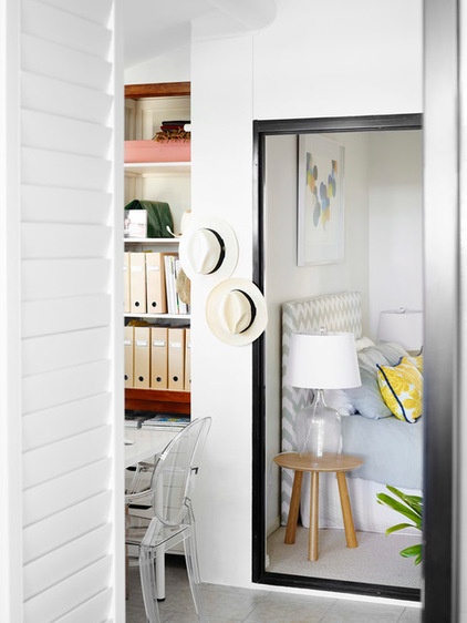
A workspace is tucked away next to the bedroom. As an often-client-facing space, it’s important that the study is both inspirational and professional. This room shows that the two can come together in harmony.
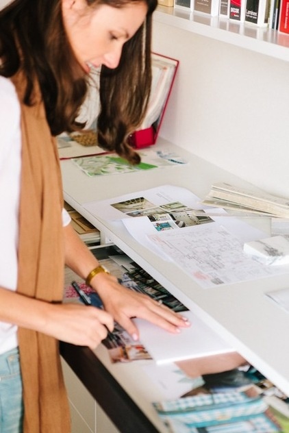
With the opportunity to head her own design space, Stevens (seen here) has been able to showcase her skills in the office, while also creating a livable and chic environment.
“It was great to be able to do up my own place and put our stamp on it. It was a gradual process, which we still like to add to and change occasionally,” she says. “There is no justifying costs or decisions either; however, making decisions for yourself can be just as difficult and time consuming as when you’re making them for someone else.”
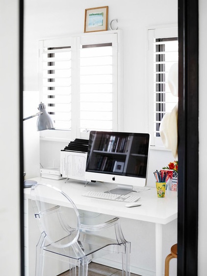
White plantation shutters and a clear Louis Ghost Chair give the illusion of more space.
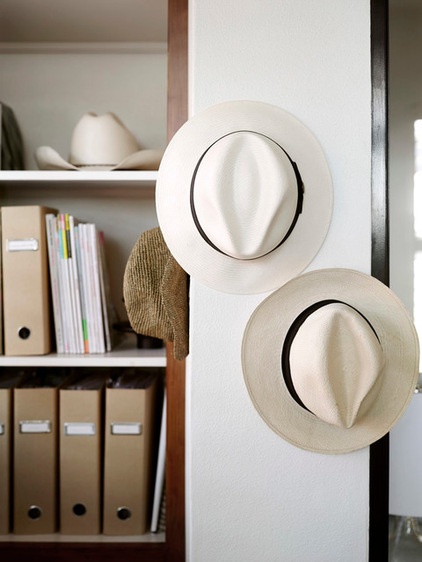
Smart storage and built-in cabinetry fill the study to house Stevens’ books, files and papers.
The couple also installed two large storage cupboards in their separate garage space, which is located on the ground floor of the apartment block. This is where they keep items that they tend not to use every day, a great way to minimize clutter in their main living spaces.
Browse more homes by style:
Small Homes | Colorful Homes | Eclectic Homes | Modern Homes | Contemporary Homes | Midcentury Homes | Ranch Homes | Traditional Homes | Barn Homes | Townhouses | Apartments | Lofts | Vacation Homes
Related Articles Recommended


