We Can Dream: An Expansive Tennessee Farmhouse on 750 Acres
There’s not much to Williamsport, Tennessee, in terms of restaurants, live music or storefronts. That’s all in Nashville, about an hour’s drive away. But what Williamsport lacks in nightlife, it more than makes up for in sheer beauty. Rolling hills, grassy farmlands and 19th-century houses dot the sweeping landscape.
It’s here that a homemaker and a top music business executive chose to grab a scenic piece of countryside as a weekend getaway. They found a farmhouse from the late 1800s on about 750 acres that were strewn with several dilapidated barns and outbuildings, and fell in love with the idea of restoring the farmhouse to its original state.
With the help of HS2 Architecture, they spent more than two years painstakingly tearing down the old poplar barns and reclaiming every piece of wood to return the house to what it once was. Meanwhile, a new addition supports the crowds: three kids, grandchildren and friends and colleagues in the music business who come for weekend parties.
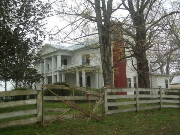
BEFORE: The shutters, siding, fencing and landscaping had fallen by the wayside.
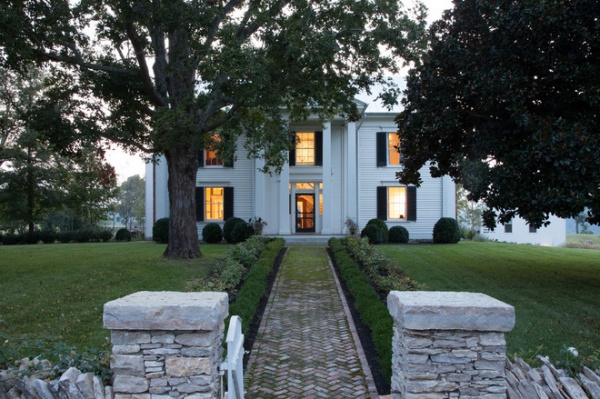
“After” photos by Caroline Allison
Houzz at a Glance
Who lives here: This is a weekend retreat for a family with three 3 kids — ages 16, 19 and 21
Location: Williamsport, Tennessee
Size: 14,000 square feet (1,300 square meters); 5 bedrooms, 4½ bathrooms, including a guesthouse with 2 bedrooms, 2 bathrooms
AFTER: The exterior was cleaned up and repainted, and new siding was added as needed. The shutters, original to the home, were removed, restored and put back on, as was the original front door. “Everything was taken off and put back on,” says architect Jane Sachs, the lead partner on the project. “The idea was always to restore and bring back the original house; anything added would be a surprise as you go beside it or behind it. Everyone went to all kinds of lengths to preserve as much as we could,” Sachs says.
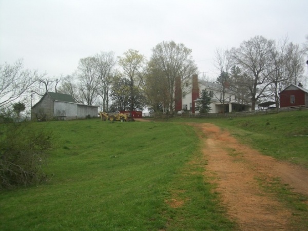
BEFORE: Most of the surrounding farmland was rather underdeveloped, and the barns were mostly falling apart.
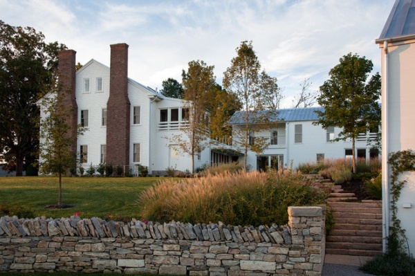
AFTER: A peek around the side of the original house (seen here on the left) reveals all-new landscaping and the addition, which is connected via a breezeway, which Sachs refers to as the “knuckle.”
The original home has a living room, dining room and study on the ground floor; a master bedroom and two bedrooms on the second; and a TV room and another bedroom on the third. The addition has a new kitchen and living area plus another master bedroom on the second floor. (Having the second “summer” master bedroom allows the homeowners to close off the addition from the original house and just heat or cool the addition when it’s just the two of them.)
The exterior of the original house is shiplap, while the new addition is a more modern, tighter tongue and groove siding. “We tried to respect what is old and what is new but all painted white,” Sachs says. “The idea wasn’t to have an old building and then a glass box. At one point there was a version in the design with a more modern, eccentric form for the addition, but the client came back and really wanted to use the barn form. So there was a lot of evolution.”
The chimney stacks are new — built in the location of the original ones from reclaimed brick.
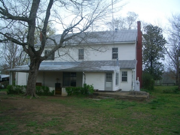
BEFORE: A kitchen addition had been tacked on to the back of the original house at some point. Because this addition wasn’t original, the architects removed it and added a sleeping porch for the master bedroom and a breezeway that connects to the new addition.
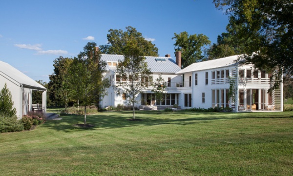
AFTER: Looking at the same rear side of the house, you can see the new sleeping porch on the second floor, the breezeway and its double-hung windows, and the new addition on the right.
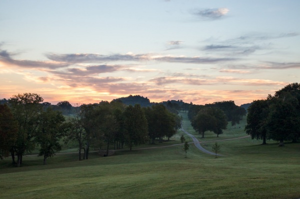
The Property
The new homeowners are only the second or third owners of the property, which stretches out almost endlessly around the house. The team toured the site and reclaimed all the wood from barns that were beyond repair, then cleaned, fumigated and planed it to use throughout the house. “All that reclaimed wood requires a lot of dedication,” says Sachs. “So much love and care went into this project, and I’m hoping at the end of the day, there’s a great conversation between the new barn and the old house.”
The owners lease out some of the acreage and have bees and cattle. They also bale and sell the hay from the property. But they’re taking their time figuring out how to best use the land.
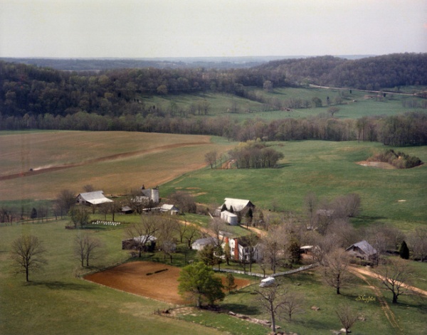
Here you can see several barn structures that became the source of almost all of the wood in the remodeled house and addition.
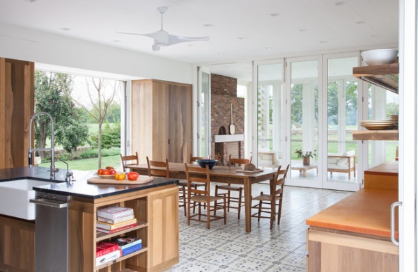
The New Addition
Instead of trying to make two separate kitchens, one for indoors and one for outdoors, the team made one convertible kitchen in the new addition. Eight-foot sliding doors retract on three sides to create an indoor-outdoor experience. The homeowners can walk from the kitchen to a garden path to collect cucumbers and tomatoes for cooking.
A screened-in porch with a wood-burning oven for baking bread caps off the space.
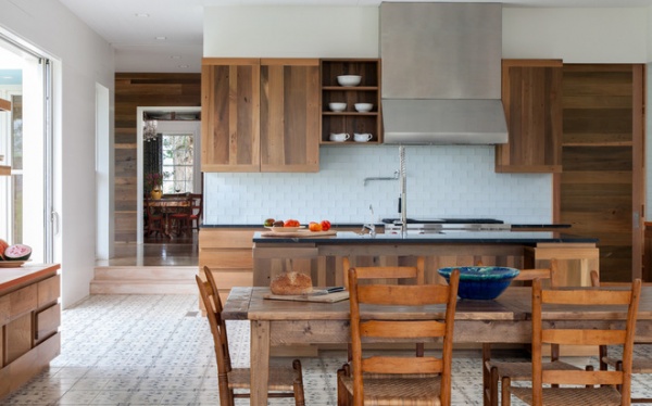
The homeowners cook a lot, so the kitchen is the heart of the home. A lot of baking and pickle-making happen here.
The concrete tiles are Zila Laguna Moroccan tiles in a custom blue color. The backsplash is white glass tile. All the millwork is custom from poplar reclaimed on the property. The counter to the left is compressed paper. The island is soapstone.
Kitchen table: Restoration Hardware
Soapstone Counters: A Love Story
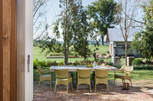
Trees planted for shade will eventually cover this patio to create an outdoor dining room just off the kitchen.
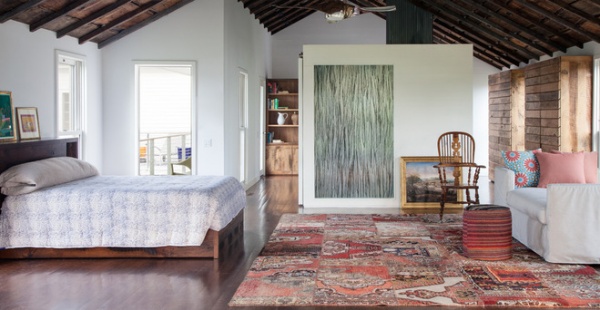
Above the kitchen is the second master bedroom. Reclaimed wood from the attic of the original house forms the ceiling here but is entirely decorative. The clothes cabinets are made of more reclaimed oak.
The square shape in the middle of the photo is the bathroom. The wall feature is made of twigs laminated in Plexiglas.
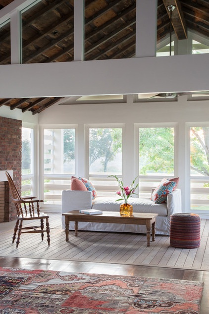
The summer master bedroom has its own sleeping porch and fireplace.
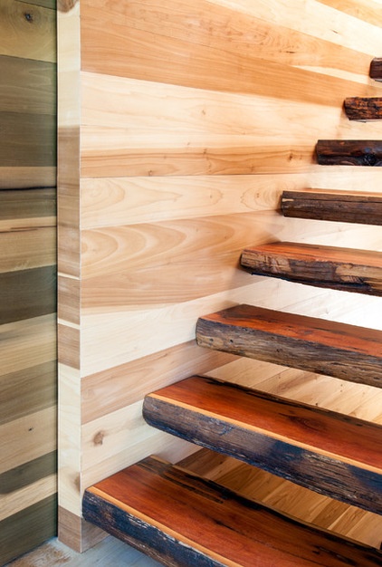
A 10-foot sliding door separates the new addition from the original. When the couple visits the farm by themselves, they can heat or cool only one side.
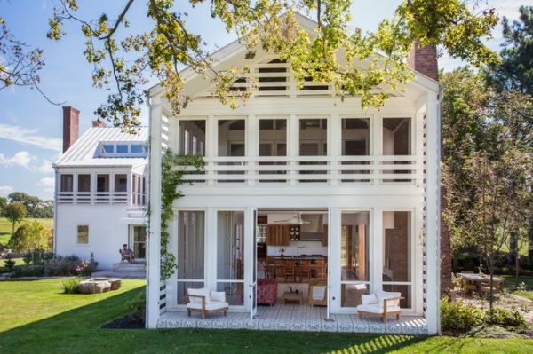
Here you can see the addition extending from the original house. The sleeping porch on the second floor and the screened-in porch below enjoy views of the swimming pool and rolling landscape.
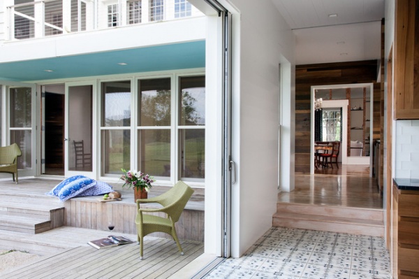
The kitchen opens to a deck made of reclaimed poplar and connects to the breezeway that leads to the original house.
The Original House
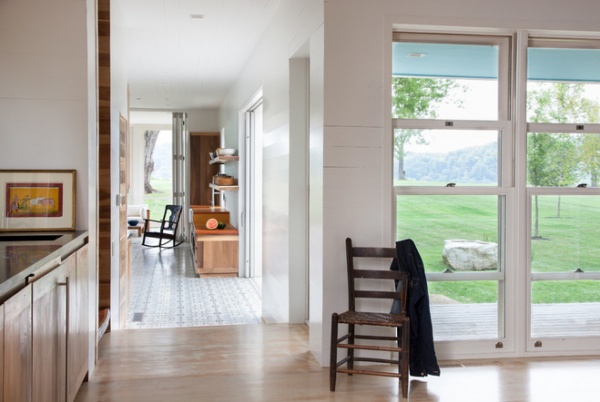
Double-hung windows in the breezeway open up to capture cross breezes.
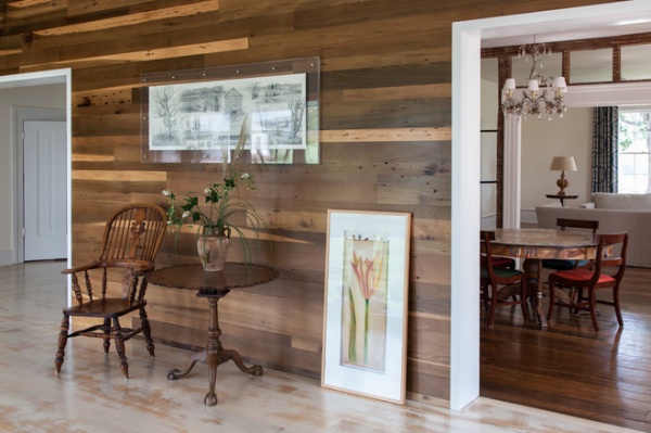
The floor in the breezeway is reclaimed oak that’s been stained white. This space was originally probably used as a porch. This is also where the tacked-on kitchen was that the architects removed.
Here you can see through to the original house and its dining room and living room.
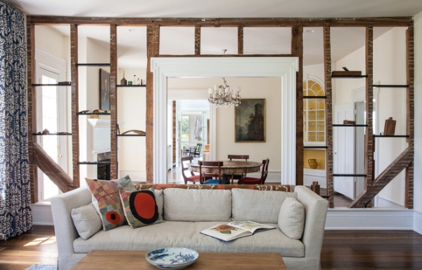
The living room and dining room are located in the original structure. The team chose to leave the framing between the living and dining rooms exposed after walking through the house during the remodeling process and liking how it looked. “It’s a nod to a modern open concept,” Sachs says.
The framing shelves hold little bottles, tools and nails found on the property.
The family used a good number of inherited pieces. There were a few pieces that came with the house, too, and they enlisted the help of interior designer Jonathan Pierce for other furnishings and accessories.
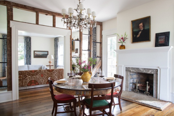
The original mantel in the dining room was taken off and rebuilt exactly as it was.
The team ripped up the carpet and refinished the original floors, one of the few things they didn’t have to remove. “The floor still isn’t level,” Sachs says. “We didn’t totally level the house. It would have required too much taking apart.”
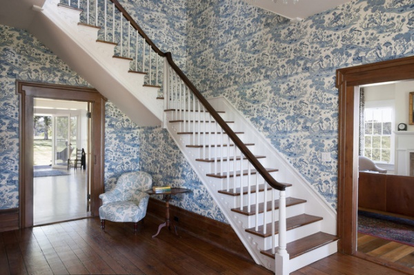
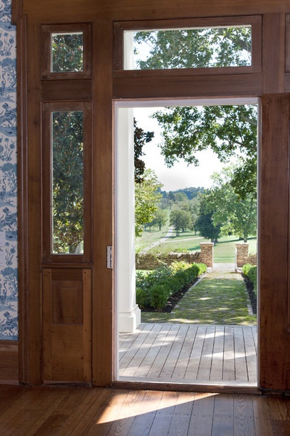
The original front door was removed, refinished and replaced. The entryway is one of the mom’s favorite spots in the house. She loves the wallpaper, calling it “psychedelic in a sort of 18th-century way.”
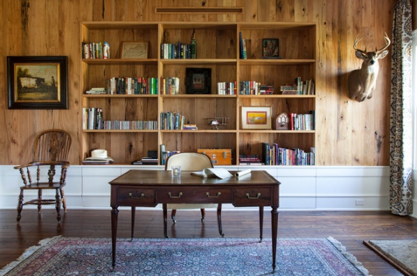
Beechwood, reclaimed from a barn onsite, wraps the original study, just off the entryway.
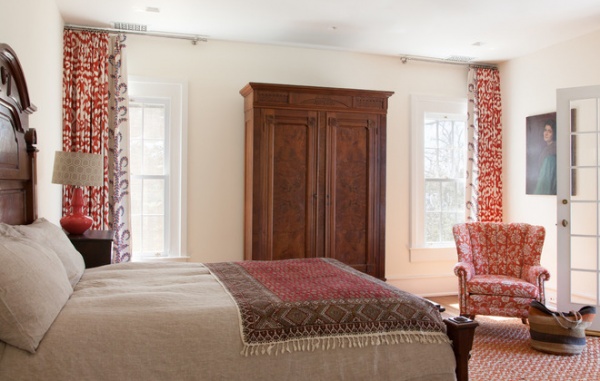
A guest bedroom in the original house exudes 19th-century charm.
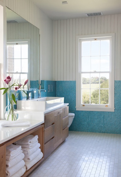
This master bathroom in the original house is completely new. “There wasn’t even a bathroom there before,” Sachs says.
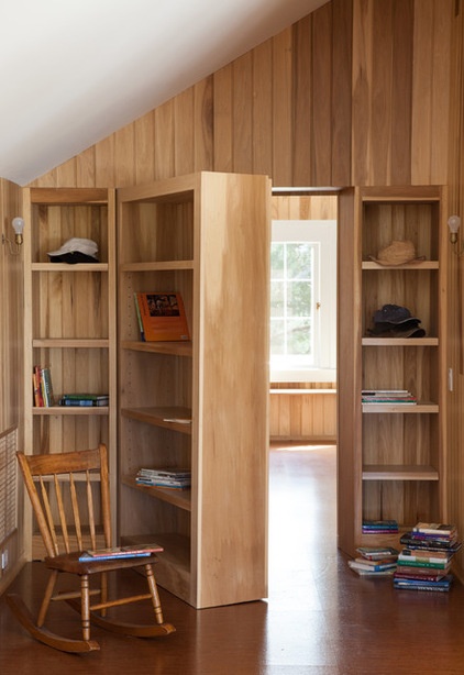
The 16-year-old son (14 at the time) requested a hidden door for his bedroom.
How to Create a Secret Doorway Behind a Bookcase
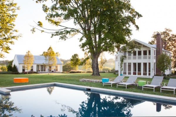
The Guesthouse
The team created a rear courtyard with a new pool and a guesthouse to the left that slopes down behind it to a hidden garage. “We did that so you wouldn’t be feeling cars on the property,” Sachs says.
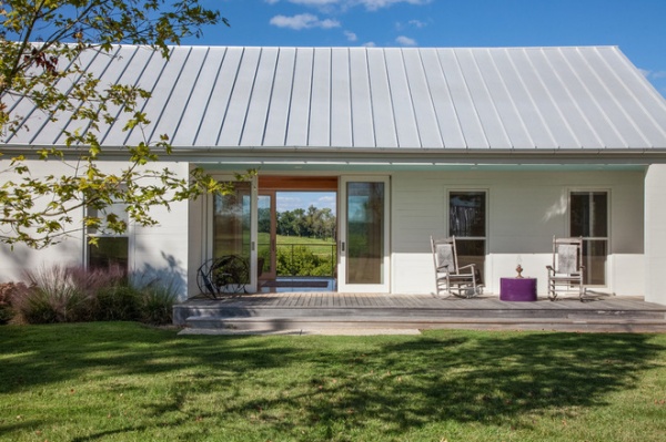
The guesthouse has bedrooms on either end with a living room in between that can be opened up to create something like a dogtrot.
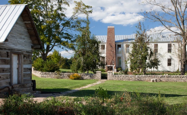
To the left is an old smokehouse that was completely taken apart; each log was numbered and then put back together. The structure is now used as a garden shed. The new chimney is made from reclaimed brick. “It’s not the same as the old ones, but it’s definitely talking to it,” Sachs says. “It’s more of a conversation. We wanted to make clear where one stops and the other begins.”
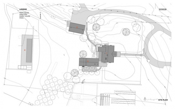
An overview of the site.
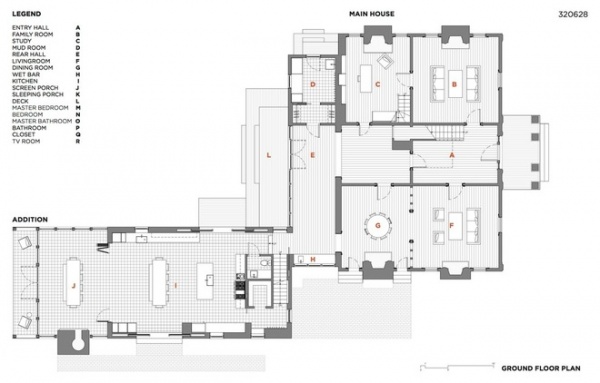
The ground-floor layout.
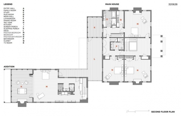
The second-floor layout.
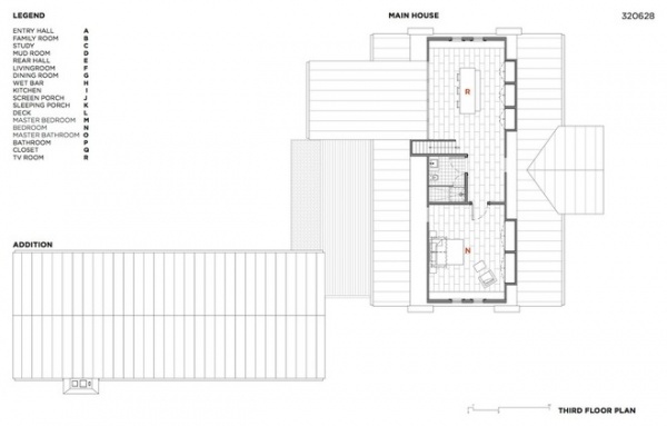
The third-floor layout.
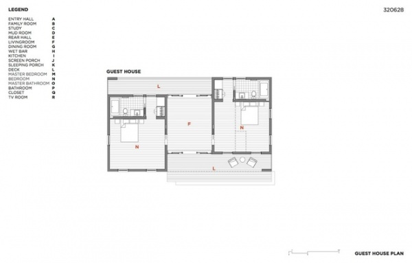
The guesthouse.
Team
General contractor: Jay Ramsey, Ramsey Daugherty
Landscape: Kim Hawkins, Hawkins Partners
Historic preservationist: Centric Architects
Interior designer: Jonathan Pierce Interior Design
Browse more homes by style:
Small Homes | Colorful Homes | Eclectic Homes | Modern Homes | Contemporary Homes | Midcentury Homes | Ranch Homes | Traditional Homes | Barn Homes | Townhouses | Apartments | Lofts | Vacation Homes


