Room of the Day: A Master Bath Embraces the River View
http://decor-ideas.org 09/22/2014 23:14 Decor Ideas
Spectacular views of the St. Lawrence River and the compelling architecture of the home drove the design of this beautiful bathroom in Rockport, Ontario. “We built the scheme around the stone and the architecture,” says interior designer Julia Enriquez. Wanting to keep the focus on their water views, the clients ordered up a minimalist design for the master bathroom. Enriquez knew this meant the smallest details would be vital to the design. She thoughtfully considered every little piece that went into the room, keeping things interesting and not too stark.
Photos by DoubleSpace Photography
Room of the Day
Location: Rockport, Ontario, Canada
Designer: Julia Enriquez, Astro Design Centre
Size: 117 square feet (11 square meters)
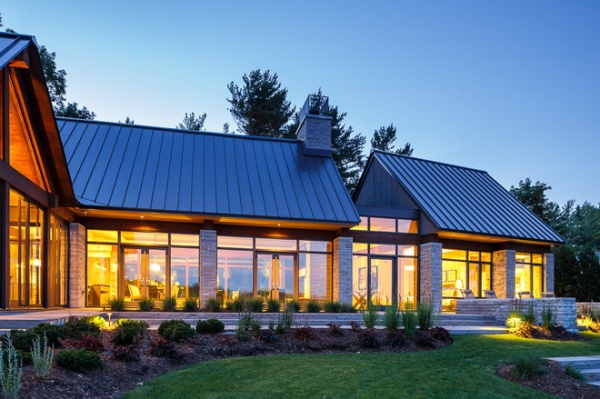
The exterior architecture makes clear transitions to the interiors, including the large windows, walnut trim and strong stone columns. The master suite (far right) has its own pavilion, with the bathroom at the very end.
Windows, doors: Astro Design Centre
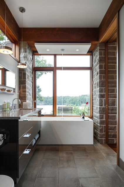
Keeping things open and uncluttered was a priority. That kept the focus on the views and on paying proper respect to the beautiful stone columns.
While the architecture is contemporary, Enriquez says the use of walnut and stone is “a little Craftsman,” and she played off those natural, local materials in her design. All of the windows and doors are trimmed in walnut, which she highlighted with additional walnut trimwork and a walnut vanity. To the right, a walnut-trimmed sliding door opens to the master bedroom.
A white ceiling feature containing the tub filler and two lights contrasts the walnut. This crisp white detail and the white rectangular bathtub below emphasize the view straight out to the water between them.
Woodipedia: Walnut Wows in Traditional and Modern Settings
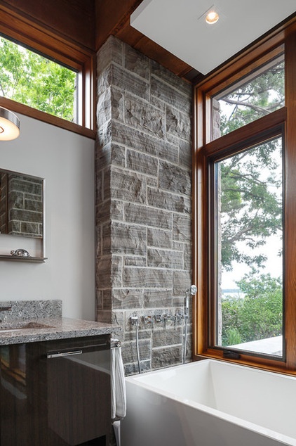
Transom windows over the vanity wall let in more natural light. Because the site is so private, no window treatments are necessary.
In keeping with the minimalist design, Enriquez mounted the faucets and hand shower into the stone column. Playing off the local stone columns, she chose a quartz stone with many shades of gray for the countertops.
“The tiny details count,” she says. For instance, while the countertop is 1¼ inches thick, the backsplash is just ¾ inch thick. “They look very chunky if they are the same thickness,” she explains.
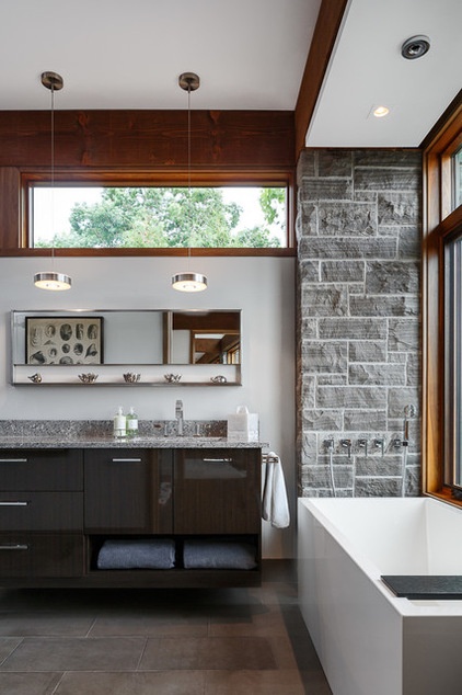
Walnut cabinetry keeps the material palette consistent, but another detail — a glossy lacquered finish — allows them to stand out just enough. The cabinets float over the floor, maintaining an open feeling.
Also appearing to float are the round stainless steel pendant lights, which hover overhead. Enriquez brought in elements that nod to sleek futuristic industrial style. For instance, a simple stainless steel-framed mirror with a shelf beneath hangs between the transom and the counter. The porcelain floor tiles have a concrete look.
Windows: Astro Design Centre; shelf with mirror, vanity, bathtub: Wet Style
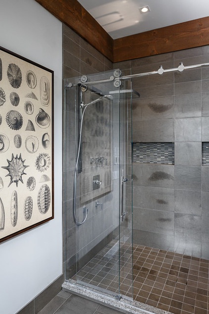
The sleek industrial details continue into the shower, where the shower door track adds small round gears to the thick glass. A small detail, the shower guard on the floor, is an important one. Enriquez used the same quartz she used on the countertop for consistency, with a ¾-inch thickness. “I don’t like to use tile on a shower guard,” Enriquez says. “One piece of stone gives it a cleaner look and helps prevent mildew.”
The porcelain tiles in the shower stall have a metallic industrial look and reflect the light. Enriquez paid careful attention to scale when planning niches for the shower.
Tip: Choose a size for your shower niche in response to the size of the tiles. Note that the niches are the same size as the large tiles here. “Because of the large size of this shower, we used two niches here,” she says.
Rather than camouflaging the niches with the same tile inside, she backed them in smaller-scale mosaic tile. The relationship between the mosaic tile’s pattern and the larger shower wall tile recalls that between the quartz countertop’s pattern and the stone on the columns. It’s the kind of tiny detail that kept this room minimalist yet interesting, limited in palette yet anything but stark.
More:
Houzz guides to designing your bathroom
See more Rooms of the Day
Related Articles Recommended


