Houzz Tour: Apartment Redesign Looks to the ’70s for Bold Inspiration
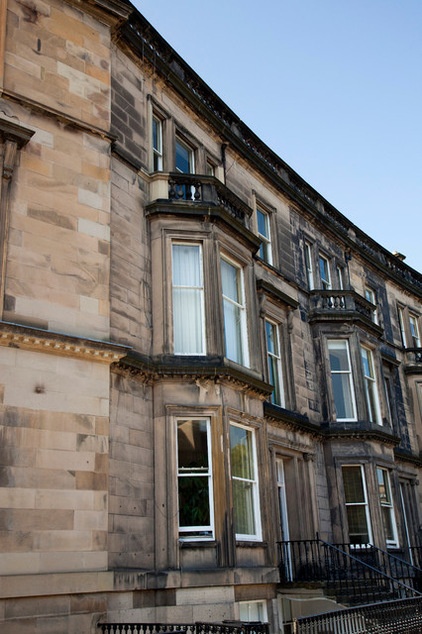
We all know the value of location when it comes to buying a new home. This Edinburgh, Scotland, apartment has that issue taken care of. Situated on the second floor of a handsome Victorian building in the city’s beautiful West End, the apartment has wonderful views over St. Mary’s Cathedral and Edinburgh castle.
The location can’t be beat, but when Malcolm Duffin of Malcolm Duffin Design first saw it, the interior left much to be desired. “It had been virtually untouched for 30-odd years,” Duffin says. “It had hideous bookcases, wardrobes and fireplaces, and the layout wasn’t working either.”
The apartment needed to be completely renovated, from rewiring and replastering to reconfiguring the space and decorating the rooms. And there was a tight deadline too. The owners had bought the property as an investment and wanted it to be ready for renting out in eight weeks. Duffin and his team, including interior designer Jenna McLaughlin, transformed it in seven.
“The style of the apartment actually inspired the designs for its refurbishment,” Duffin says. “We wanted to give it a bit of a 1970s feel, working in some punchy colors, and the existing decor was behind this idea.” The apartment now references retro style, but in a bold and glamorous way.
Houzz at a Glance
Location: Edinburgh, Scotland
Designer: Malcolm Duffin Design
Size: 2 bedrooms, 1 bathroom
Cost: About $115,000
Converted from a Victorian house on one of Edinburgh’s most attractive crescent streets, the apartment sits on the second floor, with lovely views over the city. It originally had just one bedroom, but reducing the size of the kitchen and reconfiguring the space created room for a second bedroom at the back.
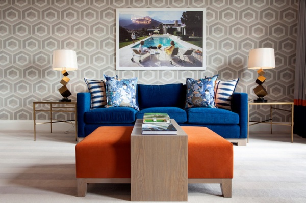
“I am very inspired by [English] designer David Hicks,” Duffin says. “His geometric patterned carpets and fabrics from the 1960s and 1970s have been a constant source of inspiration, along with his ferocious sense of balance and order.” Here patterned wallpaper is paired with furniture in strong colors, but the symmetrical arrangement and balanced feel enable these bold elements to sit together harmoniously.
All the wallpapers and carpet are available through Malcolm Duffin Design.
Discover great ways to decorate with geometrics
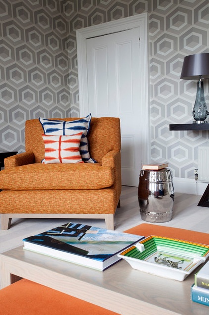
“The owners did not want too much fuss or ornamentation in the apartment,” Duffin says. Instead, geometric wallpaper provides detail; a few key pieces of furniture keep the space uncluttered while adding a shot of punchy color.
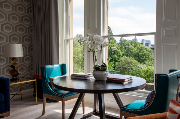
An elegant dining area next to the window makes the most of the south-facing views over the city. Again, furniture in a bright accent tone has been used to ramp up the glamorous feel. All the furniture in the apartment was custom designed by Malcolm Duffin Design and made by Charlotte James Furniture.
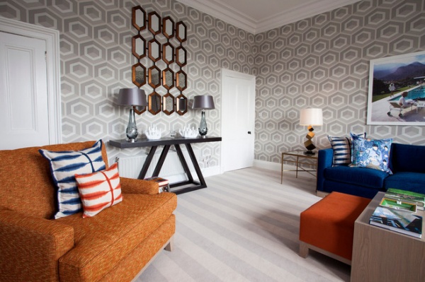
Although both the carpet and wallpaper in the living space are patterned, their muted color helps them be a gorgeous but never overpowering backdrop. “Without any furniture these two elements could actually look quite bland,” says interior designer McLaughlin. “But the bright furniture and cushions tie the look together.” The carpet was designed by Malcolm Duffin and custom made. “We often use striped carpet,” adds McLaughlin. “It looks great in any interior, traditional or modern.”
See more on 1960s- and ’70s-style influences
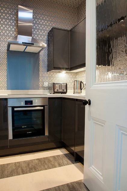
Duffin designed a small kitchen for the newly reconfigured apartment and installed cabinets with a glossy finish. “The reflective surfaces can help to widen the space,” says Duffin. A David Hicks wallpaper lines the walls and ceiling. “It makes it feel much more dynamic and exciting in here,” says Duffin. A striped linoleum floor adds the final touch of 1970s cool.
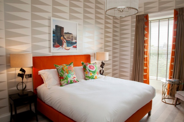
The striking mix of geometric wallpaper in a muted tone combines with splashes of hot orange on furniture in the master bedroom as well as in the living space. “Don’t be scared of using a bold wallpaper,” says McLaughlin. “It’s just about getting a balance. If you have bright paint colors or crazy wallpaper, calm them down with simple furniture.” The arrow-like design on the wallpaper seems to point the eye toward the window, which offers lengthy views over Edinburgh.
See more tips for using bright orange
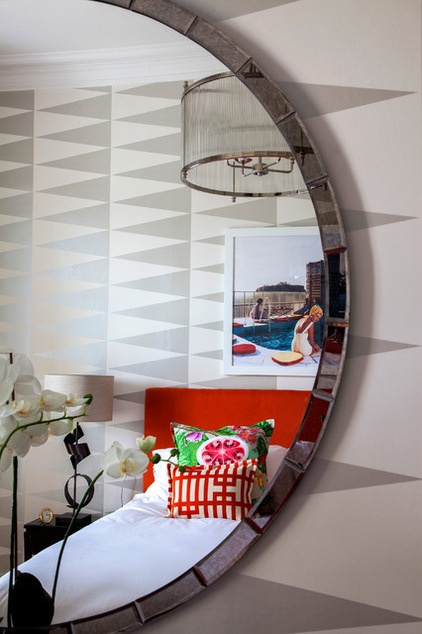
“Lucy, one of our designers, sourced a wonderful collection of Slim Aarons’ vintage photography for the apartment,” says Duffin. “It was the perfect finishing touch to the retro glamorous feel.” Mirrors, reflective surfaces and a mix of lighting are featured throughout the apartment. “Gleaming retro pendants and good lamps and task lighting supplement the ample daylight that comes in,” says Duffin.
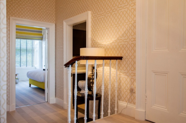
Ceilings, molding and woodwork are painted white to complement the patterned wallpaper and anchor each space. Here in the hallway, Vivienne Westwood’s Squiggle wallpaper for Cole & Son combines with fresh white paint and the striped carpet that runs throughout the apartment.
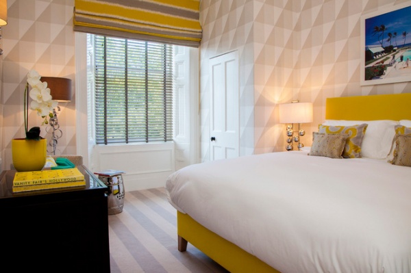
The apartment originally had only one bedroom, plus an open-plan kitchen and dining space. “It was a terrible arrangement and very wasteful in terms of space,” says Duffin. “By redesigning the kitchen and adding a dining space to the living area, we could then create a second bedroom.” This new room sits at the back of the property. “It gets lots of natural light and has views over gardens,” Duffin says.
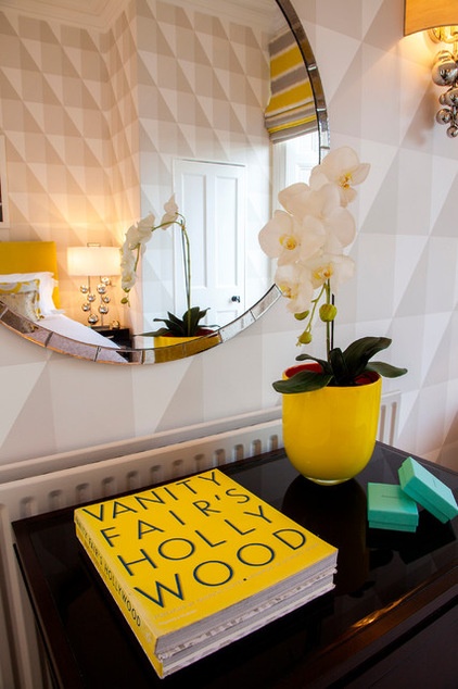
Zingy accent shades of yellow, orange and blue crop up throughout the apartment. “There is maybe a touch of Palm Springs glamour here,” Duffin says. “We love to use bursts of color,” McLaughlin adds. “Even if it’s just a few loud and boisterous cushions.”
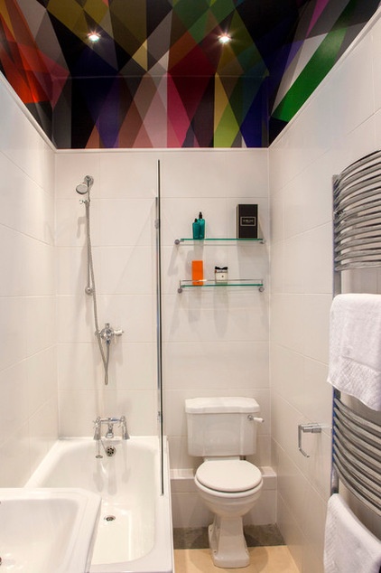
The bathroom was one of the few spaces that didn’t need major work, and simply has a new toilet and shower screen. “There was tiling quite far up the walls, so I employed an old trick of using a glamorous, geometric paper above the tiling and right onto the ceiling,” Duffin says. “This is an easy way to enhance your boring old bathroom!”
Wallpaper: Circus by Cole & Son
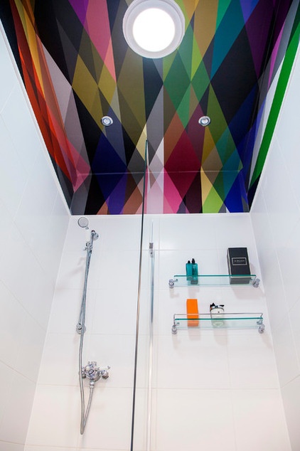
The kitchen and the bathroom are internal rooms without conventional windows. Instead, light towers channel natural light down into these rooms from a boldly decorated ceiling. “They breathe daylight into a space where previously it would have been impossible to have any,” Duffin says.
Browse more homes by style:
Small Homes | Colorful Homes | Eclectic Homes | Modern Homes | Contemporary Homes | Midcentury Homes | Ranch Homes | Traditional Homes | Barn Homes | Townhouses | Apartments | Lofts | Vacation Homes
Tell us: What do you think about this apartment renovation?


