Kitchen of the Week: High Function and a Little Secret in Missouri
http://decor-ideas.org 09/19/2014 22:14 Decor Ideas
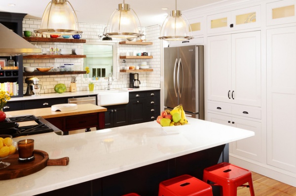
This kitchen has a clever secret, but we’ll get to that in a minute. The family who lives here hired designer Nathan Taylor to turn their kitchen into a more flexible, functional space that all of them could enjoy. They didn’t want to abandon the history of their cottage, but they also wanted to put their stamp on it.
The home was built in the 1940s and is what Taylor refers to as refined cottage style. Not so refined, though, was the kitchen, which had next-to-no storage and felt dark and cramped. The floor was linoleum on top of some more linoleum — and once they were ripped out, rotted wood floors were revealed.
Photos by Jeremy Mason McGraw
Kitchen at a Glance
Who lives here: A family with 2 sons, ages 5 and 7
Location: Springfield, Missouri
Size: About 15 feet by 15 feet (21 square meters)
Team: Interior design: Nathan Taylor for Obelisk Home; cabinetry: Cabinet Concepts by Design
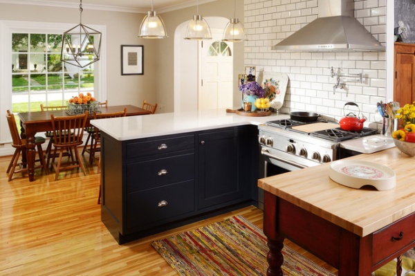
Taylor took down a wall between the kitchen and the formal dining room. He then matched the kitchen’s new 1-inch-wide oak floorboards with the original flooring in the rest of the house.
Countertops: Caesarstone; range: GE Monogram; rug (made of recycled plastic bags), stools: Obelisk Home
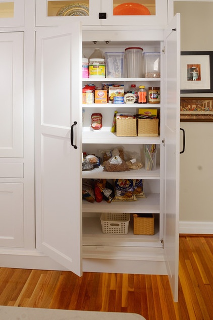
The cabinetry conceals a handful of secrets. To the left, pocket doors open to reveal a baking center with a granite countertop that can be hidden when guests come over. It also conceals smaller appliances, including a microwave and toaster. Taylor added high upper cabinets with seeded-glass doors to make the 8-foot ceilings appear higher. Their lights help brighten the room, and the seeded glass adds to the period feel.
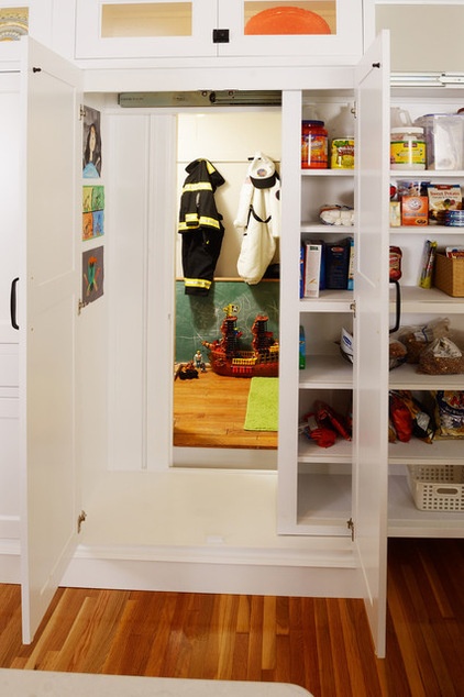
The bigger secret is a hidden fort. In the original design for the remodel, cabinets covered a door leading to an empty space under the stairs.
The clients’ young sons were forlorn about losing their favorite understair hideaway. The boys’ father and his brother came up with this clever idea. The new pantry cabinet slides on trundle-bed glides to reveal the entry to the boys’ hideout. When the cabinet moves, it also reveals their artwork (left). The glides can support up to 500 pounds.
Love secret forts? See more here
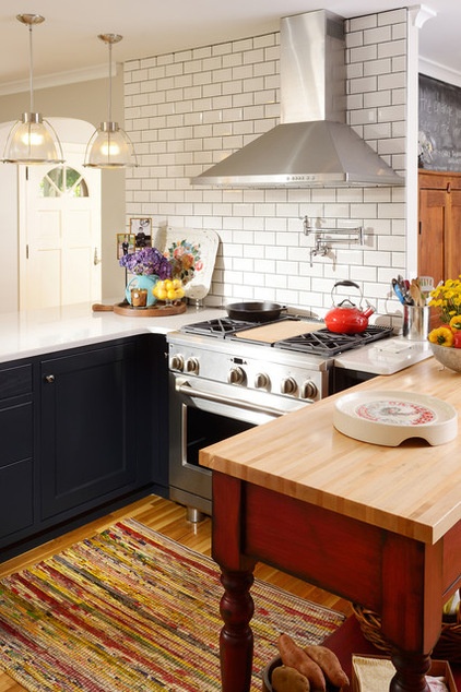
The pantry cabinet isn’t the only thing that glides. The boys’ mother wanted to pass on family cooking traditions to her sons in this kitchen, so Taylor designed a movable island on glides (right) that she can slide out for cooking lessons.
“We decided on glides over wheels because they fit in better with the period look,” Taylor says. The butcher block–topped piece is new but was made to look old. One of the owners loves red and tracked down hardware on eBay that reminded her of her grandmother.
Gliding island: custom, Obelisk Home
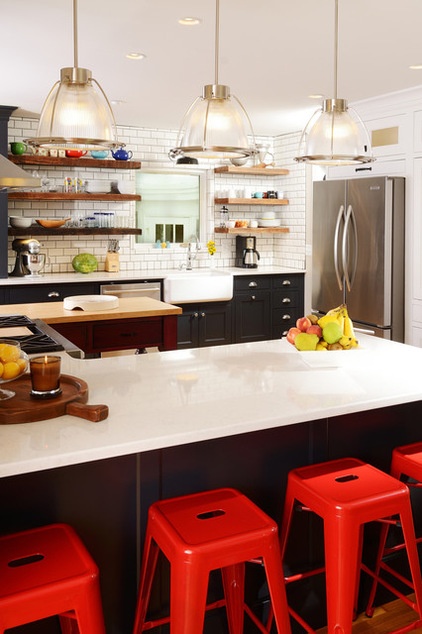
Because the kitchen now has so many efficient cabinets, Taylor was able to install open shelves around the farmhouse sink; the items the couple has collected on the shelves add to the period feel. The cabinets also hide technology; a drawer to the left conceals a charging station for phones and tablets.
The shelves themselves came from a building Taylor’s company owns. When it was rehabbed, he hung on to these boards, which were original ceiling joists. “Each one is different from the other,” he says. No remilling was necessary; the team simply used very fine-grained steel wool to smooth them a little and then finished them with a paste wax.
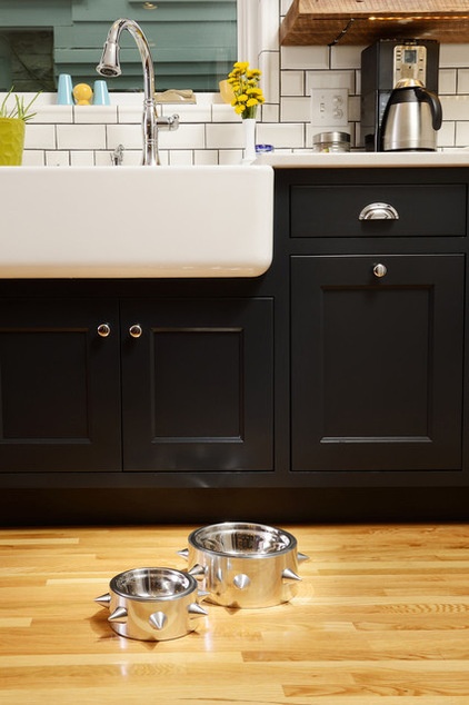
The cabinets have a classic, inset style with soft-close features on all the doors, drawers and rollouts, maximizing storage and making retrieving items from the lower cabinets easier. They read as black in photos, but they are a very dark blue that provides a strong contrast to the white wall and tiles.
Taylor found a beveled subway tile for the backsplash, which fit in with the homeowners’ wish for a handmade look.
Faucet: Delta Touch; dishwasher; Bosch; refrigerator: KitchenAid
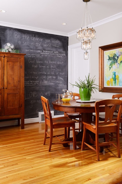
Just off the kitchen is this cozy eat-in area. “Everyone who has a glass of wine in here has to write something on the chalkboard wall,” he says. The antique pie safe is a family piece.
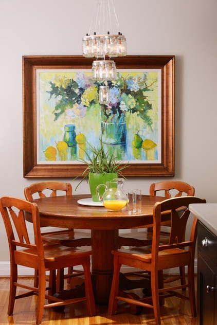
The mason jar chandelier adds a homespun feel. The still life was painted by an 86-year-old artist. The table came from a garage sale; the chairs came from a restaurant owned by the kids’ grandfather.
Being designed for restaurant use made the chairs perfect for a family kitchen — in fact, one of the homeowners turned one upside down and stood on it to show how strong they are. The grandfather “is very proud that his son’s family wanted these chairs,” Taylor says.
Have you designed a kitchen to suit family traditions? We’d love to hear about it in the Comments. Even better, please post a photo!
Related Articles Recommended


