Houzz Tour: Bright and Light, With a California Beach Vibe
“The moment I stepped through the door, I had that feeling, and I knew I had to have it!” says Gabriel Holland, recalling the moment she viewed her home in Bridport, England, for the first time. It was, she says, dark, dingy and stuck in a 1970s avocado rut, but she and husband Alan Suter saw the potential for the light and spacious home they’d been searching for.
Given Holland’s job as a color consultant, the stylish renovated home is fairly restrained. It’s the result, Holland says, of her need for serenity and calmness away from the office that only a largely white interior could provide.
“I spend all day looking at colors, so when I get home, I need a break,” says Holland, who was inspired by laid-back California living. “I craved the sense of relaxation you feel when you stroll home after a day at the beach, and this is the essence of what I’ve tried to create in the house,” she says.
Her husband was initially in favor of a bolder scheme, and Holland has included slabs of hot pink and rich blue to give it some color, but he has come to love the easygoing look of their light, bright home.
Houzz at a Glance
Who lives here: Gabriel Holland and husband Alan Suter
Location: Bridport, West Dorset, England
Designer: Gabriel Holland
Size: 3 bedrooms, 2 bathrooms
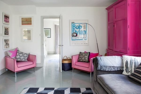
White walls and a simple glossy floor are the result of Holland’s quest for simplicity and purity in her home. “The gray painted floor has an art-gallery feel about it and was created by using cheap factory floor paint on chipboard,” she says. “I work with color every day, so I wanted to cleanse my eyes in the evenings. Plus, we’ve introduced interest with artwork and, of course, the bright pink wardrobe!” It was Suter’s idea to refresh the wardrobe (found abandoned on a pavement) with pink paint. The gray sofa was originally from the Conran Shop and was a bargain eBay find that Holland had reupholstered.
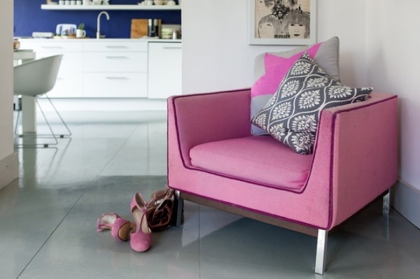
“There is a bit of a 1960s vibe going on in this corner of the room,” Holland says. The Bob Dylan print is courtesy of Suter from a Danish exhibition of posters, while the original 1960s pink armchair was bought from a friend. “We love to reinvent things, and the colors work really well here against the rest of the pared-back scheme,” she says.
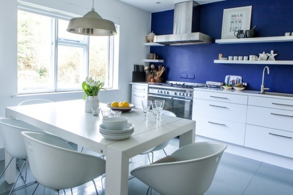
The glossy surfaces in the kitchen enhance the sense of brightness and space, while a wall of deep blue adds richness. “Deep blue may seem like an odd choice in a compact space, but it’s actually a recessive color and makes the room feel much bigger,” Holland says. The cabinets are from Ikea, and the dining chairs are from Habitat.
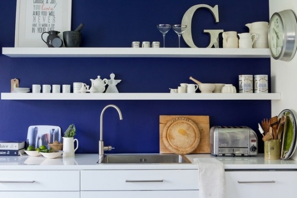
Bespoke floating shelves from the Shelving Company keep glasses and crockery close at hand. “Overhead kitchen [cabinets] would have overpowered this space,” Holland says, “so I decided to keep it open. I love the simplicity of it, and it means you can constantly change the display to suit your mood.”
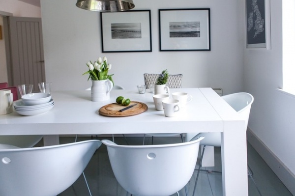
Original silver print photographs in the kitchen are by local photographer Claudine Rangecroft and depict a beach in Norfolk, England, where Holland used to play as a child. “I recognized the scene immediately, so I had to have them,” she says. “Plus, it ties in with the relaxed beach vibe I was trying to create.”
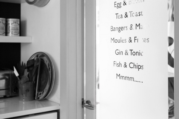
The door from the kitchen features window film with a list of the couple’s favorite things cut out of it. “The kitchen is a fairly simple, monochrome space, but there’s plenty of personality in it,” Holland says.
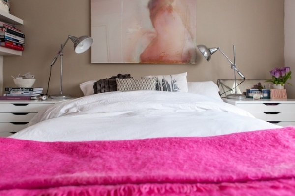
The original master bedroom on the ground floor is now used as a guest bedroom. “I wanted this to be a soothing space,” she says. “It’s very feminine, and Farrow & Ball’s Stony Ground paint has to be one of the most perfect colors.” Original artwork by Jo Love enhances the warmth and sensuality of the design. The vibrant pink blanket was a gift that came from a market in Cape Town, South Africa.
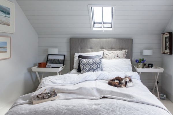
Opening up the loft created more light, bright bedrooms. “This is such a wonderful room — we use it as our bedroom,” Holland says. Wood paneling on the walls has been extended up to the ceiling to evoke a beach-hut look and is painted in Steel I from Paint & Paper Library.
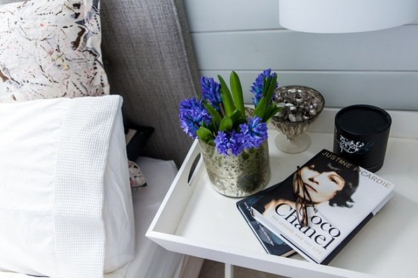
Subtle pattern, from the Timorous Beasties cushion to the Feather & Black headboard, adds interest to the soothing design. The simple bedside tray table is from the White Company.
Check out more headboards
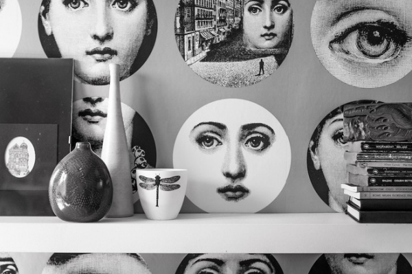
Downstairs, the utility room is decorated in dramatic Tema e Variazioni wallpaper by Fornasetti from Cole & Son. “It’s very special,” Holland says. “There are only a few rolls of this left now, as it’s been discontinued, and I have one of them!”
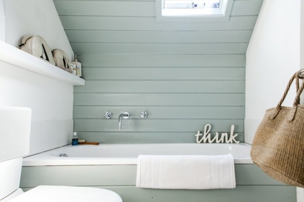
A small bathroom on the top floor previously housed a toilet and little else. “We were determined to squeeze a bath in here somehow, so although it’s a short one, you can still lie back and watch a film on an iPad balanced on the shelf above the window,” Holland says. “It’s a very relaxing space.” The tongue and groove paneling, which has been taken up onto the ceiling, is painted in Steel V from Paint & Paper Library.
See how to make the most of a small bathroom
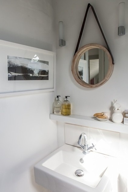
A painting by Boo Mallinson — a West Dorset artist — hangs at the other side of the small bathroom. “I studied fine art, and I used to work at the Tate, so art is very close to my heart,” Holland says. “I try to have original artwork whenever I can.”
Tell us: What do you think of this house?
Browse more homes by style:
Small Homes | Colorful Homes | Eclectic Homes | Modern Homes | Contemporary Homes | Midcentury Homes | Ranch Homes |Traditional Homes | Barn Homes | Townhouses | Apartments | Lofts | Vacation Homes


