Houzz Tour: A Modern Take on a Traditional Texas Farmhouse
http://decor-ideas.org 09/18/2014 04:47 Decor Ideas
Constraints often dictate design. Sometimes they’re difficult to work around, and sometimes they make an architect’s work just a little easier. The latter was the case for Patrick Ousey of FAB Architecture, who designed this home for builder Royce Flournoy and Anthony Hopkins, a baker. A wide and shallow lot, a utility pole and a culvert basically guided Ousey through the process. “Everything just fell into place easily,” he says. That included the farmhouse style, which the homeowners chose for its sense of timelessness. “I grew up in older homes all my life and like the feel,” Flournoy says. To which Ousey adds: “It’s like a pair of well-worn jeans and a crisp white shirt.”
Houzz at a Glance
Location: Austin, Texas
Who lives here: Royce Flournoy, owner of Texas Construction Company, and Anthony Hopkins, a baker
Size: 2,200 square feet (204 square meters); 3 bedrooms, 2½ bathrooms
A small rental home owned by Flournoy’s family previously occupied the lot. The homeowners and architect Ousey had planned to make some simple modifications to the rental, “but that turned out to not be that easy,” Ousey says. So they removed the rental home from the property, loaded it onto a truck and transferred it to a family vacation property about 40 minutes away.
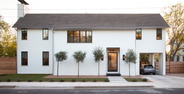
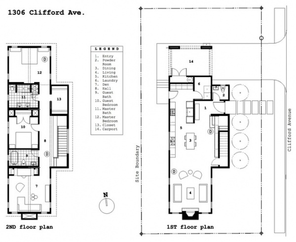
They then started from scratch. Given the setback requirements, Ousey was faced with designing a long, narrow home with the long facade facing the street. “Having the long face along the street is a whole different perspective of orientation and was a big challenge,” Ousey says. “We didn’t want to expose everything to the street.” The farmhouse style helped organize everything. “Once we simplified the spaces in design, it came together,” Flournoy says.
The form of the house, the white 6-inch Hardie planks painted in Gypsum White by PPG Pittsburgh Paints, and the window placement reinforce the traditional farmhouse style, while a bronze piping detail on the outside corners modernizes it. “It’s subtle,” Flournoy says. “The overall form is pretty simple, but then once you start coming up to the house and seeing the finer details, like that corner detailing and the steel brow awning over the front door, you see a little bit more sophistication and modern take. It’s not taking the farmhouse concept so literally but playing with details for a modern edge.”
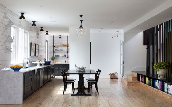
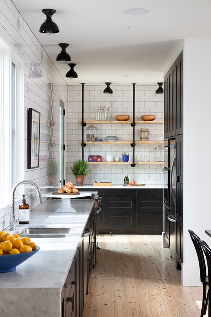
The ground floor is a combined kitchen, living and dining space. Because Hopkins uses the kitchen as a test kitchen for baking (he works at buzzy new Austin restaurant St. Philip), ample counter space is needed. The kitchen table is an 1890s mill table topped with black honed granite. Beneath is a wheel that can adjust the height to counter level so Hopkins can roll out dough for pies and pastries. “When he is in that cooking mode, he wants to spread out, but at the same time didn’t want to be stuck away from any of the action in the house, so this pushed an open kitchen that’s part of the living space,” Ousey says.
The cabinets are from Ikea and topped with marble. Around the corner is the pantry and laundry room. The lower cabinets are drawers with tons of storage. The owners considered not doing a backsplash after seeing an apartment in London without one and liking the concept. But in the end, they really liked the reflection of light a full tiled wall offered and went with 4-inch by 8-inch subway tiles all the way to the ceiling.
Floating pine shelves were sanded and sealed to look like the floor, then affixed on black gas pipe.
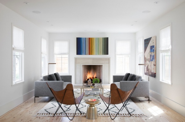
The kitchen opens to a living room, where the couple loves to entertain and sample some of Hopkins’ creations. “It’s a good place to hang out and have dessert,” Flournoy says.
Ousey’s wife, Pam Chandler, is the in-house interior designer at FAB Architecture and did Flournoy and Hopkins’ home. The homeowners thought they would eventually paint the pine flooring, but as time went on, they decided they liked it natural and left it alone.
Flournoy had the butterfly chairs custom made because he didn’t like the size of the spindles or color of the leather on those he saw for sale.
The couple chose white for the walls to help showcase their growing art collection. They commissioned both pieces seen here. The piece above the fireplace is by Roi James. The one to the right is by David Sweeney.
Wall paint: Gypsum White, PPG Pittsburgh Paints; sofa: Scott & Cooner; rug: West Elm; coffee table: Williams-Sonoma Home
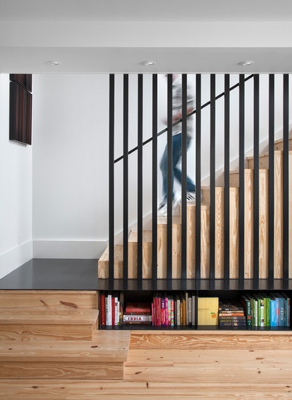
The steel landing staircase and balusters are other unexpected departures from the farmhouse aesthetic. The landing turns into a bookcase for Hopkins’ cookbooks.
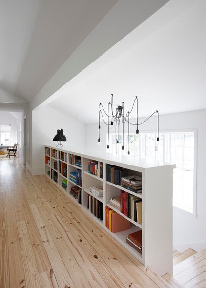
Large windows in the stairwell bring natural light into both levels of the home.
Light: Lightology
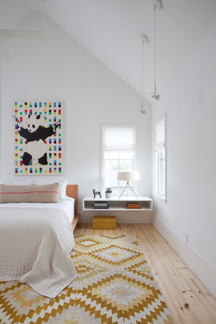
A Banksy print hangs over a bed from Design Within Reach in the light and bright master bedroom, which sits above the driveway and carport. The floating shelves were custom made.
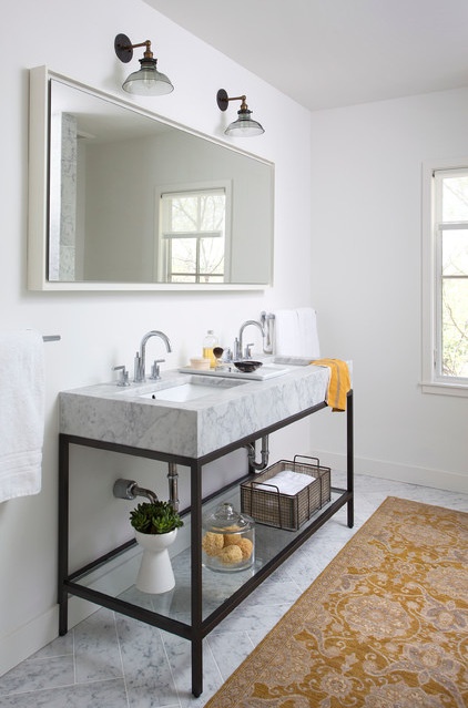
Cut 12- by 24-inch marble tiles form a herringbone pattern in the master bathroom. The mirror is a full-length version from West Elm framed and turned sideways.
Vanity: Restoration Hardware
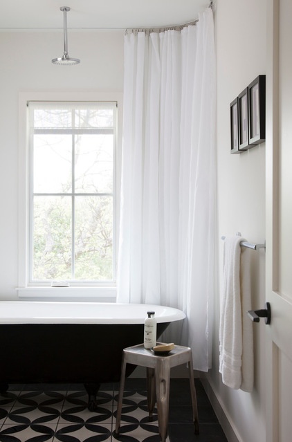
A tub salvaged from the rental house that was removed from the site and refinished sits on concrete tiles in a guest bathroom. The shower curtain is hung from a recessed track in the ceiling.
Though Flournoy has owned a construction company for nearly 15 years, he didn’t do a lot of hammer swinging on his own house, choosing to act as project manager instead. “I started out as a carpenter’s apprentice but haven’t done it in 10 years,” he says. “Trim carpenters work so fast. And if you don’t do it every day, painting a 2,200-square-foot house is not the best use of time. The trade base and in-house crew can knock that stuff out. They built this house in about four months. You can’t do that without hiring professionals.”
Browse more homes by style:
Small Homes | Colorful Homes | Eclectic Homes | Modern Homes | Contemporary Homes | Midcentury Homes | Ranch Homes | Traditional Homes | Barn Homes | Townhouses | Apartments | Lofts | Vacation Homes
Related Articles Recommended


