Room of the Day: Just Right for 2 and a Crowd
This townhouse, on the Willamette River in Portland, Oregon, is the result of some magical design kismet. “About two years before we started this project, one of the homeowners and I took a home tour together,” says interior designer Jenni Leasia. “I had taken a picture of her sitting on a townhouse’s small terrace overlooking the river, and at the time she said, ‘This is exactly what I want.’” As townhouses along the river are uncommon, she never thought she’d find one.
The photo stored in Leasia’s phone worked like a mini vision board. Two years later the homeowners found a riverfront lot and decided to build two attached townhouses on it (one for themselves and one to sell), bringing Leasia onboard during the design phase. While it was a dream come true for the couple, the space posed a lot of tricky design challenges. They wanted to take as much advantage of the river views as possible, pushing the kitchen, dining area and living room to the back of the house. This meant each room had to be relatively narrow. Another challenge was that it needed to be cozy for the couple when it was just the two of them, but also able to accommodate frequent large gatherings with extended family and friends. Finally, all of the rooms were open to one another and needed to have a cohesive flow.

Photos by Lincoln Barbour
Room of the Day
Who lives here: Empty nesters with 3 adult sons and lots of extended family in the area
Location: Portland, Oregon
Team: Interior design: Jenni Leasia Design; architecture: Curt Olson, Olson Group Architects; contractor: Riverland Homes; woodworker/cabinetry: Lorie Dearing, Mapleleaf Woodworking
Size: About 13½ by 17½ feet (4 by 5 meters)
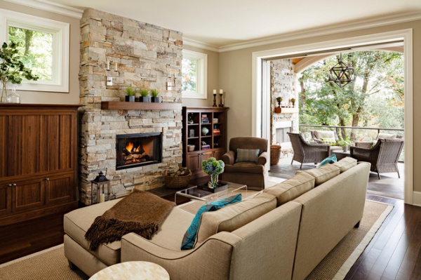
“We had to balance a lot of uses in a relatively confined space,” Leasia says. She began her space saving by designing built-ins to flank the fireplace, crafted of local walnut. The unit to the left houses all of the media equipment. It has doors that swing in on waxed tracks to reveal the TV. “The carpenter did an amazing job,” she says.
This move left the fireplace free and clear, allowing the ledgestone to make a big design impact. The rich walnut, stone and views through to the trees are a pleasing combination of natural materials, accentuated by the neutral color palette.
Leasia designed a sectional and club chair for comfy seating that’s cozy for two but can accommodate more people. She chose an acrylic coffee table to keep the space visually open.
Doors: Welland; stone (on indoor and outdoor fireplaces): Hudson ledgestone, NSVI; wall paint: custom mix of Glacial Till AF-390, Benjamin Moore: trim paint: Floral White OC-29, Benjamin Moore; coffee table: CB2; flooring: prefinished cherry with an almost-ebony stain; sconces: Visual Comfort; sofa, chair, sisal rug: custom, via Jenni Leasia Design

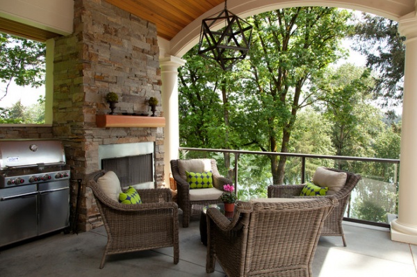
The room needed to allow a clear passage to this covered porch perched above the river. The doors between the two disappear into the wall, turning this outdoor space into an extension of the living room. The ceiling is smooth tongue and groove cedar.
“We mixed in some catalog finds with high-end pieces; I’m finding clients love that,” Leasia says. The custom sofa, chair and built-ins in the living room were more expensive investments; the coffee table is from CB2, and the outdoor chandelier is from Restoration Hardware.
Pillows: custom, with Marimekko fabric

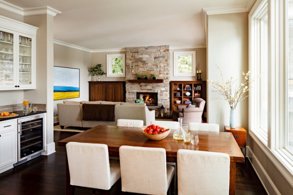
This photo, taken from the kitchen, shows how the living room is also open to the dining room and kitchen. The custom cherry table has 22-inch leaves that are self-storing and can accommodate lots of people. “This couple has a big family, and they celebrate all of the holidays here,” Leasia says. The area to the left is a drinks station complete with a wine refrigerator. A striated honed marble backsplash plays off the colors in the fireplace. Another long table lies just outside the window on the terrace.
Leasia and her client looked hard for just the right painting for the space. They were very pleased to find the one seen here, by local artist Annie Meyer. “Within a very neutral palette, adding color through art and accessories helps keeps things consistent,” the designer says.

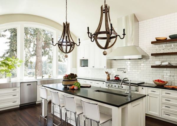
The homeowner had her heart set on a white kitchen with black countertops. An adjacent townhouse is on the other side of the very long range wall, so windows were not a possibility. The subway tile adds texture and reflects the light.
Because the kitchen opens to the dining space and family room, Leasia added a few touches to tie it to the other spaces. Ample storage space meant she was able to add open shelves (made of walnut) to the wall, covered in subway tiles. She also chose rustic wooden wine barrel chandeliers that play off the palette.
“I found the photo of my client sitting by the river in my phone while I was working on this project,” Leasia says, referring to that day two years before the project began. “It was one of those really resonant moments.”
Chandeliers: Restoration Hardware
See more Rooms of the Day


