Houzz Tour: Room for Fun in a Sophisticated Family Home
When Sacha Berger and her husband decided to redesign their home, in London’s Queen’s Park, they were determined that it would reflect their eclectic personalities.
Berger, who runs her own vintage chandelier and interior design company, was in charge of the project. She set about creating a light, bright family home that didn’t take itself too seriously. “We wanted it to be a sociable space where we can entertain family and friends, but with two children, it was important to us that it didn’t look too grown-up, either,” says Berger.
Lots of storage and a mash-up of modern and opulent styles are key to Berger’s eclectic scheme, which features a mixture of investment pieces and eBay finds. When the couple bought the house, it hadn’t been touched for 40 years, so the family lived offsite for six months while the renovations were being done. The result is a beautiful, contemporary family home that is bursting with personality and constantly evolving.
Houzz at a Glance
Who lives here: Sacha Berger and her husband, with their 2 children
Location: Northwest London
Size: 4 bedrooms, 2 bathrooms
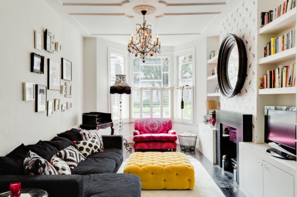
Berger designed the eclectic living room around the bespoke pink Tann Rokka chair. “It was an investment piece, so I really wanted the scheme to work around it,” she says. “In the end I decided to embrace it and go with the bold colors, which definitely makes the room a fun space to spend time in.”
The colorful chandelier pulls the look together and is one of Berger’s own, from the Vintage Chandelier Company.
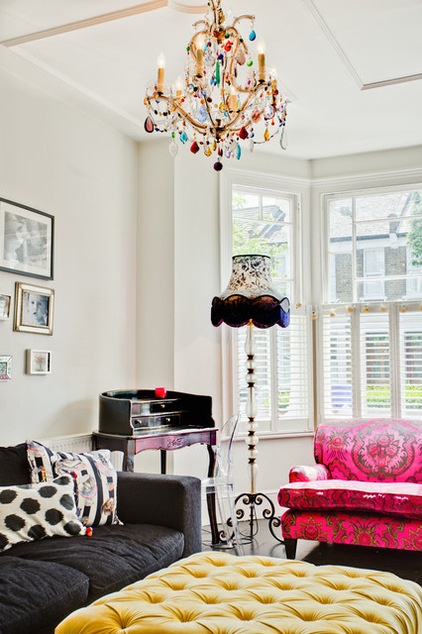
The bespoke ottoman was another investment buy, but Berger is a firm believer in mixing things up. “I love to include investment items with cheap buys from the Internet,” she says. “It creates a much more eclectic look, and it’s nice when different patterns clash.”
Berger kept the walls neutral, using Dulux paint in Timeless to create the look. The black sofa is from BoConcept.
So Your Style Is: Eclectic
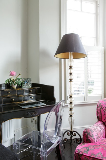
The bureau was one of Berger’s eBay purchases; it cost about $330. She discovered the lamp base in a local antiques shop.
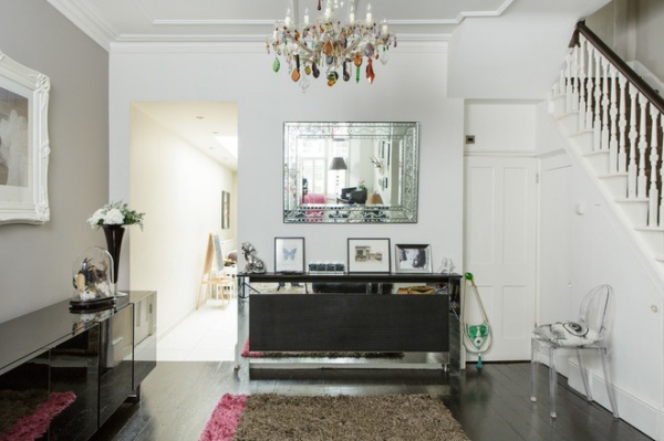
Berger wanted to make the most of the dead space leading into the kitchen, so she created a feature wall using Farrow & Ball’s Dovetail paint.
“I wanted the limited-edition Mary Ansell painting to create a juxtaposition with the modern sideboard,” she says. “The painting’s frame was originally gold, but I wanted it to look more Shabby Chic, so I sprayed it white.”
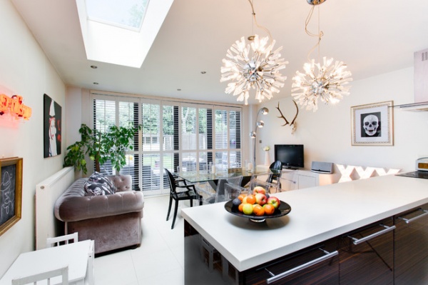
“This room goes to prove the fact that I don’t mind going for cheap finds,” Berger says, adding that the gray sofa is from grocery and general merchandise retailer Tesco. “The taupe color fitted perfectly with the kitchen, and I wanted it to be a room that got used, with lots of comfy seating.“
She completed the look using a neon light box from the Vintage Chandelier Company and dramatic retro-style pendant lights from John Lewis.
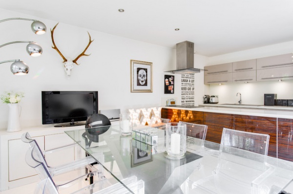
Light filters into the kitchen from a large window during the summer, and Berger chose a glass table and clear plastic chairs to keep the room feeling light and airy. She customized the stag head with Swarovski crystals for a dramatic, glamorous effect.
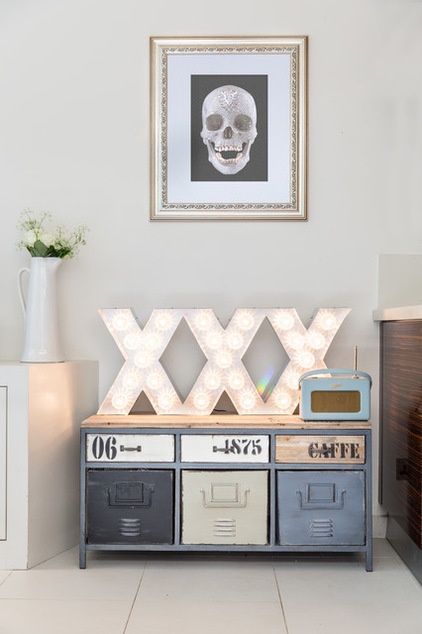
“I wanted to make the kitchen have a bit more of an industrial feel to it,” says Berger. “I found the storage unit on eBay and decided to make a feature wall with the lights and the Damien Hirst reproduction — we do like a bit of bling, and I’m really pleased with how this corner worked out.”
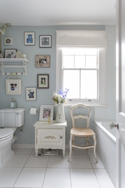
In the children’s bathroom, Berger mixed up styles again. “This is my outlet for Shabby Chic — it’s a small room, so it has to be light, and this style fits it perfectly,” she says.
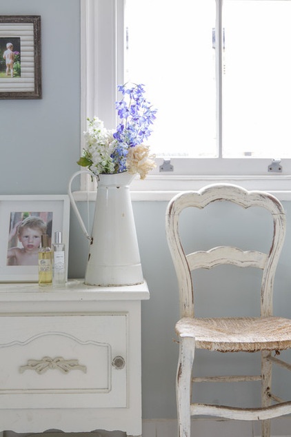
Berger completed this look with more bargain finds. The chair and jug are from the Sunbury Antiques Market at Kempton Park; they cost about $10 each.
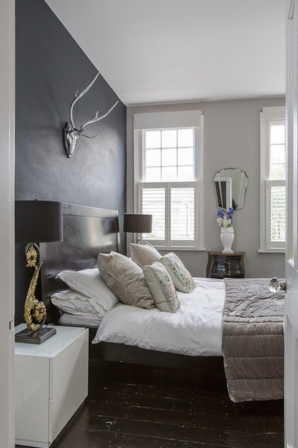
“I wanted to create a boutique-hotel look in the master bedroom,” says Berger. “We’ve got a very large TV above the fireplace, and we wanted the room to feel luxurious.”
To get the look, she used her favorite paint color, Farrow & Ball’s Railings. The lamp is from Graham and Green, as is the stag’s head, and Berger made the cushions herself. The bed is from BoConcept.
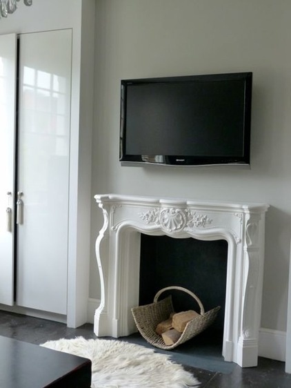
The ornate fireplace offsets the modern element in the bedroom. “I don’t like any room to look either too modern or too ornate,” says Berger. “My main aim is to mix it up.”
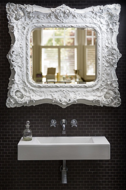
Berger wanted to make the en suite bathroom an extension of the bedroom, so it doesn’t have a door. She chose the ornate mirror for its artistic qualities, as it’s visible from the bedroom.
“It’s a small bathroom, so I wanted to make it into a feature so the bathroom looks like a part of the bedroom,” she explains.
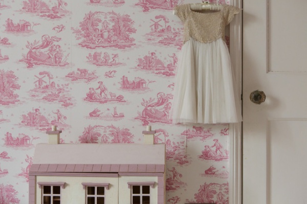
Berger’s 5-year-old daughter is quite a girly girl, and she wanted her room to reflect this, hence the pink color.
“I love the toile wallpaper from Laura Ashley,” she says. “I’m not a fan of children’s wallpaper as such, so this is a good way to get the look right without being too childish.”
Berger bought the dollhouse from Toys ‘R’ Us and customized it using Farrow & Ball paint.
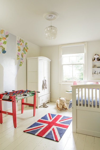
In her 7-year-old son’s room, Berger created a blank canvas. “There are pops of color — like the rug, from Aspace, and the wall stickers, from Swedish company Ink — but I wanted to create a room that he can put his own stamp on as he gets older,” she says.
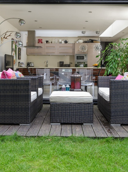
The garden is quite small, so Berger wanted the kitchen to feel like an extension of this area. Glass doors fold back to create a bright and welcoming space in summer, but she installed plantation shutters to prevent the kitchen feeling too cold come winter. She was inspired by Morocco for the soft furnishings and bought the large velvet cushions from Graham and Green.
Browse more homes by style:
Small Homes | Colorful Homes | Eclectic Homes | Modern Homes |Contemporary Homes | Midcentury Homes | Ranch Homes | Traditional Homes | Barn Homes | Townhouses | Apartments | Lofts | Vacation Homes


