Houzz Tour: Details Make the Difference in 700 Square Feet
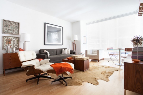
Randall Reynoso and Martin Camsey were remodeling their Monterey-colonial-style home in Sacramento, California, when life intervened. Reynoso, who works in banking, was transferred to his company’s San Francisco office. Realizing he would need to be in the City by the Bay four days a week, he and Camsey started looking for a home there. They found a sleek condo in one of San Francisco’s new modern high-rises — quite unlike the 1920s-era home they were remodeling with the help of their architect and family friend, Curtis Popp of Popp Littrell Architecture + Interiors. They asked Popp to temporarily switch gears and help them outfit the condo. “Because of the new job and because they were continuing their remodel, the place had to be done quickly and under a strict budget,” Popp says.
Photos by Kat Alves
Houzz at a Glance
Who lives here: Randall Reynoso and Martin Camsey
Location: San Francisco
Architect: Curtis Popp, Popp Littrell Architecture + Interiors
Size: 700 square feet (65 square meters); 1 bedroom, 1 bathroom
Popp has known Reynoso for most of his life. “I was an only child, but Randall was like my mother’s other son and my older brother,” he says. “And he was that good-looking, successful older brother I used to resent when I was little — and I’ve told him as much.”
As he got older, the resentment turned to sincere admiration, so Popp must have felt some trepidation when asked to design a home for his old family friend. “Working for people you know and respect can be tough,” he says. “But working with these men has been fantastic. They are demanding, in a good way — a way that pushes you in a good direction. I like it that they care as much about the project as I do.”
In this case Popp needed to pull the home together in six weeks, so style demands came with a deadline.
“We have no custom pieces here, save for bedside tables I designed,” says Popp. “The furnishings came from places like Design Within Reach and Blu Dot.”
The home has a single bedroom, so a sleeper sofa from Blu Dot in the living room gives overnight guests a place to crash. “It makes a king-size bed,” says Popp. “We chose lightweight and easy-to-move coffee table cubes so it can quickly convert to a guest room if needed.”
Diplomat Sleeper Sofa: Blu Dot
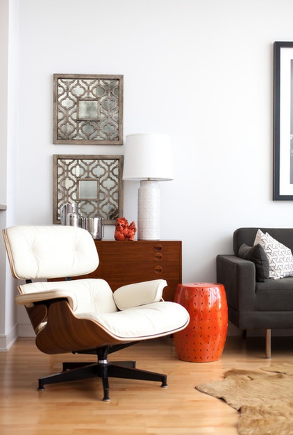
The quick turnaround and the budget made repainting the space a low priority. “We kept it white but brought in gray, orange and walnut wood,” says Popp. “It’s a white space, but pops of orange make it feel colorful.” The owners are fans of both the San Francisco Giants and Hermès designs, so the orange is appropriate as well.
Popp says Reynoso has a great eye and is adept at accessorizing and making eclectic pieces work together. In this room a classic Eames chair is grouped with the Blu Dot sofa, a console that belonged to Reynoso’s grandparents and more ornate mirror panels, and it feels right at home. “Doing things like keeping a consistent wood color helps [the pieces] live together,” Popp says.
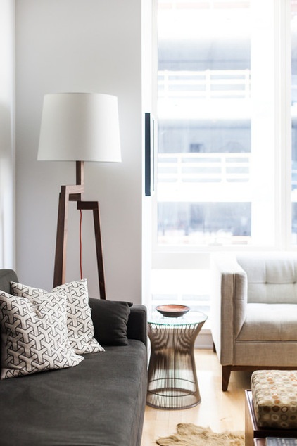
Accessorizing was the key to making the empty condo a home. “The building and its amenities are really nice,” says Popp. “But the condos themselves were a bit vanilla, probably created to suit the tastes of many different buyers. The accessories, the artwork and the bright splashes of color made it work for the couple.”
The design is in the small details, such as the orange-red cord on the walnut floor lamp.
Stilt Floor Lamp: Blu Dot; armchair: Atwood, Gus Modern
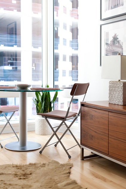
In lieu of a dining room, Popp created a dining nook that’s easy to tuck away if needed. “We have brackets in a closet for hanging up the chairs if they need more space,” he says. “And by putting the dining area here, we gave them a place to sit and enjoy views of the San Francisco Bay.”
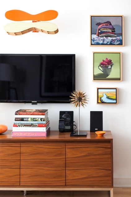
Popp positioned the television over a console and among artworks so the display reads as a gallery wall. The Dean DeCocker sculpture that is mounted on brackets above the TV is just one of what Popp calls little surprises in the space.
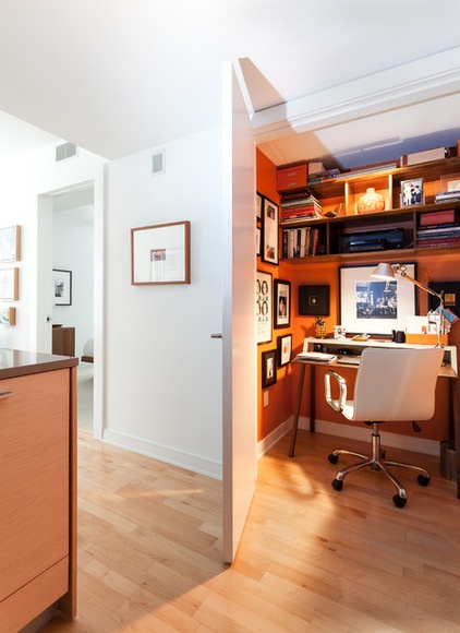
A bigger surprise is a 3- by 4½-foot office space (formerly a pantry), painted bright orange on the inside. When the door is open, the space glows. When the office is not being used, it can be closed off from the living space.
Built-in shelves above the desk provide storage, and a mini gallery wall provides a big design moment.
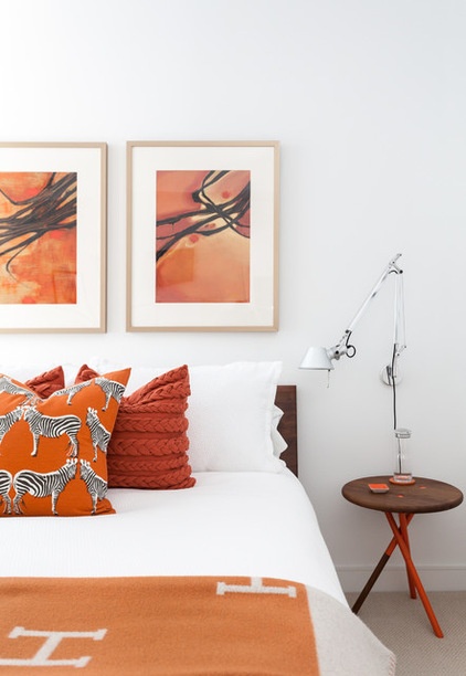
The black and orange Giants colors extend from the nearby AT&T Park to the master suite in this home. But here — with abstract art, a zebra motif and cable-knit pillows — they are reinterpreted in a way that’s anything but uniform.
Bed: American Modern, Design Within Reach; Soft Side Table: Curtis Popp
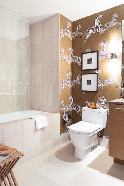
Before the makeover the bathroom was nice but unremarkable. The new zebra-printed wallpaper has made it anything but. “This was something Randall loved and had always wanted to use,” says Popp. “This was the perfect opportunity to use it to make the room cool and playful.”
Popp has a feeling that his late mother, Sue Popp, would get a kick out of seeing her “sons” collaborating. “My mother was a tough gal — a bit like an old-school Mae West character, who had a big laugh and liked cocktails,” he says. “After she died I gave Martin and Randall some of her art and her record collection, and some of those pieces are here. I think she would love that we are working together and like to come to a party here. The space is cheery and happy, and she’d like that.”
Wallpaper: Zebras, Scalamandre
Browse more homes by style:
Small Homes | Colorful Homes | Eclectic Homes | Modern Homes | Contemporary Homes | Midcentury Homes | Ranch Homes | Traditional Homes | Barn Homes|Townhouses | Apartments | Lofts | Vacation Homes


