Room of the Day: A Great Room in a Former Church
In the early 1930s, the story goes, residents of Tamalpais Valley, in the city of Mill Valley, California, got together to hand build a new one-room nondenominational church. The Methodist Church bought the building and expanded it to include a meeting hall and Sunday-school classrooms in the 1970s. It was converted to a private residence in 2000 and purchased by Jodi Riviera.
In 2013, Riviera, husband Brian Buchanan and their four kids updated the space to reflect some of its original, hand-built charm — but also give it a more modern feel. Just like with the original church, the awe-inspiring moments happen in the main chambers, where a newly remodeled kitchen and exposed scissor-truss ceiling would make anyone giddy enough to pull on the rope that rings the steeple bell.

This photo, shot in 1939, shows the original church building surrounded by not much else.
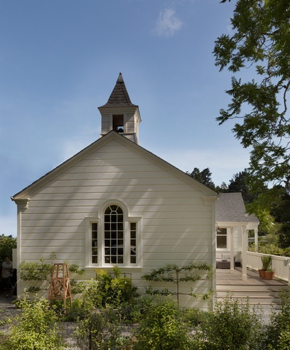
Today the main chamber remains — now part of a busy San Francisco Bay Area neighborhood — and is a combined living, dining and kitchen space. The additions became the bedrooms and bathrooms.
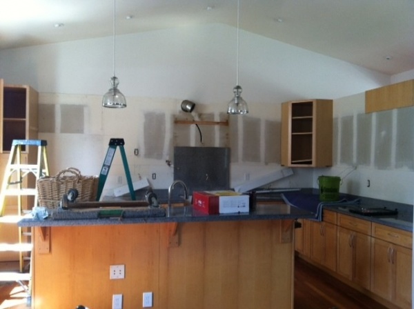
BEFORE: Previous owners had remodeled the interior, adding travertine floors and a dropped ceiling over the kitchen.
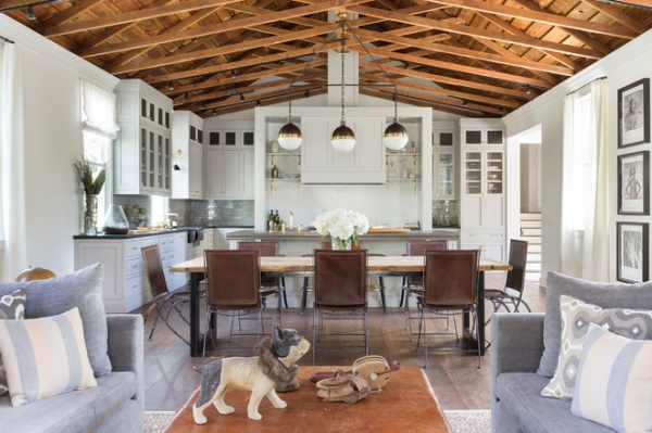
AFTER: Riviera, a design executive at a home furnishings company, and Buchanan, a consultant specializing in the health care industry, worked with architect Daniel Castor, interior designer Holly Hollenbeck and Caletti Jungsten Construction for the remodel. The team removed the dropped ceiling to expose gorgeous 2-by-4 scissor trusses. “It made an enormous difference and created one large, unified room,” Hollenbeck says.
They then pushed the kitchen back a few feet and removed a wall that separated the kitchen from the entryway.
A back wall hides the kitchen pantry, refrigerator and storage from the main chambers. “Because that’s the main living space, there’s no separate formal living room. They’re looking at the kitchen all the time every day, so we put the range forward as a showpiece and the fridge and food and not-so-attractive stuff behind it,” Hollenbeck says. “Luckily, the space was large enough to do that.”
Learn more about different types of trusses
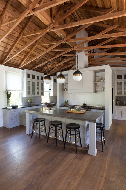
Hollenbeck had the island built by hand and topped with a hand-hammered pewter counter and an integral sink. The backsplash is made of handmade gray Anne Sacks tiles. “We wanted to return the home to something that really felt like it could have been original to the house, but with a modern industrial spin,” she says.
Countertop: pewter, Francois & Co; faucets: R.W. Atlas collection, Waterworks; floors: wood, Francois & Co; stools: Gar Products
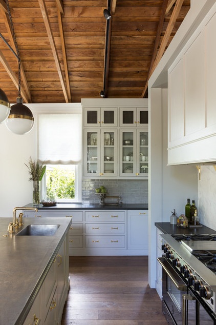
Buchanan is an avid cook and wanted a high-powered range and appliances. He picked a BlueStar range and agreed with Hollenbeck’s suggestion that it be black.
The small Hick pendants over the island came individually hung, so Hollenbeck created a custom T-bar to hang all three from.
Pendants: Circa Lighting; T-bar: custom, Omega Lighting Design; crown molding: SF Victoriana; cabinet glass: Paige Glass Comany; cabinetry hardware: Folger & Burt; LED lights: Aion; track and track heads: Hampton Bay
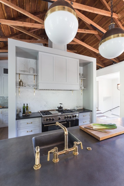
Hollenbeck chose brass fixtures and cabinet hardware to warm up the gray palette.
Cabinet paint: 490p, satin finish, C2 Paint; wall paint: Cloud White, flat finish, Benjamin Moore; marble range countertops, backsplash and shelves: Integrated Resource Group; countertop fabrication: Fox Marble & Granite; shelf brackets: House of Antique Hardware
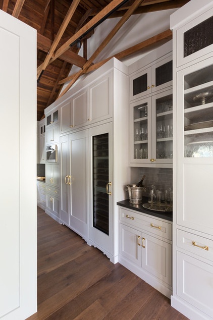
The back side of the range wall is fairly shallow, about 12 inches, but is perfect for a tall pantry for canned goods, cereal and juice. A bar niche has roll-out shelving for bottles.
Refrigerator, steam oven, wine fridge: Miele
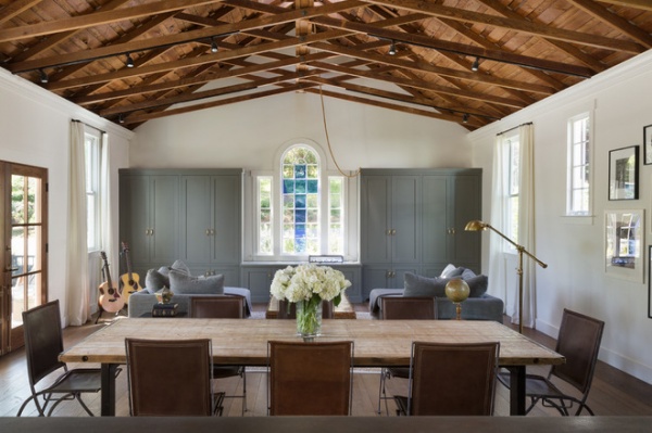
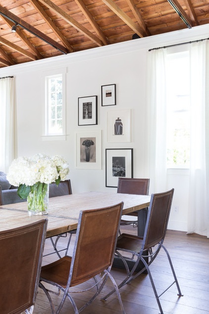
Italian folding campaign chairs from the 1940s surround an antique wood-topped dining table that rests on a new fabricated steel base.
Wall paint: Cloud White, flat finish; trim paint: Cloud White, satin finish, both by Benjamin Moore; tabletop, base: Big Daddy Antiques
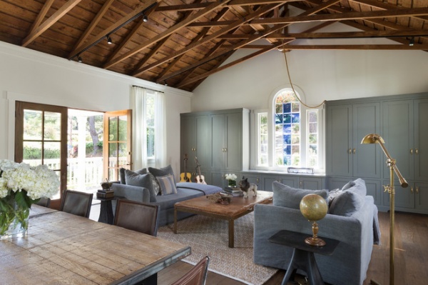
The window with the blue cross is original to the building. The rope that hangs near it is used to pull the steeple bell. Though the bell works, it’s not original to the church. The couple bought it together on a trip to Italy and had it fitted into the bell tower. The kids and their friends love to ring the bell.
Hollenbeck covered the homeowners’ existing sofas in removable, washable fabric slipcovers. “With small, active children, we didn’t want to make anything too precious,” she says.
That idea is perfectly exemplified by the coffee table, which is a vintage Eastern European gym mat from the 1940s on a steel base. “The kids can jump back and forth from the sofas onto it without damaging it,” Hollenbeck says. “It’s literally a gym mat, so you can’t do to it anything that hasn’t been done already.”
Rug: West Elm; slipcover fabric: Romo; slipcover fabricator: Belmar Fine Custom Upholstery; pillows: custom, Andrea Santana; side tables: Big Daddy Antiques; floor lamp: Restoration Hardware; papier-mâché bulldog: SummerHouse
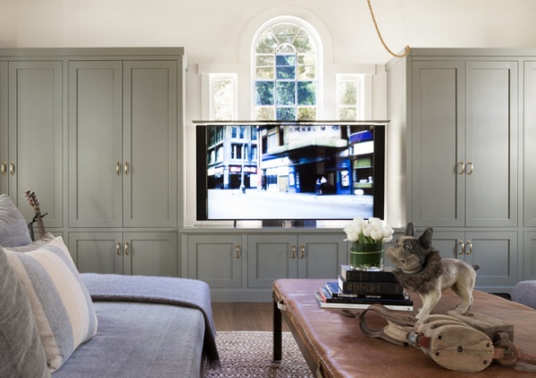
The cabinets were there before but the team retrofitted them to conceal a large plasma-screen TV. The team went under the house and dug out a hole to allow the TV to be lowered into a sunken box. “It was really a fabulous solution for having a large-screen TV without looking at it all the time,” Hollenbeck says.
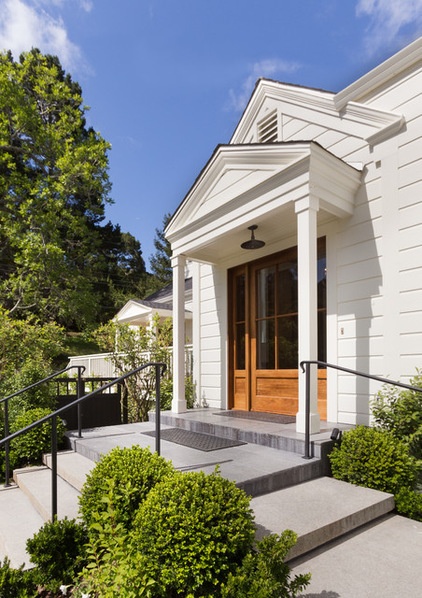
A tacked-on shelter over the entryway had blown down during a storm, leaving packages to get soaked on the doorstep when it rained. Castor added a small portico area and established a better front entry. “It was confusing where the front door was,” says Hollenbeck. “French doors off to the side attracted the eye more and created confusion as guests walked up from the street.”
The team reoriented the access to the front door by removing a tree and adding a garden gate that made the pedestrian entrance more obvious. A few years ago, the exterior had been painted yellow; Hollenbeck strongly recommended they go back to white.
Exterior paint: Cloud White, Benjamin Moore
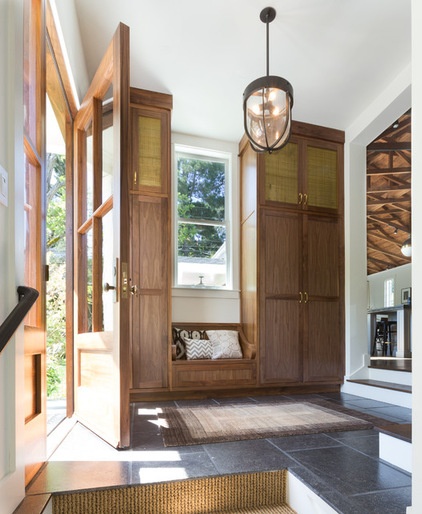
Previously, the awkward entryway had several landings. “There were stairs everywhere and no storage,” Hollenbeck says. An armoire had been backed up against a wall that divided the entry from the kitchen, but it wasn’t enough for all the shoes, backpacks and bags belonging to the couple and their kids.
Again, Castor changed the entrance sequence. Shaker-style cabinets keep with the simple country-church feel, while mesh adds a little industrial edge.
Mesh: Outwater Plastics
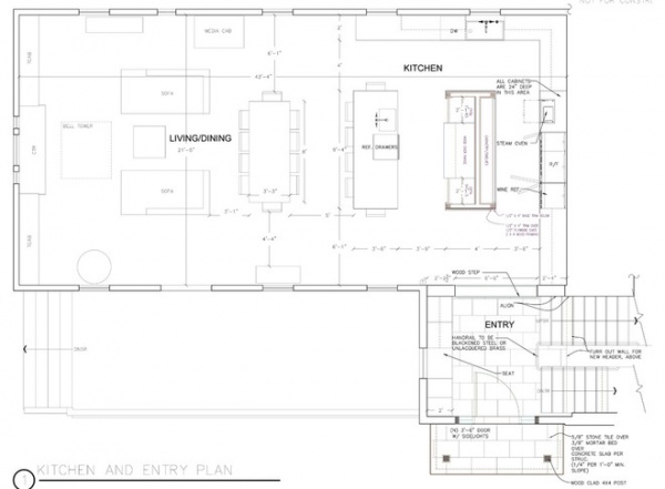
The floor plan shows the new layout and entryway.
Team:
Architect: Daniel Castor, Castor Architecture
Contractors: Rodger Chemnick, Brian Perloff and Jim McCracken, Caletti Jungsten Construction
Cabinetry in kitchen and all other areas besides living room: Keith Bruns Woodworking
Countertop fabrication: Bill Gamble, Fox Marble & Granite
Custom sconces over kitchen sink and custom T-bar over island: Vanessa Bell, Omega Lighting Design
Cabinetry in living room: Gregory Schreier Cabinetmaker
Audio and TV wiring and TV lift in living room cabinetry: Scott Sullivan, Soundvision
Electrical work: Cameron Tyson, Knights Electric
Landscaping: Richard McArdell, McArdell Landscape
Gardens: Janell Hobart, Denler Hobart Gardens


