Houzz Tour: Home Expansion Lets the Sunshine In
From the outside this house in Dublin, Ireland, looks fairly standard — a modest family home built in the 1980s. Step inside, though, and you’ll find a modern, light-flooded space that is absolutely vast. “The extension at the back has more than doubled this property’s footprint,” says Catherine Crowe of Optimise Design, the architecture and interior design team behind the project.
The space accommodates a young couple and their growing family — two small children and a baby — but it also delivers a wow factor. “The owners wanted you to come into the house and it be completely different from what you’d expected,” Crowe says. “From the outside you would never guess this property is so big.”
Spacious architecture is married to a stylish palette of gray and white, modern rustic touches and a combination of vintage and design-classic furniture for a home that looks beautiful but is family friendly too.

Houzz at a Glance
Who lives here: A young couple with 3 children
Location: Dublin, Ireland
Size: 5 bedrooms, 3 bathrooms
The long extension at the back of the house is flooded with light and replaces a small, single-story kitchen. “It more than doubles the footprint of this house,” Crowe says. “We had to design carefully, keeping that scale in mind. So rather than a single glazed wall overlooking the garden, we suggested fitting a door and windows, to help delineate the huge space and frame the view.”

The sociable couple who owns this house wanted space for entertaining. The kitchen island allows friends to relax with a drink while the owners are cooking, and this large table, surrounded by Eames DSW chairs, can seat 10. “The table was just one of several pieces the owners wanted to factor into the design of this extension,” Crowe says.
Pendant light: Maskros, Ikea
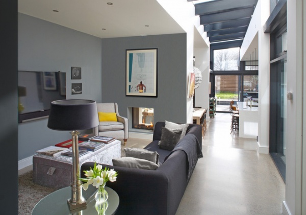
The original living room, at the front of the house, is now a playroom. This sophisticated living space straddles the place where the old house ends and the extension begins. A tunnel fireplace was installed in the wall between this room and the dining space beyond to link the two areas.
Gray paint: London Road, Dulux
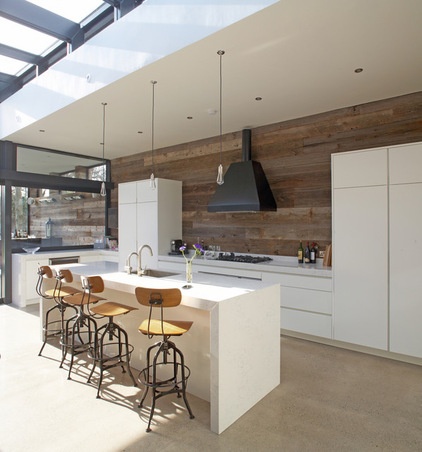
A wall clad in reclaimed timber is a striking feature in the kitchen. “The owners wanted something that looked quite wrecked and rustic against the clean, sharp, white kitchen,” Crowe says. The timber had been part of a barn and runs beyond the kitchen onto the wall outside that flanks the covered bar area. The timber came from Ebony & Co. The island and countertops are Silestone, a quartz material that looks like marble.
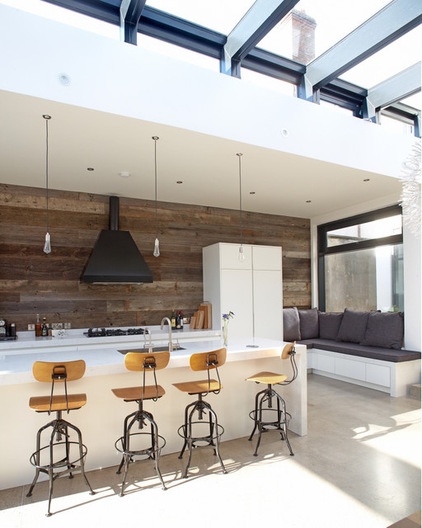
Although this extension is spacious, the owners have been careful to keep it looking sleek and ordered. They built bench seating under the window — it provides a place for relaxing without eating into the floor space too much.
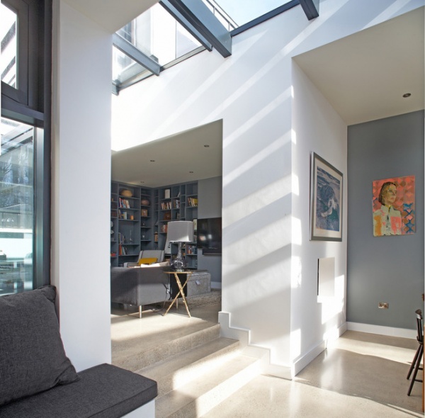
Rather than build the extension on one level, creating a huge space potentially lacking in features, the owners set the kitchen lower than the rest of the house. Stairs lead down from the living area into it. “They help to gently break up the space,” Crowe says. The flooring is poured concrete.
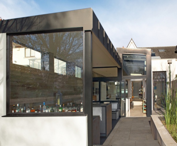
The owners love to have friends over and had a bar built outside for entertaining. It has a roof and heaters to help fight off the chilly Irish weather and make it a space that can be used year-round.
10 Elements of a Great Home Bar
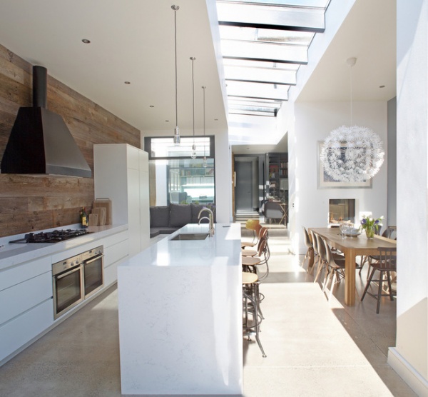
Instead of individual skylights, Crowe designed a row of roof lights that runs along the spine of the extension. “They are slightly raised too,” she says, “which helps them pull in light all day long.”
Modern Roof Features for Light, Rhythm and Interest
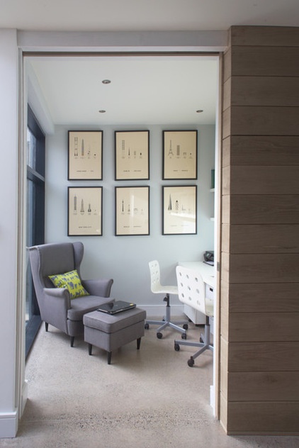
The study sits in what was the original house and is lit by a courtyard outside, which also brings natural light into the living room opposite. Large timber-clad sliding doors can be pulled across for privacy. They are less obtrusive than regular doors and help to keep the space uncluttered. Jules swivel chairs from Ikea at a built-in desk provide space for two people to work.
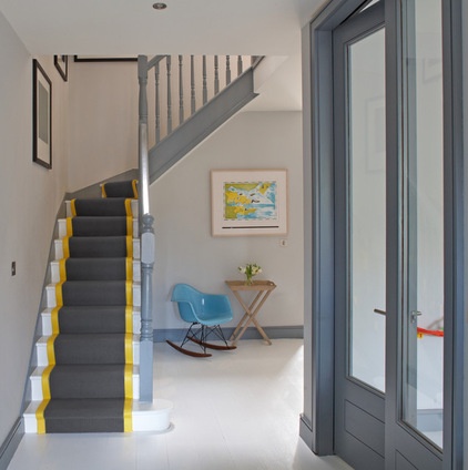
The bright yellow on the stair runner is a zingy accent that punctuates the gray color scheme. “We couldn’t find a carpet with a yellow trim, so we chose a regular stair runner and edged it with yellow leatherette,” says Crowe. “It cleans easily, and its smooth feel is a nice textural contrast to the deep wool carpet.” The floor is oak, which the designers painted white.
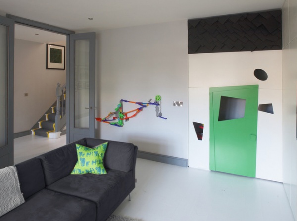
The children have a dedicated playroom at the front of the house, complete with a wall-mounted structure for running balls and marbles down. “We borrowed space off the living room to make a cloakroom,” Crowe says, “and that left a little nook, which we turned into a playhouse.”
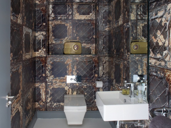
The owners had fun with the decor in the downstairs cloakroom (powder room) and chose a wallpaper designed to look like classic rusted metal tiles: Brooklyn Tin Tiles wallpaper in 08 Metallic, from Rockett St George.
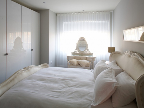
The owners chose a more romantic look for the spare bedroom, with a French-style bed and white bed linens. The built-in cupboards are fronted with glossy white doors, and their softly reflective surfaces help increase the sense of space.
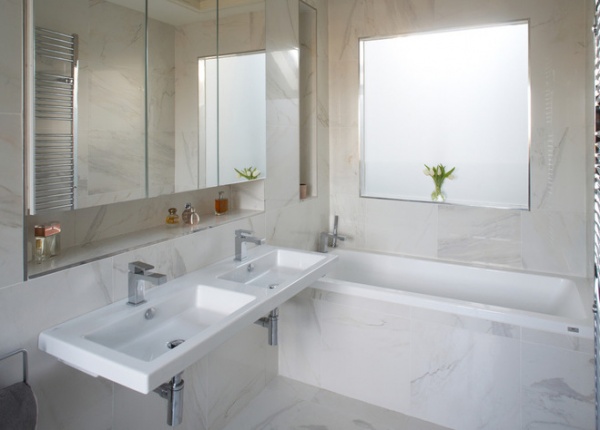
For a luxe look at a fraction of the price, Crowe sourced marble-look tiles. “Often imitation marble tiles look really rubbish,” she says, “but these are beautiful.” The tiles and some of the other bathroom features are from Tile Style.
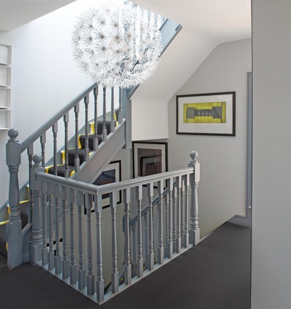
The owners stuck to a gray theme throughout the house, painting banisters in a soft gray and using gray carpet on the upper floors. “They had a very clear idea of the color scheme they wanted,” Crowe says. “Definitely no beige!”
Browse more homes by style:
Small Homes | Colorful Homes | Eclectic Homes | Modern Homes | Contemporary Homes | Midcentury Homes | Ranch Homes | Traditional Homes | Barn Homes | Townhouses | Apartments | Lofts | Vacation Homes


