Houzz Tour: An Eclectic Ranch Revival in Washington, D.C.
http://decor-ideas.org 09/14/2014 19:13 Decor Ideas
David Benton and Dennis Kirk’s 1957 ranch home sits at the end of a quiet street in the Palisades neighborhood of Washington, D.C. Its simple exterior and familiar profile recall iconic American architecture, though humbler than the White House several miles away. Whereas the architecture of the U.S. capital may be best known for its neoclassical opulence or historic federalist style, Benton’s home is on four split levels. A quick walk puts him on Georgetown University’s campus or along the Potomac River, but at home he can feel like he’s miles away. “We’ve got a country house,” says Benton, “but we’re in the city.”
Houzz at a Glance
Who lives here: David Benton and Dennis Kirk
Location: Palisades neighborhood of Washington, D.C.
Size: 2,200 square feet (204 square meters); 4 bedrooms, 2 bathrooms
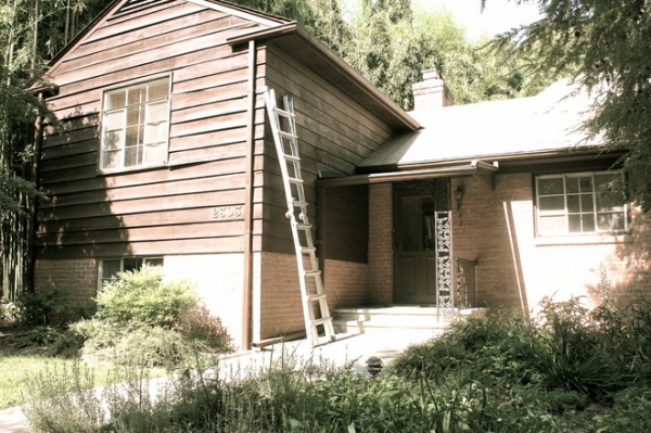
The existing exterior was every bit 1950s ranch home. The home’s previous owners had lived there for 35 years, says Benton, who describes their maintenance style as that of people who aren’t really into houses. “Instead of fixing something, they added another layer of paint or drywall,” he says. He liked the home’s bones, but a lot of stripping and cleaning up needed to be done.
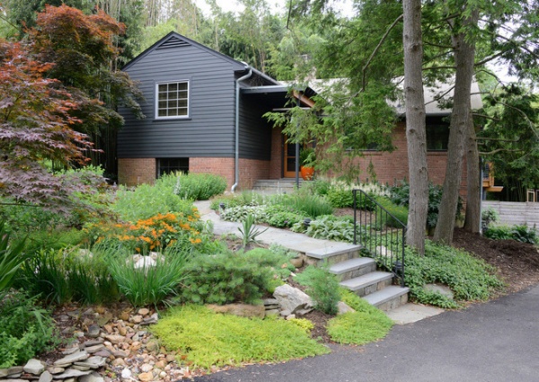
“After” photos by Michael K. Wilkinson Photography
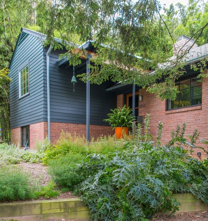
AFTER: Benton, an architect at Rill Architects, didn’t want to alter the exterior too much. He refinished the HardiePlank siding in a darker, more contemporary charcoal; left the original brick; and installed energy-efficient windows. The landscape was tackled early on. Benton had no desire to inherit the homeowner chore of mowing the lawn. “I don’t want to do that ever again,” he says. The first thing he did was remove the grass and install year-round foliage plants like lavender, rosemary and bear’s breech.
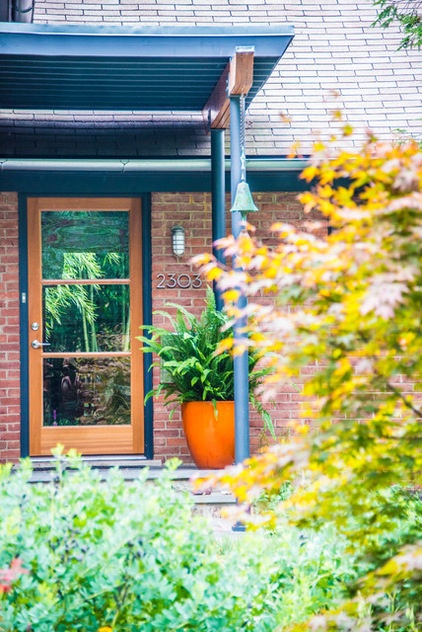
The entryway’s update was probably the most dramatic. Benton removed the ornate entry post and railing in the first photo and replaced them with a simple post and a colorful potted fern. Modern house numbers and an industrial entry light simplify the space even more. The new glass front door, highlighted with dark charcoal trim, brightens the corner.
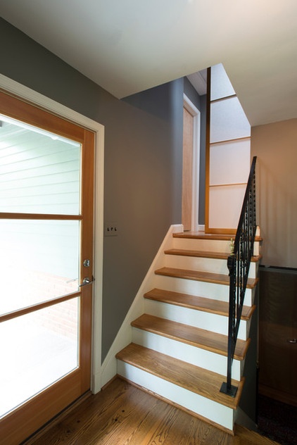
Inside, natural light from the glass door illuminates and opens up the compact entry. Dark charcoal walls provide a contemporary backdrop without feeling too heavy.
The main floor is one of four split levels; there are two floors above and one floor below. Though the rooms don’t just flow into one another, they also aren’t a full story apart. ”Everything feels like it is just a half a staircase away,” Benton says.
The railing to the third and fourth floors is original; Benton says he may or may not replace it. ”It’s kind of grown on me,” he says. “It gives some history to the house.”
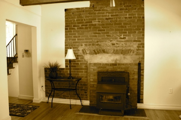
BEFORE: Straight back from the front door, the existing living room was centered around a partially exposed brick wall and a wood-burning stove, but the view wasn’t all that remarkable.
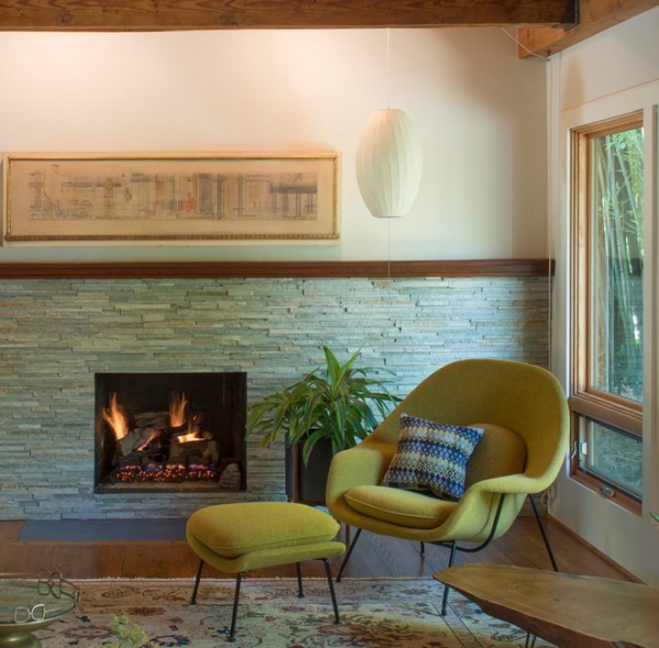
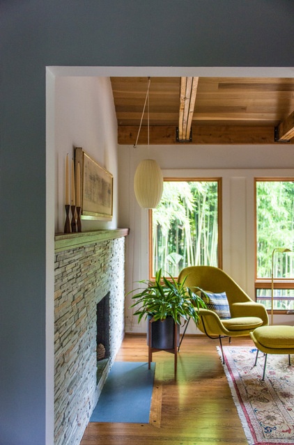
AFTER: Benton removed the wood-burning stove and installed a gas fireplace. He also covered the brick with midcentury-inspired stone tile sheets that run the wall’s length. He capped the stone with wood to create a long, seamless mantel that makes the fireplace feel much more like a focal feature.
Benton discovered the art above the fireplace in an antiques shop in San Diego. It’s a drawing by 20th-century architect Ernest Born, who retired to San Diego after a successful career in New York and San Francisco, where his work included designing all the signage for the Bay Area Rapid Transit (BART) system. This drawing was done when he was working at architectural firm Shreve, Lamb and Harmon, when the firm designed and built the Empire State Building in New York. This was Born’s rejected competition entry for the lobby’s mural. It’s filled with New York imagery, including old-fashioned limousines, cigarette ads and Coney Island.
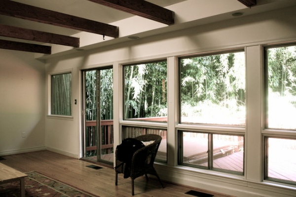
BEFORE: A sliding glass door in the living room used to lead out to a private deck and hot tub, but Benton says he didn’t use it that much, and it affected the room’s layout and balance.
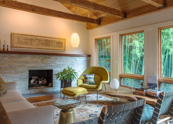
AFTER: He removed the door and deck and continued the row of windows to the wall’s end. The home’s lush surroundings had originally attracted Benton to the property, and removing the deck allowed the plants to grow up close to the windows as a green planted backdrop.
The living room is filled with an eclectic collection of furniture, but midcentury modern design is an overriding theme. The green Womb Chair is an original Saarinen piece from the 1950s that Benton bought on eBay. Risom chairs by Jens Risom look over the fireplace, and Noguchi and Nelson light fixtures give the living room a soft glow in the evenings. The rug is from Hollis and Knight.
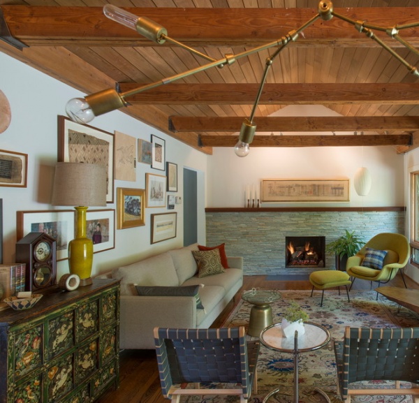
Benton also changed the living room’s roofline. The ceiling had always been vaulted, but the original pitch spanned the living room and kitchen, so the peak was off-center. To create more symmetry, Benton centered the vault over the fireplace and flattened the kitchen’s ceiling.
In addition, he covered the ceiling in unfinished cedar lap siding, which is typically used on home exteriors. The wood, fireplace and rich furnishings create a warm, inviting retreat.
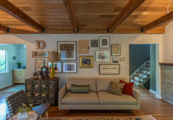
Art collected from travels, antiques stores and family collections mixes on the wall behind the sofa, between the kitchen and the entryway. The clock on the sofa’s side table is from the mid-1800s and came from Benton’s great-great-grandparents. The cabinet it’s sitting on was purchased in a Tibetan community near Kathmandu, Nepal, and is more than 100 years old.
Benton is meticulous about his acquisitions. ”You should be able to see individual pieces,” he says. “Everything should have a place.” Important family heirlooms will stay with him, but other items may have a limited shelf life. ”I’m not too afraid of getting rid of things,” he says.
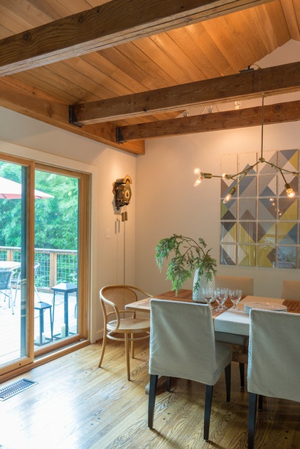
At the living room’s far end, the main dining area connects to the kitchen. A new deck sits just outside.
In addition to vintage collectibles, Benton has furnished his home with pieces he created. He made the chandelier with brass lamp parts. The art is a grid of frameless 8-by-10 picture holders filled with cutouts of colored paper he arranged. He changes up this artwork a couple of times a year, depending on the season or what he’s interested in. Sometimes he’ll print a large photo, deconstruct it and put it in these frames.
Benton’s parents bought the cuckoo clock on their honeymoon in Holland in the 1950s.
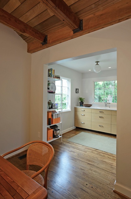
A new opening in the wall makes the galley kitchen accessible from the dining area. The kitchen runs all the way back to the front door.
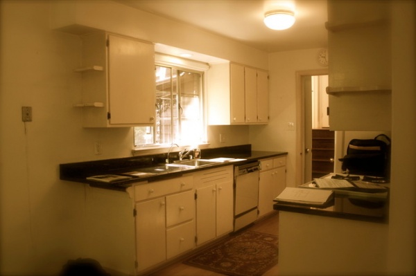
BEFORE: The kitchen’s original layout didn’t seem practical to Benton. It was closed off entirely from the dining room and had a small breakfast nook as its only eating area, so the flow from cooking to dining was broken. Valuable potential counter and cabinet space had been lost in making room for the breakfast nook.
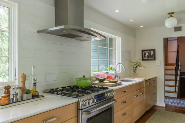
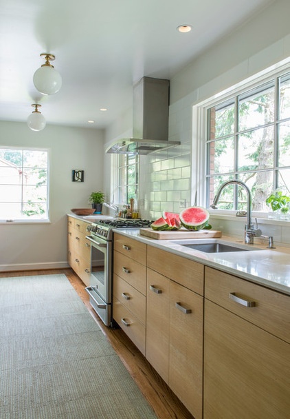
AFTER: Benton thought the breakfast nook was redundant and wanted more counter space and storage instead. Now the kitchen is close to 20 feet long.
The kitchen now connects directly to the dining room through a door opening, but Benton decided not to turn the kitchen, living area and dining area into a great room. “I kind of liked the idea of the kitchen as a separate area,” he says. There’s still a connection to the dining room, but it doesn’t feel like he’s cooking in the living room. Also, he didn’t lose all of that counter space along the extra wall.
Rug: Made You Look carpet squares in Palm, by Flor; light fixtures: Schoolhouse Electric
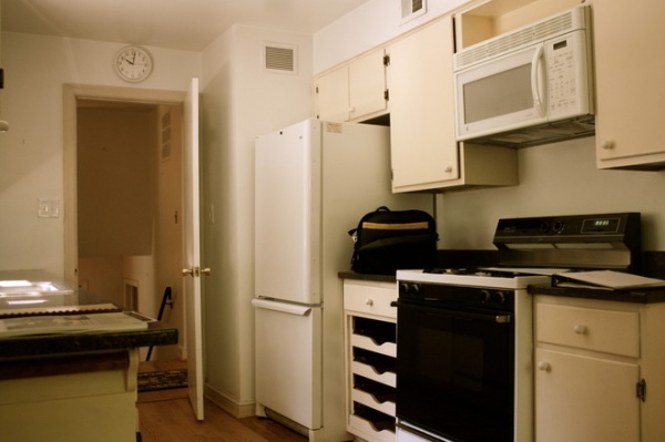
BEFORE: Another view of the original kitchen.
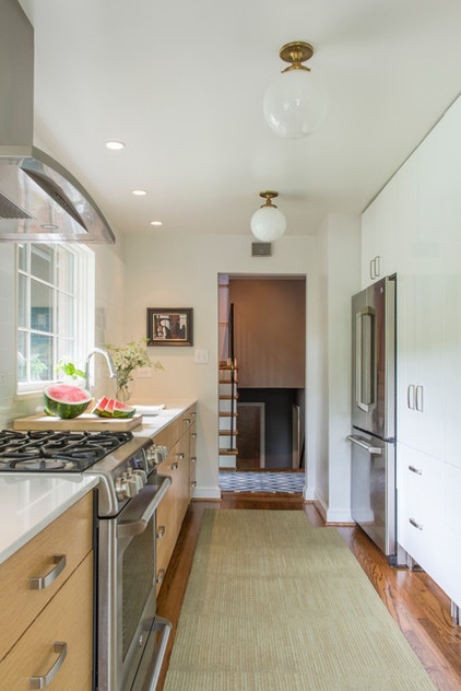
AFTER: Benton replaced the kitchen cabinets with a combination of glossy white Ikea cabinets and custom horizontal-grain oak cabinets. The counters are by Silestone.
Kitchen counters: Blanco Maple, Silestone; backsplash: Modern Dimensions tile in Arctic White, Dal Tile; white cabinets: Ikea; wood cabinets: custom, oak with horizontal grain; handles: Varde, Ikea; appliances: Cafe series, GE; main faucet: Tails, Hansgrohe
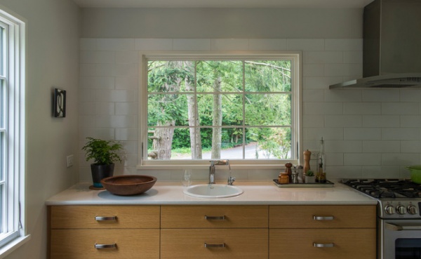
The kitchen has a prep sink and bar area in the space acquired from the breakfast nook.
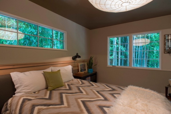
Upstairs, in the master bedroom, Benton painted the ceiling a metallic bronze. He says the color is somewhat reflective and glows in the room at night.
Bedding: West Elm (no longer available)
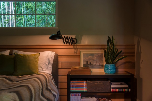
Benton used the same cedar paneling for the wood wall behind his bed that he put on the ceiling in the living room. His bedside table stores a hefty collection of magazines. “Design magazines are one of my big clutter weaknesses,” he says.
Wall lamp: Bruno Scissor Lamp, Lamps Plus
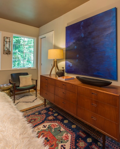
Benton carried the midcentury theme into the bedroom with a vintage dresser and Danish armchair that came from his father-in-law’s office. ”Very rarely do I go out and buy something,” he says. “The art above the dresser is by my husband, with help from our now-deceased shepherd-greyhound-mix dog, Brittany.”
Layered rugs create an even cozier bedroom. The rug under the armchair is from West Elm, and the Kazakh rug at the end of the bed was purchased in San Diego over a decade ago.
Cleo Table Lamp: Crate & Barrel
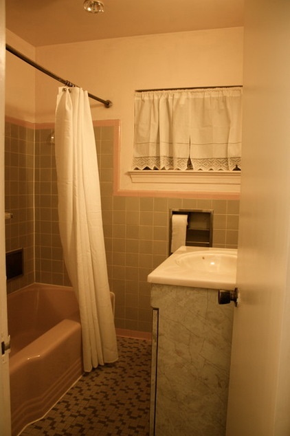
BEFORE: Space was tight in the original ’50s bathroom, so Benton stole some square footage from an adjacent bathroom during the renovation.
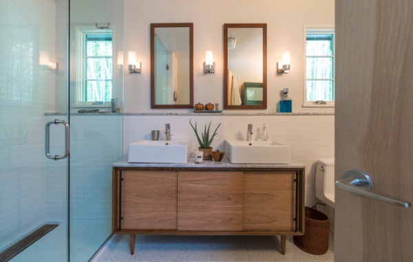
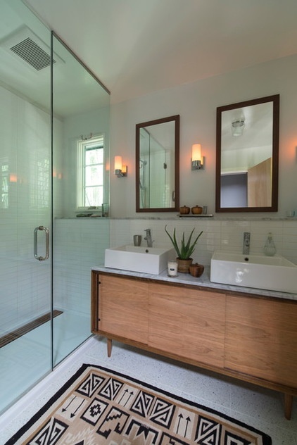
AFTER: With more space, Benton was able to build a walk-in shower and add more natural light with windows.
The bathroom vanity is new but was built by Benton to look like a midcentury credenza. The two sinks are by Nameeks. A Navajo rug from the 1930s or 1940s gives feet a soft landing.
Faucet: Grohe; floor tile: Concourse in Saybrook, Waterworks; wall tile: Modern Dimensions in Arctic White, Dal Tile
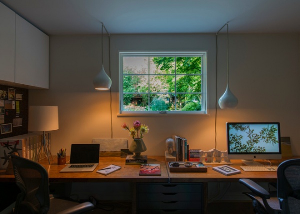
Downstairs, the home office overlooks the front yard through a small window in the front of the house. When Benton planted the front yard, he left the ground in front of the window clear and added a patch of gravel to reflect light into the sunken space. The room is half underground, which adds a calming quietness. It’s a comforting home, he says, and because so much of it is below grade, he feels very protected. The desktop is made from two salvaged doors from Community Forklift, a D.C. salvage store.
Unlike the projects he designs for clients, Benton says, his home is a constant work in progress. But after five years of tinkering, he thinks his house is getting there. “The vibes in the house are starting to feel really good,” Benton says.
Pendant lights: Crate & Barrel (no longer available)
Browse more homes by style:
Small Homes | Colorful Homes | Eclectic Homes | Modern Homes | Contemporary Homes | Midcentury Homes | Ranch Homes | Traditional Homes | Barn Homes | Townhouses | Apartments | Lofts | Vacation Homes
Related Articles Recommended


