Room of the Day: Red, White and Bright in a Fun, Multifunctional Space
http://decor-ideas.org 09/09/2014 20:13 Decor Ideas
When Shivaa Sharma moved into her tiny South London flat in July, she enlisted interior designer Bhavin Taylor to help her realize the full potential of the space. “When I first met Shivaa, the main thing I noticed was her vibrancy,” says Taylor. “She wasn’t a person who was going to be scared of color or stepping outside the box.”
Two of the main constraints Taylor faced with the living room were space and budget, so storage and multifunctionality were essential. Carefully chosen pieces, clever zoning and a dash of color mean it now functions as a lounging space for friends, a second bedroom for guests, a dining room and an area in which Sharma can chill out in front of the TV.
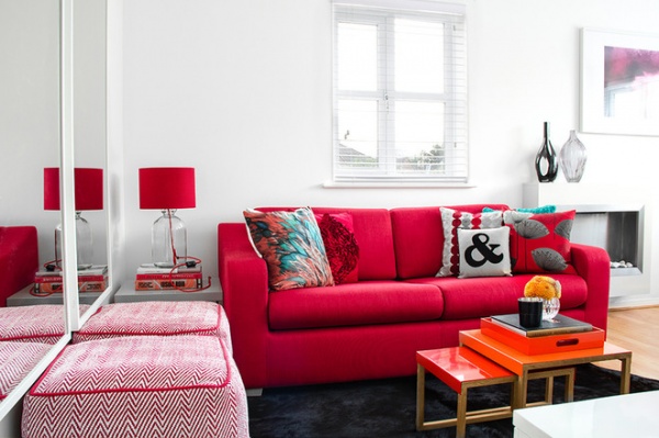
“Red was one of the colors Shivaa said she liked,” says Taylor, of Bhavin Taylor Design. “My starting point was the sofa — that was the foundation of the design.” He was looking for one that was not too big for the room yet was spacious enough for guests, and could be converted into a bed when necessary, and he found the perfect model at John Lewis.
The apartment is quite bright, so Taylor emphasized the light with brilliant white walls, which form a blank canvas for the bold furniture. Then he hung two framed mirrors side by side. “Using dual mirrors visually doubles the space and reflects the light,” he explains.
The nesting orange and red coffee tables slide under the gray side table in the corner to create space so the sofa bed can open out. The poufs can also easily be moved to provide extra seating at the dining table. “I wanted the space to have that extra flexibility,” says Taylor.
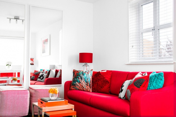
The cushion with the feather design in orange, turquoise and red, which came from Doris by Karen Miller, was one of the first items purchased, and it gave Taylor the accent colors for the room. “The sofa is quite bold, so it was difficult to decide which colors would work with it. That cushion kind of opened the floodgates,” he says. Touches of the three colors can be seen in everything from the cushions and lamps to the artwork and glassware.
More ways to decorate with red around the house
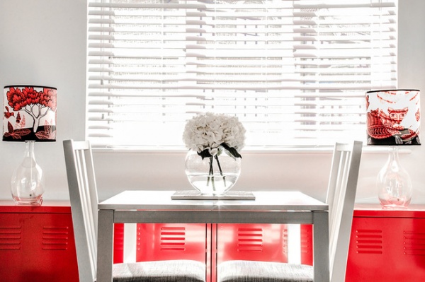
In contrast with the vibrant living area, the dining spot is a calm, minimalist space. “I wanted to keep the dining side quite simple,” Taylor says. He chose a white table and chairs, with a discreet white blind at the window. But he linked the two areas with a bright red sideboard made from two Ikea PS units. “They fit in so well, they look as if they were built for the space,” he says, “and they provide a good amount of storage, which was so important in this apartment.”
He continued the room’s color scheme by framing the dining space with two black, white and red lamps.
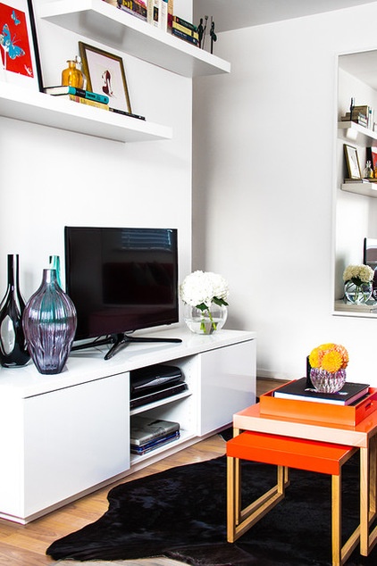
Much like the red sideboard, the freestanding TV console could have been made for the room. The floating shelves add interest at eye level without dominating the space and, teamed with the unit below, give the media area a custom feel.
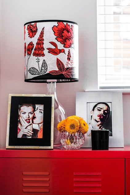
The color scheme is picked up nicely in the accessories. “Just because it’s a small space, it doesn’t have to be lifeless,” says Taylor. “It can have a lot of personality without feeling overcrowded.”
See more details and textures from this apartment
Related Articles Recommended


