8 Things Successful Architects and Designers Do
Every architect’s design process is extremely personal and nuanced. For example, I have certain tools that I reach for ritually when I start a new project. One is a favorite lead pencil with a lightweight, medium-size barrel and a thinly ridged grip, loaded with a medium-weight HB lead that’s not too soft and not too hard. It has a broken clip at the top and a small blue button near my thumb to advance the lead.
It’s with this pencil in hand that I begin each design, visiting the project site, writing, taking notes and sketching in a pocket-size gridded sketchbook. I take with me a small corded bundle of Prismacolor pencils — light cream, sky blue, May green, French gray, yellow ocher and oxide red — to fill in the line work of my sketches and suggest order. It has to be this way for me, and I know that when I’m armed with these tools, the ideas will flow easily.
While each designer’s habits are individual and idiosyncratic, the broader architectural habits we share lay the foundations for good design. Here are eight (of the many) habits that help guide successful architects and designers during the design process.
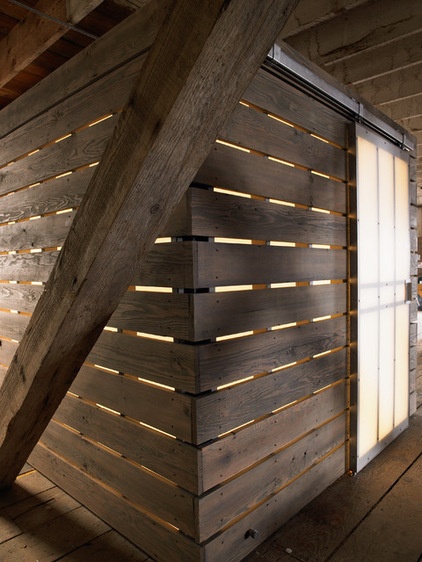
1. They tell a good story. Our memories of places are inherently linked to stories. A home that tells the story of a specific client, in a specific place, at a specific time enriches the experience and gives it a reason for being. Architects and designers are taught very early in design school to conceptualize projects by inventing a narrative, which is traditionally referred to as a parti.
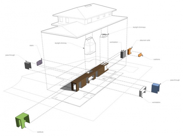
A parti is like a rulebook, in a way, and a good one allows us to refer back to it when we’re stuck wondering what to do next. It organizes our thoughts and guides us in how to best relate the story through our design.
The narrative can flow from something specific — say, a beloved tree to preserve — or something more general, such as, “All rooms must have natural light.” It can emerge from a client’s specific request: “Nothing white, please.” Or the shape of a building lot. It can apply to every level of design problems, even down to small renovation or decorating tasks.
Finding the bigger, guiding idea and creating a story around it imbues every design decision with meaning.
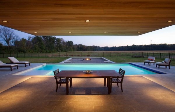
2. They take risks. Taking risks to do something out of the ordinary is part of any creative field. Rethink, reimagine, retool and invent new ways of doing the same old thing — while the laws of physics still apply, even gravity can be challenged. This isn’t to say that everything requires innovation or bold action, but looking at a problem through a different lens often reveals interesting solutions that don’t rely on standard practice.
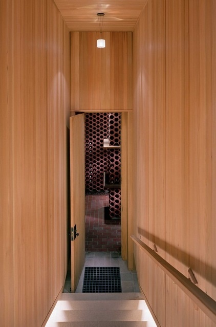
Here’s one of my favorite designer hacks for being bold: the 8-foot door. Standard doors are 6 feet, 8 inches tall and 3 feet wide, and roughly correlate to the human form. We’re used to seeing doors this size. Substitute an 8-foot slab, and the difference is instantly recognizable. Just the act of opening this door forces you to sense its weight and its height.
Sure, 8-foot doors are more expensive, but the effect elevates a standard design element from mundane and accepted to exceptional. Taller doors can let in more light when glazed, and their proportions can completely reorient smaller, narrow spaces, like this hallway, making them seem larger. I use them often in spaces with 8-foot ceilings where when the door is open, it’s as if the entire wall has dissolved.
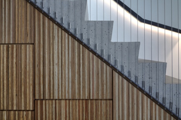
3. They sweat the details. At its heart architecture seeks to solve problems, but it’s the way we’re able to solve those problems — the poetry we bring to the solution — that separates the good from the bad.
It’s possible to solve the problem of a stair guard in many different ways, but here the designer has chosen a minimalist, outwardly effortless expression. The gray of the thin stainless steel cables matcllhes that of the concrete stair run, and their attachment is deliberate and considered.
Details matter because they’re often the things we’re most engaged with on a daily basis. The means by which all of the components come together in a structure are the details.
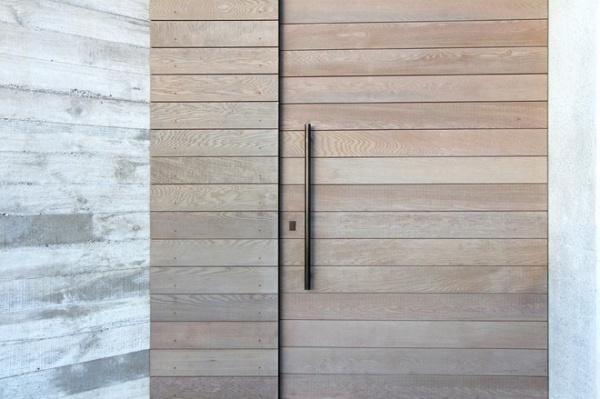
Creating what architects and designers call “a family of details” unifies a project. The horizontal patterning of the wood-clad wall here references the board-formed concrete wall to the left. While they’re different materials, they speak the same language. The same can apply to the hardware used on project — all the doors have bar pulls in stainless steel, for example, or all the plumbing fixtures are angular and in brushed nickel.
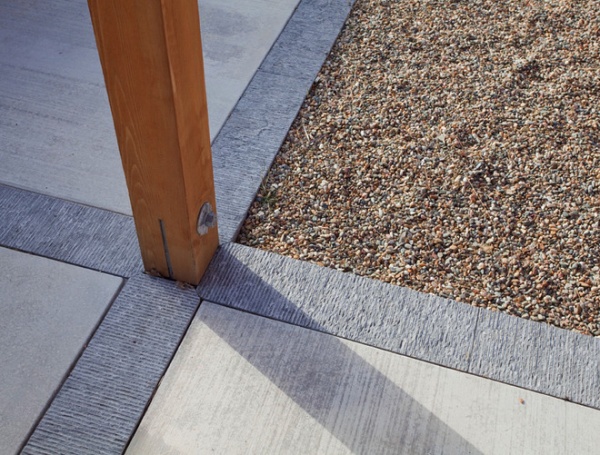
4. They simplify. “The ability to simplify means to eliminate the unnecessary so that the necessary may speak,” said painter Hans Hofmann. Too often we let complexity act as a proxy for interest. Architects and designers are schooled in editing down to the essential components. If it doesn’t have a function, its necessity should be questioned.
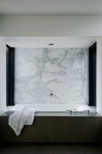
Here are just a few areas where simplifying can make the design stronger:
Simple shapes: They usually cost less, are easier to build and look beautiful unadorned.A simple material palette: two or three materials at most. Devise rules for how each will be used. By varying one material’s finish — from smooth to rough — you can achieve variety without complexity.Simple trim (or none)Simple windows: Choose two window sizes — one for large openings, one for small ones.Leave connections between materials exposed and expressive. Concealed joints are usually costly and time intensive to execute.
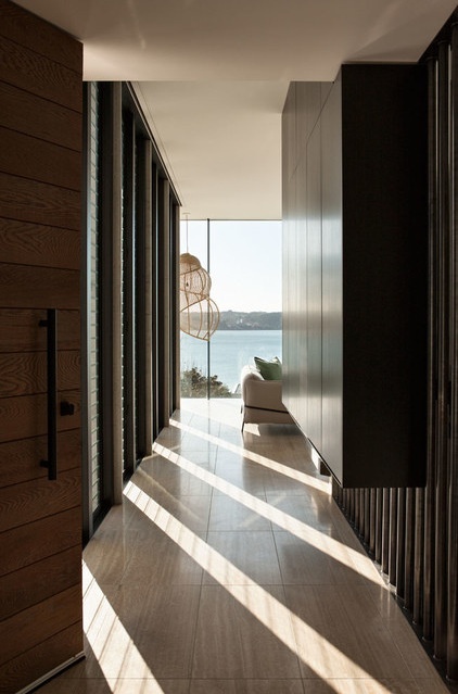
5. They establish order. Designers prefer applying ordering principles to everything, at every level. Naturally, the need for order requires hierarchy — which basically means you have to decide what’s the most important thing and let the other things defer to it. When beginning a new design project, I usually evaluate three main things: the building site (existing or new), the client and the budget. The overarching concept is derived from the one that asserts the strongest pull, and I begin crafting a narrative around that force. That’s where the ordering begins.
Regardless of the strongest pull, it always circles back to the site, where I determine which dominant site features (view, topography, other structures) are most important.
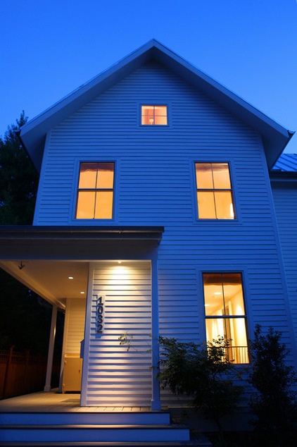
Before deciding what a building will look like (the form), we have to think about and order the spaces on the site, from most public to most private, and decide how we’ll arrive and the sequence of how the spaces will unfold.
For renovations the ordering principles are often set by what the existing structure is lacking — natural light, space, connection to the outdoors etc. For some projects I’ve even gone so far as to develop a rulebook to establish specific modules, the grid, materials and a guide for adding modules to the structure in the future.
The wonderfully illustrated compendium Architecture: Form, Space and Order, by Francis Ching, is required reading for every first-year architecture student, and it’s one that I still personally find inspiring, especially with respect to order.
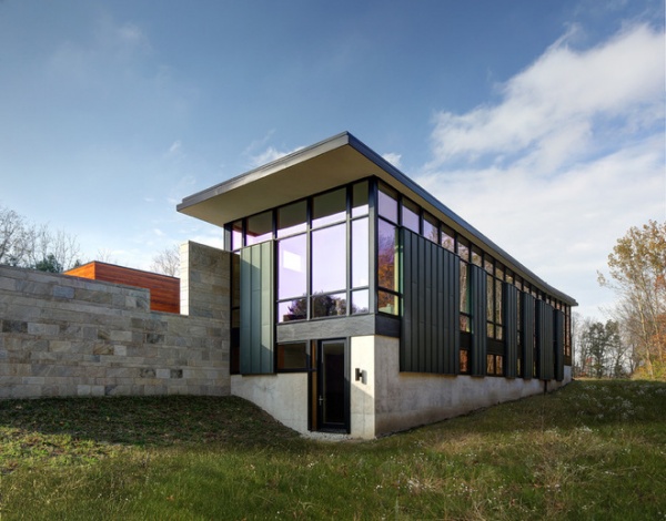
6. They repeat, repeat, repeat. Repetition is a good thing in architecture. Common thematic elements repeated again and again help to reinforce our previous habit of establishing order. Windows, doors, columns, beams, materials … these are all part of the natural order of buildings.
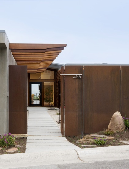
Repetition doesn’t equate to boring; rather it unifies a design. Repeating patterns, materials, grids and proportions are the underpinnings of order. The cardinal rule of repetition is that it takes a minimum of three of anything to see the benefits. If two is good, three is better.
Repetition not only makes sense from an economical standpoint, but it provides a reference point and background against which to highlight the things that we think are really important, laying the groundwork for our next habit.
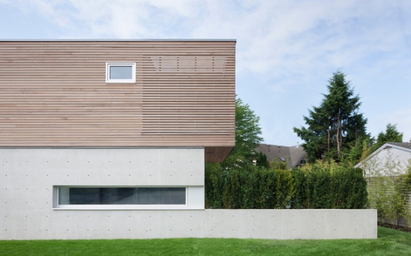
7. They break the rules. The prerequisite to this is the previous habit. Once we have an established repeating pattern, we can decide where to break the rules. Imagine a series of windows aligned on an orderly grid. The one window that breaks this set of rules must do so for a very important and specific reason, like a view to a tree canopy or a distant view.
With a repetitive order as the background, calculated rule breaking is assured to have special meaning. It also balances the repetition to keep it from being staid and monotonous.
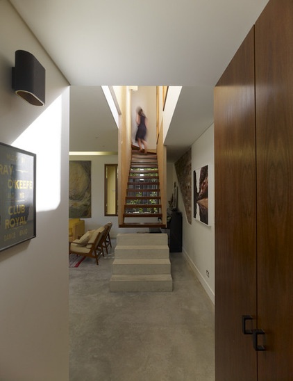
This stair illustrates the power of breaking rules. Look at the restraint exercised in the surrounding space. Traditionally, stairs are composed of stringers at the edges, boxed risers and some combination of a handrail and guardrail. The designer of this stair reconsidered every one of those assumptions, breaking the rules and turning it into a sculptural object. The stair hangs from the upper story, forcing one to observe the process of moving upward by springing from a heavy concrete plinth to a much lighter stair object. The risers are open, allowing light and views through, and the plywood “stringers” double as stair support and guard.
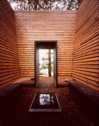
8. They engage the senses. While the stunning visuals of the architecture we consume online appeal to our sense of sight, our experience of architecture is actually quite different. We’re taught as architects and designers to think about all of our senses when designing.
Opening a home to a view is as important as shielding it from unwanted noise or the smell from the ocean or a nearby cedar tree. Architects consider the difference in feel of cool concrete versus warm wood on one’s feet and the sound rain makes on a metal roof.
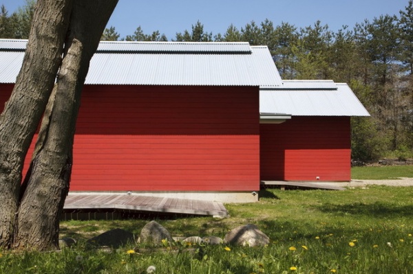
To think about design from an experiential level often reveals architectural opportunities that make life in a home or a place much more pleasing. Good architects and designers think about light and shadow, where the sun moves throughout the day, where the wind comes from or the sounds of an urban neighborhood — and how they can play along.
More: Design Practice: How to Start Your Architecture Business


