Inside Houzz: A Walnut Wall of Storage Opens Up a Kitchen
Traditional kitchens reign supreme in this particular suburb of Philadelphia. And that’s exactly what this family of four didn’t want. So finding a local designer to do something different proved challenging. “They didn’t get what we were looking for,” says one of the homeowners. “We wanted someone who could think outside the box a little bit.”
They wanted something, well, the opposite of traditional. They wanted “all the cliché things, like clean lines, an open floor plan, all white, no upper cabinets,” the homeowner says. So they searched for home professionals on Houzz and came across general contractor Brian Osborne. “He just got us,” the homeowner says. Osborne and his team of designers and fabricators helped modernize the space by integrating a 30-foot black walnut wall of storage that took all the pressure off the cooking stations and hangout areas to create an incredibly spacious and airy kitchen.
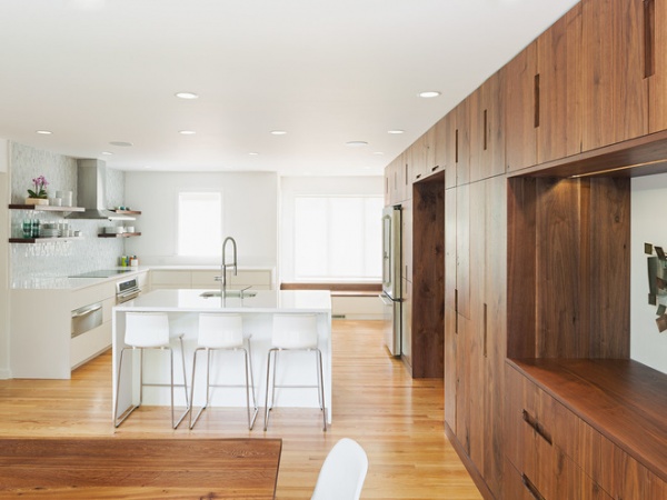
A structural wall that housed the air conditioner return originally broke up the kitchen where the island is now. Osborne removed it and put in a beam, then moved the HVAC behind the wall of black walnut cabinetry.
The cabinet wall, a collaboration between Osborne, the homeowners, C2 Architecture, Loubier Design and Kole Made, is 30 feet long and 8 feet tall. “It’s like a furniture pantry,” Osborne says. “There’s endless real estate to store things.” The wall helps keep the rest of the space open and airy. There’s room for plates, serving platters, food and even a Sonos stereo system housed in a slide-out shelf. At the far end is a homework station for the kids, and at the other is a recess that creates a buffet-style table that often acts as a cocktail station.
Osborne mocked up a few designs in which the sink was under the window, but that meant the homeowners would have been sequestered in the corner doing dishes or washing vegetables. To get them in the room more, it made sense to put the sink in the island, where the dishwasher is now located too.
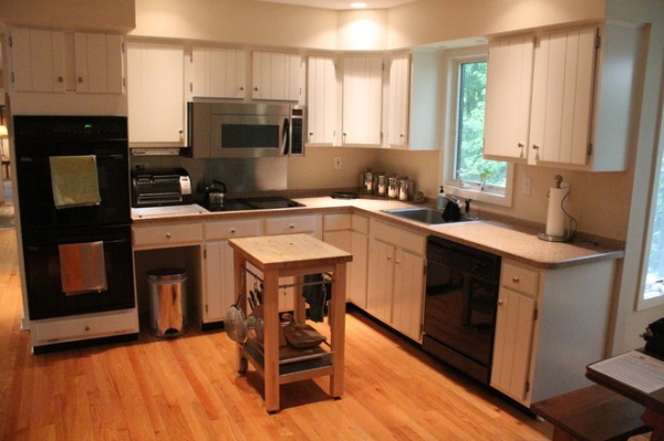
BEFORE: The old kitchen was all tucked into a corner, making those who were cooking feel like they always had their back to family and guests. And all the cabinetry added to the crowded feel for the homeowners.
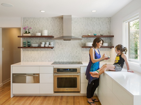
AFTER: Now there are only a few floating shelves and some undercabinets, freeing up the room. “A big, bright, wide-open kitchen is what they always wanted,” Osborne says.
A warming drawer to the left of the induction stovetop and electric oven keeps food at 140 degrees while the homeowner preps and cooks other things. The backsplash is tumbled marble. The floors are refinished tongue and groove red oak.
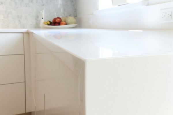
The countertops are 3-centimeter Caesarstone in Pure White. “It’s the most expensive Caesarstone you can get, because those solid whites are hard to get, but we wanted something white, white, white,” Osborne says.
Houzz guides to kitchen counter choices
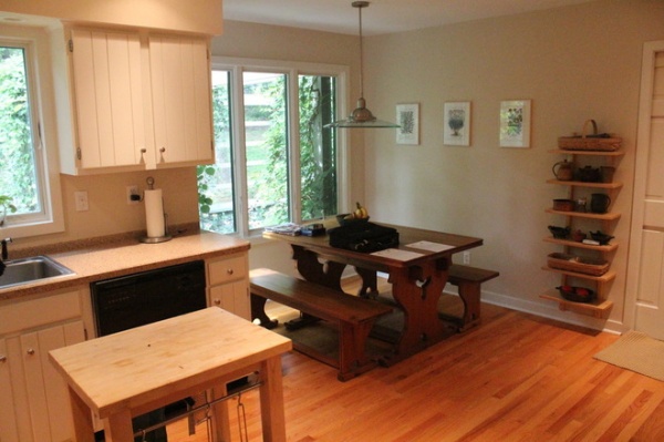
BEFORE: The previous layout didn’t take advantage of all the space the kitchen offered. It was fine for the family alone, but the space was always a bit crowded when they were entertaining.
The dining table went to the other side of the room, and Osborne used this space for the wall of cabinets and a homework nook for the kids.
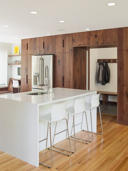
AFTER: The homeowners wanted an island that the whole family and guests could convene at. Osborne established different stations so the maximum number of people could be cooking and prepping. “There’s tons of real estate in there,” he says. For example, six people can sit at the table, three at the island, and two or three can be cooking. “There’s a large-path triangle between the sink and fridge and those stations,” he adds.
The couple kept a Houzz ideabook for years with ideas to share with their design team. And when they questioned whether something would work, they went to Houzz for answers. “It solved any disagreements we had,” the homeowner says. “Like when we wanted to put gray underneath the island. We said, ‘Do people do that?’ And we would go back to Houzz and find things supporting my argument or supporting her argument.”
The cabinets surround a door that connects to the mudroom, laundry room and garage. A batten of black walnut with hooks holds bags, coats and hats. “There’s also a little bit of walnut on the baseboard and door casing, so it’s like a continuous wood story,” Osborne says.
He got the black walnut from Shelter Island, New York, from a woodworker who was selling his property and stock of wood. Osborne drove out there, picked up the wood and drove it back to Philadelphia to be milled and slabbed. “I drove out there and said, ‘Oh, my god,’” Osborne says. “It had been air dried and was beautiful and ready to go. Had probably been sitting in his shop for 10 to 15 years.”
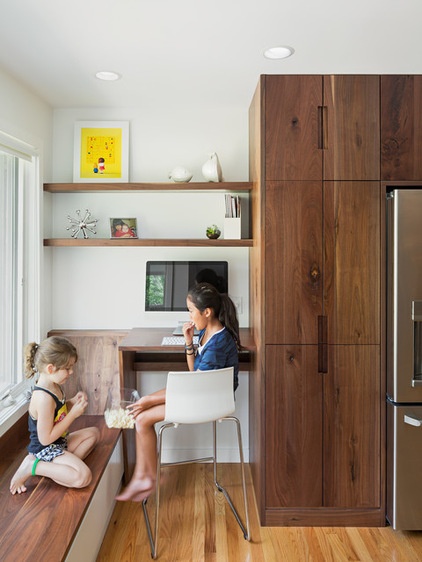
The homeowners had always wanted a desk in the kitchen for the kids to do homework at, so Osborne created a nook in this leftover space near the back windows.
Cabinets underneath the bench store toys, games and books. “It ties the walnut together, so it kind of bleeds into the room from the cabinetry,” Osborne says.
While the cost for the kitchen exceeded the homeowners’ initial budget, they are glad they made it happen. “We picked an arbitrary number for our budget cost, and it was more than double that, but we loved what Brian Osborne came up with so much, we said, ‘Let’s do it,’” the homeowner says. “We haven’t had a single regret since.”
General contractor: Osborne Construction
Architect: C2 Architecture
Custom cabinetry and additional design: Loubier Design
Design and additional fabrication: Kole Made
Find a home pro on Houzz: Click or tap “Find a Pro” at the top of any Houzz page to find a pro near you
More Houzz guides:
How to contact an architect, a designer or a remodeler and get your project going
How to create and use personal ideabooks on Houzz
Tell us: Has a Houzz pro helped you with a recent project? We’d love to see it!


