Kitchen of the Week: Brick, Wood and Clean White Lines
http://decor-ideas.org 09/06/2014 01:13 Decor Ideas
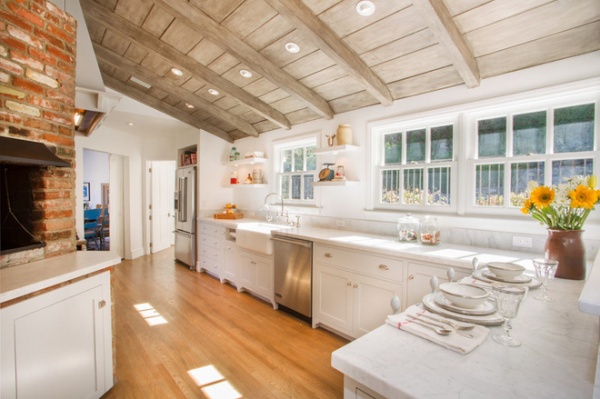
This 1949 Los Angeles ranch had its charms, but in the kitchen the lack of storage, funky old booths and cabinets past their prime were not functional for the young family who were living there. The homeowners had admired interior designer Thea Segal’s light, clean-lined and calming signature style on another one of her projects and wanted her to bring it to their home. At the same time, maintaining the home’s original spirit was important to the designer. “We remodeled the whole house for them but wanted to keep the integrity and character of the house, especially the charming kitchen,” Segal says. The resulting room balances white with warmer surfaces, functionality with open space and original elements with updated finishes.

Photos by Dana Miller Photography
Kitchen of the Week
Who lives here: A couple with 2 children
Location: Fryman Canyon area of Los Angeles
Size: About 300 square feet (28 square meters)
Designer: Thea Home
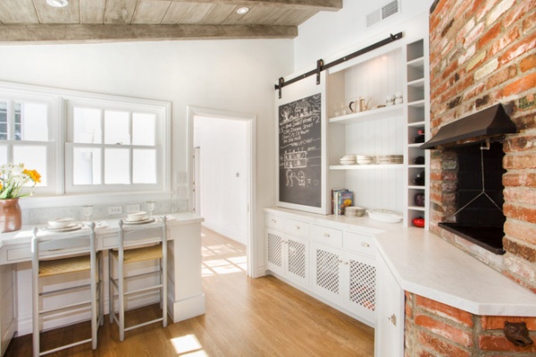
“We always like an eat-in kitchen if we can have one. It is a great place to eat a quick snack or for the kids or adults to eat breakfast,” Segal says. It was challenging to fit an eat-in area into this layout, but Segal was able to install a counter with two stools. With the kitchen somewhat separate from other rooms in the house, the eat-in area gives people a place where they can perch and keep the cook company.
A sliding chalkboard on a barn-door-like track conceals an appliance garage. “This is really our signature detail. You can hide but also easily access your toaster, coffeemaker and any other electronic appliances,” Segal says. Texture keeps the space from feeling too sleek or cold; the adjacent shelves are backed in beadboard, and the designers added decorative screening panels to the cabinets below. “This detail makes the kitchen feel softer and a little more airy,” Segal says.

Segal kept the original brick around the existing grill and the new range to maintain a strong connection to the original architecture. The brick warms the room, and its texture helps to break up all the white.
A unique treatment on the ceiling boards and beams adds texture and color. Segal used a staining method she honed while working on her furniture line. The vaulted ceiling adds to the open and airy feeling, while the stained boards contribute warmth.
The Shaker cabinets are modern in their clean lines, and their feet give them a farmhouse look. Calacatta marble countertops and polished nickel hardware add elegance.
Shaker Style Still a Cabinetry Classic

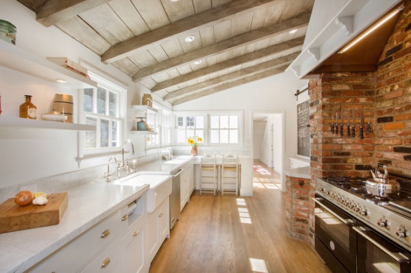
A large Bertazzoni range is tucked into the existing brick surround, picking up on the color of the darker bricks and providing contrast with the white cabinetry. Floating shelves balance out the brick wall across the room.
“We integrated lights into the shelves to create a sophisticated and calming ambience,” Segal says. “If you have a ton of upper cabinets, the kitchen can feel overwhelming and crowded. Floating shelves also create space to showcase your style and beautiful accessories.”
Segal takes a careful inventory of everything her clients need to store before planning cabinetry and shelves. In this kitchen the lower cabinets and a separate pantry provide plenty of storage, eliminating the need for upper cabinets.

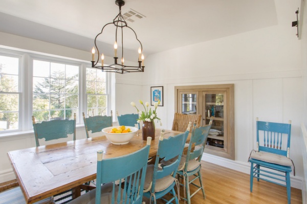
In the adjacent dining room, windows look out to the surrounding hills. Before construction began Segal recommended the custom-made recessed cabinet. “It is a great way to showcase your nice china while not taking up space in the dining room,” she says.
The family eats meals together and entertains in here, and the antique trestle table is a good place for doing homework. Segal added vintage chairs painted a robin’s egg blue, which ties them together. Woven host and hostess chairs bring more texture to the mix, and an unfussy chandelier keeps things serene and simple.
Contractor: Tal Naor
More:
See all Kitchens of the Week
Key Measurements to Help You Design Your Kitchen
13 Ways to Create an Inviting Eat-in Kitchen
Related Articles Recommended


