Houzz Tour: Up and Out Around a Heritage Tree
Natalie and Christian Kopp bought a 1930s ranch-style home in Austin with plans for a renovation and addition that would turn the dwelling into a more comfortable place to raise a family. The obvious location for the addition was the back of the house. The problem: A gracious elm stood smack-dab in the middle of the backyard, its long, tentacle branches spanning the narrow lot. Because it had been designated a heritage tree by city ordinance, the Kopps had to figure out how to expand their home around the tree.
For that, they called architects Ed Hughey and Ben Arbib of Arbib Hughey Design. Drawing on the neighborhood’s architectural vernacular, the partners crafted a modern-meets-historic makeover for the home and tucked in a two-story wing in back, located to one side of the elm. The historic tree, trimmed up a tad, became a backyard focal point celebrated through multiple window walls and decks that wrap around it.
Houzz at a Glance
Location: Austin, Texas
Who lives here: Natalie Kopp, a Realtor, Christian Kopp, an insurance professional, and their baby
Architects: Ed Hughey and Ben Arbib of Arbib Hughey Design.
Size: 2,650 square feet; 3 bedrooms, 3 bathrooms
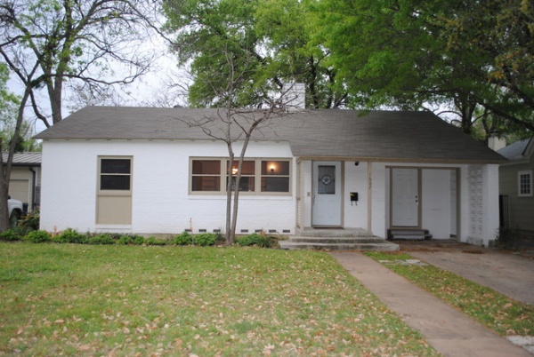
Despite numerous remodeling efforts over the decades, the 1,460-square-foot home built in the 1930s still sported a plain Jane street-side elevation.
“After” photos by Dennis Burnette
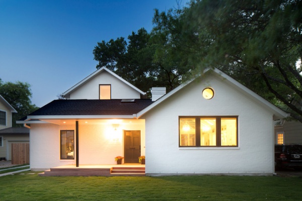
AFTER: The front became more interesting with the addition of a bump-out for the new kitchen, a new entry and porch. A second-story addition is in the back. The home’s original bricks were re-used for the kitchen expansion. The circular window is a nod to attic vents found in many of the neighborhood’s older homes.
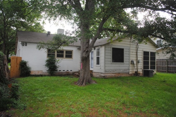
The heritage elm had to stay rooted in place in the backyard, which dictated where the additions would go.
Windows: Jeld-Wen
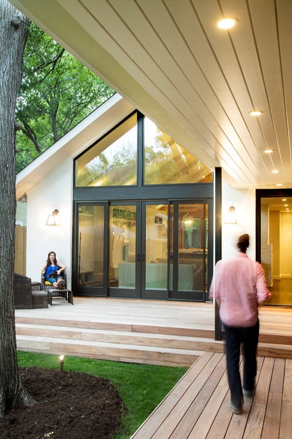
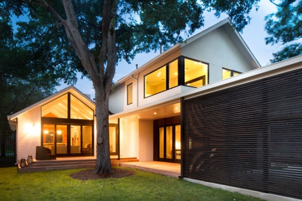
AFTER: Large windows, walls and wrap-around decks open the home to the backyard and the elm, which has been trimmed.
Hughey and Natalie hang out on the tigerwood deck. The tongue-in-groove lines of the overhang’s ceiling echo the lines of the deck.
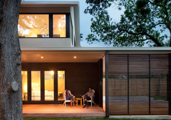
Outdoor furniture: Target
The two-story addition includes a master suite on the ground level and two bedrooms and a bathroom upstairs.
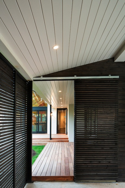
The new carport to the right is screened with stained cedar slats. The carport doubles as a spot for outdoor parties.
“It’s covered, and there’s lighting,” says Arbib, who’s seated here on the deck next to Natalie. “The carport is a great extension of the decks as an outdoor social space.”
A barn door screens views of the vehicles from the house.
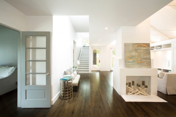
The home’s entry opens to the original fireplace, which separates the great room and the passage leading to the master suite. Original French doors on the left lead to the dining room, which the homeowners use as a home office and guest room. The stairs lead up to the bedrooms.
Deeply hued oak flooring underscores the interior’s pale palette. The painting is by Oklahoma artist Claudette Williams.
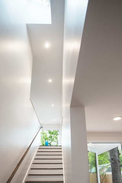
Skylights flood the home’s interior with light and illuminate the stairs to the second floor.
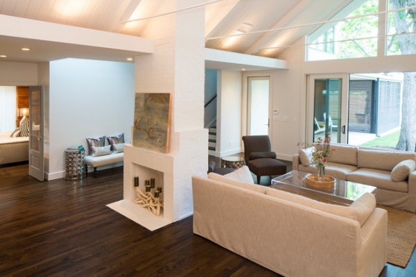
“We saved the original fireplace as a landmark and to help with spatial organization in the house,” Hughey says. “We also liked the tactility of the brick.”
Natalie worked on the interiors with the help of Austin designer Sally Smith of D.Co.
Sofas: Restoration Hardware; small metal end table: Four Hands
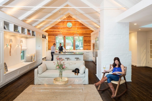
Natalie relaxes in the great room with her dog Eddy while neighbors make themselves at home in the kitchen. A newly raised ceiling adds a sense of volume to the original part of the home. Exposed tie rods add architectural interest.
Area rug: IKEA
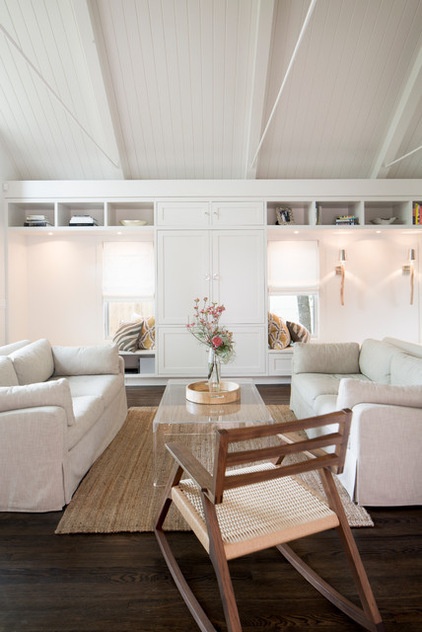
Custom Shaker-style cabinetry runs the length of great room, providing storage and extra seating. The doors in the center hide media equipment.
Chair: Michael Yates Design; sconces: T.A. Lorton
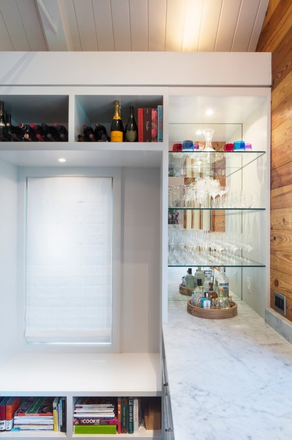
The cabinetry in the great room culminates in the kitchen with a small bar fitted with glass shelving and a Carrera marble countertop.
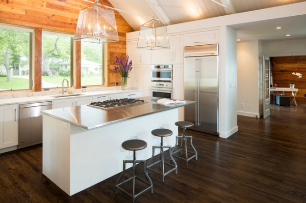
A stainless steel-topped island anchors the kitchen. The original knotty pine paneling was salvaged from elsewhere in the home and used to add texture and interest to the new space.
Appliances: GE Monogram; light fixture: Horchow; faucet: Delta; bar stools: CB2; cabinets: custom
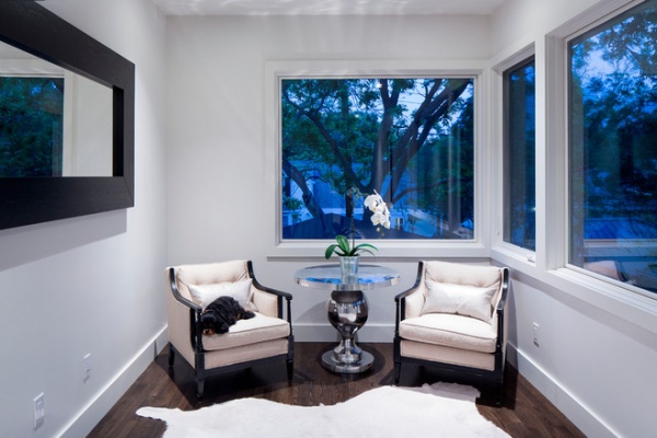
In the new addition, a landing at the top of the stairs serves as a reading area and overlooks the neighborhood’s large trees. The chairs were flea market finds.
Table: Four Hands
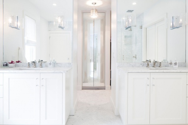
Carrera marble, glass and mirrors add a sense of luxury to the master bath. His-and-hers custom vanities flank a passage to the walk-in closets and mirrored shoe cabinet.
Lighting: Lights Fantastic
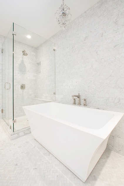
A separate soaking tub adds a spa-like touch to the master bath.
Plumbing fixtures: Kohler
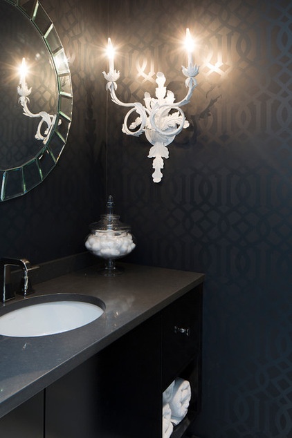
A small bathroom with a shower on the first floor doubles as the powder room. The sconce was created by the homeowners.
Builder: Wilmington-Gordon
Mirror: Horchow
Browse more homes by style:
Small Homes | Colorful Homes | Eclectic Homes | Modern Homes | Contemporary Homes | Midcentury Homes | Ranch Homes | Traditional Homes | Barn Homes | Townhouses | Apartments | Lofts | Vacation Homes


