Inside Houzz: Refaced Cabinets Transform a Kitchen
http://decor-ideas.org 08/31/2014 21:13 Decor Ideas
“I help a lot of people not move,” says interior decorator Lori Steeves. Though sometimes it takes remodeling or a move to make you love your home again, at other times a decorating refresher is all you need to revive your house. “People don’t realize what they can do with the house they already have,” Steeves says.
In this case, by simply refacing the kitchen’s cabinets and backsplash and pulling a color palette from an existing stone fireplace, Steeves answered her clients’ call for a bright kitchen and a cohesive layout without tearing out a single wall.
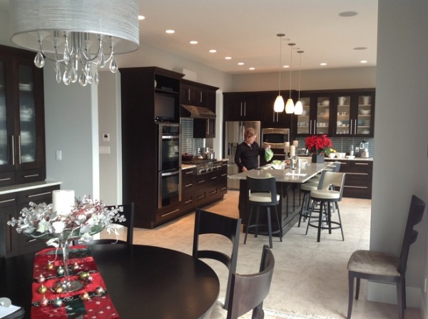
BEFORE: Marion and Barrie Reeves had built the home they saw themselves spending the rest of their lives in on the water near Vancouver. A close-knit extended family meant this house would be the site of family gatherings for years to come. And while they were happy with most of their decorating decisions, the most prominent family rooms — kitchen, dining room and living room — never felt quite right. The kitchen was too dark, the living room wasn’t intimate enough, and the dining room couldn’t accommodate Sunday family dinners for 14 or more. They discovered Steeves on Houzz and hired her to fix these issues in a cohesive way that would give them the home they’d never want to leave.
Marion tried her new kitchen for 2½ years before she called the professionals. “She explained she had been persuaded into a dark kitchen by her husband, and she was really finding it was so darkening,” says Steeves. Her kitchen was in great shape and had been well planned, but Marion knew without a doubt that she wanted a white kitchen. The dark wood cabinets and green tile backsplash had to go.
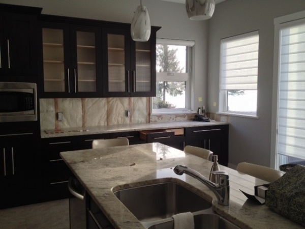
Marion and Barrie own a building supply store in British Columbia and had overseen the construction of previous homes. Marion had hired a colorist before, but never an interior designer or a decorator. ”I thought I could do it,” she says, but she soon realized she was in over her head. “She was at a standstill and didn’t know where to go,” says Steeves. Marion’s daughter suggested she browse Houzz for ideas, and Marion found inspiring kitchen photos — as well as her interior decorator.
Marion and Barrie spend their winters in Palm Desert, California, and wanted the project completed while they were away. Steeves did a preliminary consultation at the house in December before they left, taking measurements and understanding the clients’ wishes, before the parties separated.
“This was the ultimate test in my methodology,” she says, since most of her work was done away from the home, and feedback from the clients came via email, telephone calls and video chats. During her walk-through she got a feel for the clients’ wishes and needs. “I have very specific questions I ask them,” she says. She listens to what clients say they like about their house and what they don’t, what’s a priority and what isn’t, styles they gravitate toward etc. — sometimes without the clients’ realizing what’s going on. “I’ve done my job when they tell me that I’ve read their minds,” Steeves says.
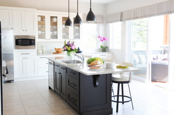
AFTER: Steeves suggested that Marion reface the 30 linear feet of perimeter cabinets and 10 linear feet of cabinetry in the dining room and leave the island as is. “At first she wanted to reface everything,” says Steeves. But after seeing examples of similar cabinet combinations on Houzz, they decided that the dark island would add more depth to the kitchen and save money for other project priorities. “Budgetary considerations always come into play,” says Steeves. And by not refacing the entire kitchen, they were able to save enough to design and build a custom dining table.
It cost $25,000, including labor, to replace all perimeter cabinet doors, drawers, end panels and toe kicks with new ones painted Benjamin Moore’s White Dove. Steeves says they considered simply having the doors refinished, but in the end decided to replace them. Everything needed to be removed regardless, and Steeves says that it would have cost more in time and labor to remove, sand down and refinish them than it did to replace them. Merit Cabinets also couldn’t guarantee the finish wouldn’t bubble or crack, since they would be applying a new finish over an existing one. “For these two reasons we decided to replace [or reface] rather than refinish,” says Steeves.
How to Reface Your Old Kitchen Cabinets
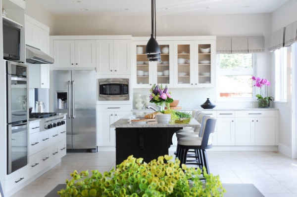
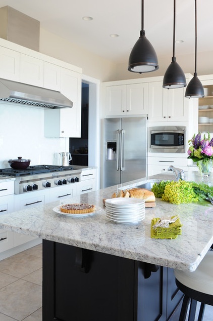
They kept the existing granite counters but replaced the green glass subway tile backsplash. The backsplash had been a nod to the coast, but like the wood cabinets, it felt off in this space. “The color didn’t tie in with anything at all,” says Steeves.
Kitchen cabinets: Merit Kitchens; cabinet paint: White Dove, Benjamin Moore; pendant light: DVI lighting; metal pulls: Richelieu
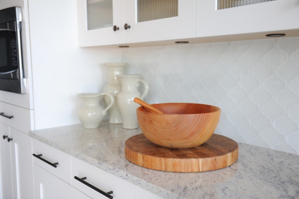
She matched the backsplash color with the new cream-colored cabinets for a bright, streamlined kitchen. Steeves discovered these custom tiles by Edgewater Studio at a convention in Toronto and knew they were the only tiles for this kitchen. “I saw the right thing at the right time,” she says.
The designer selected the Classic Moroccan tile to reference the couple’s extensive world travels and had the tile manufacturer back-paint the tiles to match the cabinets. “It’s the most outstanding thing in the kitchen,” she says, adding that the tile reflects the water and surrounding landscape.
“I just love going in [the kitchen now],” says Marion.
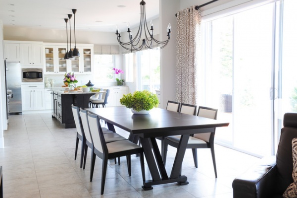
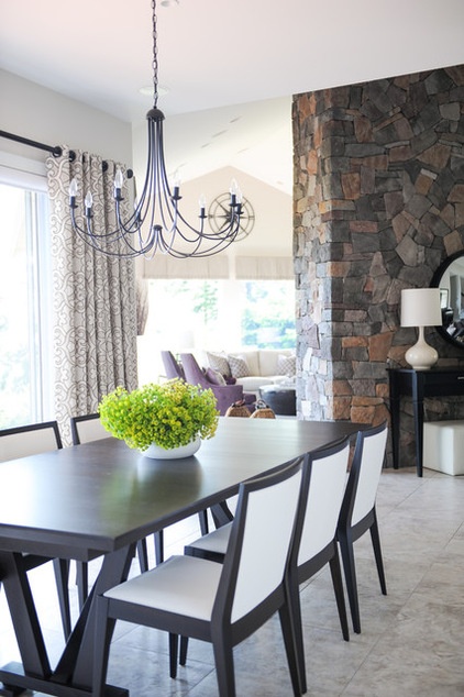
The dining area was another big priority for Marion, who hosts weekly family dinners for 14 people, including six grandchildren.
The round dining table they had was too small for the family to sit around and looked small in the open space. Since the couple eats most of their meals at the island, they weren’t afraid of an oversize table for family dinners.
Steeves designed a larger table that could expand to easily accommodate the whole family. It better complemented the shapes of the kitchen and the farmhouse-style kitchen Marion wanted. For easy cleaning after meals, Steeves covered the dining chairs in a wipeable fabric.
Dining table: rift-cut oak, custom made by Once A Tree Furniture; dining chair: Flame, Once A Tree Furniture; drapery fabric: Amboise Linen Embroidery, Schumacher
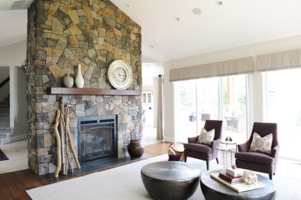
As part of her early-stage design process, Steeves created a color scheme to tie the rooms of the project together, based on the preferences and inspirations of the homeowners. At first she was stumped by this house, but then she discovered last-minute inspiration. “Just as I was getting ready to wrap up, I asked her about the fireplace stone,” says Steeves.
A four-sided fieldstone fireplace dominated the living area that Steeves was also tasked with redecorating. Marion said she disliked the salmon and orange colors of the stone but liked the gray and purple tones. Steeves noticed these purple tones elsewhere in the house and asked Marion about them. ”She got really excited,” says Steeves, and showed her all of her other purple housewares and art.
They pulled a plum color from the fireplace as the color inspiration and incorporated soft purple tones throughout the redesign. Steeves painted all of the walls a soft tan as a neutral backdrop for the furniture and textiles.
Wall paint throughout main floor: Balboa Mist, Benjamin Moore
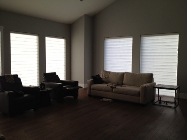
BEFORE: Steeves took this photo of the existing living room for her records. With the blinds drawn, it’s easy to see the potential of this spacious room, but it felt incomplete; the single sofa and two recliners floated in the nearly 500-square-foot living room. “They didn’t have enough furniture,” she says. What furniture there was didn’t relate to the kitchen and dining areas.
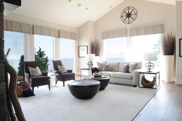
AFTER: She added two more chairs and drum coffee tables, creating a cozy U-shaped sitting area. Steeves also added a 12-by-14 rug and pulled all the furniture onto the rug to make the space more intimate and to keep the large windows free. Soft fabrics warm up the space and complement the color scheme, while the rug defines the furniture area.
The living room serves a variety of needs: The family uses this space for watching TV; they also play games with grandkids and hang out with family and friends here, so the new seating area provides opportunities to focus on the TV and the fireplace as well as the views. The furniture is also now close enough so that people can talk with one another.
Table lamps: Lucy, Robert Abbey; sofa, beachcomber baskets: Pottery Barn; end tables (discontinued) and Dana Chairs: Mitchell Gold + Bob Williams; Clint Drum Cocktail tables: Arteriors; area rug: 100 percent New Zealand wool broadloom, cut to size and bound
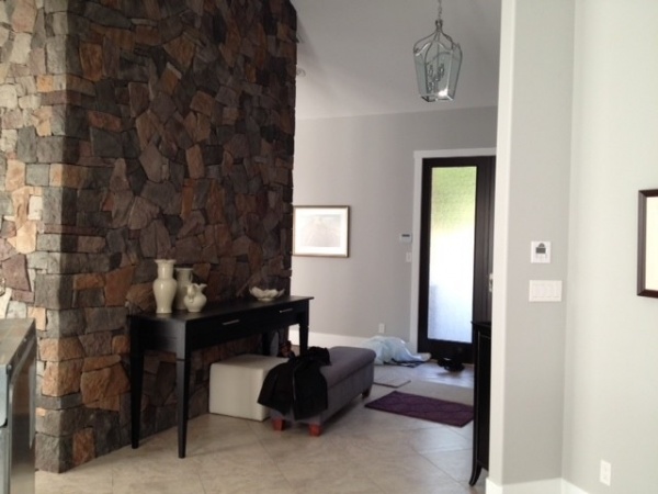
Between these two redecorated spaces, the entry connects the living room with the kitchen and welcomes guests into the home. The console table and poufs were existing when Steeves was hired, but she removed a colorful nature painting from the wall. “The stone didn’t look its best, and neither did the painting,” she says.
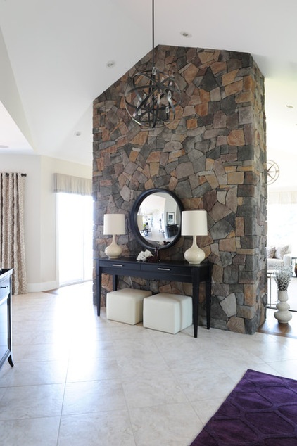
AFTER: The fireplace wall sits at an angle and blocks the kitchen and living room from view when visitors enter. ”I wanted to create curiosity when you walk in the door,” says Steeves. She hung a parabolic mirror where the nature painting had been, providing guests with a glimpse into the kitchen and living room from the entry, drawing them into the home.
By the time Steeves wrapped up this project in May, she had visited the house a total of three times, including installation day, and all went according to plan. Steeves had sent a presentation package to the couple to review after the first walk-through that included proposed layouts, plans and material samples for the whole project. “When I sent [Marion] the package, I knew [the rooms] would look good,” she says.
Parabolic mirror: Reflecting Designs; Lucy 8-Light Pendant: Robbert Abbey
We love hearing about your success stories. Please share details of your before-and-after projects in the Comments!
How to Find a Designer or Architect Using Houzz Photos
More:
Find design professionals near you
See more guides to using Houzz to help with your home projects
Related Articles Recommended


