Houzz Tour: Stunning Curved Architecture Rises Among the Trees
These homeowners are building the dream house of a lifetime, which takes time, patience and flexibility. Not just on their part, but on the part of their architect as well. It’s so fitting that they found architect Robert Oshatz, who rolls with his clients’ needs, letting the house evolve as they progress through the design process.
So far this unique lakeside home has taken two years to design and two and a half years to build, and that’s just phase one of construction. Designed to fit into the wooded slope along the shores of a Wisconsin lake, the organic architecture evolved from responding to its surroundings and the needs of the family, which was growing as the house went up. The result is a home that is continuous from room to room and from indoors to out.
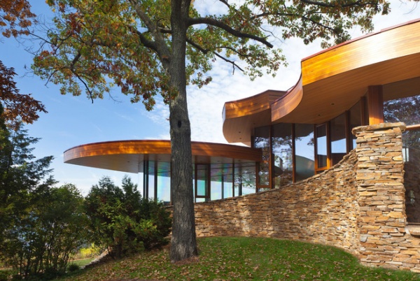
Photos by Cameron Neilson
Houzz at a Glance
Location: On a lake near Milwaukee
Size: About 7,500 square feet (697 square meters); 4 to 5 bedrooms; 3½ bathrooms
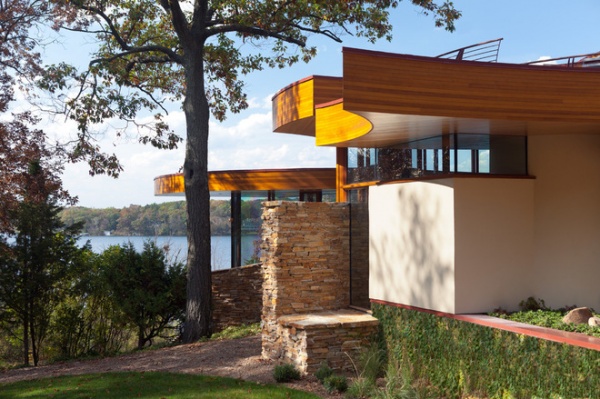
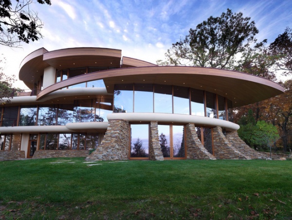
The home’s curves were inspired by the trees on the site; the house wraps around the trees so as not to disrupt the forest. “My clients wanted an asymmetric house, and they love curves but not circles,” Oshatz says.
They also love using natural materials that continue from the inside to the outside. The stone seen throughout the project is Idaho quartz. The wood on the vertical parts of the roofline is cedar; the lighter wood on the underside of the overhangs and the interior ceilings is hemlock.
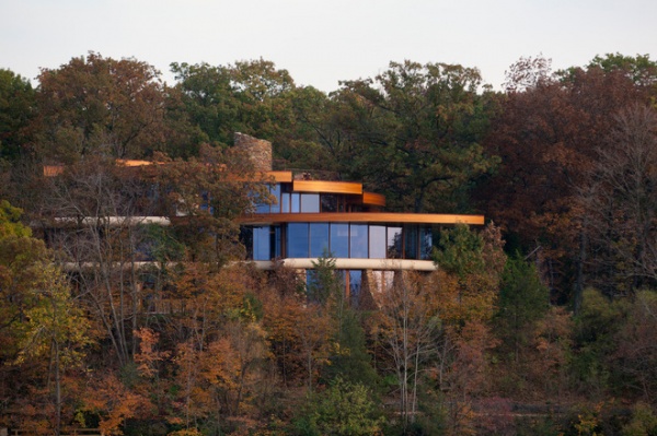
Tucked among the trees, the large home is difficult to discern from the lakeside setting. Oshatz designs from the inside out, incorporating his clients’ needs on the interior and making the most of the views beyond. However, in this case the site influenced the house’s organic forms as well. He designed around trees and created a house that works with the existing hillside’s dramatic slope.
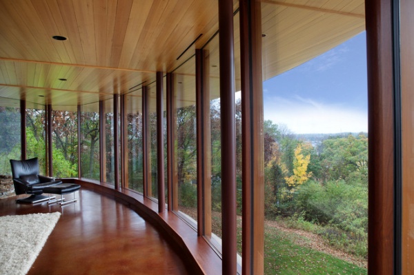
Floor-to-ceiling windows provide spectacular views of the lake and woods from every room in the house. Using the same material from indoors to out created a strong sense of continuity and blurred the line between the two. For example, the hemlock wood used on the ceiling continues on the overhang outdoors.
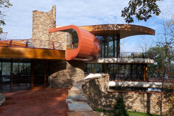
The home appears much smaller on the street side, as the first level is not visible at all. This is the main entry … for now. Believe it or not, the home is not complete; it’s a work in progress. Phase-two plans include a new wing to the left of the house. It will include the main entry, a study and guest suite, and a bridge across an indoor pool that will connect through the white stucco wall you see below to the rest of the house. The suite will provide a private living area for grandparents when they come to visit, or could potentially provide them with a permanent residence should they need it in the future.
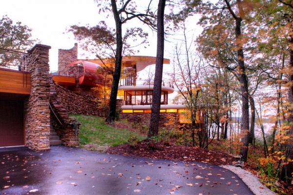
The garage is tucked to the side and has a grassy play area atop it on the entry side of the house.
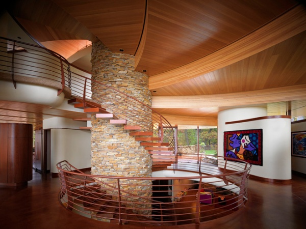
Inside, a large cylinder dominates the center of the home. It houses an elevator shaft, and the staircase spirals around it. The plan radiates out from this central core.
The quartz cylinder extends right up through the roof and beyond. The fireplace and some other features around the home are crafted of the same stone. The railings are painted metal, and the stair treads are wrapped in jatoba wood. The ceiling is composed of steel beams clad in wood. It spins off the elevator shaft.
Just as the house’s form evolved organically, so did its concept. “It came together as the house started to take shape,” Oshatz says. “The clients had a great deal of say in how their house would function.” One example of how he tailored the interiors to these clients was creating walls that were suitable for hanging their large pieces of art on.
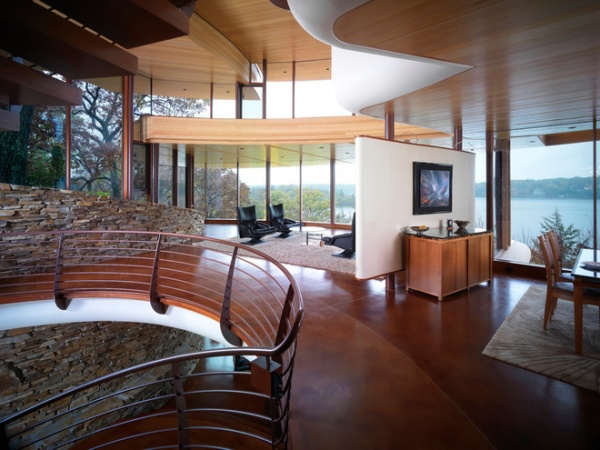
Another partial art wall creates a sense of separation between the lounge and the dining area. The clients wanted all of the rooms to flow from one to the next. Using the same materials throughout, like stained concrete for the floors, as well as the continuous curved walls of windows created continuity.
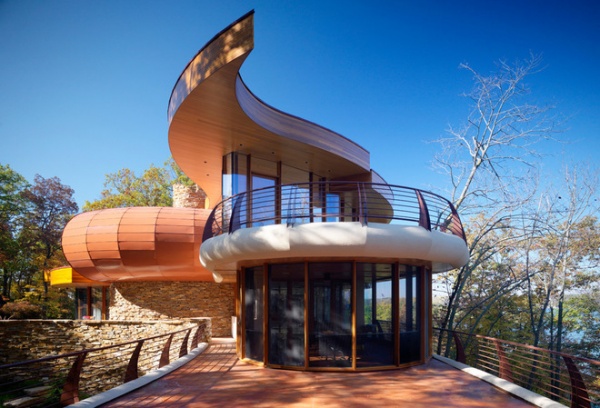
Curving around to the side, we get a glimpse of the screened-in porch off the kitchen and the master bedroom’s terrace overhead. A paisley-like shape’s point on top marks the end of all of the roof levels, which spiral up around the central stone shaft. “It’s a termination point,” Oshatz explains. The curved tube to the left is the master bathroom; we’ll get a peek inside in a moment. The entire top level is the master suite. A nursery off the master bedroom will serve as a hobby room–office after the clients’ baby grows up and moves to the lower level, where the rest of the children’s rooms are.
Below, the terrace off the kitchen forms the roof of their daughters’ room. The quartz used throughout the project grounds the house into the hill. It was important to the clients that their children share bedrooms and bathrooms. The bulk of the square footage went toward communal spaces.
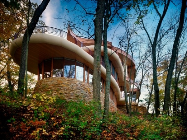
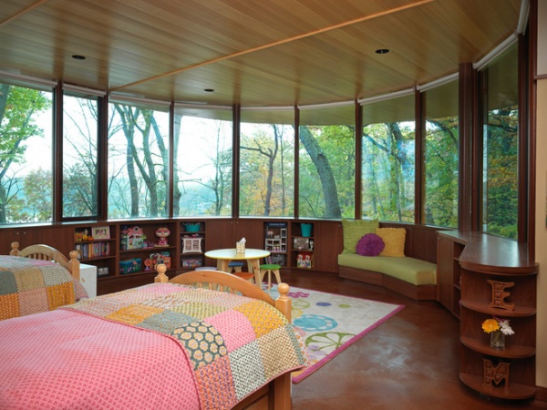
Even though the daughters’ bedroom is located on the lower level, it still has spectacular views and a tree house feel because of the slope of the site. Built-in cabinets, shelves and seats lend a seamlessness to the room that puts the spotlight on the view. Also adding to that seamlessness is the hemlock ceiling, which extends right through the glass to the underside of the exterior overhang.
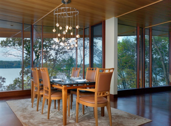
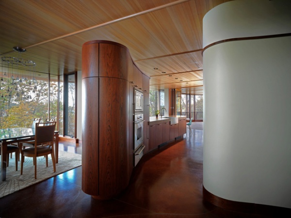
The dining room flows into the kitchen. The appliances are concealed from the other rooms by a curved partial wall made of jatoba wood.
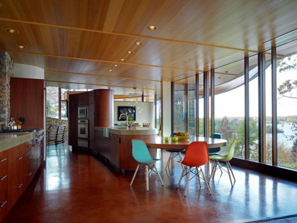
The kitchen counters are concrete that was poured onsite. The owners love the look of the 4-inch-thick band of concrete atop the cabinets; it stands up to the scale of all the large elements in the room. A table that cantilevers off the island provides a cozy eat-in space right in the heart of the kitchen. Just beyond it a screened-in porch adds another eating space.
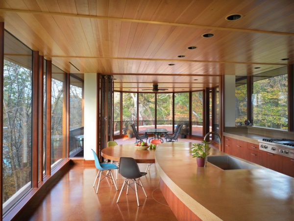
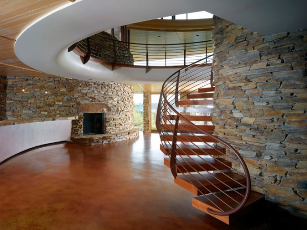
The lower level, still unfurnished, will be all about the children. The kids’ bedrooms are on this level, which also includes the family room you see here; it’s open to the staircase atrium. This level also includes a playroom, gym, theater room and garage.
The insulated Heat Mirror glass on the windows functions much like triple-glazed glass, Oshatz says. A geothermal heat pump and a sophisticated HVAC system make the home as efficient as possible for its size.
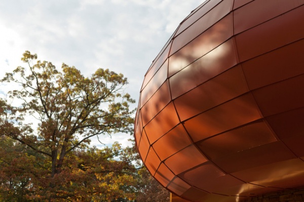
Moving up to the top floor, we see the painted metal-clad tube that encases the master bathroom. It also has poured-in-place thick concrete countertops.
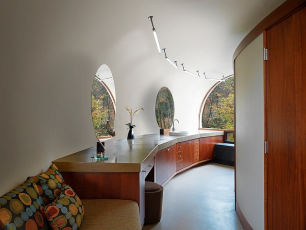
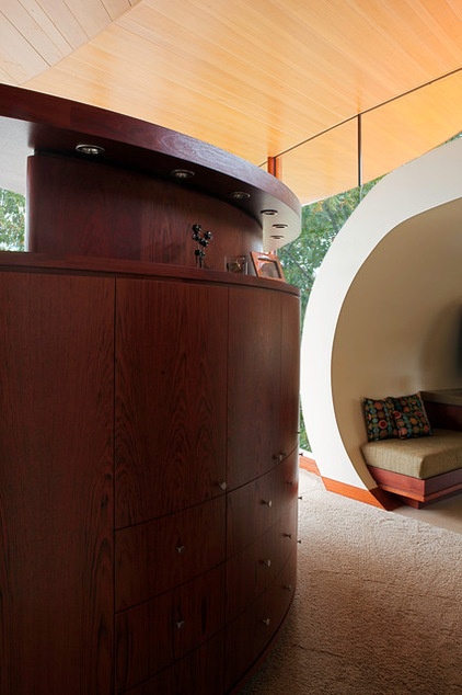
The curve on the right marks the entrance to the master bathroom. The curved cabinets on the left are the back of the custom built-in bed’s headboard. A TV rises up from the footboard, then can be tucked away when the owners want to enjoy clear lake views from the bed.
The terrace off the master bedroom is planted, as are many of the outdoor terraces.

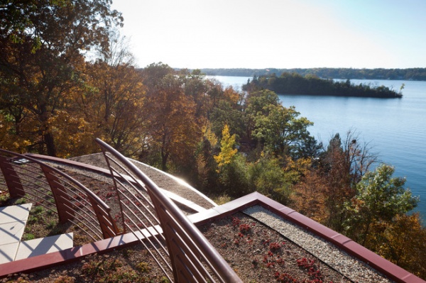
The roofline rises in a series of stepped terraces at 2 feet per step, and ends at the paisley shape’s point. While there are plans for more building at some point, the house has been designed to look complete without it.


