Room of the Day: A Guest Room Like No Other
http://decor-ideas.org 08/28/2014 20:17 Decor Ideas
Cyndi and John Kane found themselves with a larger nest when their son left their Pawhuska, Oklahoma, home for college. Following an American tradition so established it’s practically a rite of parental passage, they turned their son’s vacated room into guest quarters. With the help of interior designer Kara Paslay, they created an inviting guest room that is like no other.
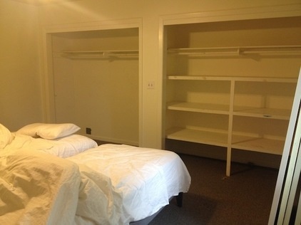
BEFORE: Prior to the remodel, Cyndi cleaned out the space and painted it white. The room was unusual in that it had three closets. “The house was built in 1959, and the Kanes weren’t the original owners,” says Paslay. “I’m not sure why the family who built the house chose to put three closets in this room.”
She started with a blank slate, but Paslay quickly came up with two smart moves that injected the room with rich character.
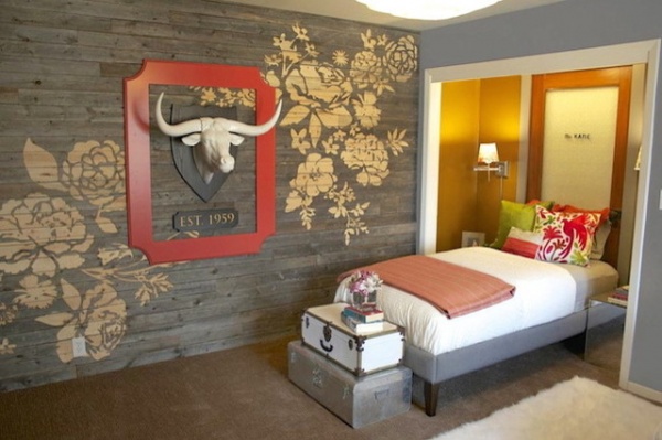
AFTER: The first step was to cover one 8- by 10-foot wall with reclaimed wood etched with a floral pattern of her own design.
Paslay’s husband, Tim, owns a CNC router (a computer-controlled cutting machine) for his business, Two Guys Bow Ties, which makes handcrafted wooden bow ties. Since the couple frequently collaborate on set design and other projects, it was only natural that she tapped him for help.
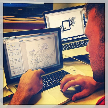
“I started by grabbing several digital photos of flower silhouettes on the Internet and creating my design in Photoshop,” says Paslay. “Tim worked with the file to make it readable by the CNC machine.”
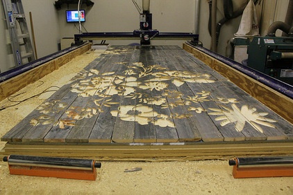
The couple bought weathered fence posts for the wall. “A lot of people love barn wood — I do too,” says Paslay. “But demand makes it hard to find and expensive. Tim called a local fence builder and was able to find these posts for less.”
They nailed the wood to a large sheet of plywood and let the CNC machine do its work.
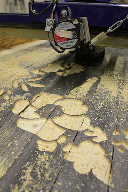
“It was necessary to nail the reclaimed wood to the plywood so it would be stable during the cutting,” says Paslay. “After it was done, we had to cut the piece into smaller sections in order to move and install it.”
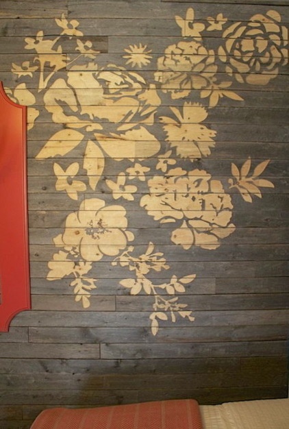
The result is a unique accent wall whose beauty lies in juxtaposition. “I like the way the feminine floral pattern looks against the manly texture of the wood,” says Paslay. “My hope is that it is a guest room that appeals to both sexes.”
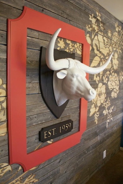
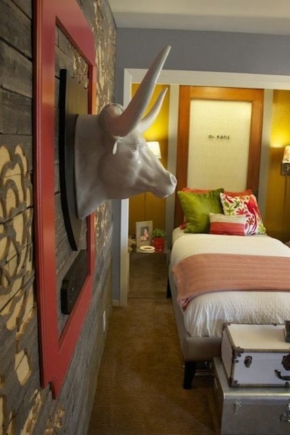
The wall’s other feature speaks to the room’s former inhabitant. “Ree Drummond, star of the Food Network’s Pioneer Woman, and Cyndi are best friends, and Cyndi’s son was a cowboy on Ree’s ranch,” says Paslay. “I wanted to reference his former job with a steer head. I chose this white ceramic one for a more modern look. The frame makes it more substantial and gives the wall color.”
The plaque references the year the home was built.
As an interesting aside, Paslay became acquainted with Drummond through the Kane family, and ended up doing a project for her that millions of foodies have seen.
See Paslay’s refresh of The Pioneer Woman’s set design
Ceramic steer head: Z Gallerie
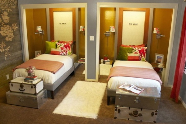
The Kanes envisioned the room’s being used by their son and his friends when they visit, and they wanted to outfit it with twin beds. “Cyndi was having a lot of trouble making two beds fit in the room, and that’s why she called me,” says Paslay. “I made it work by taking over two of the closets and making them niches. Taking away closets is something a lot of people might not do, but since there is a closet that is still in the room, it works here.”
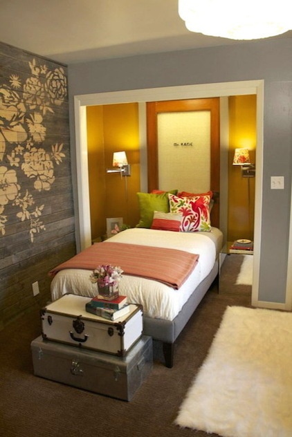
The designer added a personal touch with two doors that are special to the family. “This is a family of lawyers, and the doors were once on John’s father’s law office,” says Paslay. “They had saved them when the building was renovated. I touched up the words on the doors — they both say ‘Mr. Kane’ — and painted the back of the glass white to make them bright.”
Paslay added molding around the doors to give them presence and make them feel like real portals. “It looks like you could actually open them and go through. It’s kind of a magical effect,” says Paslay. “Cyndi says they remind her of the wardrobe from The Chronicles of Narnia.”
Creating the niche provided another benefit. “It gives visitors a sense of privacy,” says Paslay.
Painting the inside a metallic gold color made what could have been a rather dark space luminous. Mirrored beside tables enhance the feeling.
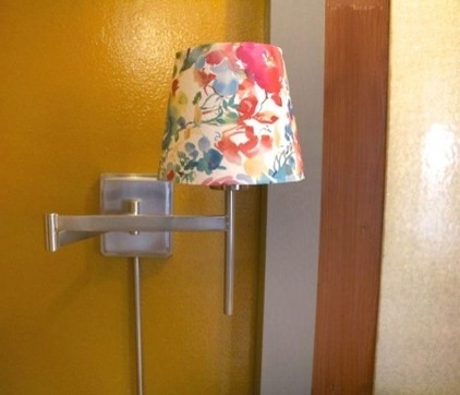
For extra lighting Paslay embellished wall sconces with paper shades. “It’s a plain white lampshade, but I made this little paper sleeve to drop over it,” she says. “I wanted to carry the floral pattern around the room.”
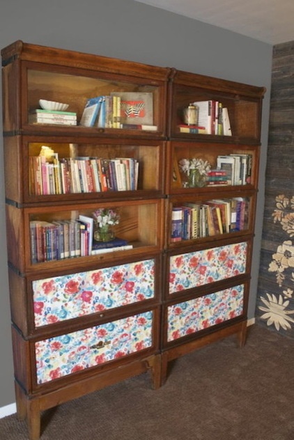
Paslay used the same paper to cover the glass on the lower shelves of the bookcase. “When we took away the closets, we removed some storage space,” she says. “We wanted to give them a covered space to stow a few things.”
Paslay says her set design projects have influenced her interior design business. “Working on sets for commercials, television shows and movies, I learned how important it is to select items that visually tell a story,” she says. “Now I use the same practice in private homes to create an atmosphere or tell the client’s personal story.”
See more Rooms of the Day
Related Articles Recommended


