Houzz Tour: A ’60s Apartment Gets a Retro Revamp
This fifth-floor apartment built in the 1960s needed opening up to make it lighter, brighter and more livable. But in updating the decor, Mr. Mitchell interior designer Andrew Mitchell resisted the urge to depart too radically from the building’s origins. “We wanted to make some reference to the retro era of the building and give the apartment a clean, fresh and airy contemporary appeal,” Mitchell says.
The owners’ main home is in the same Melbourne suburb; they bought the unit primarily as a place for friends and family to stay at. They loved the apartment’s sweeping city views, and it was a smart investment in an improving area. But its small rooms and dated decor desperately needed a rethink. Although the kitchen and bathroom had been renovated in the past, they were neither serviceable nor stylish, and the layout didn’t take advantage of the views.
Houzz at a Glance
Who lives here: Guests of a professional couple and their 3 children
Location: South Yarra, Victoria, Australia (suburb of Melbourne)
Size: 2 bedrooms, 2 bathrooms
Interior designer: Andrew Mitchell, Mr. Mitchell
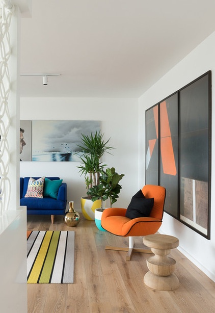
Mitchell knocked down the walls in the main living areas and opted for limed oak boards throughout to unite the updated kitchen and bathrooms with the bedrooms, living and dining area. The clients’ artwork became the inspiration for a bright color scheme.
Artwork: Christopher Dolman (right), Juan Ford (triptych on far wall); side tables: solid oak, Sabrina, Zuster; gold vase: Meizai
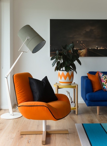
The retro theme plays out subtly throughout the apartment with the help of color, pattern and form.
Side table: Temperature Design; planter: Fenton & Fenton; floor lamp: Space Furniture
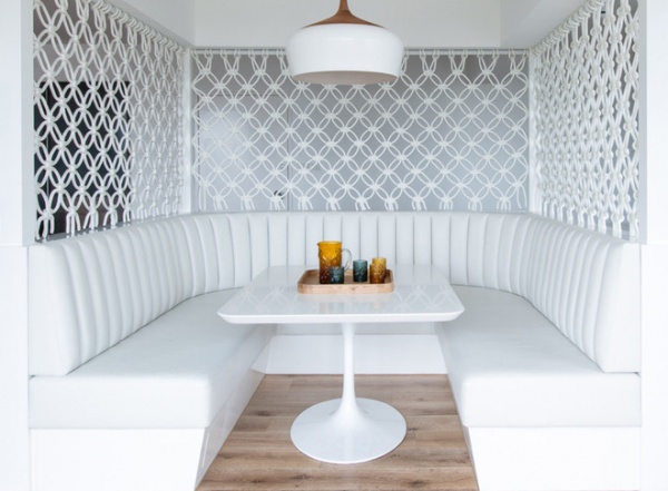
The dining banquette sits in the middle of the living space. “It allowed us to introduce the macramé screen, which is a fun reference to the retro era of the apartment,” Mitchell says.
Macramé screen: Smalltown; banquette seating fabric: Pellan in Dove, Austex; Coco pendant: Corporate Culture; tabletop: Corian in Glacier White, Pro Solid
Knot Again! Macrame Is Back
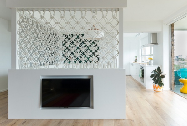
Construction in a small apartment on a fifth floor is never an easy task, but installing a banquette this size proved to be the project’s biggest challenge. “The banquette had to be winched in by hand up a central light well through the middle of the building,” Mitchell says.
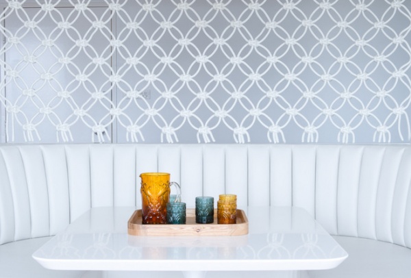
The macramé screen was a labor of love for artist Sarah Parkes. It was crafted by hand offsite and installed over the course of a full day by Parkes and her partner.
“The banquette is a real focal point of the property,” Mitchell says. “It is visible from the moment you enter the apartment and provides an intimate place for family gatherings or a quiet place to read the paper and take in the expansive views.”
Timber tray, jug, glasses: Zuster
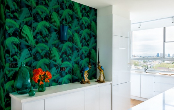
Playful wallpaper by Cole & Son from Radford wraps around the central structural wall, again referencing a slightly retro aesthetic.
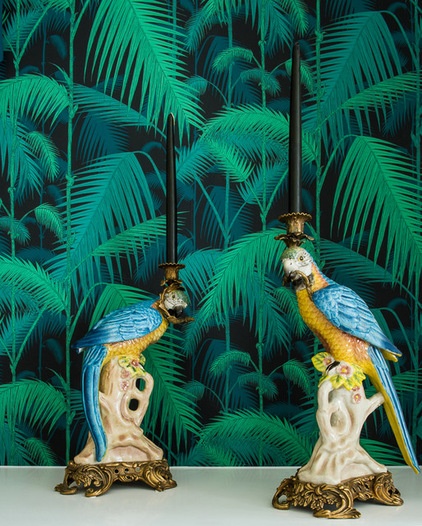
Even the candlesticks are a kitschy nod to the past.
Candleholders: Meizai
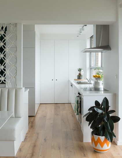
The kitchen was updated with guests and visiting family members in mind.
Flooring: European oak with smoked oak and lime finish, Timberland; Quantum Quartz benchtops in Alpine White: European Marble Centre

The bedrooms are just as stylish as the rest of the abode. Mitchell custom made this headboard with fabric in Peacock from Unique Fabrics.
Lamp: Space Furniture; throw: Abode
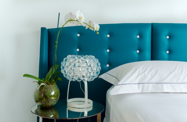
Here is a closer look.
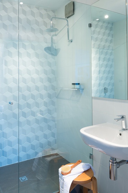
The shower wall is a modern take on a retro theme and adds appeal to this simple but inviting bathroom.
Stool: timber, Temperature Design; feature wall tiles: Academy Tiles
More: 12 Retro Pieces to Accent a Contemporary Space


