Light and Personality Fill a Remodeled London Home
http://decor-ideas.org 08/27/2014 04:13 Decor Ideas
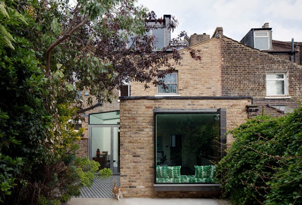
This house in Hackney, London, was in poor condition when the owners enlisted the help of architect Brian O’Tuama. They wanted a complete refurbishment without the hassle of obtaining planning permission, so they extended and improved within permitted development guidelines. “The owners wanted an eclectic feel to the house that reflected their personalities, so we decided to introduce lots of pattern and texture,” says O’Tuama. “The main challenge we faced was to open the house up to as much light as possible, while at the same time making the flow of space work more effectively.”
Houzz at a Glance
Who lives here: A family of 3
Location: London Fields area of Hackney, London
Architect: Brian O’Tuama Architects
Size: 3 bedrooms, 2 bathrooms
To solve the light issue, an airy new extension (left) is covered by a single pane of glass — a feature the owners were determined to run with despite needing a crane to winch it into position.
The designers also enlarged and punched out an existing window to bring in even more light. “The owners are both very creative, so when they approached us, they already had lots of ideas, which was wonderful,” says O’Tuama.
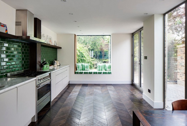
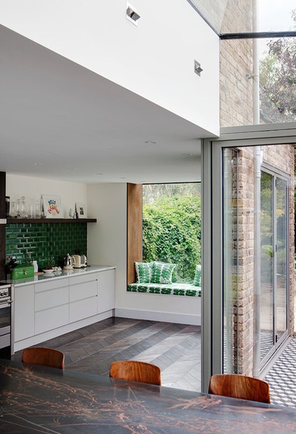
O’Tuama widened and lowered the original 1970s window, flooding the back of the house with natural light, which dances on the parquet floor.
“The floor in the kitchen is a new discovery of ours,” O’Tuama says. “It’s engineered oak in chevron parquet that’s been preassembled. It’s laid down onsite in planks, and it’s a wonderful way of achieving a heritage look without having to have it hand installed, which can be very costly.”
Sliding doors and the glass ceiling over the extended dining area giving the space yet more natural light.
The bronze-topped dining table is among a number of vintage pieces the owners collected over the years that they wanted to incorporate into their new home.
Green subway tiles add depth to the scheme, and O’Tuama chose the same color for the cushions in the oriel window to consolidate the look.
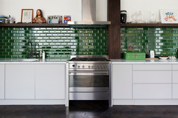
O’Tuama wanted to combine the airiness of a contemporary kitchen with eclectic and heritage elements to give the space plenty of character. “We purposefully restricted the kitchen units to one wall to keep the rest of the space free for pictures the family had collected,” he explains. It is, he says, a multifunctional space that doesn’t conform to the stereotype. A simple stained oak shelf displays treasured items collected by the family, almost like a mantelpiece.
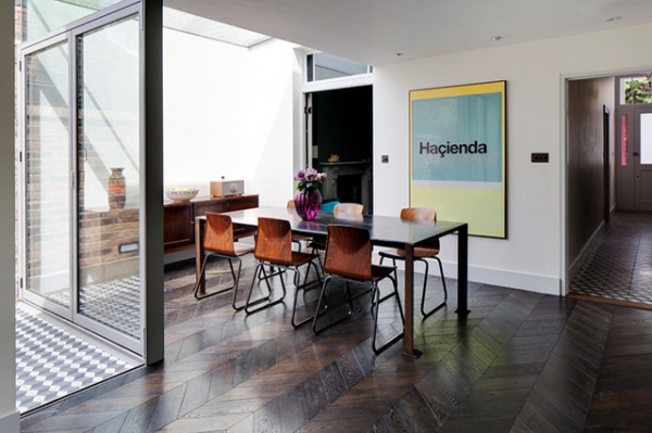
Black, white and gray concrete tiles adorn the floor of the outdoor terrace, nodding to the Victorian heritage of the building. Pieces such as the poster from Haçienda, a club, add a really personal feel — one of the owners was a DJ there. “It was important we left them plenty of space to display their keepsakes,” says O’Tuama.
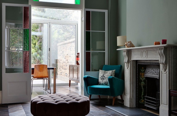
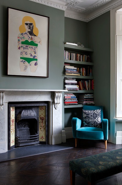
French windows mark where the garden used to begin. To unite the old and new parts of the house, O’Tuama used the same parquet flooring in the living room as in the kitchen. The walls are painted in Arsenic by Farrow & Ball, which complements the rich velvet furniture.
O’Tuama was careful to restore original features, such as the cornices, sensitively. “The family were very keen to keep these elements of the house, and we were careful to make sure the space didn’t look too new and fake,” he says. “It was a gentle restoration, and we kept the edges soft.”
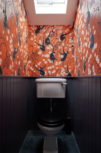
The owners love De Gournay’s hand-painted wallpaper and decided this bijou powder room would be a great — and more cost-effective — spot in which to showcase it.
“It’s made to order and very expensive, so we needed a relatively small space in which to put it,” says O’Tuama. Edwardian fittings were sourced to give the space a traditional feel, and a skylight was added to pull in some natural light and really make the orange come alive.
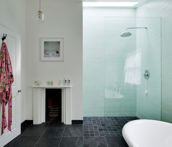
This bathroom on the third floor was originally a bedroom. The owners liked the quirky fireplace, so they kept it in the reconfigured space to add character to the crisp, white design. Large slate floor tiles from World’s End Tiles — complete with underfloor heating — are a practical, nonslip choice and make a great foil for the white subway tiles in the shower.
More: Micro Additions: When You Just Want a Little More Room
Related Articles Recommended


