Houzz Tour: A Historic House Gets a Feng Shui Adjustment
http://decor-ideas.org 08/26/2014 01:14 Decor Ideas
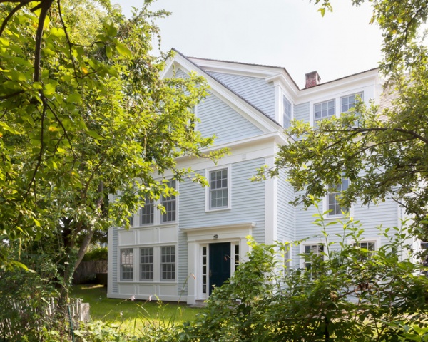
While completing a renovation on their intended home away from home in Rockport, Massachusetts, this Brooklyn, New York, family of five wanted to make sure they brought some of their favorite borough with them. They also wanted to make sure the house had good energy, so they enlisted interior designer Reiko Gomez, an expert in feng shui. A mix of historic architecture, favorite street art, bright happy colors and feng shui calculations has resulted in a home that’s comfortable and reflects their playful and colorful personalities.
Photos by Yorgos Efthymiadis
Houzz at a Glance
Location: Rockport, Massachusetts
Who lives here: This is a vacation home for a couple and their 2 sons and daughter.
Size: 3,900 square feet (362 square meters) 4 bedrooms, 3½ bathrooms
Interior designer: Reiko Gomez, Reiko Feng Shui Design
The couple had been schoolmates growing up in Rockport and wound up marrying years later. Their extended families live nearby, so they spend a lot of time in the seaside town. With the new house, they hope to spend much more time there.
When they bought the house, it was dilapidated and needed a gut renovation. Because it is in a historic village, they were not allowed to change the exterior.
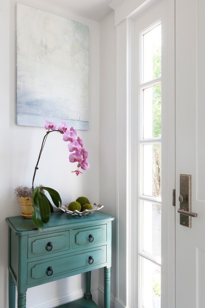
Gomez (who often goes by her first name, Reiko, pronounced RAY-ko) joined the project right after architect Philip Duffy completed his plans, and added some features to support feng shui principles. For instance, she scooted the front door over a bit and changed its swing so it did not line up with the stairs. In feng shui lining up the two features means money goes down the stairs and out the door.
Also, the house didn’t have a foyer (the family was not allowed to build out to create one), so Gomez created the sense of one. She added a few thin closets between the front door and the living room and added this petite console table. “Having a space to land is important,” she says. The small console table fits into the tiny space and provides a place to drop keys.
Art: Chris Minot
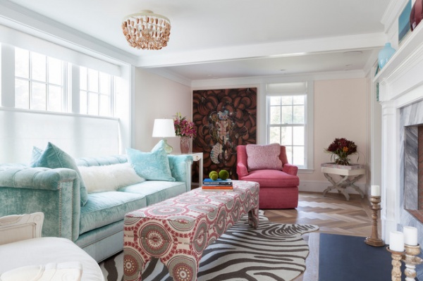
“They are really fun, colorful people who love funky things,” Gomez says. “The woodwork and architecture are true to the home’s history, but the art, fabrics and bright colors are all about them.” For instance, the large piece of art on the back wall of the formal living room is by SupaKitch, a French street artist who lives in New York City.
Gomez used the art as a starting point, found a fabric with matching colors and covered the ottoman with it. “Find a colorful print and pull the colors from it,” she says of choosing a color palette. She also advocates experimenting; she picked up the outdoor zebra-patterned rug with the sunporch in mind, but after throwing it down in here found it added excitement to the room.
Rug: Grandin Road
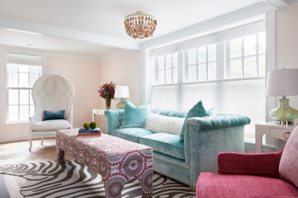
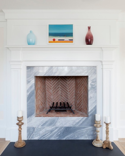
Gomez calculated how to use the five feng shui elements (wood, fire, earth, metal, water) throughout the home. The seashell light fixture, jade sconces and marble around the fireplace bring the element of earth to this room. The floors throughout the home are Siberian white oak; in the living room they are laid in a herringbone pattern.
A porter’s chair has its back to the entryway and creates a protected spot. “I like to create little niches and nooks where people can feel tucked in and cozy,” she says.
Art over fireplace: Jill Demeri
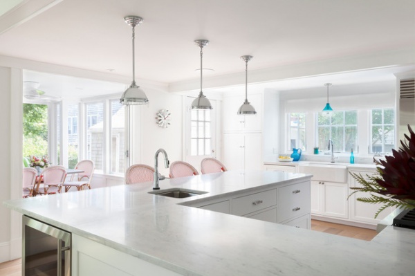
Another place Gomez made some tweaks was in the kitchen, where she created a U-shaped counter. “This gives the cook a place to feel protected and to take center stage in the kitchen,” she says.
The space called out for fire, according to her calculations. “You can use the actual element itself or one of the colors associated with it,” she says. This is why she chose the red and white café counter stools.
Café stools: Serena & Lily
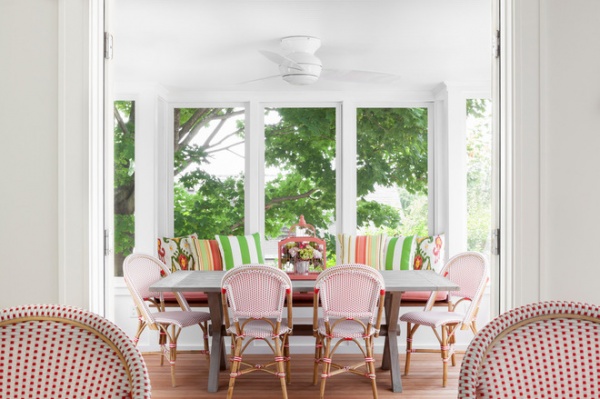
“The café stools are supercomfy, and we liked them so much that we also used the chair version out on the sunporch,” she says. The family will enjoy most of their casual meals in this welcoming and happy space. Because it is above the walk-out lower level, the porch feels like a tree house.
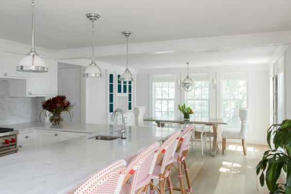
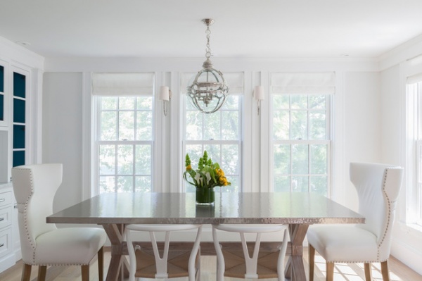
The dining room is just off the kitchen. This space called out for metal, which Gomez brought in via the steel tabletop, light fixtures and upholstery nails on the host and hostess chairs. She added the element of water via deep blue paint on the inside of the china cabinet.
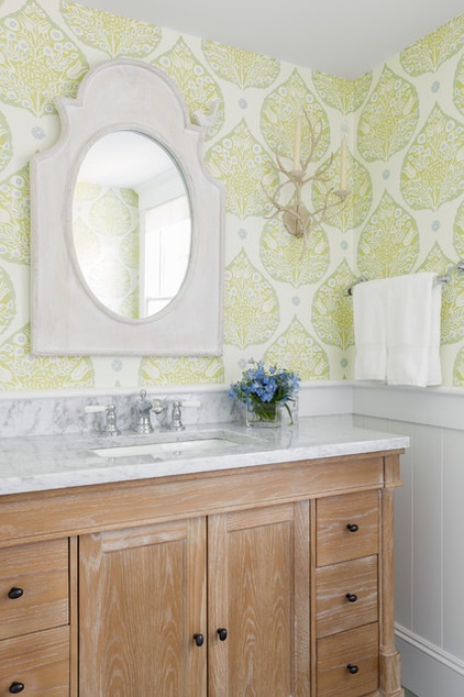
Earth elements in the powder room include a green wall covering with a leaf-shaped pattern, a wood vanity and branch-like sconces. And if you look closely, you’ll see a little bird at the top right of the mirror.
Wallpaper: Galbraith & Paul
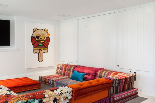
“Basements often get the short shrift,” Gomez says. “I didn’t want that to happen down here. I wanted it to be special.” Another piece by SupaKitch infuses the space with the family’s playful Brooklyn style. The Mah Jong sofa in a bright mix of Missoni fabrics continues that spirit down here. The room can easily turn into a guest room or slumber party room — the wall contains a Murphy bed, and the cabinets contain nightstands and reading lights.
Mah Jong sofa: Roche Bobois
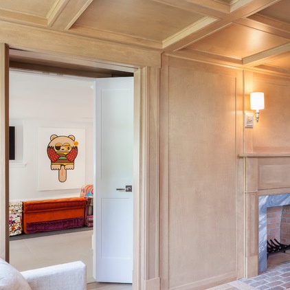
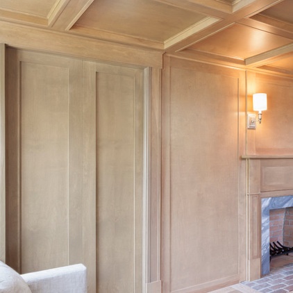
Two pocket doors separate the playroom from the home office. Inspired by the old Get Smart show intro, Gomez created doors that look like a paneled wall when closed. When you push one just a little to one side, both doors open.
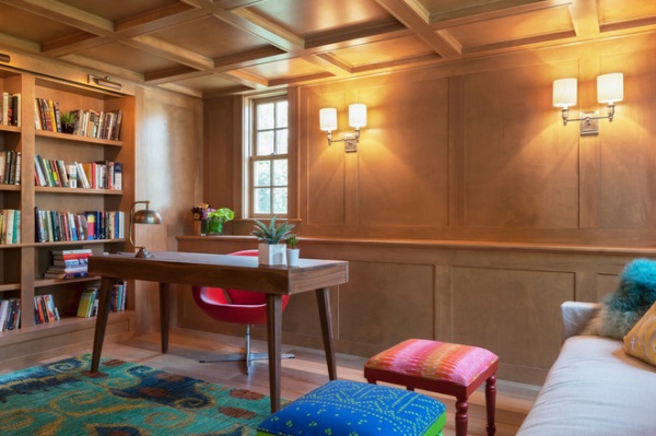
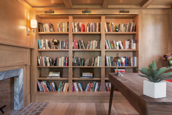
The office-library will be used during the day mostly by the husband when he’s telecommuting to New York City. “It’s a paneled man cave but with pops of bright color,” Gomez says. “It reflects him; he’s very playful and colorful.” The fireplace is a new addition that cozies up the space in the winter.
This is more than a man cave. If you look carefully beneath the art lights, you’ll see a slit where a movie screen drops down. The shelves with the horizontally placed books house surround-sound speakers.

The turquoise beaded chandelier was something the homeowner and Gomez both had admired in magazines, cutting out photos of it before they started the project, and they knew they had to have it somewhere in the house. When they bought it, they had no plan for where it would go. Now it hangs over the staircase between the main floor and the second floor and can be enjoyed from both levels.
Gomez wanted the children to have an inviting spot here to hang out and read in, so she created a comfy nook in the light-filled space between their bedrooms.
Chandelier: Currey & Company
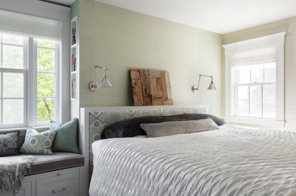
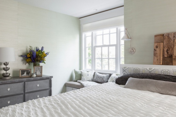
Gomez made a few small but significant tweaks to the master bedroom plans. “Originally, their bed was placed beneath a window, which can lead to sleep deprivation,” she says. “I wanted to create a place where they would feel cozy and tucked in.” She bumped out the wall behind the headboard and designed built-ins that connect the headboard to a new cozy window seat and a niche for bookshelves. Trays slide out on either side of the bed to provide a nightstand surface.
According to her feng shui calculations, this room needed the earth element, so she papered it in a green grass cloth wall covering. It also called out for touches of metal and wood, provided by the sconces and table lamp, the driftwood piece over the bed and furniture such as the dresser.
Driftwood art: Nina Samoiloff; headboard fabric: Galbraith & Paul
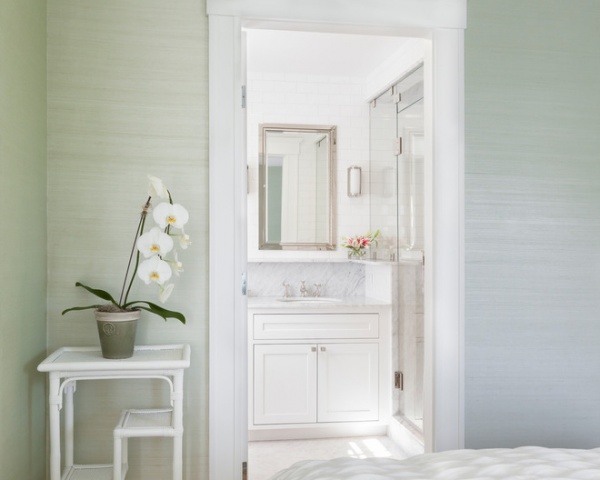
The couple is gaga over the bathroom at their favorite Hamptons getaway, the Inn at Windmill Lane in Amagansett, New York. “They wanted me to copy that bathroom for them to have at home, so that’s exactly what we did,” Gomez says.
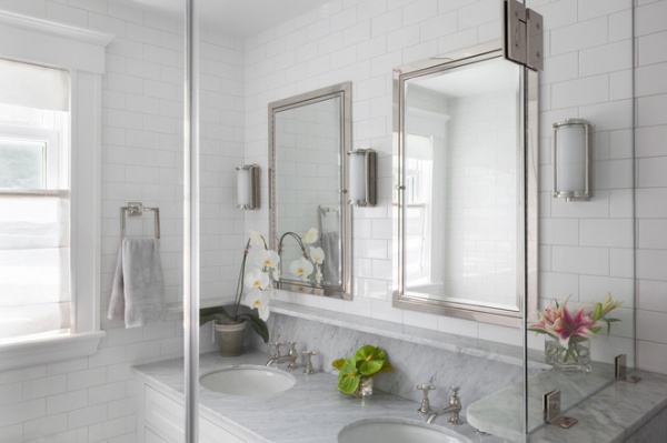
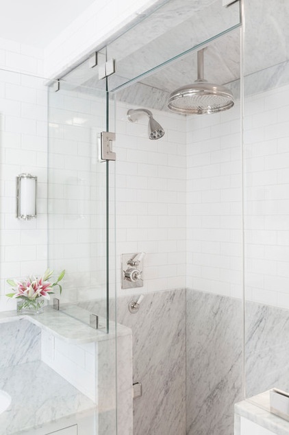
Gomez re-created the feeling from the inn’s bathroom with subway tile, marble counters, chrome mirrors and a rounded marble ledge for toiletries.
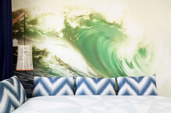
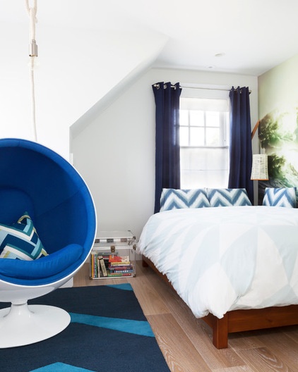
Water was the suitable element for the room belonging to the older son, a tween. “I just went for it,” Gomez says. Each of the boys picked his own mural from Brooklyn’s Flavor Paper. In the tween’s room, a powerful wave gives the room a funky surf vibe. The blue ball chair provides a comfy place in which to read. The hanging light overhead can be pulled down lower when needed.
Hanging light: CB2
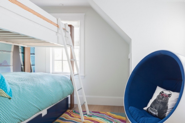
The younger son picked a mural of a graffitied street scene. “Once he saw that his older brother had a ball chair, he had to have one,” Gomez says.
Bunk beds: Ducduc
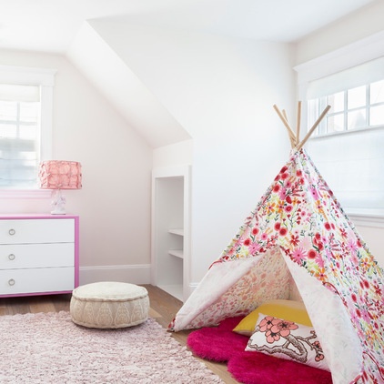
The couple’s youngest is still a baby and sleeps in the couple’s room, so her bedroom is serving more as a playroom for her until she grows into it. A colorful pink floral tepee offers a protected spot where she can feel tucked in.
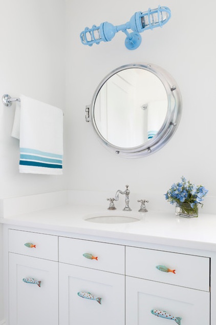
The kids’ bathroom has whimsical beachy touches like a porthole mirror and fish-shaped drawer pulls.
Drawer pulls: Anthropologie; double sconce: Barn Light Electric Company; countertop: White Zeus, Silestone
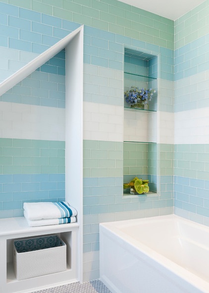
“This glass tile is really beautiful and looks like sea glass,” Gomez says. “You can see into this bathroom as you go up the stairs, and I thought, “Let’s just stripe the walls and have some fun with it.”
Glass tile: Ann Sacks
Contractor-carpenter: James Theophanis
More:
A Crash Course in Feng Shui
Houzz Tour: Fred MacMurray’s Enduring Farmhouse Retreat
Related Articles Recommended


