My Houzz: Color and Fun Behind a Victorian Facade
http://decor-ideas.org 08/23/2014 00:23 Decor Ideas
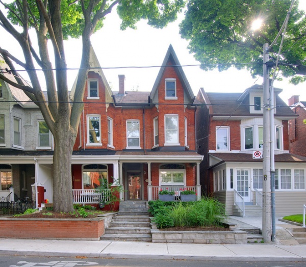
After living in a loft on the east side of Toronto for a number of years, Andrea Van Leeuwen and Daniel Habashi were eager to move back west to be closer to friends and family. They came out on top in a bidding war for an 1880s Victorian townhouse in the Dundas West neighborhood. Its spot on a quiet side street — just steps from Trinity Bellwoods Park, a local landmark — was perfect for the family of four. The house had been recently renovated when they moved in, and they’ve since filled it with an eclectic collection of midcentury furnishings and bold contemporary art that reflect their love of clean, open spaces and color.
Houzz at a Glance
Who lives here: Andrea Van Leeuwen, Daniel Habashi and their 2 sons
Location: Dundas West/Trinity Bellwoods neighborhood of Toronto
Size: 2,000 square feet (186 square meters); 5 bedrooms, 3 bathrooms
Built in: 1880s
From the street the townhouse blends in with the rest of the neighborhood, with its classic redbrick facade so common to Toronto, thanks to the former lake bed it sits on. The series of terraced, gray stone planters that line the front steps are filled with a subtle variety of grasses and shrubs, a traditional landscaping approach that defers to the existing streetscape.
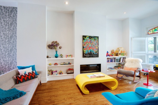
Belying the traditional exterior, the remodeled interiors provided the couple with a great base for their expanding collection of bold midcentury designs and pieces in bright colors. The sofa and blue armchair were both purchased at the Sunday Antiques Show, located in the landmark St. Lawrence Market. The sofa, marked as “free sofa with purchase of chair for $199,” had a hole in it that discouraged other buyers. The couple reupholstered it with gray and turquoise fabric they found at The Wool House on nearby Queen Street West.
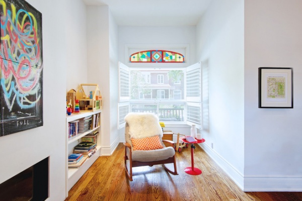
Leftover fabric from the sofa was later used on the midcentury rocking chair they found at The White Monkey, a vintage shop in Ottawa. Fabric, they’ve found, is a surefire way to tie together two pieces of furniture that may not otherwise relate to each other. The map on the right depicts the nearby Trinity Bellwoods Park; it was hand drawn by local artist Marlena Zuber, seen here.
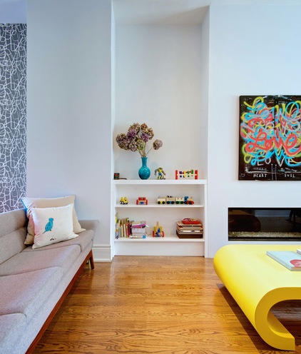
When the smell of gas alerted the couple that the fireplace needed replacing, they decided to redefine the space with a more contemporary linear model. To avoid losing square footage in the room, they needed to remove some of the old masonry to make room for the wider footprint of the new fireplace. The Fireplace Shop, located in Toronto, was able to recommend a contractor with the masonry, drywalling and fireplace installation skills to cut the replacement time down to one week. The final cost was $10,000 for the fireplace installation, plus an extra $4,000 for the custom built-in bookshelves.
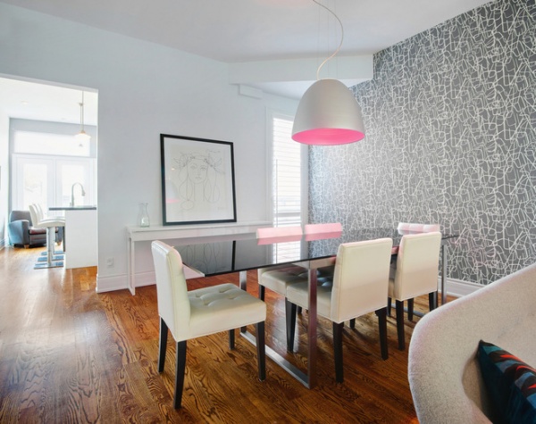
There’s an easy flow throughout the first floor, with a combination living-dining room and a kitchen only partially hidden by a wall, so the rooms feel connected.
The dining room is defined by a bold graphic print from Spanish wallpaper company TresTintas, which the couple purchased while on vacation in Madrid. It features a repeated line drawing of a chair, but the couple installed it upside down so the print reads as more of an abstract pattern.
Table, chairs: Casalife; pendant: Artemide; wallpaper: TresTintas; sideboard: Ikea
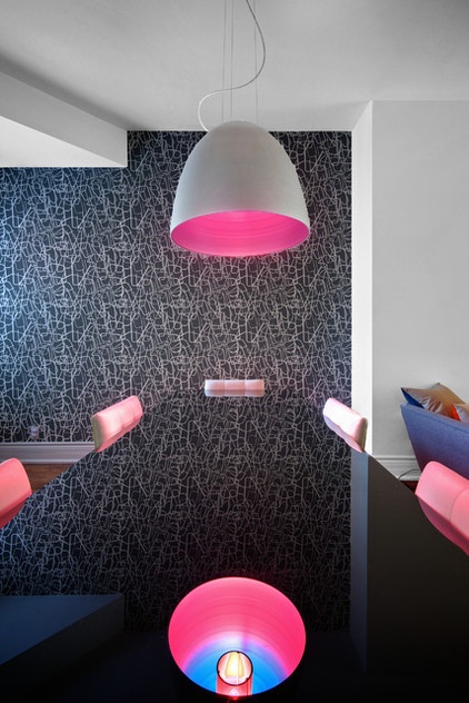
No strangers to bold color choices, the couple purchased the Nur Hal suspension pendant from Artemide with an optional color filter that casts pink light across the table and chairs. The blue and pink filter surrounds a standard lightbulb, which can be seen in the reflection on the black smoked-glass table, from Casalife.
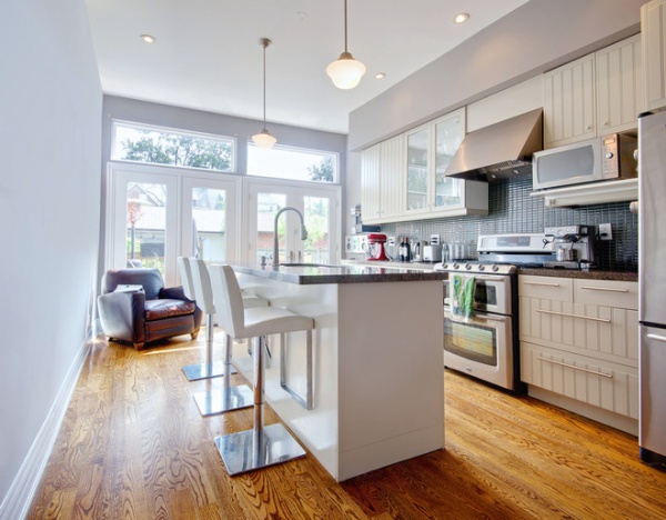
Facing east, where a wall of glass catches the morning sun, the renovated kitchen makes the most of its modest footprint. Organized around a long run of cabinetry and a central island with seating for three, it still manages to have room for a comfy leather armchair, a perfect place to lounge with a glass of wine and chat while dinner is being cooked. The glazed French doors also help to make the room appear larger, drawing in the rear patio and backyard. On a summer’s day, the doors can all be swung open to remove any boundary between indoors and out.
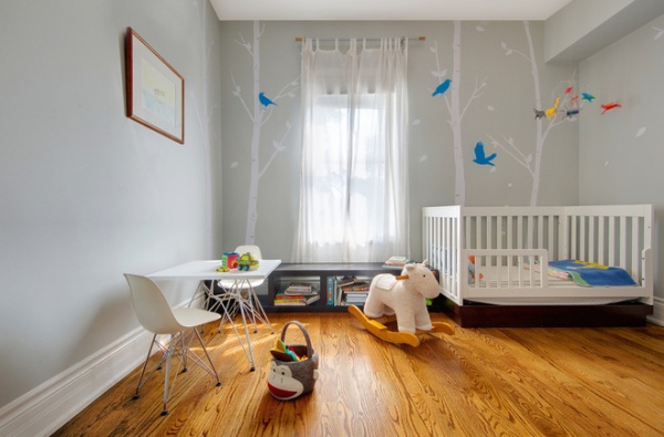
The couple worked hard to provide calming, clutter-free spaces for both of their young boys, ensuring that an ample amount of storage could be found for toys and books. They cloaked the walls of this bedroom in a soothing shade of pale gray with a whimsical pattern, a perfect foil for the pint-sized Eames replica chairs.
Rocking horse: Pottery Barn
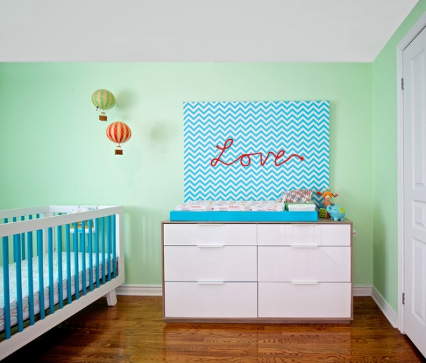
A smaller room on the third floor is home to the younger son. The cozy nook is outfitted with an inexpensive crib from AllModern, which the couple sent out to be spray painted with blue spokes in a hard-wearing lacquer paint. An Ikea dresser is topped by a long custom changing table tray built by Van Leeuwen’s father, which they had painted in a matching shade of blue.
Dresser: Ikea; hot-air balloon mobile: KolKid
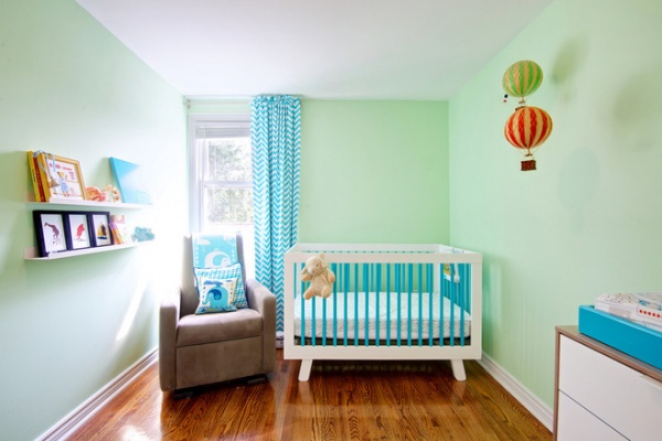
A rocking chair placed next to the crib is the perfect spot for relaxing in the light from the window.
Rocking chair: Monte Design; floating shelves: EQ3; blanket, pillows: Jonathan Adler
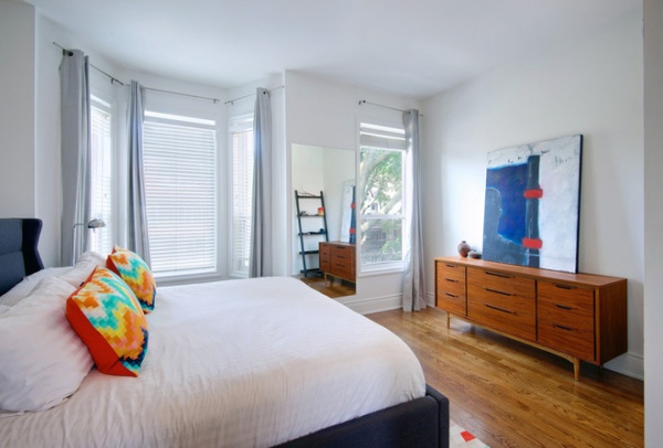
Habashi and Van Leeuwen’s master bedroom sits on the second floor overlooking the tree-lined street. It’s a stress-free retreat for the couple, outfitted sparingly with a mix of high and low items, including a vintage Danish sideboard and throw pillows from CB2.
Throw pillows: CB2
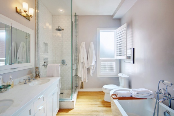
The master bathroom is the one room in the home where the existing floorboards were in salvageable condition. In deference to this piece of the house’s history, the redesign of the space took a more traditional course, with recessed panel cabinets, blown-glass sconces and vintage bath fittings.
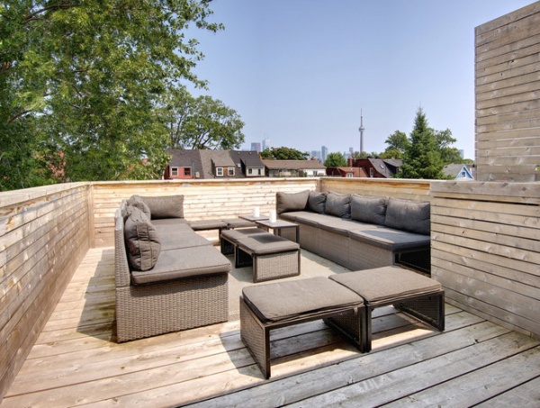
An unexpected retreat is tucked away at the top of the third-floor stairs: a large rooftop patio with stellar views of the CN Tower and the Financial District. With seating for 12 and a built-in sink and wine fridge, it is the perfect place for the family and their friends to while away the long summer nights.
In the end it’s the juxtaposition of old and new that the couple appreciates. Their home has the spirit and character of a 130-year-old Victorian, but with the functionality of a fully modern, family-friendly dwelling, one that’s perfectly situated to soak up the energy of a buzzing neighborhood.
My Houzz is a series in which we visit and photograph creative, personality-filled homes and the people who inhabit them. Share your home with us and see more projects.
Browse more homes by style:
Small Homes | Colorful Homes | Eclectic Homes | Modern Homes | Contemporary Homes | Midcentury Homes | Ranch Homes | Traditional Homes | Barn Homes | Townhouses | Apartments | Lofts | Vacation Homes
Related Articles Recommended


