Kitchen of the Week: Organic Modernism in Seattle
http://decor-ideas.org 08/15/2014 19:14 Decor Ideas
This Seattle homeowner was ready for a radical change. Her architect, Nils Finne, described her approximately 85-year-old home as Tudor-ish,” with a separate kitchen and dining room. After persuading the homeowner to remove the wall between the two rooms, the architect needed to turn the resulting 34-foot-long kitchen into something warm and wonderful.
Now it was time for him to get radical. So Finne invoked his love of “crafted modernism,” as he calls it, and custom designed everything: the space plan, the island, even the pendant lights. Mixing natural and engineered materials, straight and organic lines, and dark and light tones, he created a kitchen that feels contemporary and fresh yet is well integrated with the rest of the home.
Photos by Benjamin Benschneider
Kitchen at a Glance
Location: Seattle
Size: About 510 square feet (47 square meters)
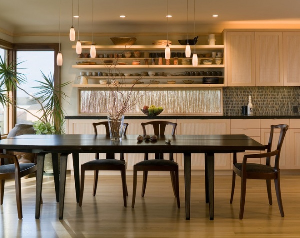
Finne implied a dividing line between the two rooms. The open shelves and backlit sea grass end, and the cabinets and backsplash tile begin, where the two rooms meet.
The sea grass brings a natural element into the room. It was encased in resin and attached to the window frame in front of the window. Finne originally chose it to screen out a banana-peel-yellow house next door. It was his first time working with sea grass, and it turned out to be a striking feature. Finne loved the result so much, he used a shot of himself in front of it as his professional profile photo.
Resin panel: 3form; pendant lights: Kane low-voltage halogen pendants with custom brackets, Bruck
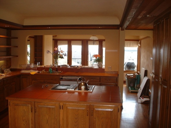
The previous kitchen was not an inviting space, and it didn’t have room where people could gather or hang out. The room beyond it is the former dining room.
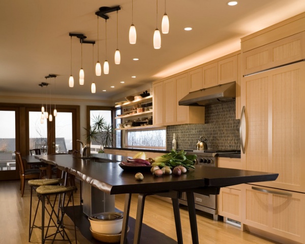
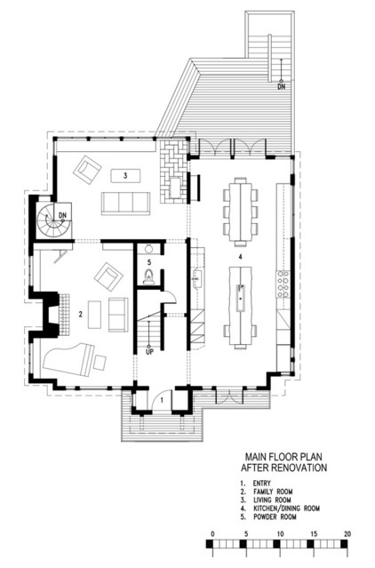
AFTER: Now the room — 34 feet long and about 15 feet wide — runs from the east side of the house to the west. To complement the linear space, Finne added two custom surfaces: an island and a dining table. The doors at the west end of the room offer views of Puget Sound.
Finne custom designed and fabricated the island and the dining table, as well as the stools and light fixture brackets. The island and the dining table were milled from the same elm tree; the owner likes to stand at this end of the island and say she can see all the way up the tree.
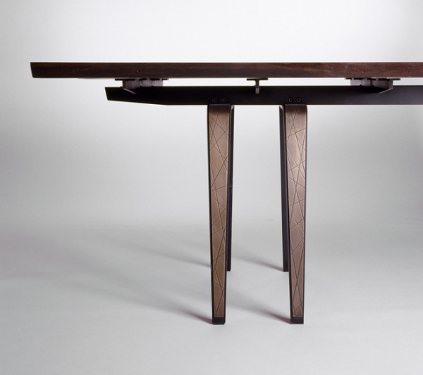
Ling Dining TableThe dining table has a reclaimed, live-edge elm top that floats above a blued-steel base. The top is stained dark espresso. The table legs have a bronze overlay that’s been laser cut with a leaf pattern. The straight machine-cut lines have nature-inspired patterns; the live-edge wood is supported by lines of steel. There’s tension and balance between these engineered and nature-inspired details throughout the home.
“I love to get into a design to this level,” Finne says of custom designing pieces like this. “It gives my projects a depth that they simply wouldn’t have without it.”
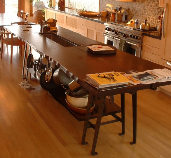
This photo shows the size of the trough sink in the island and how much can be stored on the shelf below. The custom sink is 41 by 12 inches and made of stainless steel. “The sink allows two people to work side by side, and it is also great for parties — you put ice in the trough and fill it with bottled drinks,” Finne says.
On the island the slot between the two pieces of elm wood is filled with limestone. On the dining table, this slot has been left open.
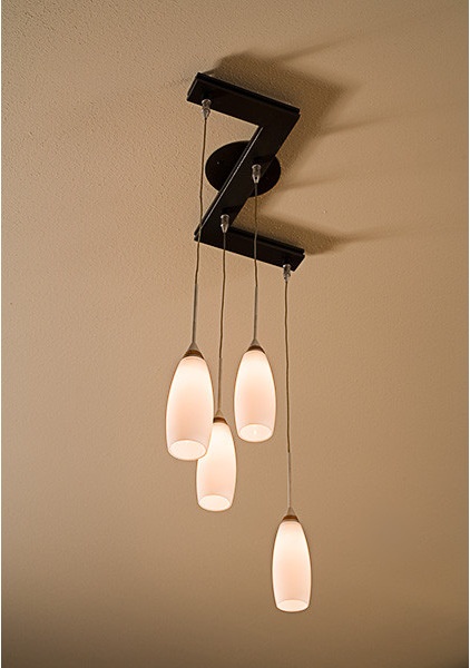
To play against the linearity of the space, Finne dotted the pendant lights in a haphazard pattern across the long room. “I wanted them to look like candles floating in the air,” he says. He chose inexpensive off-the-shelf pendants, then crafted custom brackets in blackened steel.
At the east end of the space are views out to a garden.
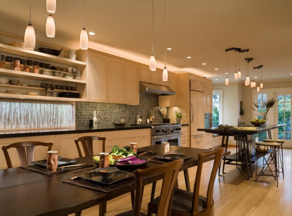
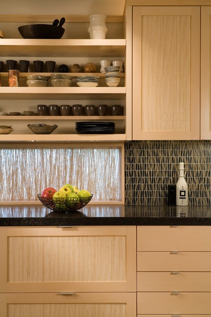
The client’s son is a potter who worked in Japan for a Japanese “living national treasure,” Finne says. Most of the pottery displayed in the kitchen is the son’s work. “There was definitely some Japanese inspiration in here,” Finne says. “The dark countertops paired with the light wood cabinets and bamboo is very Japanese.”
The light wood is indigenous Alaskan yellow cedar, which has a tight, straight grain. The inset panels are bamboo. The countertops are dark limestone.
The backsplash creates a connection between the light wood cabinets and the dark limestone countertops. The stone mosaic has a dynamic pattern that feels organic. “It’s all about textural interplay,” Finne says.
Backsplash tile: Selvaggio, Ann Sacks
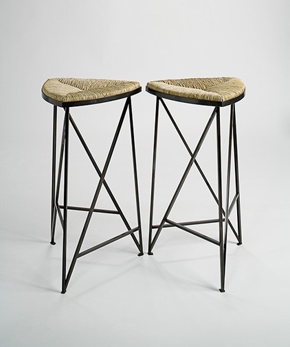
Lista StoolsStools designed by Finne and woven by artist Deloss Weber add to the textural mix. Their blued-steel bases pick up on the other blued-steel pieces on the island, and the cattail rush seats add another natural material that converses with the bamboo cabinet panels and sea grass panel.
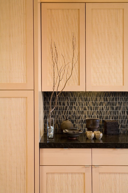
More of the work of the homeowner’s son decorates the countertop. His and the architect’s passions for excellent craftsmanship suit the kitchen well.
“Because of the level of craft, because it is not overwhelmed by modernity, because of the respect for materials, the touch of the human hand and the care that went into making it, this kitchen transcends time,” Finne says. The new space has an organic feeling and a level of detail that makes it feel at home in the 85-plus-year-old house.
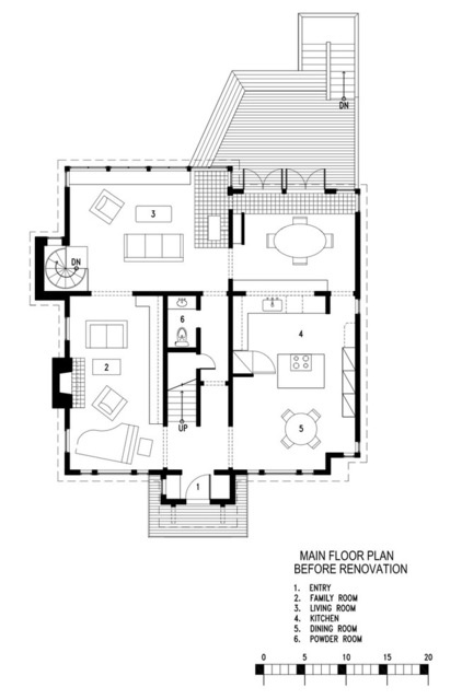
Here are “before” and “after” plans to help you better understand the renovations.
Houzz Guide: How to Remodel Your Kitchen
Related Articles Recommended


